UPDATE, August 26, 2024: Microsoft has changed the wording of the note that resulted in the Ars Technica article. The update is in the same article link below, but for the link-averse, here's the before/after:

BEFORE: "The Control Panel is in the process of being deprecated in favor of the Settings app, which offers a more modern and streamlined experience."

NOW: "Many of the settings in Control Panel are in the process of being migrated to the Settings app, which offers a more modern and streamlined experience."
The story on Ars Technica: Microsoft formally deprecates the 39-year-old Windows Control Panel
It’s explained in the story that the time between announcing official deprecation of the Control Panel (now) and it actually being removed from Windows could span years. The current Settings app has a few things to recommend it:
- Generally it looks nicer and more modern
- It features breadcrumb navigation
- The search (which you will probably need) works reasonably well in my experience
But it also falls short:
- Many Control Panel settings are absent, especially ones for more advanced options
- The categories are, I think, not as straightforward
- System seems to be a dumping ground for “Where do we put this setting?”
- It’s a single window, so you can’t have two of them open at the same time
- The home page is filled with
informationpseudo-ads for Microsoft services, such as OneDrive, Microsoft 365 and more
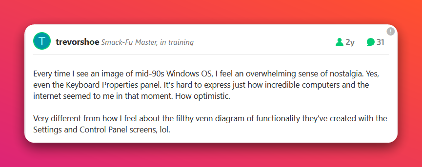
The comments on the article are a mix of nostalgia and the expected nerd rage against the generally considered-to-be inferior Settings app. This comment resonated with me:

The reason it resonates is that I feel that same nostalgia when I see that mid-90s Windows GUI. I feel that GUI, with higher-resolution elements and a few tweaks, would look fine today and in some ways, even better than what we have with Windows 11 (also see my post on Windows GUI: Good, Bad and Pretty Ugly (Ranked)). The post also hits on an issue that has been happening since the Settings app was introduced in 2012 with Windows 8: A constant visual clash between Settings and Control Panel. Also, it’s been 12 years! Why is Microsoft still not finished moving over everything in the Control Panel to Settings1This is the mild exasperation referenced in the title? ~nerd rage intensifies~
Anyway, I actually rarely use Control Panel these days, as Windows mostly just works (and I use PowerToys, which probably helps), but the article did prompt me to pin Control Panel to the Start menu, just in case. Then I went in and looked through some of the options, pretending it was suddenly 1999 again and computers were cool. They were still tools, but they were also just kind of neat. To nerds, at least.

