As soothsayers and Nostradamus wannabes attempt to divine Apple’s product schedule for everything (except the iPhone), let’s pick on the company again for a design that is both ugly and awkward.
This is the Apple iPhone 6/6s Smart Battery Case:

Or as I call it, “Is that a deck of cards in your case or are you just glad to see me?”
Why it’s ugly: it looks like the case has a large rectangular growth attached to it. I suspect very few would describe this appearance as visually appealing.
Why it’s awkward: Pick up your smartphone right now (if you don’t have one, use your vivid imagination instead) and hold it as you normally would. If you’re like most people, you’ll be gripping at least three fingers along the bottom side edge of the phone. Note in the photo that this would put your fingers right on top of the bulge where the battery pack meets the regular part of the case. Awkward.
This is a surprisingly ugly product from Apple, which usually gets at least the aesthetics right.
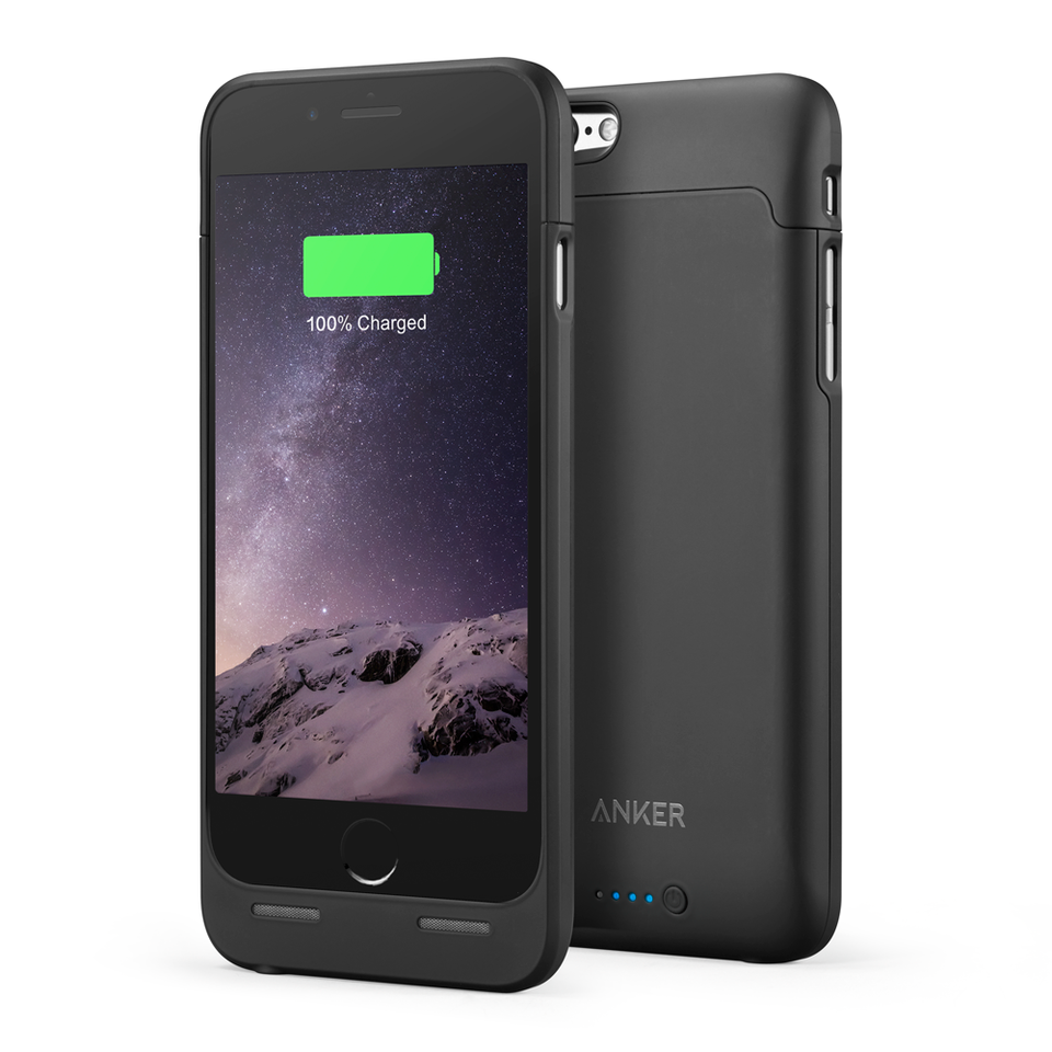
Compare this to the Anker Ultra Slim Extended Battery Case for the iPhone 6/6s:
Sure, the phone is a bit longer as a result but the design actually keeps in mind that people don’t want a lumpy, misshapen phone. It also costs about $80 less than Apple’s battery case while offering 75-90% of the equivalent battery extension.


