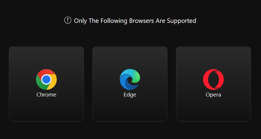
I got an email from Keychron inviting me to try their newly-improved keyboard launcher software. Better yet, it’s browser-based, so you just open up your browser and go, no software to install or keep updated. Except for one thing…
Now, if you don’t run macros, or want to assign keys to quick launch applications, or remap keys in general, or fine-tune the RGB lighting, this software can be considered optional.
However, it’s the only way you can do a firmware update if something goes amiss with your Keychron keyboard. And that can happen!
Forcing users to use a Chromium-based browser is bad because it ignores other perfectly viable browsers, like Firefox or Safari. macOS and most Linux distros don’t even include a Chromium-based browser. The graphic above isn’t accurate, either, as it ignores other notable Chromium-based browsers, like Vivaldi or Brave. This is also a bad thing because instead of adhering to web standards (as any good web-based software should), it uses hooks that are exclusive to Chromium, helping to further entrench Chromium–and Google–as the de facto monopoly in web browsing. And Google is actively working to destroy the web right now, in order to make more money for itself.
Mostly, it’s silly forcing people to use specific browsers, because it goes against everything that the web is meant to represent.
In conclusion, Keychron is bad and should feel bad.
A new retro console! An Intellivision console, just like I had as a surly teen! It’s called the Intellivision Spirit.
But wait, there’s a YouTube link in the same article…
This seems to suggest the name is Sprint, not Spirit. And yes, it is the Intellivision Sprint, not Spirit1Bonus: How does a carpet get “cigarette-soaked”, exactly? And were the kids playing Intellivision back in 1982 chain smokers or something?.
The story was posted two days ago (as of this post I’m writing) and this curiously obvious gaffe has not been corrected. The first (of two) comments also points out the error.
But hey, it’s just a sloppily rewritten press release, rather than AI slop, so I guess we should be thankful for that.
A breathtaking example of dark patterns and how not asking for consent from a user can lead to a tech-related catastrophe filled with bogus warnings and alerts.
A neat tale of dogged perseverance beyond what most people would do, with connecting-the-dots and searching saving the day.
A sad testament to what a big ol’ pile of poop Windows has become in its latest incarnation. For every good feature, it feels like there are two user-hostile ones added.
My own experience with Windows 11 has increasingly soured since its debut, which is a neat trick, considering an OS normally starts out kind of janky and unstable when it launches and smooths out over time. Instead, Windows 11 has become both increasingly fragile and obnoxious, with ads, dark patterns and AI shoved into every corner of it, even basic apps like Paint and Notepad.
In version 7.51 of Signal (desktop version) they changed how you access stickers. Before, you clicked on a sticker icon in the text box and chose a sticker. One click, simple.
Now you click the emoji icon, which makes no sense because stickers are not emojis, they’re stickers, then you have to click over to the Stickers tab and choose a sticker.
In simpler terms, what took one click now takes two. This is a regression, no matter how you look at it.
Here’s how the Signal team looks at it on their Github page: “Now you can experience the pinnacle of human technological advancement in Signal Desktop with a brand-new selection interface that makes it easy to quickly find an emoji, sticker, or animated GIF that’s perfect for the moment.”
They could have left the sticker button in the text box and still implemented this change. They could have made the sticker button customizable for “quick access” to stickers, emoji or gifs, but no, instead they just made adding a sticker two steps instead of one.
They have also taught me to never update Signal again. Good job, you clowns.
I have tweaked some of the fonts on the site again (but not all of them, so there is a bit of a crazy quilt effect going on here).
Specifically:
Body font: JetBrains Mono
Heading 2 font (used for post titles): Ubuntu Mono
As an added bonus for me, because WP doesn’t “see” JetBrains Mono in the editor, it is using Bold Segoe UI at 17px instead.
I’m all about the monospaced fonts. For now. For today. We’ll see what happens tomorrow.
EDIT: I have already changed the Header font to Barlow Semi Condensed, mere minutes later.

EDIT 2: I've now changed the sidebar to JetBrains Mono and also made the background colour of the site blue, and the sidebar a greenish-yellow. Or a yellowish-green.

EDIT 3: I've updated the blue in the logo to make it a bit lighter and it seems WP just needed to cache the fonts, as the editor now shows JetBrains Mono, as nature intended. More tweaking undoubtedly to come.
This article is just all-around depressing: Casual Viewing
Such slipshod filmmaking works for the streaming model, since audiences at home are often barely paying attention. Several screenwriters who’ve worked for the streamer told me a common note from company executives is “have this character announce what they’re doing so that viewers who have this program on in the background can follow along.” (“We spent a day together,” Lohan tells her lover, James, in Irish Wish. “I admit it was a beautiful day filled with dramatic vistas and romantic rain, but that doesn’t give you the right to question my life choices. Tomorrow I’m marrying Paul Kennedy.” “Fine,” he responds. “That will be the last you see of me because after this job is over I’m off to Bolivia to photograph an endangered tree lizard.”)
And:
Netflix’s “views” might look impressive on paper (even Sweet Girl, the TNM starring Jason Momoa as a vengeance-seeking survivalist whose MMA-trained daughter takes up his cause, was viewed 6.7 million times in the first half of 2024), but these figures remain a sham. To get to 6.7 million, Netflix first tallies the film’s “viewing hours,” the total amount of time that users have spent streaming the movie. Here, Netflix makes no distinction between users who watch Sweet Girl all the way through, those who watch less than two minutes, and those who watch just a few seconds thanks to autoplay, or skip around, or watch at 1.5x speed. All this distracted, piecemeal activity is rolled into Sweet Girl’s total viewing hours (12.3 million at last count), which the company then divides by the program’s runtime (110 minutes, or 1.83 hours) to produce those 6.7 million views. According to Netflix’s rubric, two users who watch the first half of Sweet Girl and close their laptops equal one full “view”—as do 110 users who each watch a single minute.
To compensate for reading this, here is a cat watching a TV with more attention than a typical Netflix subscriber:
Yesterday I went to the Verge homepage, but never clicked on anything. I appear to have not looked at any articles in the last few days, judging from my browser history. This makes sense, because I’ve de-prioritized the site since it added an “optional” subscription.
Today I clicked on the lead article and got this:
Yes, a paywall on the feature article, which was–hold onto your hats–about rearranging your home screen app icons. I did not get a Verge subscription, nor did I try any trickery to allow me to read the article. Instead, I closed the tab, removed the Verge from my new tab page list of bookmarks and will rarely check the site in the future.
I don’t begrudge the Verge wanting to extract money from its readers–you gotta cover expenses! But the way they are doing it sucks, and I’m not going to reward them (apart from the volume of clickbait junk opinion pieces is still too high, as well) with my money.
A partial/ambiguous paywall is bad design. It just is. I’ve barely looked at the site in the past week, so I don’t know if I’m getting hit by the paywall at random, if I reached my limit of “free” articles, or the feature article is paywalled by design. The pop-up doesn’t say, and I’m not going to dig around on my own to find out.
Asking people to fork over money and still serving them ads is also bad design. And tacky.
I don’t care about the newsletters. It’s not an enticement.
In a time when subscription fatigue is a real thing, the Verge has taken probably the second-worst approach to adding one (the worst would just be a complete paywall. I wonder if they’d still have ads then? Maybe!)
I don’t know how their two markets compare, but the way Ars Technica does subscriptions feels right to me:
If you don’t subscribe, the site is plastered with ads. Gotta pay the bills!
If you subscribe, you get some perks:
Article PDFs to download
A better layout for articles and the site in general
Customization options for text size, width and additional themes
No ads
Notice the last one? You get an ad-free experience and, knowing it is ad-free, subscribers get a layout that flows nicely without having to accommodate ads.
No content is locked behind a paywall. The sub is reasonable–as low as $25 per year. I like supporting the site this way and I get a nicer experience (to be clear, I do subscribe to Ars Technica).
Anyway, I suspect the Verge will do fine, since subs or not, they are still running ads. I’ll miss some of their content (but not their awful comments system). Having culled the site, I now have a tiny bit more time to devote to cat pics, so in a way, it’s win-win for me.
I say this as someone who has owned an iPad Pro since 2017.
When the iPad debuted in 2010, Steve Jobs pitched it as a “between” device that could do things a smartphone could, and things a desktop computer could–but it could do them in a more convenient form. The activities included:
Browsing web pages
Reading magazines and books
Watching video
All of these activities require minimal interaction, so they are suited to a touch-oriented device. The iPad’s larger display–yet still eminently portable design–makes it superior to a smartphone for viewing web pages or magazines, though with more responsive designs and larger phone screens, this use case is not quite as compelling as it once was. It’s still better for watching video in bed than a laptop or phone, I’d say.
Jobs only lived long enough to see one iteration of the iPad, called, cleverly1Given Apple’s often byzantine and arbitrary naming schemes, this is not sarcasm!, the iPad 2. It refined what was in the original, but otherwise changed nothing. It was just a better iPad.
That changed a bit in 2012 when Apple introduced the iPad Mini. It was, quite literally, a smaller version of the iPad. This didn’t change much, but it did mean that consumers now had two distinct choices when buying an iPad: regular size or smaller.
Apple then blew things up when they introduced the original iPad Pro in 2015. This had some refinements, but mostly it was bigger, going from a 9.7″ display to a 12.9″ one. Apple muddied the waters by later introducing a 9.7″ iPad Pro, which really wasn’t much better than the standard iPad Air available at the time (also a 9.7″ device). Apple “fixed” this by junking the Air (for a while) and bringing in a new base model iPad that stripped away things like the laminated display, but also dropped the price to a mere $299 (the original iPad sold for $499). The Pro models also supported a stylus, the Apple Pencil.
Does anything in the above paragraph look like a carefully-planned, long term strategy? Because it is not. It is Apple deciding one thing (“We need an upscale iPad so we can charge a premium price”) and then shuffling everything else around to make the line-up work. The early iPad Pros, apart from supporting Apple Pencil–an arbitrary limitation that was lifted a few years later, when Pencil support was added to all the myriad iPad models–didn’t really do anything that the base model couldn’t do. They looked a bit nicer, they sounded a bit better, they ran faster (not that you could really notice).
It was the Apple Pencil support that got me to buy that 10.5″ iPad Pro in 2017, then to move to the 12.9″ model when it was new in 2020 (I still use it today). It seemed like a way to get a Cintiq-like device, but (surprisingly, given Apple) for less than an actual Cintiq would cost. (This year’s iPad Pro models have reversed that, as Apple leaned much more into making the Pro model “premium”–even though it still can’t do anything more than a $300 iPad you can grab at your local Walmart.)
When I bought the 12.9″ iPad Pro in 2020, I got it from Apple directly and paid $1167. That’s pricey! The equivalent 2024 version is $1799. That’s silly.
But the price is not the main reason the iPad Pro is silly. You were probably wondering when I was going to get to this.
The silly part is: No one needs an iPad Pro. I don’t, you don’t, Apple doesn’t. Apple started the line to generate more revenue, and now they’ve jacked prices because Apple is in one of its greed-driven, “squeeze them for everything” phases (the last time was in the mid-90s). But in the drive for more money, Apple has boxed itself in, adding bits and pieces to iPadOS (which, let’s be serious, is just iOS with a different sticker on it), trying to make it work more like a laptop, with split screen, Stage Manager, a Files app (which started terrible and has stayed terrible since its introduction). But it is still marred by terrible memory management, arbitrary restrictions, a lack of utilities, and turning one or two click operations on a PC into a maze of steps, swipes and taps that sometimes just fail at the end, forcing you to start over.
It’s a mess and it’s a mess because Apple made a fundamental error in 2015 by introducing the iPad Pro. They got greedy, they made a mess, and in almost 10 years have failed to clean it up. WWDC 2024 is tomorrow, and Apple will probably make a few more token gestures to fixing iPadOS. But I don’t think they can.
The basic iPad experience is fine. Apple should refine what is there now to work better.
But here’s my advice for a company regularly valued at $2-3 trillion:
Keep the base iPad, Air and Mini. Lose the suffixes. They are all iPads now, differentiated only by size. If they insist on a cost-cutting base model, call it the iPad SE.
Kill the iPad Pro. Yep, kill it! No more iPad Pros! Continue to support existing models for 5–7 years.
Introduce a Mac tablet that runs a touch version of macOS. Include optional support to run a virtualized iPadOS.
Now you have a truly professional-calibre touch device. Yes, I’m basically asking Apple to re-invent the Surface Pro, but with Apple’s level of polish and precision.
The iPad Pro is just not going to get better, software-wise, without major surgery on the operating system that Apple will never commit to. So they shouldn’t. They should just give up and put out touch-based Macs instead.
LinkedIn decided to send me an unsolicited email recently. I immediately unsubscribed, because I have negative interest in receiving anything at all from LinkedIn.
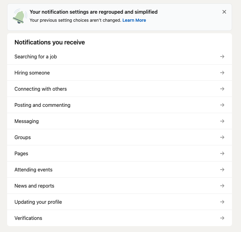
Today I got another email. I followed the Unsubscribe link and logged into my LinkedIn account. There is a section called Notifications. Convenient!
It has a lot of categories:
That’s 11 categories–and several have sub-categories, each with their own notifications. You can disable all of them, if you like (I like this very much). What you can’t do, however, is just turn off ALL notifications at once–the option doesn’t exist.
This is LinkedIn, and by proxy, Microsoft, showing contempt for its users. Turning off all the notifications requires 24 clicks. 24! Absurd. This should be illegal. It probably is in Europe.
I’m now pondering whether to just delete my LinkedIn profile entirely, make it part of The Culling. LinkedIn is bad and should feel bad.
Yes, I’m afraid this is a complaint. I promise an adorable kitten at the end.
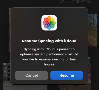
I updated to the latest version of Mac OS yesterday (I am no longer going to write out Apple’s stylized “macOS” anymore. I also say iPhones plural, so take that, Apple marketing department!), which is 14.1.1 as I type this. The update did not go smoothly.
It took multiple reboots to get everything working again. Why, I do not know. But now, the Photos app, which has always had stupid syncing settings on the iPhone, seems to have adopted these stupid, idiotic settings on the Mac.
I noticed that the last few photos from the phone hadn’t synced. I tried restarting the Photos app, to no avail. It said the last sync was yesterday and that was that.
I turned the Mac off, and went back to my Windows PC, which still behaves like a normal computer.
Today, I turned on the Mac and the Photos app presented me with this prompt:
Some context: I am using a Mac Studio with an M1 Max SoC. This is a desktop computer. At the time this prompt appeared, I had two photos to sync.
Two.
I am curious how much system performance optimization was achieved by not syncing TWO photos.
And look, Apple is being generous. If I really MUST sync, I can go ahead…for the next four hours, after which I guess I get this prompt again?
This isn’t just bad design, it is TERRIBLE design, and the people who coded and approved this are trying way too hard to be smarter than the user.
Here is your adorable kitten:
BONUS CONTENT:
I decided I should at least offer a solution or two instead of just griping!
Make this a setting the user can control
Allow granularity/context in the controls. Some examples:
Always sync photos
Never sync photos
Only sync when system has been inactive for [xx] minutes
Normally, if you want to repeat/shuffle music in your favourite music app, you just click or tap the appropriate control right there in the interface where you play the music.
Observe in Windows 11’s Media Player, the control to repeat is right there with shuffle/back/play/forward:
Easy peasy!
Even the desktop version of Apple Music–not a great app, by any stretch, puts the option right there with the main playback controls, albeit shoving those controls way up in the upper-left corner of the UI, for some reason:
But if you’re using Apple Music on your iPhone, behold the steps, taken straight from Apple’s support page:
A couple of points:
What should be a single tap is three
The controls for repeating or shuffling music are hidden behind another control
That control itself is hidden inside another option you must first tap
This isn’t just bad design, it’s shamefully bad design. It baffles me how Apple can do such a shitty job1You know I am ruffled when I start a-cussin’ on one of their core apps–and one that can also feature a monthly subscription fee–so millions of people are paying for this experience!
What makes it even worse than it already is: the present UI has plenty of room to have controls like shuffle and repeat right there in the main music player UI. Look:
A metric ton of unused space, let’s hide common controls! – some Apple design genius, probably
Yes, I realize that the Bad Design category here has been almost exclusively Apple, but that’s because they are so huge and carry an equally outsized amount of influence in design. And for most of the last decade, it’s been (IMO) largely in the wrong direction.