But the one I’m going to highlight here is, of course, Apple’s. Apple makes itself such a juicy target because the company’s leadership extols its superior design aesthetic while charging a premium price for the experience.
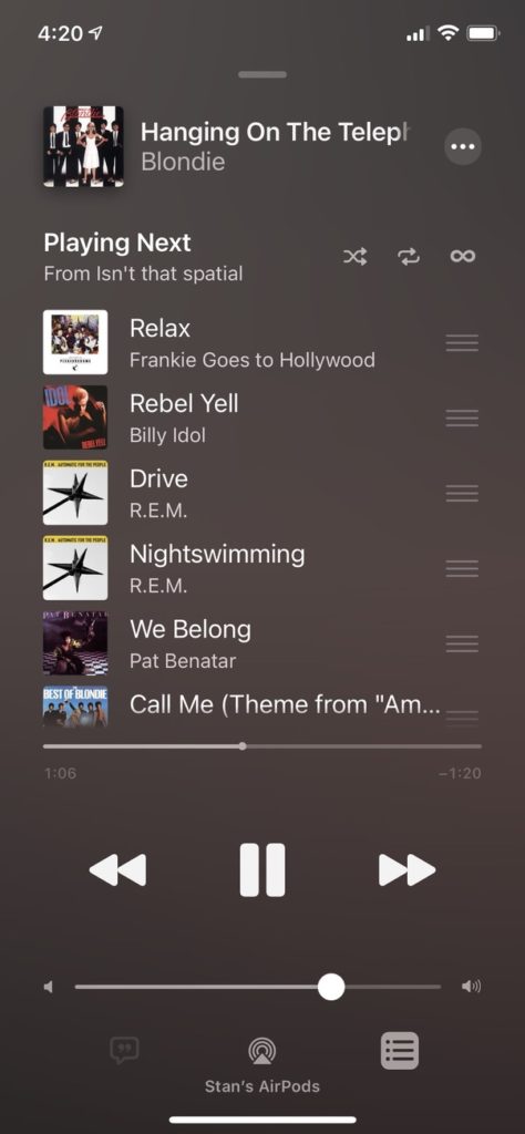
Specifically, I want to highlight one thing about the interface of the iOS music app, which is pre-installed on every iPhone. You can see it in this screenshot:

First, let me acknowledge the prehistoric nature of the songs highlighted (the newest is from 1992). I am old as dirt, and so is the music I like. Plus, I was sampling some music Apple has highlighted that supports the Dolby Atmos spatial sound standard (more on spatial music in another post) and I didn’t recognize the majority of suggested tracks (again, due to being an out of touch dinosaur).
(Also, the fact that the time was 4:20 p.m. when I grabbed the shot is not some sly signalling that I love the mary-ju-wanna, it’s just a coincidence. Sorry, my BC buds!)
You can see the currently playing song at the top of the screen. It’s Blondie’s well-known classic, “Hanging on the Telep.” It’s “Telephone,” of course, but because the song title is too “long” (four entire words) for the UI, it gets truncated. Apple’s solution (as with nearly all music players) is to slowly scroll the title from beginning to end, allowing the music lover to eventually piece together the entire title of the track they are listening to.
Look at the rest of the music app and ask yourself, “Is there enough room here to fit the entire four word title of a song so it doesn’t have to scroll?” and you may find the answer is, in fact, yes.
And yet this is almost never done. The UI of the music app isn’t actively bad or anything (Apple has much worse stuff tucked away in other areas of iOS), but this tiny space for song titles has always baffled me, because when you’re listening to music this is always going to be the active part of the interface. It just grates on me, especially since there is enough room to easily manage any title of reasonable length. I mean, okay, I don’t expect a music app to properly display Pink Floyd’s “Several Species of Small Furry Animals Gathered Together in a Cave and Grooving with a Pict”, but still.

