Why am I picking on delicious jam, especially when I have just had a slice of homemade bread lovingly covered with said delicious jam?
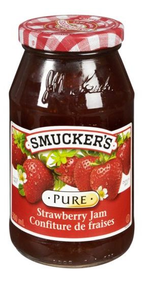
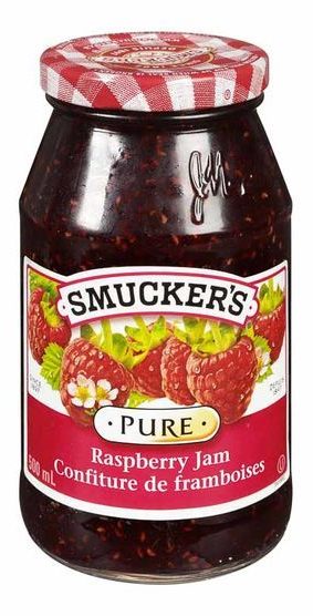
Because Smucker’s has made their strawberry and raspberry jam jar designs so similar that it is easy to grab the wrong one, especially if stores shelve them beside each other, which they tend to do (this is also bad design on the part of stores like Save-On-Foods that do this, placing like-colored jams next to each other on a shelf, which is logical enough, but makes it more difficult to tell at a glance that you are looking at different products).
Photographic evidence:
Note that the color difference in the labels is more subtle when you are actually looking at the jars in-person, anticipating their fruity goodness.
Smucker’s has gone with a standard design here, no doubt to reduce costs and provide uniformity, usually considered desirable for a brand. McDonald’s hasn’t messed around with the look of its Golden Arches for a reason.
However, the similarity extends well beyond what is needed for branding and into the sort of obsessive manipulation that is explained in horrifying detail in books like Brandwashed. The logo and typefaces are the same. That’s fine and expected, and Smucker’s certainly can’t be held culpable for both fruits ending in “berry.” But look at the placement of the fruit. Each jar has six pieces of fruit arrayed identically. Further, the size of the raspberries has been boosted to match the strawberries.
Here are some typical strawberries:
And some raspberries:
Raspberries are cute and small. Strawberries are cute and bigger. Strawberries are bigger than raspberries.
Unless they are on a Smucker’s label, then they have been made equals in the world of fruit.
What this means is it’s easy to grab the wrong jar if you’re distracted, in a hurry or if some other evil shopper has mixed the two types of jams together on the shelf.
It could be solved by simply making the picture on each label distinctive while keeping everything else about the label identical. The most obvious fix would be to scale the raspberries to be a bit smaller then slap more of them on the label to compensate. Make it a veritable cornucopia of raspberries. Have them in a cornucopia. Something.
Anything less is just bad design.


