In the interest of keeping to a complaint-free lifestyle, I’ll emphasize again for Bad Design I am doing a couple of things:
- pointing out the bad design as a way to highlight how something should not be done, even if it seems logical or a popular way to go, in the hope that it encourages others not to repeat what I feel are mistakes in design
- offering a solution or alternative design that addresses the flaws
And I only pick a lot on Apple because I own and use a lot of Apple products (which I will address in another post) and because as the world’s largest, richest company, they have the power to influence a lot of others (see Samsung and its weird and lawsuit-attracting tendency to follow Apple’s designs very closely).
And with that, I present:
The iMessage fireball
For those unfamiliar with Apple’s message app, it works like most text messaging apps and allows people to send and receive messages across Apple devices, including the iPhone, iPad, Watch and Mac. If you send a message to a non-Apple device, it shows in a green bubble as a regular text message. If you send a message to an Apple device, the bubble turns blue and it becomes an iMessage, sent through Apple’s servers.
With iOS 10 Apple revamped the Message app, expanding what you can send.
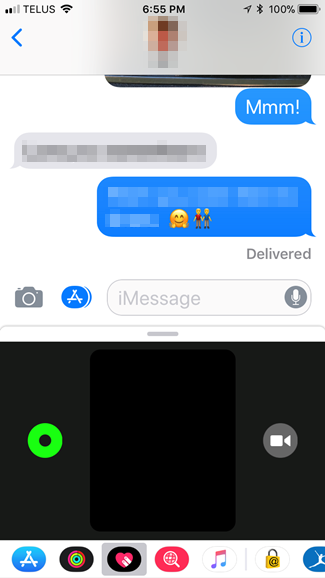
When you are in the Message app, tapping on the App Store icon presents a small black window that you can doodle and do other things in (it defaults to this, though tapping the icons to the left or right of the heart will allow you to use stickers from other apps, search for images and more):
By tapping on the horizontal gray line above the window it expands to give you more room and also exposes a small information icon in the lower-right corner that, if tapped, presents an explanation for the various actions you can perform:
The Heartbeat option only works if you are wearing an Apple Watch, as it includes a heart rate monitor.
The first option is Sketch and it seems pretty straightforward. Draw with one finger.
The next option is Tap. What is a tap? There is no explanation.
The fourth option, Kiss, puts a pair of lips in the window.
Let’s go back to the third option, Fireball. This puts an orange fireball-like blob in the window and as long as you keep pressing you can move it around. As soon as you release, the Fireball message sends.
Bad design #1:
Some actions send the message instantly, others require you to tap a send button to send it. This is inconsistent and can result in messages being sent prematurely.
Bad design #2:
There is no explanation for what a Tap is. The others are straightforward, but what is a Tap? It’s a ring that dissolves. If you do a bunch of taps in succession you can send multiple rings–er, taps–but if you pause too long the message auto-sends. I am unsure as to why anyone would ever want to send a Tap.
Bad design #3:
The Fireball and how it is invoked. Like the Tap, I’m not sure why you would send someone a Fireball. It looks more like a glowing orange ball than an actual fireball and it also auto-sends. The worst part, though, is that to invoke it you press your finger on the screen. You might think this is the same thing you do to make a Sketch, but there is a subtle difference. The difference is so subtle that you may find yourself sending off fireballs when you meant to start a sketch, and you may receive fireballs for the the same reason. In fact, since iOS 10 launched I have only sent two fireballs deliberately. The first was to see what it looked like, the second as a joke. Pressing the screen is a very basic gesture and it shouldn’t be tied to a fairly obscure action that few people would seemingly ever use.
Solutions
Bad design #1: Require tapping the Send button for all actions before the message is sent. Give options to edit or cancel the message.
Bad design #2: Rename Tap to Rings. Change text to “Tap with one finger to place one or more rings.”
Alternate solution: Remove this option altogether if it is seldom-used.
Bad design #3: Change the action required to invoke the Fireball to something that is not likely to be used accidentally, like tapping with three fingers.
Alternate solution: Remove this option altogether.
My personal feeling is the Tap and Fireball options could be removed. I have no evidence to back this up, but based on anecdotes and my own experience, neither is used much at all and the Fireball is almost exclusively used unintentionally.


