New Outlook (is better than New Coke)

As seen in the top-right corner of the standalone Outlook app:

Toggling this on switches you from the incredibly dense and old original Outlook UI to a new one that is intended to ultimately become the replacement for all versions of Outlook and the mail app on Windows 11. It’s vastly simpler and streamlined, and will probably make old time Outlook grognards from 1997 crazy.

I decided to try it because a) I like trying new things, and b) I’m kind of dumb when it comes to being sensible and sticking to things that just work on computers.

It turned out to be a very slight change from the web-based version of Outlook I normally use. At a glance, it appears to be the exact same interface, just wrapped up as a separate app. The only real difference I’ve found is using it means you miss a few amenities you might get from your normal browser that would automatically kick in (blocking trackers, etc.) but in exchange New Outlook allows me to actually add and maintain my Gmail account, so I can keep tabs on the few messages I still get there without having to log in to another mail service.

It also tidies up my browser a bit, possibly freeing up a few more resources that I would probably never really notice being freed up, anyway.

Overall, it’s not bad, but it’s pretty much identical to what I’ve been using for the past few years. The Dark Mode still looks off, somehow. I think it’s a combination of the way it mixes the darker shades with the standard Office/Windows colours, along with new email (normally bolded) being harder to scan at a glance.

Overall, I am left mildly pleased (by being able to add my Gmail account), but otherwise :shrugemoji:

On a scale of 1 to 10 actual physical envelopes used for mail you can touch and sometimes smell, New Outlook rates a 7.

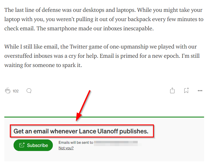
Today’s delightful nugget of irony

I got an email today (which is totally perfect and appropriate for this post) from Medium on various tech stories. One of them is titled We’re Buried Under Email, A Monster of Our Own Creation.

It ends, naturally, with this, which amuses me more than it should:

I’ve been mulling over the whole email thing myself, and my solution lately has been to approach it mercilessly. If I’m getting some kind of flyer that isn’t immediately relevant to me, I unsubscribe or block (blocking only when unsubscribing “mysteriously” fails). This alone has made things more manageable. But it does seem that email is stuck in this weird place, where the general internet is evolving (or devolving) and email mostly stays the same. I don’t have a solution to “fix” email, I’m just content to cut down on what comes into my inbox for now.

How not to use email

This could almost go under Bad Design.

I occasionally get newsletters from Canon Canada because I have a Canon camera and apparently managed to sign myself up for their newsletters. It was fine, though, as they came infrequently and while they didn’t always interest me (kids photography camps, etc.) they weren’t, like, offensive or anything.

This morning I got one reminding me to stock up on Canon ink for my Canon ink jet printer.

  1. I don’t have a Canon ink jet printer
  2. I don’t have any ink jet printer
  3. I have a Brother laser printer that uses toner and I’ve never had to replace the toner because that’s how often I need to print something

This blatant shilling to get me to buy something I have no use for was enough to get me to unsubscribe, so now instead of getting exposed to all of their news and promos, I get exposed to none of them.

Whoever decided to send out this email should be bopped in the head with a Canon in jet cartridge.