On Mastodon, someone linked to a full set of icons used in BeOS, an OS that tried to make a splash late in the 20th and early 21st century, failed, but still lives on as Haiku.
You can see the icons here: BeOS icon pack
I really like them. Warm, slightly cartoony, psuedo-3D. It’s the latter that one of my interweb gaming pals described as “the Zaxxon angle”, which is a great way of describing it. Today’s icons in Windows, macOS, and most Linux distros are generally flat, with maybe some slight bevelling or something to hint at 3D, but nothing is close to what BeOS did. And that’s kind of a shame to me. It’s not just nostalgia, either. The icons are distinctive and have style, they feel of a piece, not just random whatever.
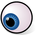
Plus, giant eyeball!
And books: