This is enough icons to fill about six and a half rows. Eying it now, I’d say it covers about 20% of my very cool-looking Mars wallpaper–so it could be worse. Roughly five times worse, if my incredible math skills haven’t failed me. Still, it’s clear I’ve become lazy and turned the desktop into a dumping ground for all kinds of junk.
Or have I?
Well, yes. Yes, I have. But there’s also a practical reason. The desktop is always right there, so it’s easy to grab a file from it, rather than rooting around in File Explorer. But I could, of course, clean up all these files after I’ve made use of them (they are typically screenshots or other things I only need to keep handy in the moment, not forever and ever). This is where the lazy part comes in.
I’m going to clean them up right now. I will insert simulated time below and report the results.
…
…
Well, that took longer than expected, but the final result is:
A bunch of files moved to appropriate folders
A bunch of files deleted
Only two icons remain on the desktop, one of which is the Recycle Bin
File Explorer also crashed toward the end of the clean-up, possibly because I had the temerity to have about five tabs open.
In all, success! Now to get just as organized off the computer.
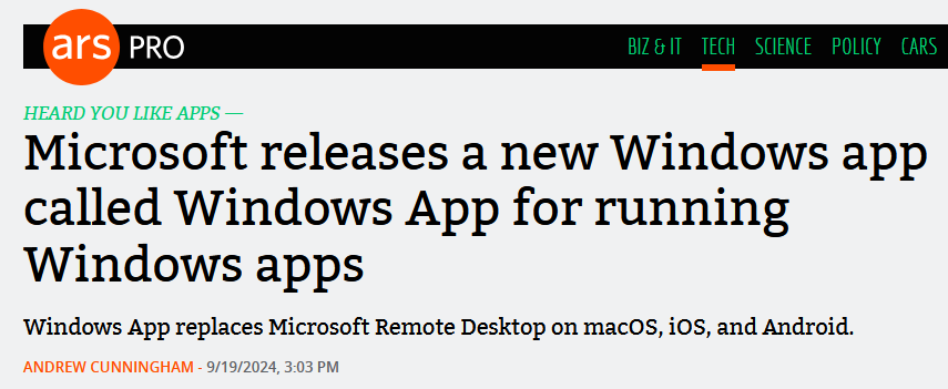
Perhaps the most famous desktop wallpaper ever, if only through ubiquity (and it’s also pretty!), is Bliss, the image of a green hill against a pleasant blue sky that was the default background on the Windows XP desktop.
This:
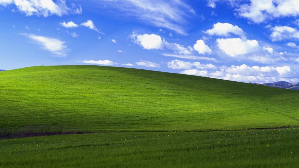
I asked DiffusionBee to make an image reminiscent of Bliss, and it came up with this:
It’s all right, and you can definitely see the family resemblance, but it’s a little too candyland for my taste. I could rework the prompt, but my curiosity has been sated. In the sage words of Homer Simpson, “Eh, close enough.”
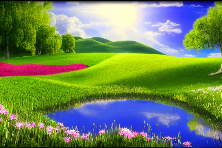
EDIT: Ok, I tried once more, using the Image to Image option, and it came up with something a lot closer, yet slightly different, mainly in that it removes the road and the background mountains tucked in the corner. It also seems to think no one would ever cut the grass.
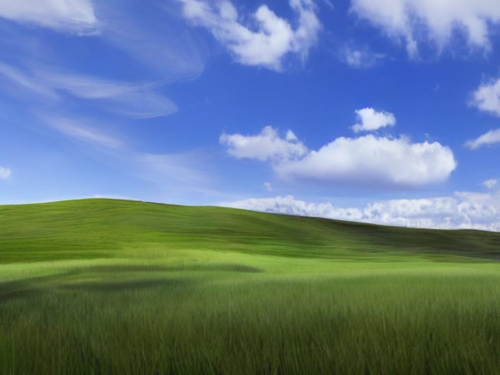
Then I did the exact same thing, but added “detailed” to the prompt and it did indeed add some of the detail back, while making the shadows more dramatic:
Am I going a little loopy? Have I been bribed by the Linux penguin? Do I like mint so much that I want an OS named Mint, too?
The answer is: I’m not sure!
After my PC experienced a near-death experience on Saturday (August 20, 2023, for people or bots reading this in the far future) I had time to think about my options while waiting for its miraculous recovery:
I currently can’t afford a new PC, so I was hoping I’d only have to replace some of it to get it going again (fortunately the miracle recovery meant I didn’t need anything)
It made me wonder how much some aspect of Windows, specifically, was responsible for The Incident
It made me further wonder if I had been running, say, some version of Linux, if The Incident would have happened at all.
The answer to the latter is I just don’t know. My theory, that some app or process pegged the CPU at 100%, causing the system to overheat and the fans to spin up and roar like supersonic jets, is just that, a theory. I will probably never know precisely what happened. But it really has me thinking more about ditching Windows for good, and how to best address the deficiencies I previously found in Linux Mint.
Windows launched way back in 1985, when I was still using a Commodore 64 and PCs were all of four years old–barely out of diapers. The GUI or Graphical User Interface, has changed a lot over the years and I thought it might be fun/horrifying to rank every major version of the Windows GUI, from Windows 1.0 in 1985, to Windows 11 as of 2023.
I’m rating not based on how the system looked at the time (you can do only do so much with CGA/EGA graphics, after all), but how they look now. Is this fair? Probably not, but as always, I make the rules!
The rating system is based on a scale of 1 to 10 Clippys, with 10 being best.
NOTE: I am skipping over all versions of Windows NT because it follows the look of other versions mentioned below.
Overall Rankings:
Windows 11
Windows 2000
Windows 95/98/Vista/7
Windows 10
Windows 3.0/3.1/XP
Windows 8.1
Windows 8
Windows 2.0
Windows 1.0
Windows 1.0 (1985) Rating: 1 Clippy
In 1985, Windows ran on top of DOS, had drop-down menus, fixed windows, and CGA graphics. In a way, the extremely limited colour palette actually made it more colourful. Perhaps too colourful. This is pretty ugly all around. If you are a fan of this, you probably wear plaid bow ties unironically.
Windows 2.0 (1987) Rating: 2.5 Clippys
This is where Windows goes from hideously ugly to just unattractive. The menu bars and arrows have been refined a little, and now you get resizable windows. It’s like a colour Macintosh, but hit with an ugly stick. And still needs to run on top of DOS.
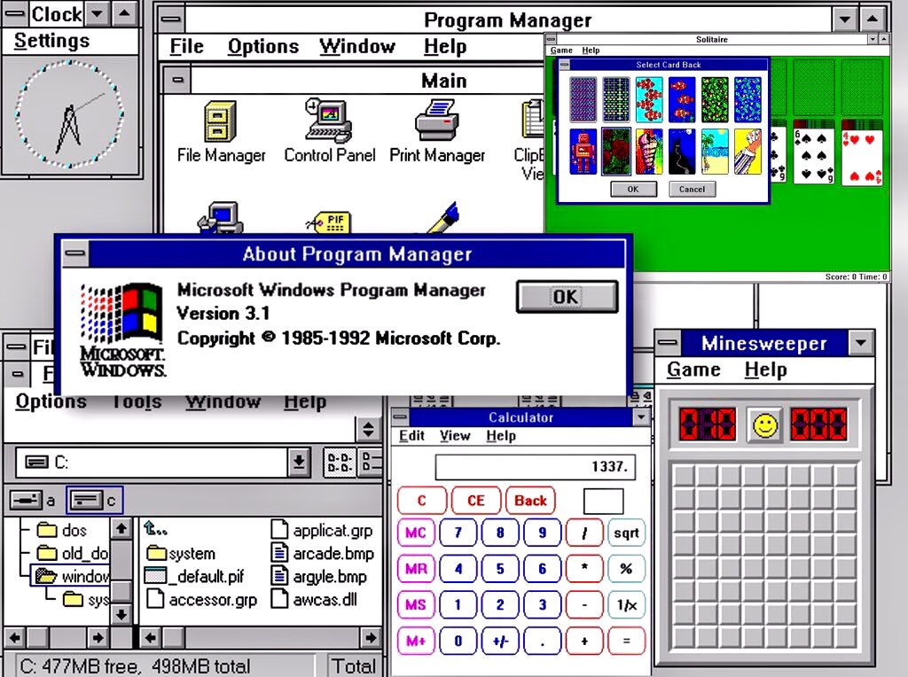
Windows 3.0 (1990) Rating: 6 Clippys
Microsoft makes a big leap with Windows 3, the first version to offer a coherent GUI, with pseudo 3D elements for buttons and scroll bars. Support for VGA graphics also means the cartoony look has gone away, making it look that more professional. It still needs DOS and has that weird File Manager/Program Manager split. Oh, and Minesweeper.
Windows 3.1 (1992) Rating 6 Clippys
Windows hits the big time. This is the version where it was clear Windows was the future and DOS was the past. Windows 3.1 actually doesn’t look much different than 3.0, though, so it rates the same.
Windows 95 (1995) Rating: 7.5 Clippys
With Windows 95, Microsoft managed to produce a version of its OS that scared Apple so much they ended up bringing Steve Jobs back, along with his own operating system, NeXTSTEP. Windows 95 introduced the taskbar, the Start button (it’s even labelled Start, how quaint!), a proper desktop and a continued refinement with the 3D bevelled look. The GUI is also simplified in some ways, with the title bar widgets all getting moved to the top-right corner. Icons are more detailed and colours are overall more subdued.
While it looks dated to our 2023 eyes, this GUI remains just as clear and functional today as it was 28 (!) years ago.
Windows 98 (1998) Rating: 7.5 Clippys
Windows 98 basically looks the same as Windows 95, but Microsoft did add a stylin’ gradient effect to title bars. It’s not enough to change its rating over 95, though. Sorry, MS!
Note: I am skipping Windows Millennium Edition (Me) because while it had changes under the hood, visually it is pretty much Windows 98 Third Edition.
Windows 2000 (2000) Rating: 8 Clippys
I admit bias here. First, this is essentially a version of Windows NT, which I said I wouldn’t be rating. Second, it really just brings the 95/98 look to the NT version of Windows. But this was the first version of Windows that tried to bridge the gap between consumer and business versions–and it mostly worked (if you could get it at a discount, like I did at the time). I give it a slight edge because they changed some of the icons, improving them, in my view. It also had a generally more sophisticated veneer–the last version of Windows to really use this approach for many years.
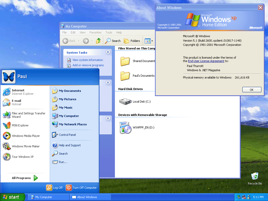
Windows XP (2001) Rating: 6 Clippys
Our first regression! Windows XP gave us a pretty wallpaper (probably the most famous OS wallpaper ever) and there’s something I find pleasing about the look of its buttons and most of its icons. The bevelled look, combined with much brighter colours, though, gives the OS a decidedly less serious look. I’m not sure what Microsoft was going for, but I don’t think “cartoony” is what they had in mind. Not a total disaster or anything, but kind of goofy-looking in hindsight.
Windows Vista (2006) Rating: 7.5 Clippys
With Vista, Microsoft sought to strip away the bright, simple colours of XP in favour of a glossy 3D sheen. For the most part, I think it works, though transparency does get a bit out of hand at times. I like how the Start button now looks more like a button. Icons are cleaner and more detailed. This is Microsoft saying Windows is all grown up now. Too bad about all the driver issues and steep system requirements.
Windows 7 (2009) Rating: 7.5 Clippys
As you can see, Windows 7 is pretty much Vista, but with the transparency toned down. This is welcome, but it’s not enough to change its rating over Vista.
Windows 8 (2012) Rating: 5 Clippys
And here we have a major step back. Microsoft somehow thought that in 2012 everyone would be using tablets with swipe gestures, and designed Windows 8’s GUI around this. They also elected to do away with finely-detailed icons in favour of simple, single-colour tiles and widgets. But the tiles could be one of many colours (and sizes), so you ended up with a crazy quilt look (see the screenshot below for a representative example). They got rid of the Start menu and the Start button. This is ugly. If you like Windows 8’s look, you are a bad person. You are the one Steve Jobs was talking about when he said Microsoft had no taste.
Windows 8.1 (2013) Rating: 5.5 Clippys
Windows 8.1 made some changes, such as adding back the Start button and including the option to boot to the desktop, but the GUI was mostly the same, and just as ugly.
Windows 10 (2015) Rating: 6.5 Clippys
Windows 10’s main mission was to undo Windows 8. It brought back the Start menu, it made the desktop the central part of the UI again, and it tamed some of the tile experience, though the flat look still persisted. This frankenOS approach means it feels like a cross between Windows 7 and 8. It’s not bad, but it’s also clearly the result of yanking the Windows GUI off in a new and unplanned direction.
Windows 11 (2021) Rating: 8 Clippys
There are things to critique about Windows 11–its security requirements, the all but mandatory MS account, a push toward oversimplification of the Start menu. But in terms of GUI, this is probably the most refined the OS has been since 2000. It also restores a cohesion to the look of the OS that had been missing since Windows 7 in 2009. Sure, it’s clearly aping macOS in some ways, like the rounded corners on windows, but everything looks very clean. I actually would give this version the nod, aesthetically, over the current version of macOS (Monterey as I write this)–though not by a lot. The biggest knocks are its lack of customization (in some regards), removal of features (the taskbar can no longer be moved to other edges of the screen) and Microsoft’s annoying habit of adding more intrusive bloatware, pop-ups and other distractions. Looks-wise, though, it’s pretty nice!
Overall, the versions I feel Microsoft got right (and iterated on) were:
Windows 3.0
Windows 95
Windows Vista
Windows 11
The ones that struck out were:
Windows XP
Windows 8
The early versions (1.0 and 2.0) were hamstrung by the technology at the time, while Windows 10 had to pick up the pieces from Windows 8.
Rumours say Microsoft is working on Windows 12. If so, I wouldn’t expect it to depart visually from Windows 11, but you never know.