Today is the first day of WWDC 25, Apple’s Worldwide Developers Conference. It always starts with a keynote, which highlights the new features and changes across Apple’s array of operating systems.
This year the rumour (correct, as it turned out) was that Apple would introduce a new look to its OSes called “Liquid Glass” (because “Aero” had already been used in 2006 for Windows Vista, which this is VERY reminiscent of. And no, the irony of Apple copying Microsoft–old Microsoft–is not lost on many).
Any change is always going to get a varied set of reactions. People generally oppose change, even when the change is mostly good. People are weird.
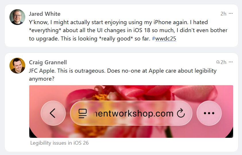
These two posts showed up in order in my Mastodon feed and perfectly sum up the zeitgeist on UI redesigns.
Take 1: I like it!
Take 2: An abomination!
And so it goes.