I have avoided discussing this in much detail, but in brief: I don’t like Liquid Glass. Like, at all. I think it’s glitzy, half-baked trash from people who don’t understand or care about good UI. But author Matt Gemmell put it better on Mastodon:
Liquid Glass is the kind of thing that would happen if someone with no UX design experience was put in charge of design, had no opinions on the matter so asked for suggestions, then approved the ideas from the youngest and least design-experienced people who could implement the most flashy demo.
It is thus, comprehensively and multifariously, Not What Apple (Used To) Do. An emblem of the sickness in the company, driven by moribund leadership, dilute focus, and ever more stagnant insight.
Here’s another thing: the degree of vacillation on design in public betas is disgraceful. About 5% of the time, when you change something due to feedback, it’s because you’re responsive and democratic. The other 95%, some highly-paid and ostensibly professional people did not sufficiently consider what they made. Design is intention and anticipation. Aesthetic fuckery is just playtime. When you then make multiple significant changes in successive betas, it’s no less than rudderless farce.
Today is the first day of WWDC 25, Apple’s Worldwide Developers Conference. It always starts with a keynote, which highlights the new features and changes across Apple’s array of operating systems.
This year the rumour (correct, as it turned out) was that Apple would introduce a new look to its OSes called “Liquid Glass” (because “Aero” had already been used in 2006 for Windows Vista, which this is VERY reminiscent of. And no, the irony of Apple copying Microsoft–old Microsoft–is not lost on many).
Any change is always going to get a varied set of reactions. People generally oppose change, even when the change is mostly good. People are weird.
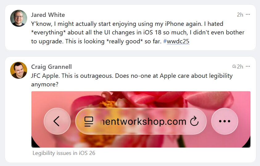
These two posts showed up in order in my Mastodon feed and perfectly sum up the zeitgeist on UI redesigns.
I saw a post on Mastodon lamenting the current state of scroll bars in computer software, most often in web browsers, but pretty much everywhere they appear. They have become weirdly thin, they’ve lost the navigation up/down arrows, they often disappear when no scrolling is taking place, or they’re completely off by default.
I miss the old days of chunky scroll bars that:
Let you know where you are in a document/web page/window
Allow you to easily grab the widget to scroll in bigger chunks
Had those navigation arrows that let you scroll a little bit with the mouse or arrow keys
My browser of choice, Firefox, uses the in vogue super-thin scroll bars, but this article shows how to make them chunky again. Woo. I repeat the steps here because I found this both useful and delightful and wanted to share it.
How to Get Chunky Scroll Bars in Firefox
In the address bar, enter about:config, then click the button after the scary warning appears
Search for widget.non-native-theme.scrollbar.size.override
Edit the number to your desired chunkiness. I find 18 or 20 comes pretty close to what I consider “classic” scroll bar size.
Bonus: Change the shape of the widget by searching for widget.non-native-theme.scrollbar.style and changing that number. Choosing 4 changes the widget to a classic-style rectangle.
This may go away on future versions of Firefox, and it doesn’t put back the navigation arrows, but it’s still nice to not just have chunky scroll bars back, but actual customizable scroll bars!
UPDATE, September 30, 2023: New deficiencies/regressions are being added to a list at the bottom of the post as I encounter them.
UPDATE, November 15, 2023: WordPress 6.4 is out and at least one of the regressions has been addressed. The Open in new tab option for links is no longer buried, as seen in the screenshot below. Yay.
I try to avoid spending too much time complaining. Who wants to read some random dude’s complaints, after all? I mean, if they’re clever enough, sure. But this is not particularly clever, so I’ll be brief1In retrospect, this was a massive lie. Apologies for massively lying to you!.
WordPress 6.3 brought a few tweaks to the UI of the editor/block editor, resulting in inconsistency, adding extra steps to do the same tasks as before, and generally made the experience of doing stuff other than just basic text entry more cumbersome, with no discernible benefits that I can see as a trade-off.
There has been a lot of hate for the block editor, and rightly so2Not even a humble opinion, no sir.. It made it easy to drop in or move around blocks of “content”, but made it harder to actually just write, like in the olden days when blogs were all the rage.
I flirted with the classic editor plugin (5+ million installs) and have the classic editor block I can always use in a pinch, but my preference is to use software as intended, not install a bunch of hacks or workarounds to bend it to my will. The assumption is that the software will work the way I expect it to (mostly), and stay out of the way.
WordPress 6.3 does not stay out of the way. It blocks (ho ho) your way. It is anti-way.
None of what I’m about to detail is going to cause meteors to fall out of the sky or give someone a bad rash. These things don’t make WordPress unusable. But they make it clunkier, they add friction where there was no friction before, and they speak to a trend in design that suggests things may get worse still.
The three issues covered here:
Preview is now hidden behind a terrible, tiny, and meaningless icon.
If you want a caption on an image, you now have to specifically toggle captions on.
Setting a link to open in a new tab is now a multi-step, cumbersome process.
NOTE: I have added a pretty blue border around a lot of the shots below to make them stand out better. They are not this pretty in real life.
In order:
Preview’s new icon
Preview used to be a button that looked like this:
It is now this icon instead:
I believe it’s supposed to be an icon representing a laptop. Or maybe it’s an old-fashioned hand iron. Who knows? And if it’s a laptop, what does that have to do with Preview, anyway? And why is Preview now an icon, but Save draft and Publish aren’t? It’s not like there isn’t enough space. It’s inconsistent, vague and looks amateurish. And ugly.
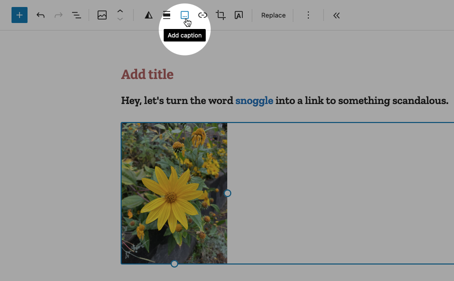
Caption an image
Back in the olden times of WordPress pre version 6.3, you would add a caption to a photo by simply typing it into the caption space below the image. If you left the caption space blank, the space would not render. Simple!
Now when you want to caption an image, you must specifically choose the option from the toolbar while the image is highlighted, like so:
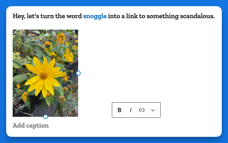
This puts the caption area below the image:
In some crazy parallel universe where everything is opposite, this makes sense. Here, it just adds busywork to a task that literally had no steps to it, you just started typing!
Making a link open in a new tab
In the previous version of WordPress, if you wanted to make a link open in a new tab, it was a checkbox item right there below the URL, like so:
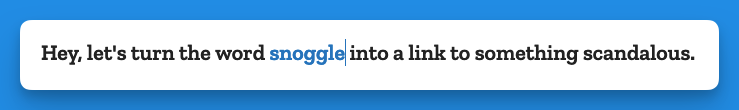
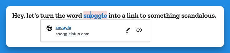
Now, when you go to add a link, you get this (in the example below I have highlighted the word snoggle for the link):
You get a blank text box, and nothing else. So let’s type something in there:
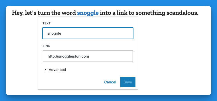
Now we have a link, Hooray!
But how do we have the link open in a new tab?
Well, you click on the link (you naughty person) and get this:
The two icons above are, respectively, Edit and Unlink. So you click Edit and you get this:
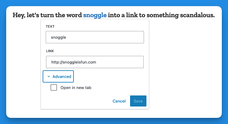
Then you click on > Advanced and get this:
That’s right, the Advanced menu gives you one option: Open in new tab.
I don’t have the proper vocabulary to express how cosmically dumb this is. If there was a universe-wide contest for really, really bad UI, this would finish in the top three.
Now, go back and add up the number of images I’ve used to illustrate the new way of opening a link in a new tab vs. the old way. Explain this madness. You can’t. There is no explanation. Perhaps it’s meant as a joke, a cruel joke on us pathetic humans.
Theses are only three obnoxious things I’ve found in WordPress 6.3 so far. There may be more. And I haven’t even listed the remaining issues with the block editor (or other parts of the UI). But I have written enough on this, and now it is time for chocolate.
Post-chocolate:
Additional 6.3 regressions
Previously when using the Preformatted block, if you copied the text from a Preformatted block, then pasted it elsewhere, it would remember the formatting (bold, etc.). It now strips this formatting. Even better, it does this inconsistently, so sometimes it will strip, and other times it won’t.
Previously, a selected image would show you its dimensions under Width and Height. This information is no longer present, though the Width and Height properties are still shown.
For the past week or so, my brain has just not been cooperating with this blog. Giving myself permission to write about anything I want here was liberating, but even that freedom hasn’t been enough the past few days. I stare at the blinking cursor, and then I feel my mind drifting off, not to some great blog topic, but just weird little mundane things and thoughts. Nothing that I’d want to share in this space.
I do have a backup–a collection of blog ideas saved in Obsidian. But a lot of the topics I’ve jotted down no longer appeal. A lot of them are Apple kvetching, and I exceeded my quota on that at least 50 years ago.
So I end up doing these meta posts.
Oh, I just thought of a topic: Mastodon clients!
Mastodon is the only social media I use semi-regularly right now and I like it because:
No ads
No “reels” or other unavoidable short form videos
No algorithm–I only see the people/orgs I choose to follow
Not overwhelming. I like that I can easily keep up with what I’m following. It feels cozy and approachable.
I also don’t visit Mastodon on mobile. It’s strictly on my Mac or PC. On the Mac, I use the Mona app, which is a one-time purchase (hooray) and works well. On Windows, I use an alternate web version currently in alpha called Elk. It improves on the web interface and is pretty good, with only a few minor shortcomings. Still, I’d rather use a dedicated client, but all the Windows clients seem to have some flaw, the most common of which is they are ugly as butt. Windows apps don’t have to look ugly, but so many do. Every Mastodon client I’ve tried has been butt ugly. So I use Elk.
I don’t know why, exactly, the odds of a Mac app looking better than a Windows app is so high, but I suspect that it has something to do with the Mac GUI always being “good” and remaining fairly consistent over the years, with few dramatic changes. There’s a polished kind of consistency.
With Windows, well, just look at the GUI for different flavours:
Windows 1.0. I mean, yikes. But it was also 1985.
Windows 3.0. Pretty slick for the time, but crude by today’s standards.
Windows 95. Pretty decent, really.
Windows XP. Changed pretty much all UI elements in a way some liked, but others didn’t, feeling it was too “cartoony.”
Vista. Ignoring the initial quality of the OS, it again completely revamped the look, giving everything a pseudo-3D effect and having a glossy, reflective sheen to it.
Windows 8. Another complete change, flattening everything and subbing in garish colours and simplified icons.
Windows 10. A hybrid of 7 and 8 that reverses some of 8’s design.
Windows 11. A refinement of 10 that again changes the look of many elements, though perhaps not as dramatically as before.
Basically, if everyone followed the design language of Windows 11, apps would look pretty good. But a lot of apps seem to be weird hybrids of older versions of the OS and that’s when you get butts meeting the ugly.
Oh well. In the end, we’re seeing fewer native apps on both Windows and Mac as more devs use tools like Electron to make apps that look and feel the same (and don’t feel particularly native) on all platforms. I guess that’s the future.
There are a bunch of examples for this one, but I came across the one below when I was using the venerable Microsoft Word.
The design problem is especially common on mobile OSes, but as you can see, it’s not limited to smaller screens where companies might argue space is limited and there is a need to compact options down to only showing the most essential out front.
Word checks spelling and grammar using its AI-driven Editor, which is also available in Edge (browser) and the online version of Outlook, among other apps.
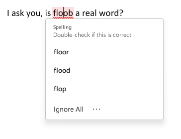
It works as expected, highlighting a misspelled word and offering options when you click on the word. Observe:
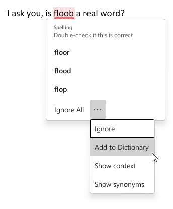
Note the three-dot menu at the bottom, next to Ignore All. What do we have here?
Two of the options, Ignore (basically “ignore this one instance”) and Add to Dictionary are pretty common options for spell checking, and having these in the main pop-up menu would not take up much more room, particularly for a program that is going to be running on desktop and laptop PCs with decent-sized to humongous-sized screens.
So why is the user forced to click on three dots to even see these options? There is no good reason, which is why it’s bad design. It’s simply in line with the current fad of minimizing UI, even when it makes no sense to, and makes the experience worse for the user.
Good design would at least offer the first two options to the main pop-up, so you’d have:
Ignore Ignore All Add to Dictionary
Then you could bury the other options behind the three-dot menu, though I think it would be better to just include all four of the sub-menu options in the main pop-up. What if the menu is too long because someone is using Word on a 2005-era netbook they got for $10 at a garage sale? Just dynamically have the pop-up appear above instead of below the misspelled word. Even the tiniest usable screens would be able to accommodate the pop-up menu somewhere.
The Photos app Apple has is roughly the same on all of its devices, if you are on the latest version of the device’s OOS–in this case I refer to iOS 13.x, iPad OS 13.x and macOS 10.15x (Catalina), but for this post I am specifically referring to the iPhone version.
Generally for looking over your photos, sharing them with friends, cursed social media or other apps, the Photos app works well enough. iOS 13 even adds a surprisingly robust set of editing tools, so the typical user will never need to use another app to apply hideous, Instagram-style filters. Smiles all around, as they say.
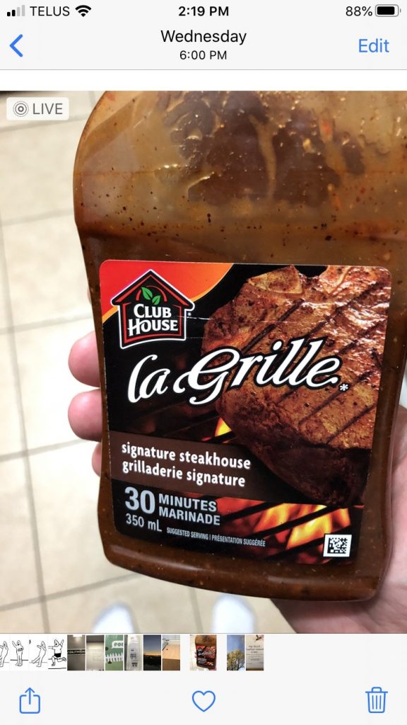
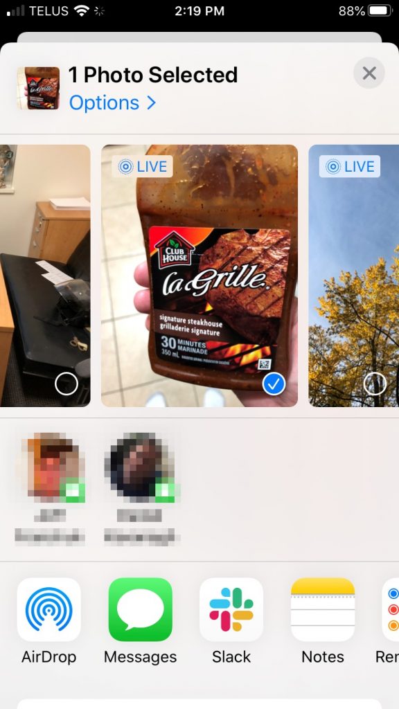
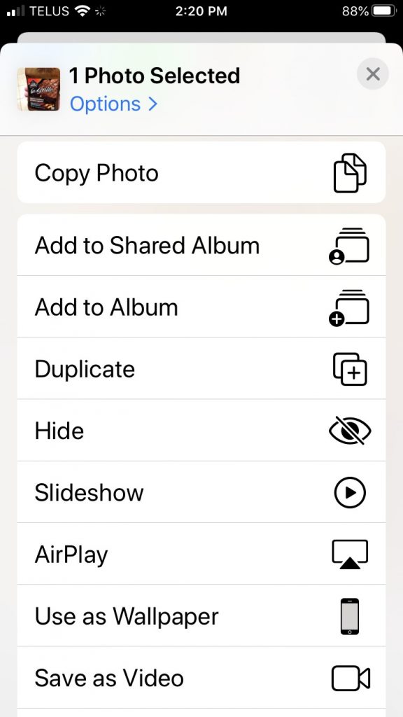
But let’s say you want to do something like duplicate the photo, because you want to keep two copies–the original, and the version you have applied hideous Instagram-style filters to. Let’s take this image of me holding a bottle of delicious Clubhouse La Grille Signature Steakhouse marinade. This marinade is so good I want to, I don’t know, add stars to the image or something. So I tap on the square with the arrow pointing up. This opens the share sheet, which gives you options for sharing the photo (and lots of other stuff).
And here you can see some share options (I have obscured two AirDrop contacts in keeping with Apple’s much-ballyhooed privacy). This is mostly a list of other apps. Where’s the ability to copy, duplicate or do other things? They are not here. I am very sad.
But wait, those options are actually here. Do you see the sliver of white at the bottom of the screenshot, with the rounded corners? That’s the rest of the interface, almost completely obscured from view. In fact, if you wiggle the page slightly you can make that small visible portion completely vanish, while still showing everything above it. This is bad design.
If I swipe down I get so many additional options I have to swipe again to see all of them. This is what the first swipe gets me on an iPhone 8:
This is a perfectly clear, usable list of options. Apple has listed everything in plain text with a little icon for easy visual scanning. This is all really nice–if you actually scroll down and find it.
Obscure UI is something that has been discussed a lot with the touch interfaces used on phones and tablets. Without the “traditional” scrollbars, arrows and so on, a lot of the options you may have at your disposal are effectively hidden like treasure, waiting to be uncovered by swiping or long-pressing or tapping x number of fingers on the screen, or something else entirely. Some suggest that Apple’s own 3D Touch (or Force Touch) was removed on the 2019 phones (replaced by “Haptic Touch”, which is just a long press with a bit of vibration attached to it) because no one knew it existed. Most discovered it by accident–by pressing harder than needed for a long press and invoking the 3D Touch pop-up.
3D Touch is pretty handy once you know to look for it, but even then it’s not a system-wide feature. Apps don’t have to support it, and since Apple always sold phones that didn’t include it, a lot of app developers ignored it. And now it’s gone, with a lot of people never knowing it existed.
But back to the Photos app–burying a long list of options at the bottom of a page is not a bad thing in itself. Where Apple fumbles here is not giving the user any concrete visual clue that the options are even there. A few obvious fixes come to mind:
Add a “More options…” button to the initial photo screen. Currently there are three choices: Share sheet, Favorite and Trash. They could squeeze in another icon here.
Another choice would be to add it after tapping the Share sheet icon. And look! Do you see at the top where it clearly says Options already? You might think that’s where you would find all of these extra options. But instead it’s where you find exactly two options concerning sending the photo as “automatic”/an individual photo/iCloud link and whether to include location/all photo data. The additional options could simply be added here. But this has two problems of its own: it adds an extra tap to get to the options, and it doesn’t necessarily address the original issue, which is the options not being clearly visible.
A third choice, then, is to make the additional options more obvious. One way would be to turf the AirDrop contacts, since there’s already an AirDrop button and I suspect people are not AirDropping photos all over the place, anyway (I could be wrong). This would leave enough room for the list of other options to be more visible.
A fourth choice would be to provide a visual indicator that there are more options available if you swipe up. This could be done several ways:
Adding a scroll bar. This will never ever happen.
Adding a floating arrow pointing down to indicate you can swipe to see more. This has the advantage of being something that could be used universally, much like scrollbars.
Some other visual indicator that I haven’t thought of. Let’s face it, I’m not a UX/UI designer, I just know bad design when I see it.
I have no expectations that Apple will move away from the “obscure gesture” interface. One need only look at iPad OS to see how, if anything, they have embraced it even more. There are now large swathes of the iPad interface that most people don’t know about–and never will. This is in part due to obscurity, but also in part due to questionable interface choices. But that’s a whole other post. Soon™.
For what it is worth, 2013 is also the ugliest version of Office ever. It looks like a web page where the style sheet failed to load.
This is an amusing and clever way of describing the whiteout approach Microsoft has used in the user interface for Office 2013. Rumour has it that we may see changes in the next version (for PC this will probably not be out for another year or more, though). I’m going to offer some of my own thoughts on UI design in iOS 7, Mac OS X, Windows 8 and a few miscellaneous others soon. In the meantime, have a look at the Ars Technica feature The software design trends that we love to hate. And you thought faux leather stitching was bad.
Google has been having some interface issues of late. Adam Snell, via Chris Nahr posted an image that aptly illustrates the problem with the newly-designed desktop UI for Google+ as seen below:
Check out the post on Google+ itself here. I don’t have anything to add except for agreement. The Google UI team is going for some kind of minimalist aesthetic, I suppose, but falling down fairly badly in their attempt. I shouldn’t have to scrunch up my browser window horizontally to get a balanced design.
Update: As Jason Pace points out in this post, the white space in the redesign is where ‘hangouts’ (video chat) go. As he also wisely points out, if that’s the case the space should be allocated dynamically so it doesn’t otherwise leave a huge chunk of nothing staring you in the face.