The comments were posted at the same time.
Frank probably made his post in response, but it’s still kind of impressive he got it in when he did, given the article got over 40 pages of comments in about 24 hours.
Myself, I’m using List View now instead of the main Grid view. My issues reflect a lot of what others are saying:
- Too much white space (and I see even less of it, since I subscribe and the design takes into account the now-unused ad space), which means a lot more scrolling and a lot less visible content.
- Article headers are way too big, both font size and image.
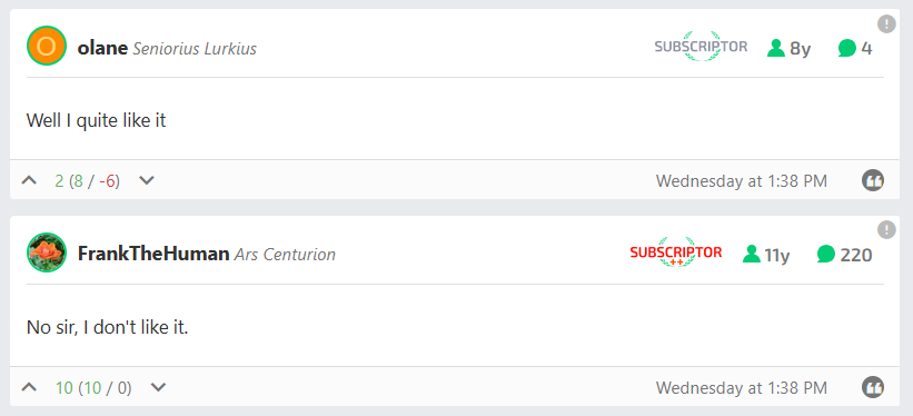
- The Grid view commits a huge faux pas by showing a large block of black with white text on it…when you select the Light theme. Not only is this illogical, it’s a legit accessibility issue. Light themes should be light.
- Images in circles are small and not particularly easy to scan, which is overall minor.
I knew there would be griping a-plenty when the article about the redesign talked about updating to current design trends (which in many ways are bad and user-hostile). We’ll see where it ends up as they tweak, but history suggests it will be mostly as is and people will just get used to it.
Here’s the Grid view, as seen on the front page (click to see full-size):

That is a lot of dark for a light theme.
The headers on articles in Light view are still dark, too:
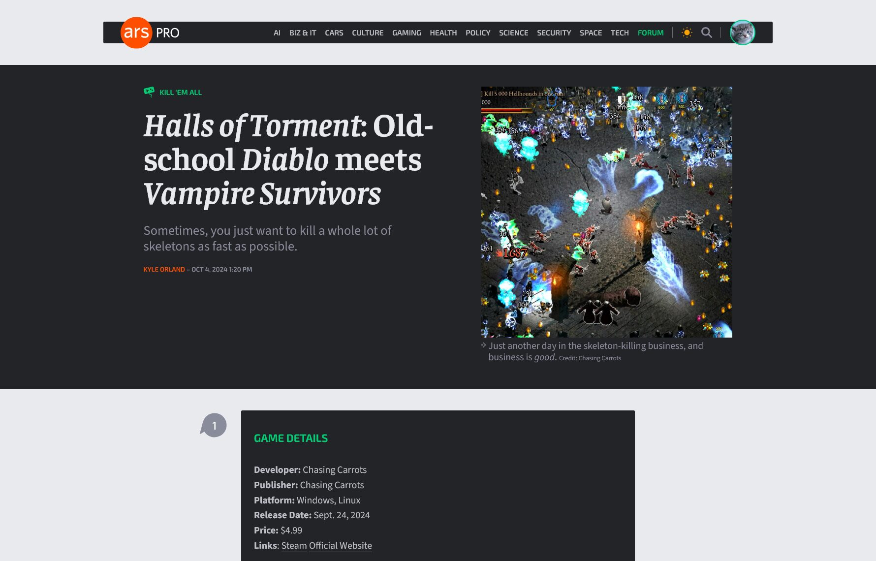
Also, note that despite having my browser window set to 1780×1140 (not counting the address bar, etc.) I have to scroll just to start reading the article text. This seems suboptimal.
We’ll see how it evolves over the next few weeks. I’ll post an update if I remember!