Instagzam and other logo redesigns

Today, Instagram updated its logo wordmark. CNET had a nice image of the before and after, presented below as after and before:
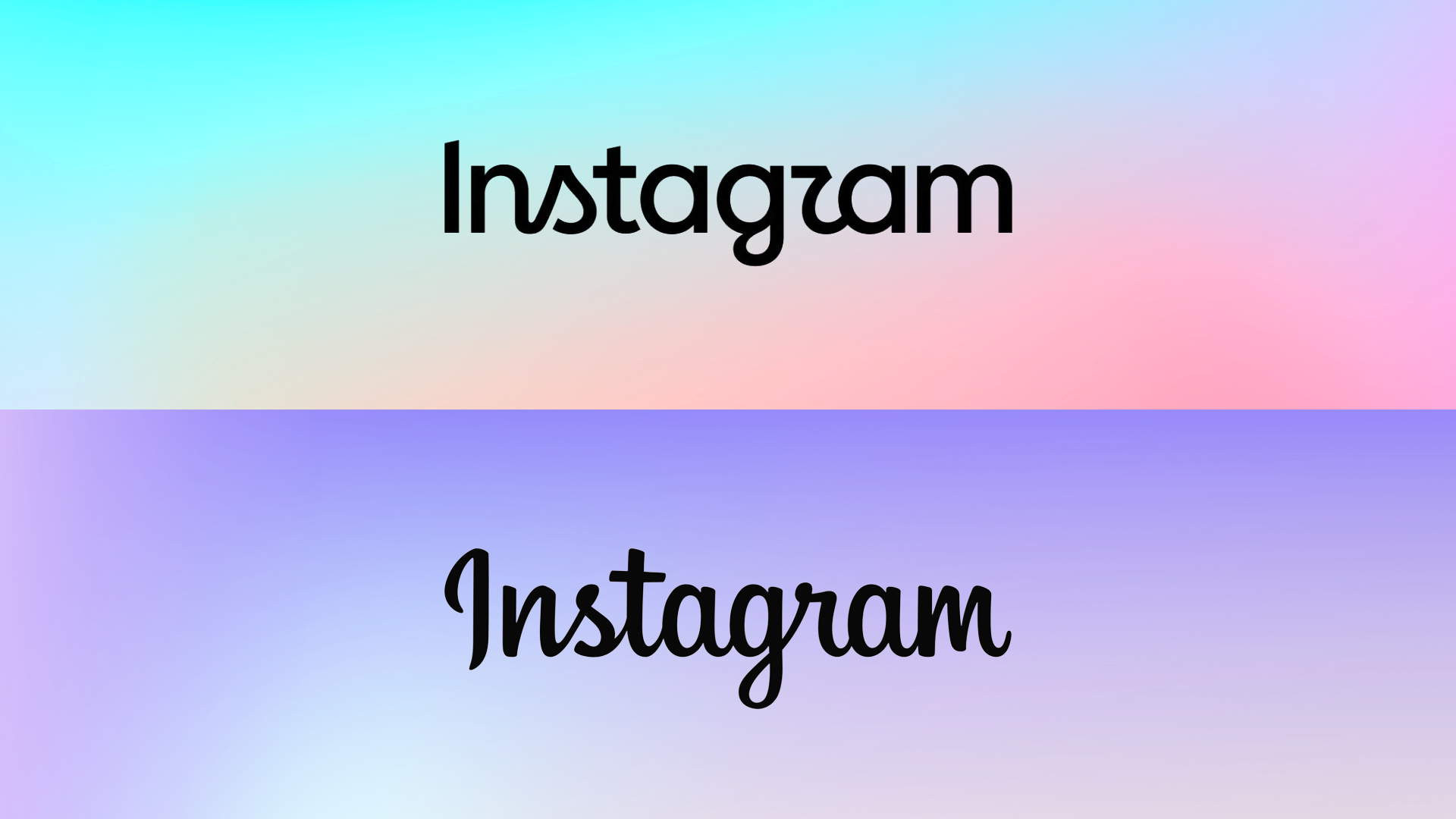
Instagzam vs. Instagram

Although I don’t think AI was used in the creation of the new logo, it still smells of it in the way AI messes up things, like:

  • Goofy kerning
  • Goofy mix of cursive and non-cursive letters (apparently trying to call back to the previous logo the same way someone riding a bike off a picnic table and crashing calls back to Evel Knievel)
  • Goofy letters (notably the R, G and S. Someone on Ars Technica commented that the S looks like a side boob and now I can’t unsee it.)
  • Despite all the above, still looking limp and bland

Speaking of Ars, their creative director Aurich Lawson wrote a rare and relatively brief article offering his thoughts on the redesign (spoiler: Like most of the internet, he does not like it).

My take? Yes, it’s bad. The old logo is instantly recognizable, legible and stylish. The new one is a graceless “reeks of committee” thing. It’s also exactly the kind of logo I’d expect a big (and awful) tech company like Meta to produce in 2026.

This led me to other logo redesigns of recent years, such as the also awful one for Pringles:
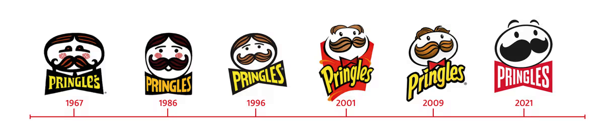
Quaint, quaint, groovy, pretty good, perfectly fine, blech!

Here, I think they really hit it in 2009, though 2001 is pretty good, too. The flattened, gormless 2021 redesign is so bad that the longer you look at the face, the less it looks like a face and just a set of weird shapes. It also inspired me to do this:
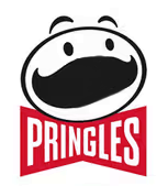
I am your nightmare.

You’re welcome!

Another good (bad) example is Jaguar’s recent logo redesign:
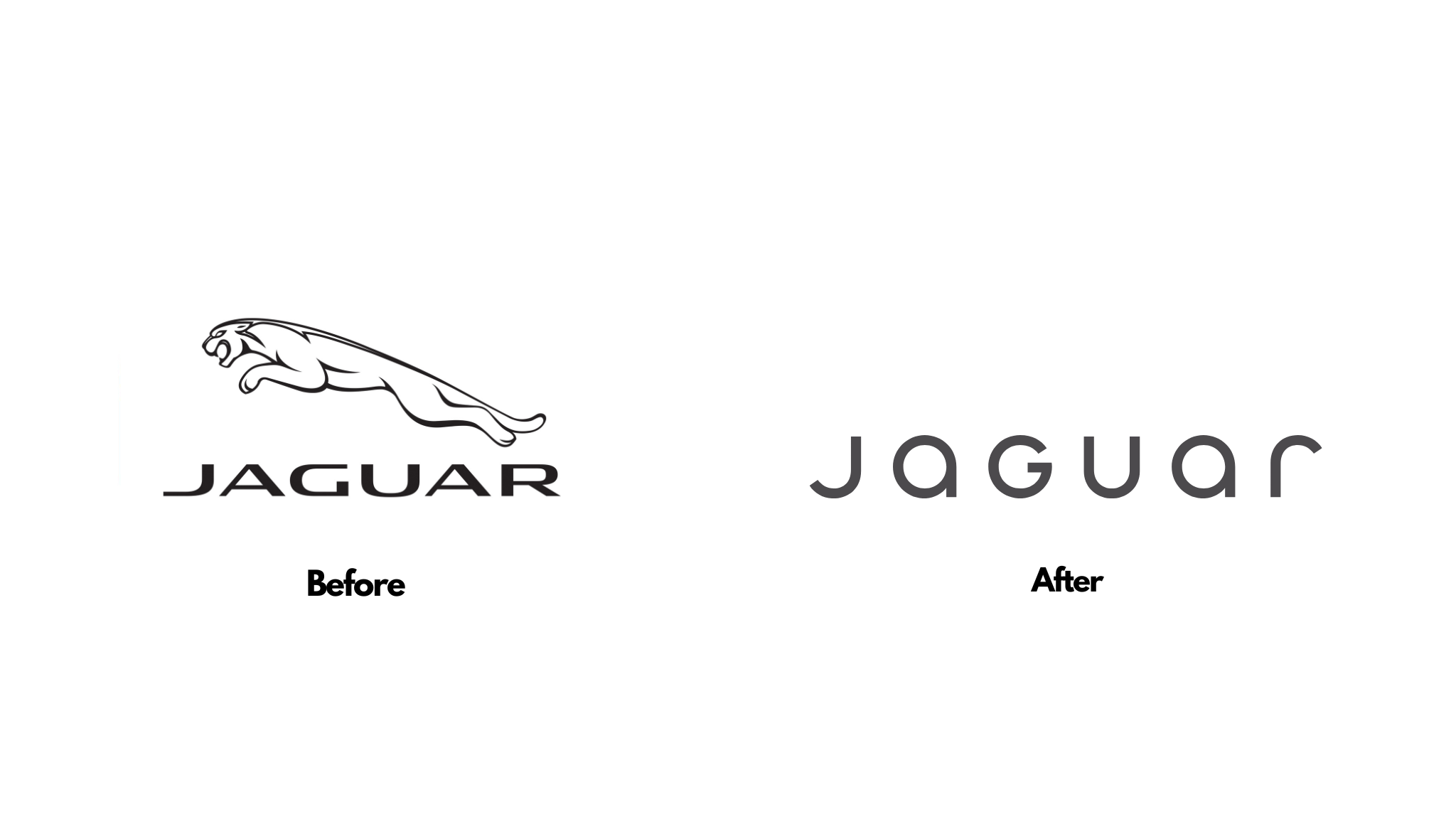
Cool cat vs. A mix of letters

It went from instantly recognizable to something absolutely generic that says nothing (it’s still way better than Instagram’s, even at that).

In conclusion: Logo design is a fine balancing act between art, character, and image (the type you project). We live in an era where almost every logo out there is being flattened, simplified and stripped of all character and identity (see also: Jaguar’s impressively bad update). The only reason I can think why this is happening is companies are going cheap by making logos so simple they can be slapped on anything at any size with no need for adjustment. If it’s not this, then somehow bad design has become good design, the same way 2 + 2 = 5.
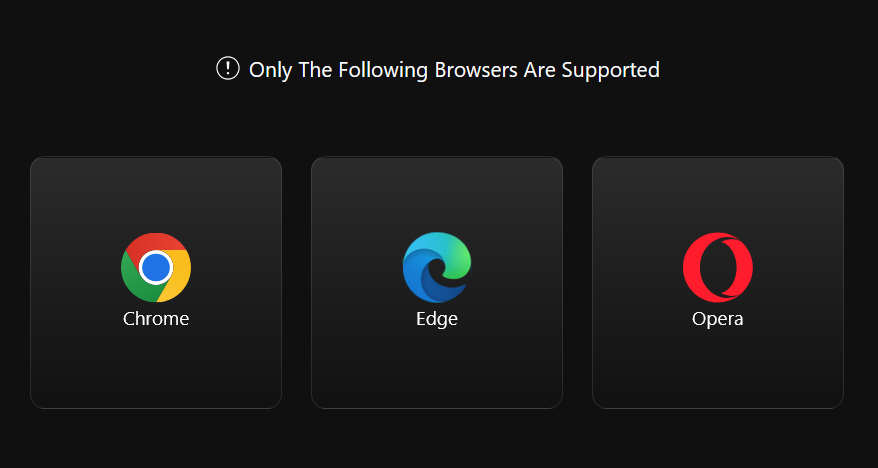
Forcing Chromium on people in 2025 is bad design

I got an email from Keychron inviting me to try their newly-improved keyboard launcher software. Better yet, it’s browser-based, so you just open up your browser and go, no software to install or keep updated. Except for one thing…

Now, if you don’t run macros, or want to assign keys to quick launch applications, or remap keys in general, or fine-tune the RGB lighting, this software can be considered optional.

However, it’s the only way you can do a firmware update if something goes amiss with your Keychron keyboard. And that can happen!

Forcing users to use a Chromium-based browser is bad because it ignores other perfectly viable browsers, like Firefox or Safari. macOS and most Linux distros don’t even include a Chromium-based browser. The graphic above isn’t accurate, either, as it ignores other notable Chromium-based browsers, like Vivaldi or Brave. This is also a bad thing because instead of adhering to web standards (as any good web-based software should), it uses hooks that are exclusive to Chromium, helping to further entrench Chromium–and Google–as the de facto monopoly in web browsing. And Google is actively working to destroy the web right now, in order to make more money for itself.

Mostly, it’s silly forcing people to use specific browsers, because it goes against everything that the web is meant to represent.

In conclusion, Keychron is bad and should feel bad.

Engadget: At least we’re not using AI (are we?)

A story in Engadget:

A new retro console! An Intellivision console, just like I had as a surly teen! It’s called the Intellivision Spirit.

But wait, there’s a YouTube link in the same article…

This seems to suggest the name is Sprint, not Spirit. And yes, it is the Intellivision Sprint, not Spirit1Bonus: How does a carpet get “cigarette-soaked”, exactly? And were the kids playing Intellivision back in 1982 chain smokers or something?.

The story was posted two days ago (as of this post I’m writing) and this curiously obvious gaffe has not been corrected. The first (of two) comments also points out the error.

But hey, it’s just a sloppily rewritten press release, rather than AI slop, so I guess we should be thankful for that.

Dark patterns and Windows 11 (and Samsung and OneDrive)

This is a story that is:

  • A breathtaking example of dark patterns and how not asking for consent from a user can lead to a tech-related catastrophe filled with bogus warnings and alerts.
  • A neat tale of dogged perseverance beyond what most people would do, with connecting-the-dots and searching saving the day.
  • A sad testament to what a big ol’ pile of poop Windows has become in its latest incarnation. For every good feature, it feels like there are two user-hostile ones added.

My own experience with Windows 11 has increasingly soured since its debut, which is a neat trick, considering an OS normally starts out kind of janky and unstable when it launches and smooths out over time. Instead, Windows 11 has become both increasingly fragile and obnoxious, with ads, dark patterns and AI shoved into every corner of it, even basic apps like Paint and Notepad.

Anyway, here’s the story of how OneDrive going rogue almost nuked someone’s Windows 11 installation. Enjoy!

Why is UI design so terrible now?

In version 7.51 of Signal (desktop version) they changed how you access stickers. Before, you clicked on a sticker icon in the text box and chose a sticker. One click, simple.

Now you click the emoji icon, which makes no sense because stickers are not emojis, they’re stickers, then you have to click over to the Stickers tab and choose a sticker.

In simpler terms, what took one click now takes two. This is a regression, no matter how you look at it.

Here’s how the Signal team looks at it on their Github page: “Now you can experience the pinnacle of human technological advancement in Signal Desktop with a brand-new selection interface that makes it easy to quickly find an emoji, sticker, or animated GIF that’s perfect for the moment.”

They could have left the sticker button in the text box and still implemented this change. They could have made the sticker button customizable for “quick access” to stickers, emoji or gifs, but no, instead they just made adding a sticker two steps instead of one.

They have also taught me to never update Signal again. Good job, you clowns.

Font (no longer huge) Awesome

There was a recent update to the Official™ Font Awesome plugin, and I was excited, because I like icons and glyphs and other weird non-verbal forms of communication. However, when I tried inserting Font Awesome icon of a cat (of course), I discovered it was very big. Like, taking up half the screen of a 27″ monitor big.

I noticed you could adjust the size, so I adjusted the size way down. This seemed to have no effect.

I was sad.

But today there was an update and I think it’s been fixed. I’ll test this below by clogging up the rest of this post with Font Awesome icons! Or maybe just one. Or two.

This is the cat I originally tried posting:

And now, the yin-yang symbol. It spins! I think.

Here is a larger version of the cat, now in orange:

Exciting times here on the ol’ blog. Carry on with your day, if you can!

I’m feeling weird about fonts lately

I have tweaked some of the fonts on the site again (but not all of them, so there is a bit of a crazy quilt effect going on here).

Specifically:

Body font: JetBrains Mono

Heading 2 font (used for post titles): Ubuntu Mono

As an added bonus for me, because WP doesn’t “see” JetBrains Mono in the editor, it is using Bold Segoe UI at 17px instead.

I’m all about the monospaced fonts. For now. For today. We’ll see what happens tomorrow.

EDIT: I have already changed the Header font to Barlow Semi Condensed, mere minutes later.

EDIT 2: I've now changed the sidebar to JetBrains Mono and also made the background colour of the site blue, and the sidebar a greenish-yellow. Or a yellowish-green.

EDIT 3: I've updated the blue in the logo to make it a bit lighter and it seems WP just needed to cache the fonts, as the editor now shows JetBrains Mono, as nature intended. More tweaking undoubtedly to come.

A look at Netflix’s “casual viewing” (that is, most of Netflix)

This article is just all-around depressing: Casual Viewing

Such slipshod filmmaking works for the streaming model, since audiences at home are often barely paying attention. Several screenwriters who’ve worked for the streamer told me a common note from company executives is “have this character announce what they’re doing so that viewers who have this program on in the background can follow along.” (“We spent a day together,” Lohan tells her lover, James, in Irish Wish. “I admit it was a beautiful day filled with dramatic vistas and romantic rain, but that doesn’t give you the right to question my life choices. Tomorrow I’m marrying Paul Kennedy.” “Fine,” he responds. “That will be the last you see of me because after this job is over I’m off to Bolivia to photograph an endangered tree lizard.”)

And:

Netflix’s “views” might look impressive on paper (even Sweet Girl, the TNM starring Jason Momoa as a vengeance-seeking survivalist whose MMA-trained daughter takes up his cause, was viewed 6.7 million times in the first half of 2024), but these figures remain a sham. To get to 6.7 million, Netflix first tallies the film’s “viewing hours,” the total amount of time that users have spent streaming the movie. Here, Netflix makes no distinction between users who watch Sweet Girl all the way through, those who watch less than two minutes, and those who watch just a few seconds thanks to autoplay, or skip around, or watch at 1.5x speed. All this distracted, piecemeal activity is rolled into Sweet Girl’s total viewing hours (12.3 million at last count), which the company then divides by the program’s runtime (110 minutes, or 1.83 hours) to produce those 6.7 million views. According to Netflix’s rubric, two users who watch the first half of Sweet Girl and close their laptops equal one full “view”—as do 110 users who each watch a single minute.

To compensate for reading this, here is a cat watching a TV with more attention than a typical Netflix subscriber:

The Culling: The Verge

Yep, it happened.

Yesterday I went to the Verge homepage, but never clicked on anything. I appear to have not looked at any articles in the last few days, judging from my browser history. This makes sense, because I’ve de-prioritized the site since it added an “optional” subscription.

Today I clicked on the lead article and got this:

Yes, a paywall on the feature article, which was–hold onto your hats–about rearranging your home screen app icons. I did not get a Verge subscription, nor did I try any trickery to allow me to read the article. Instead, I closed the tab, removed the Verge from my new tab page list of bookmarks and will rarely check the site in the future.

I don’t begrudge the Verge wanting to extract money from its readers–you gotta cover expenses! But the way they are doing it sucks, and I’m not going to reward them (apart from the volume of clickbait junk opinion pieces is still too high, as well) with my money.

A partial/ambiguous paywall is bad design. It just is. I’ve barely looked at the site in the past week, so I don’t know if I’m getting hit by the paywall at random, if I reached my limit of “free” articles, or the feature article is paywalled by design. The pop-up doesn’t say, and I’m not going to dig around on my own to find out.

Asking people to fork over money and still serving them ads is also bad design. And tacky.

I don’t care about the newsletters. It’s not an enticement.

In a time when subscription fatigue is a real thing, the Verge has taken probably the second-worst approach to adding one (the worst would just be a complete paywall. I wonder if they’d still have ads then? Maybe!)

I don’t know how their two markets compare, but the way Ars Technica does subscriptions feels right to me:

  • If you don’t subscribe, the site is plastered with ads. Gotta pay the bills!
  • If you subscribe, you get some perks:
    • Article PDFs to download
    • A better layout for articles and the site in general
    • Customization options for text size, width and additional themes
    • No ads

Notice the last one? You get an ad-free experience and, knowing it is ad-free, subscribers get a layout that flows nicely without having to accommodate ads.

No content is locked behind a paywall. The sub is reasonable–as low as $25 per year. I like supporting the site this way and I get a nicer experience (to be clear, I do subscribe to Ars Technica).

Anyway, I suspect the Verge will do fine, since subs or not, they are still running ads. I’ll miss some of their content (but not their awful comments system). Having culled the site, I now have a tiny bit more time to devote to cat pics, so in a way, it’s win-win for me.

I changed my logo and realized why it looked familiar…

The new logo uses the same font but adds an underline and changes the colour from all-orange to green and yellow. Green and yellow work well together, but there was something a little too familiar. Then I realized it.

I had created the Subway logo.

So now I have to change it again.

My Subway-ish logo:

Fake edit: I’m going with this for now. At least it doesn’t make me crave a six-inch chicken sub.

Not a fake edit: Now I’m trying a yellow and gray version. I’ll probably keep changing it, but won’t update this post every time, so the true level of my madness will not be fully revealed.

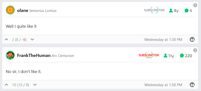
Ars Technica’s redesign, summarized in two comments

The comments were posted at the same time.

Frank probably made his post in response, but it’s still kind of impressive he got it in when he did, given the article got over 40 pages of comments in about 24 hours.

Myself, I’m using List View now instead of the main Grid view. My issues reflect a lot of what others are saying:

  • Too much white space (and I see even less of it, since I subscribe and the design takes into account the now-unused ad space), which means a lot more scrolling and a lot less visible content.
  • Article headers are way too big, both font size and image.
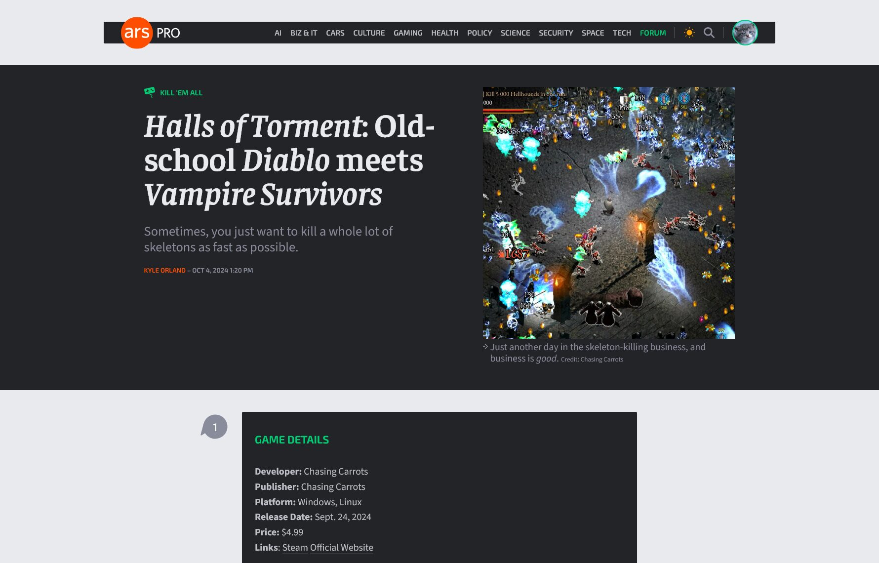
  • The Grid view commits a huge faux pas by showing a large block of black with white text on it…when you select the Light theme. Not only is this illogical, it’s a legit accessibility issue. Light themes should be light.
  • Images in circles are small and not particularly easy to scan, which is overall minor.

I knew there would be griping a-plenty when the article about the redesign talked about updating to current design trends (which in many ways are bad and user-hostile). We’ll see where it ends up as they tweak, but history suggests it will be mostly as is and people will just get used to it.

Here’s the Grid view, as seen on the front page (click to see full-size):

That is a lot of dark for a light theme.

The headers on articles in Light view are still dark, too:

This is a 1780×1140 window.

Also, note that despite having my browser window set to 1780×1140 (not counting the address bar, etc.) I have to scroll just to start reading the article text. This seems suboptimal.

We’ll see how it evolves over the next few weeks. I’ll post an update if I remember!