The Photos app Apple has is roughly the same on all of its devices, if you are on the latest version of the device’s OOS–in this case I refer to iOS 13.x, iPad OS 13.x and macOS 10.15x (Catalina), but for this post I am specifically referring to the iPhone version.
Generally for looking over your photos, sharing them with friends, cursed social media or other apps, the Photos app works well enough. iOS 13 even adds a surprisingly robust set of editing tools, so the typical user will never need to use another app to apply hideous, Instagram-style filters. Smiles all around, as they say.
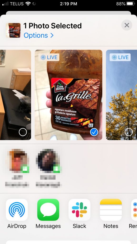
But let’s say you want to do something like duplicate the photo, because you want to keep two copies–the original, and the version you have applied hideous Instagram-style filters to. Let’s take this image of me holding a bottle of delicious Clubhouse La Grille Signature Steakhouse marinade. This marinade is so good I want to, I don’t know, add stars to the image or something. So I tap on the square with the arrow pointing up. This opens the share sheet, which gives you options for sharing the photo (and lots of other stuff).

And here you can see some share options (I have obscured two AirDrop contacts in keeping with Apple’s much-ballyhooed privacy). This is mostly a list of other apps. Where’s the ability to copy, duplicate or do other things? They are not here. I am very sad.

But wait, those options are actually here. Do you see the sliver of white at the bottom of the screenshot, with the rounded corners? That’s the rest of the interface, almost completely obscured from view. In fact, if you wiggle the page slightly you can make that small visible portion completely vanish, while still showing everything above it. This is bad design.
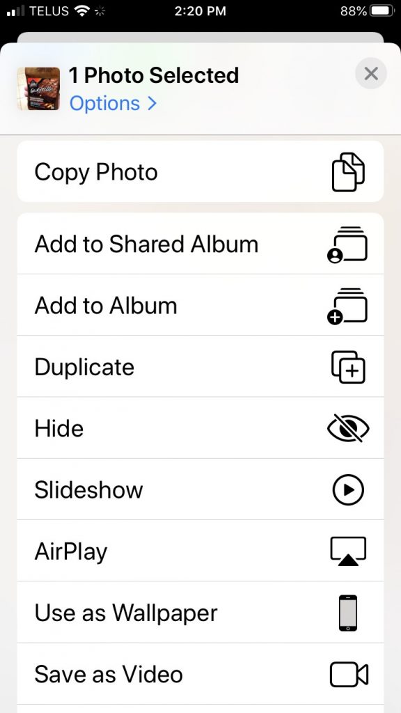
If I swipe down I get so many additional options I have to swipe again to see all of them. This is what the first swipe gets me on an iPhone 8:

This is a perfectly clear, usable list of options. Apple has listed everything in plain text with a little icon for easy visual scanning. This is all really nice–if you actually scroll down and find it.
Obscure UI is something that has been discussed a lot with the touch interfaces used on phones and tablets. Without the “traditional” scrollbars, arrows and so on, a lot of the options you may have at your disposal are effectively hidden like treasure, waiting to be uncovered by swiping or long-pressing or tapping x number of fingers on the screen, or something else entirely. Some suggest that Apple’s own 3D Touch (or Force Touch) was removed on the 2019 phones (replaced by “Haptic Touch”, which is just a long press with a bit of vibration attached to it) because no one knew it existed. Most discovered it by accident–by pressing harder than needed for a long press and invoking the 3D Touch pop-up.
3D Touch is pretty handy once you know to look for it, but even then it’s not a system-wide feature. Apps don’t have to support it, and since Apple always sold phones that didn’t include it, a lot of app developers ignored it. And now it’s gone, with a lot of people never knowing it existed.
But back to the Photos app–burying a long list of options at the bottom of a page is not a bad thing in itself. Where Apple fumbles here is not giving the user any concrete visual clue that the options are even there. A few obvious fixes come to mind:
- Add a “More options…” button to the initial photo screen. Currently there are three choices: Share sheet, Favorite and Trash. They could squeeze in another icon here.
- Another choice would be to add it after tapping the Share sheet icon. And look! Do you see at the top where it clearly says Options already? You might think that’s where you would find all of these extra options. But instead it’s where you find exactly two options concerning sending the photo as “automatic”/an individual photo/iCloud link and whether to include location/all photo data. The additional options could simply be added here. But this has two problems of its own: it adds an extra tap to get to the options, and it doesn’t necessarily address the original issue, which is the options not being clearly visible.
- A third choice, then, is to make the additional options more obvious. One way would be to turf the AirDrop contacts, since there’s already an AirDrop button and I suspect people are not AirDropping photos all over the place, anyway (I could be wrong). This would leave enough room for the list of other options to be more visible.
- A fourth choice would be to provide a visual indicator that there are more options available if you swipe up. This could be done several ways:
- Adding a scroll bar. This will never ever happen.
- Adding a floating arrow pointing down to indicate you can swipe to see more. This has the advantage of being something that could be used universally, much like scrollbars.
- Some other visual indicator that I haven’t thought of. Let’s face it, I’m not a UX/UI designer, I just know bad design when I see it.
I have no expectations that Apple will move away from the “obscure gesture” interface. One need only look at iPad OS to see how, if anything, they have embraced it even more. There are now large swathes of the iPad interface that most people don’t know about–and never will. This is in part due to obscurity, but also in part due to questionable interface choices. But that’s a whole other post. Soon™.

