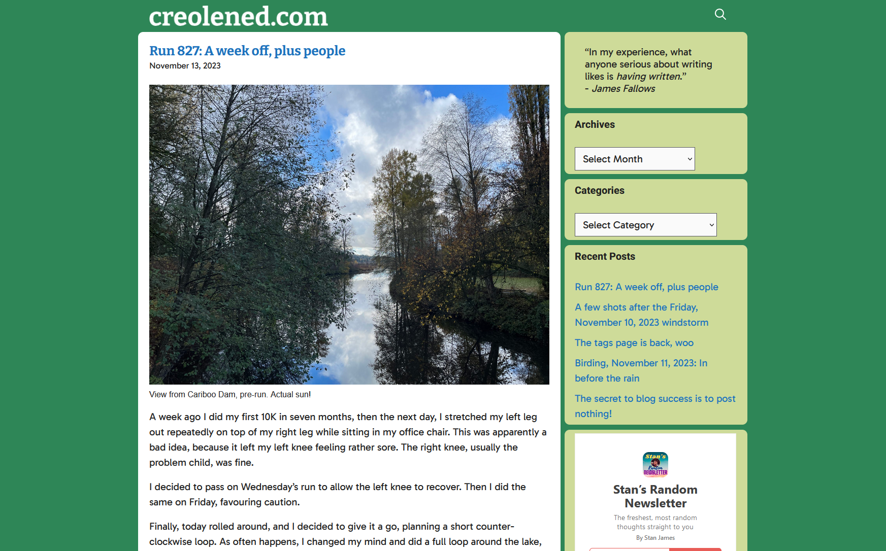
When I look at my current blog design (captured in screenshot form below for posterity, and for when it inevitably changes) it occurs to me that it is quite retro and I hadn’t consciously realized it. Today, I happened to look at someone else’s blog and it was very typical of what you see on most sites–clean white expanses, black text, little in the way of links or other clutter. Just the posts and that’s about it.
Conversely, my site currently:
- Slaps you in the face with not one, but two bright colours, one that surrounds that traditional black text on white “standard” look.
- Has a Categories list. Seriously, this is a standard part of WordPress, but I seldom ever come across it elsewhere.
- An Archives dropdown. Also pretty rare and another built-in part of WordPress. This one is mostly for me, though. Also, easily seeing how many posts I’ve made per month is oddly satisfying.
- The design isn’t cluttered, exactly, but it isn’t overly spacious, either. I feel most sites have a lot more white space. Mine is…cozier? Maybe it’s just more cramped.
And I’ve actually stripped away a lot of the stuff I used to have. The menus at the top are gone, the logo is now just text.
Maybe one day I’ll finish that redesign. For now, I’ll probably just continue to add bits back, content to have a blog that looks very 2005.
My site, as of November 14, 2023:


