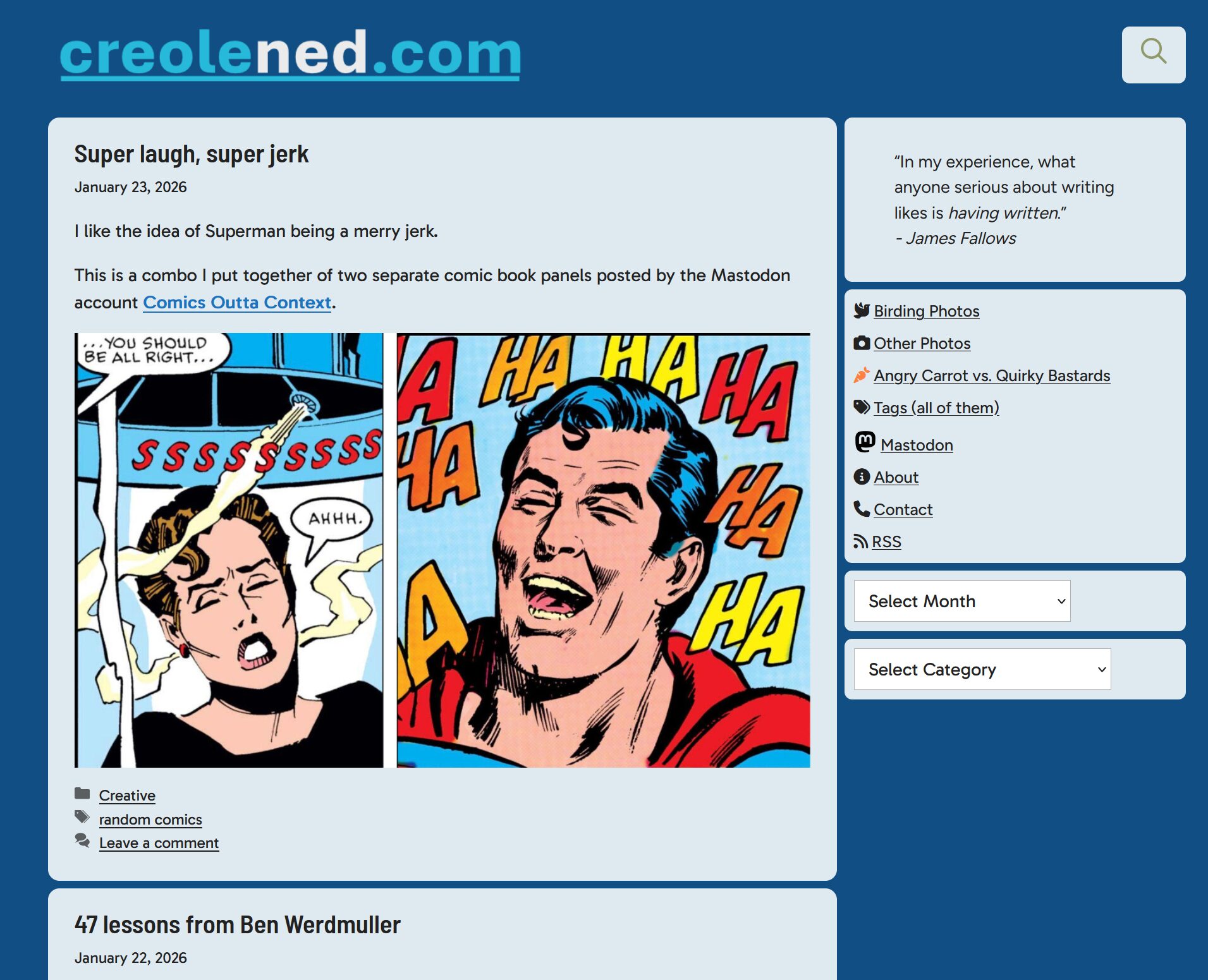
My site here runs on WordPress, but I started it back in 2005 when WP was at version 1.2 (it just hit version 7.0 a few weeks ago). To say it was a simpler system then would be correct.
Reading through PoT’s post, I found myself nodding in agreement and considering myself lucky that my site has pretty much been in maintenance mode for years now (backend-wise–I still churn out nonsense regularly), running the same theme (GeneratePress) and a handful of plugins. Things generally just work.
Except recently, I had a plugin update go haywire for the first time in ages. This led me to disabling all plugins until I (relatively quickly) found the rogue one. But instead of re-enabling all the plugins I’d been using, I only re-enabled the ones I considered essential, even if they were fairly frivolous 1Like Modern Footnotes, which allows me to place pop-up style notes to offer witty little bits as I see fit.. It made me think again about my failed search for a WordPress alternative. My needs seem simple on the surface:
A space to write, with the usual formatting options
A space to post photos, including galleries
Something that doesn’t require a lot of coding, as I’m not a programmer (I can handle some CSS and the like)
But I am also a bit of a weirdo, as I like having more precise control over the text and photos than most blogging platforms allow. WP, as awful as it is, gives me that flexibility, and I’ve grown familiar with it and accustomed to its general awfulness. But now I wonder if I should again renew my search?
If anyone happens to read this and has a suggestion, hit me up on Mastodon, email me or otherwise reach out as outlined here.
FUNNY NOTE: After writing this post, I recalled I'd seen this blogging question challenge last year and couldn't remember if I'd answered the questions back then. It turns out I did, so I have now answered the questions twice, which makes me a bit of a dope, but also provides an interesting comparison between what I wrote on January 26, 2025 and today, June 3, 2026.

It's worth reading the older version, some of the answers are more fleshed out than in this post. But read both and enjoy the blogginess of it all!
What platform are you using to manage your blog and why did you choose it?
Have you blogged on other platforms before?
How do you write your posts? For example, in a local editing tool, or in a panel/dashboard that’s part of your blog?
When do you feel most inspired to write?
Do you publish immediately after writing, or do you let it simmer a bit as a draft?
What’s your favourite post on your blog?
Any future plans for your blog? Maybe a redesign, a move to another platform, or adding a new feature?
Answers:
Why did you start blogging in the first place?
I like to write and I’ve always enjoyed journaling and noodling around writing my thoughts down. When blogs started to become a thing, I was just technically capable enough to slap together a blog of my own in February 2005.
What platform are you using to manage your blog and why did you choose it?
I am using WordPress and creolened.com has been using WP for over 21 years now. When the WP CEO started getting, er, a bit eccentric a few years ago, I started looking at alternative platforms, but none had all the things I wanted. And 20 years of inertia is hard to fight. In 2005 WordPress struck me as having the right balance of features and ease of use that worked for me. Admittedly, I didn’t really try anything else, because WP clicked pretty quickly.
Have you blogged on other platforms before?
I have dabbled and experimented with the following:
Ghost
Posthaven
Bear
Pika
Write.as
Probably more I’m forgetting
The only ones that survive today are Write.as as a free account and Pika, which I subbed to for a year, then never really used (not a reflection on the platform).
How do you write your posts? For example, in a local editing tool, or in a panel/dashboard that’s part of your blog?
I used the built-in editor in WordPress. And yes, I use blocks, I’ve tried fighting them before, but for the most part have adapted to them. But I have also used other programs to write and save blog posts before posting them here, with Obsidian, iA Writer and Ulysses (Mac) being the most common. If there’s a program that lets me export to WP, I’ll usually try it at least once, but most of the time I’m typing in the built-in editor.
When do you feel most inspired to write?
It varies, but it tends to be on the extremes, either early morning or late evening, probably because of the quiet (sometimes in the morning because I’m feeling zesty).
Do you publish immediately after writing, or do you let it simmer a bit as a draft?
Drafts are where posts go to die. I rarely come back to a draft, so I write “live” and post immediately. This is also reflected in that most of my posts are not planned, just whatever flits through my mind at the moment.
My viewpoint tends to be a bit jaded, but ultimately hopeful and a bit sarcastic. I realize it may not work for everyone.
Any future plans for your blog? Maybe a redesign, a move to another platform, or adding a new feature?
My blog is pretty much done as far as features and whatnot. I’ve actually been trying to prune back the number of plugins I use, though it’s hard to resist some 1Like these pop-up footnotes, for example. I do occasionally tweak the layout and design of the blog and assorted elements and will continue to do so. I need a new logo as of writing this (June 2026) but haven’t had anything really speak to me yet.
Yes, this blog still works for posting things that are not running or birding related.
The lack of posts (other than for the topics mentioned above) has made me think, which happens occasionally. Why am I not posting much? Is it a general sense of contentment that leaves me so fulfilled that I don’t have any inclination to post about concerns, complaints or conundrums here?
As the kids would say, lol no.
I think it’s a few things:
A broken habit is hard to restart
I have actually been busy, which means I prioritize, and other things have been winning out lately
My seasonal allergies have been hitting especially hard lately, which affects mood/desire, etc.
Diablo 3
I think about writing a lot. This is actually a good sign, as it usually means I’m on the verge of getting back into the habit.
I started this blog with my first post on February 4, 2005 and as of this post right here, I now have 6,040 entries. I knew I was getting close to 6,000 but then kind of forgot about it until I saw another blog post talking about blogging (how meta), which made me check the stats here.
This averages to around 287 posts per year, or a little less than once per day, though if you check the posts widget on the sidebar, you’ll see my volume increased quite a bit starting around September 2015, when I began posting 1–2 times per day because I declared anything that popped into my head fair game to record here.
My posting pace started flagging a bit in the last few years for various reasons as life and other things distracted me, but I’m working on getting back into that “post anything” mentality, because some of my best/weirdest writing has come out of that.
I really want to end this with typing cat again, but I will resist.
For a long time, I resisted using Gutenberg with WordPress. It’s the default block-based editor used for crafting your artisanal posts about kittens and retrocomputing.
Reducing every paragraph to a block that could be shuffled about was not very useful to me, since my site is an old-timey blog that is just lots of text and some photos and drawings. I don’t need sexy layout options and the need to move content around in convenient blocks has only ever happened a few times over many years.
I also disliked that Gutenberg turned paragraphs into monolithic structures, where only basic formatting could be applied. Sure, I could make things bold or italicized. But what if I wanted to make my text redbecause I had something alarming to say? Gutenberg doesn’t allow that.
So I’m trying the Classic Editor plugin. I’ll see how it feels to be doing WordPress again, pre-2018 style.
What the title says. The text logo is…fine, but it’s not even actual text, it’s an image of text. And it’s a little plain. I feel like I need to go all 2005 retro for this.
Although it does disturb me a bit that 2005 is now retro.
Here is one I whipped up in Canva a few years ago that I did not use, because even I have my limits:
Or at least the website is, now. I’ve changed up the colour scheme again, going with an icy blue theme to reflect our wintry cold. Mostly, I just wanted a change.
For future reference, it looks like this:
Also, if John Gruber was dead, he’d be spinning in his grave because the header font is Aptos. Yes, Aptos! (I was lazy and just grabbed a font that was handy. I may change it later.)
The next experiment in design might be to go with some kind of dark mode style. I wish WordPress had a built-in way to switch between light and dark themes (you have to use a plugin). It seems like an obvious thing to add, vs. whatever AI nonsense they’re planning to shove in.