Bad design: Ambiguous UI buttons

Yes, I promised to be more positive, so think of this as me highlighting a UI issue in hope of a positive change. It’s a stretch, just go with it!

The Cider app is currently in beta, and generally I find it to be a superior and certainly a much better-looking experience for listening to Apple Music than Apple’s own decrepit iTunes program (the fact that it still exists on PC years after being retired on Mac shows the contempt Apple has for people who don’t fully buy into their ecosystem).

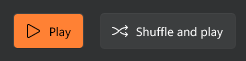
If you have an album in Cider queued up that is in your library, you’ll see a strip of icons above the list of songs like this:

Remove from Library is pretty clear, so let’s move on to the other two.

Play: The button is red. Does this mean it is waiting to be clicked, then the music will start to play?

Shuffle: This button is also red. Does that mean shuffle mode is currently toggled on? Or off?

Answers:

Play: This is what the Play button looks like when music is playing. It’s also what the button looks like when music is paused.

Shuffle: This is what the Shuffle button looks like when shuffle mode is off. It’s also (go ahead, guess!) what the button looks like when shuffle is on.

In other words, these buttons convey nothing about their current state. To me, this is bad design, but as you’ll see below, it’s actually pretty common, so it would seem to be the expected convention as I’ll explain below.

By comparison, the new Media Player for Windows 11 is…well, it’s exactly the same. The Play and Shuffle buttons don’t change state when these options are on:

Both buttons will highlight on mouseover, but neither otherwise changes when clicked. How do you know shuffle mode is on? You don’t!

I believe the thought here is these are “top level” buttons used to initiate an action, and are not meant to represent the current state. For that, you look at the full set of controls, which do reflect changes when music is paused or playing. Cider again:

Music paused

Here, the shuffle icon is highlighted, indicating shuffle is on. The Play arrow indicates music is paused. We can confirm this by clicking on Play and seeing the change:

Music playing

So, am I complaining about nothing? Maybe, a little, but I still think a button should change to reflect the current state regardless of where it sits in the UI, so I’m still hoping UX gnomes will fight to get these changed.

P.S. I am obviously not a UI/UX designer, so if all of this seems silly and obvious, remember that…I am not a UI/UX designer! I’m just a slob with a website who would prefer more informative buttons, regardless of what current conventions are.

That darn cloud: A technology reminder

One of the reasons I chose to try Obsidian as my new note-taking app is that it works with plain text files and stores them locally, meaning there is less likelihood of file corruption due to weird syncing/internet issues. As they put in on their site:

In our age when cloud services can shut down, get bought, or change privacy policy any day, the last thing you want is proprietary format and data lock-in.

With Obsidian, your data sits in a local folder. Never leave your life’s work held hostage in the cloud again.

Taken from the Obsidian site

But they also state:

Your notes live on your device, period. You can encrypt them or back them up however you want; it’s your decision, not ours. Plain text files let you do various sync, encryption, and data processing on top of it. Obsidian plays nice with Dropbox, Cryptomator, and any software that works with plain text files.

Here they suggest you can back up or sync files–if you choose–using whatever suitable service you may have access to.

I chose to use iCloud Drive, because it lets me sync between the three devices I’m likeliest to use Obsidian on:

  • Windows 11 PC
  • MacBook Air
  • iPad Pro

It has worked fine so far. But then it didn’t. Ack. What happened was I restarted my PC (because Windows 11 still requires reboots after most updates for reasons) and when I reloaded Obsidian, it began to sync files and folders, and to also index them, which it promised was a one-time operation. It then seemed to cough up a hairball on one file I had open previously (my random newsletter) and started creating non-working duplicates of it. It renamed the original file. It was just generally weird.

On the iPad and MacBook, things seemed to be working normally, so it appeared to be a Windows-specific issue. I managed to create a local version of the files and folders on my C: drive and that is working as expected, but on PC the iCloud version is still behaving weirdly. I might try duplicating the local version and see if that works.

My main point here is that the makers of Obsidian are right–while data failures are possible on local storage (SSD could suddenly die, for example), when your stuff lives in the cloud, you increase the surface area for failure/corruption and can potentially lose your data forever if you don’t have any local backup.

This has been a good reminder for me, albeit a somewhat unwelcome one.

I’m still deciding how best to maintain my Obsidian vault. Local network storage might be a way to go. We’ll see.

Clipboard history is strangely useful

Apparently I copy and paste a lot of random things, so the Clipboard history feature in Windows 10 (accessed by the Win + V combo) is surprisingly handy. I’m not sure if using it makes me a power user, but I’m going to pretend it does.

Here’s a few other random small utilities I use with Windows (I may make a Mac list if I’m not feeling lazy–and the Mac actually has a more dire need for these sorts of things, so take that, Tim Cook!):

  • Greenshot. The included Snip & Sketch actually works pretty decently now, but I’ve gotten used to Greenshot. It works great for grabbing screenshots and has a nice assortment of editing features that turn it into a mini image editor. And it’s completely free. Sadly, the not-free Mac version is not nearly as good.
  • Sizer. This program lets you assign keyboard shortcuts to predefined window sizes. I currently use a horrible piece of software at work that opens windows to something like 80% of your screen size, which may have made sense back in 2003 when everyone had 15 inch monitors, but is super-obnoxious when your monitor is a widescreen 27 inch model. I can only imagine what these windows would look like on a 34 inch ultrawide. Anyway, with one swift key combo I can resize the window to something sane and move it to exactly where I want it on screen. Also free!
  • EarTrumpet. Goofy name, but it acts as a replacement for the standard Windows volume control, making it a lot easier to control audio from multiple devices.
  • PowerToys. Yes, they’re back. It’s the 90s all over again! This is a nice collection of small utilities that let you do things like remap keys, quickly resize images, includes a color picker and more.