The daring adventures of Mac and Tosh (Part 1. Er, Part 3, technically)

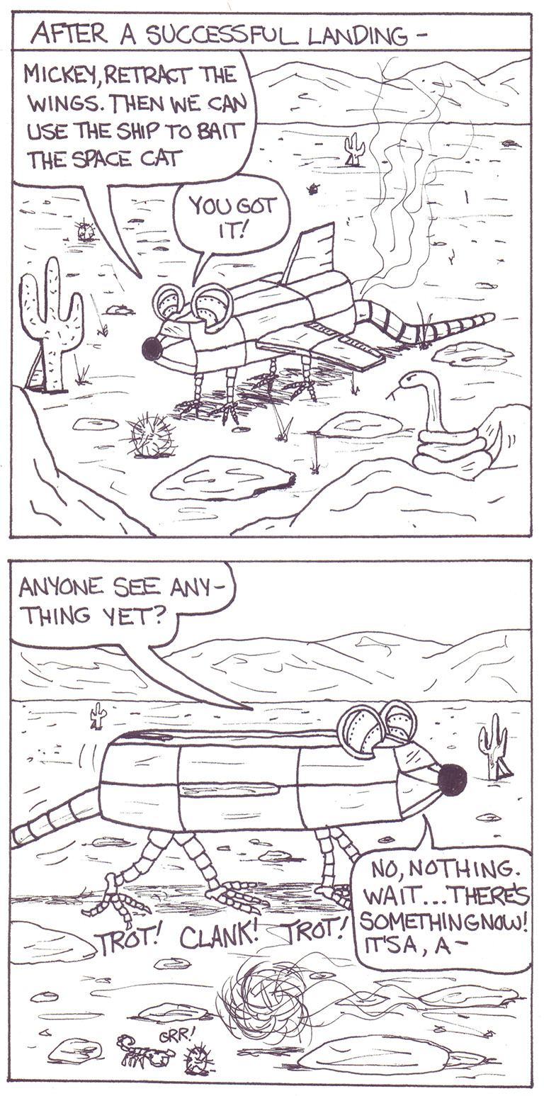
It was time to test out the scanner of the new multi-function Brother MFC-9130CW or as I like to call it, the heavy thing that sits on the corner of the desk behind me, so I grabbed a collection of Mac and Tosh comics I made when I was a wee one. As you will see below, my sense of humor was already suitably dark, albeit somewhat unsophisticated. The bleed-through is an accurate reflection of the thin and worn paper, hence I’ve made no attempt to fix it.

Mac and Tosh "The Bomb"

I dated some of my earliest comics but not this series. There are several important clues, though. The lowercase “a” is written the “normal” way and I switched to the “fancy” version around the age of 10 or 11. The appalling spelling (“heavan” and “hear we come”) also indicates the period before I suddenly developed an internal spelling checker. I’m going to say I was around 8 or 9 years old at the time this epic was penned.

Speaking of penned, I bravely inked the comic without drawing it in pencil first. Note the very first word was a mistake that I crossed out and corrected. Perhaps white-out did not exist back then. You can also see the classic “make a balloon then scrunch the words to fit inside it” technique favored by many budding comic strip auteurs.

Sadly, Parts 1 and 2 seem to have gone missing. One can only imagine the tense build up leading to the eventual catastrophic demise of the characters.

Also, I can’t recall which was Mac and which was Tosh. Their names are directly ripped off of the Goofy Gophers featured in Warner Brothers cartoons, of which I was (and remain) a big fan. At the time I probably thought of it as an homage. At least I didn’t also make them gophers. Their explosive deaths could have been inspired by one of many Warner Brothers cartoons but most likely something from the Roadrunner series. I like how either Mac or Tosh looks on the bright side even as they let slip their mortal coils.

The last three panels are scratched in with pencil and I have no idea what the cryptic “TERRI DID THE” message refers to (Terri is one of my sisters). I also have no idea what the circle, #, square and 61 are references to or why they are repeated twice. It’s like clues to a murder mystery, but the only deaths I know of are in the panels above these would-be clues.

Anyway, I’m going to recreate these strips to see how they’d look from an adult perspective. My guess is sad, but in a different and less-cute way.

My fantastic rendition of a ring-tailed cat

Did you know a ring-tailed cat is not a cat? Did you know I sketched a ring-tailed cat back in junior high and upon looking at the sketch today I had no idea what it was, except that it was small and furry and possibly a little mean? Did you know that I discovered it was a ring-tailed cat (which is not a cat but a relative of the raccoon) by doing a search for “ring-tailed animals” and coming across a similar image?

Now you know. Hopefully these trivial bits of information didn’t shove out something way more important from your brain.

Note the small backwards check in the lower right of the drawing. I think this was my teacher’s way of saying, “I acknowledge your work but dare not comment on it.” Which would be fair, really. I’ve never been more than a mediocre visual artist.

The scan is actually a photo I took with my iPhone 6, which I then cropped on my PC. Isn’t technology grand? The original image is 5×7 inches. Also, the ring-tailed cat appears to be missing a leg, a recurring theme in my animal sketches, apparently.

Ring-tailed cat, sketch done at age 15.

And here’s the same sketch using the Composition filter from the iOS app Prisma. These filters are so sophisticated they can make my trashy junior high art actually look kind of neat. Did I mention how grand technology is?

Ring-tailed cat with groovy image filter applied.

The not-so Ever-Continuing Saga of the Round Balls

Way back when parachute pants were not worn ironically (or were still worn at all), I made a series of comics called The Ever-Continuing Saga of the Round Balls. I did 11 issues in all, each lovingly handcrafted by hand. The ongoing story was just a bunch of nonsense to allow for topical jokes and sight gags. The balls were on a quest to find Pia Zadora. For people born in this century, she was the 1980s equivalent of Paris Hilton, more or less.

The cast of characters was large and impressive. There were magic talking bean bags and mice, nefarious enemies in the form of rocks, adventures on tropic islands and more.

I have lost all 11 issues. I have no idea where they are. It makes me sad.

I tried to revive the comic about a year after the last issue but it never took. Below is a gallery of all that remains of those unfinished Round Balls comics. I’d say I’d go back and revive the comic except it was a lot of work and I ain’t no artist.

But it was fun and satisfying at the time.

Angry Carrot on a new Surface

Behold my masterwork, Angry Carrot as drawn using the stylus that comes with my Surface Pro 3 and using Corel Painter Essentials 5 software. I did no editing, as is rather obvious. Some day soon™ I may try a better drawing than this quick proof of something or other.

Angry Carrot Surface quick doodle
Angry Carrot quickly doodled on a Surface

The fake house I drew when I was 17

I promise I’ll scan more than one of these for my next trip down mediocre teenage art memory lane.

In the meantime I like this minimalist but slightly goofy perspective exercise. It’s simple and has a looseness that I probably couldn’t have captured if I was actually going for that. It’s not dated but judging from some of the work from the same book it looks to be from early 1982, a mere 31 years ago!

The Perspective House on the Hill

I deliberately allowed the image on the reverse side to bleed through on the scan because hey, art!

Note: If you reference the previous post, I lied. The teacher did not grade this particular piece. But I can pretend I got an A for it.

The fake chipmunk I drew when I was 15

I’ve been going through some of my school sketchbooks of late and what I’ve found is that I was a fairly consistent and mediocre visual artist, with occasional flashes of talent/skill/luck beyond my usual stuff. The following is not an example of that. Sorry!

Instead it’s a drawing I made of a fake chipmunk I did while our art class was touring the provincial museum (now the Royal British Columbia Museum) in Victoria in October of 1979. The museum was absolutely wondrous to me. It had the usual exhibits, mainly focused on local native art, totem poles and such, but it also had life-size or nearly life-size dioramas depicting scenes both past and present from around the province. The highlight was probably the mining town that was modeled in loving detail, complete with a fishy-smelling cannery, a street filled with shops, a movie theater and a bakery that always had the aroma of cinnamon wafting from it.

The chipmunk was part of the one of the nature dioramas. I don’t remember the exact scene it was in but judging from its stance it was probably not about to be eaten by a moose.

It’s not a bad little drawing but there’s nothing especially remarkable about it, either. I think I’m most proud that I got the proportions right and didn’t give it some weird mega-head or something. Maybe I’ll go over the digital copy and see how I’d improve on it today with 30 more years of life experience and 0 more years of useful art talent. The teacher gave me a B for it. I can’t really argue with that.

The Chipmunk Eats

Next: Something the teacher gave me an A for!

UPDATE:

Here’s what I would have done to the image if I’d had a PC with Photoshop in 1979 instead of an Atari 2600 with a Canyon Bomber cartridge:

Crosshatched chipmunk

(apply the crosshatch image effect and adjust the level to give it better contrast)

The Unfinished Tree: A masterpiece (except for the masterpiece part)

Occasionally I get the urge to indulge the drawing ‘n painting artistic side of me and the results are usually halting, uninspired and incomplete. And here’s one of them!

The Unfinished Tree
The Unfinished Tree (rejected U2 album, 1987)

This is based on a photograph I found by cleverly doing an image search on the phrase ‘spooky tree’ in Google. The original:

As you can see my early rendering has captured none of the original spookiness and the tree exists in an existential white void, without bound, without limit, without me being arsed to finish the dang thing. Mostly it was an excuse to break out my digital tools and see how I fared with them. I used the Bamboo Fun tablet and Corel’s Painter Essentials 4, a cut-down version of their pricey Painter program. I could see myself getting some traction with this combo if I devoted enough time to it but the chances of me carving out that sort of time is pretty small these days.

Still, I was at least inspired to create a new category of post for this (Creative) so that’s something. I promise to maybe finish you someday, would-be spooky tree.