Not the band, an actual pair of doors. Specifically, the doors for the storage in Lower Hume Park, which I have post-processed into some black and white something:
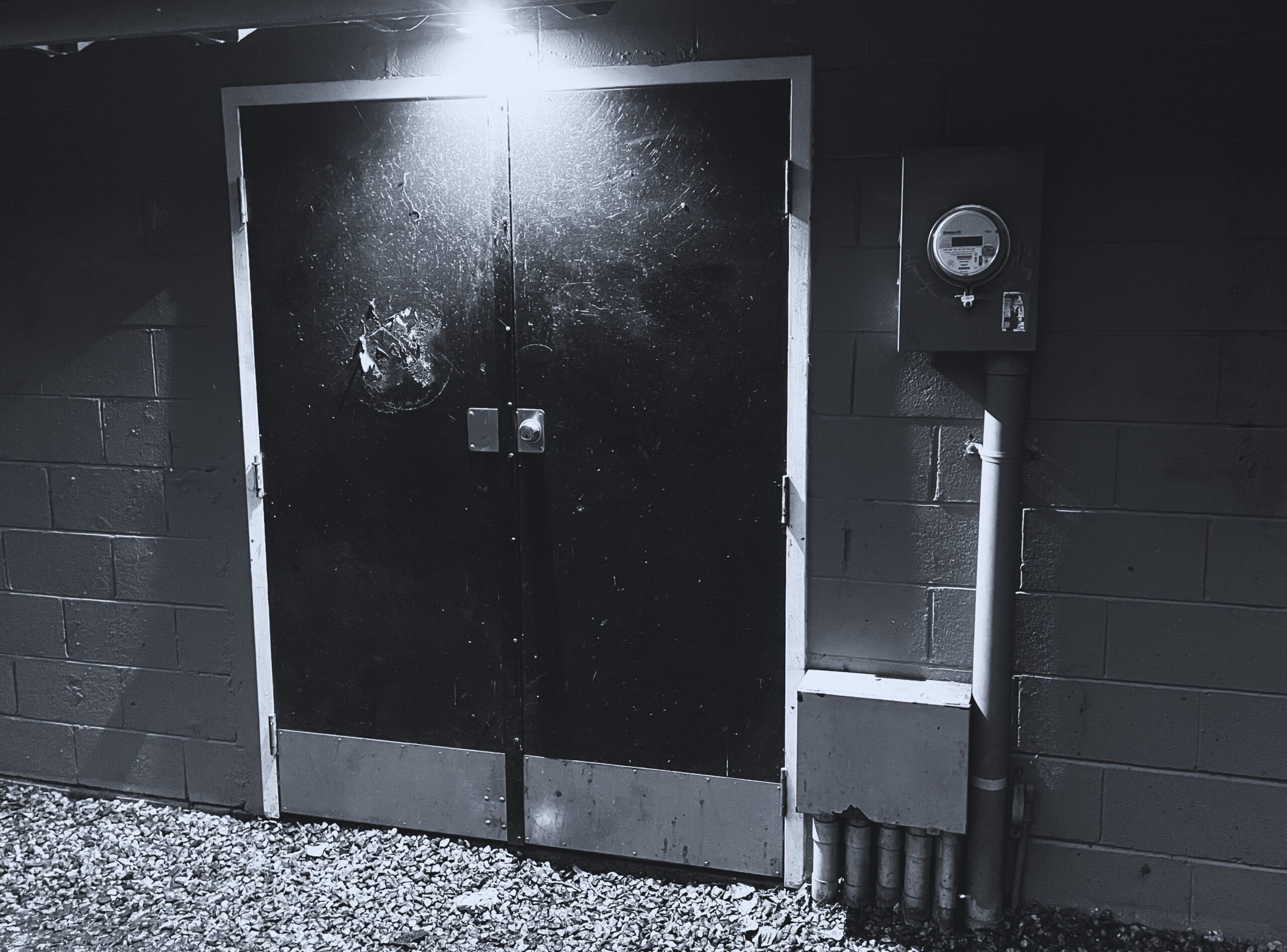
Not the band, an actual pair of doors. Specifically, the doors for the storage in Lower Hume Park, which I have post-processed into some black and white something:
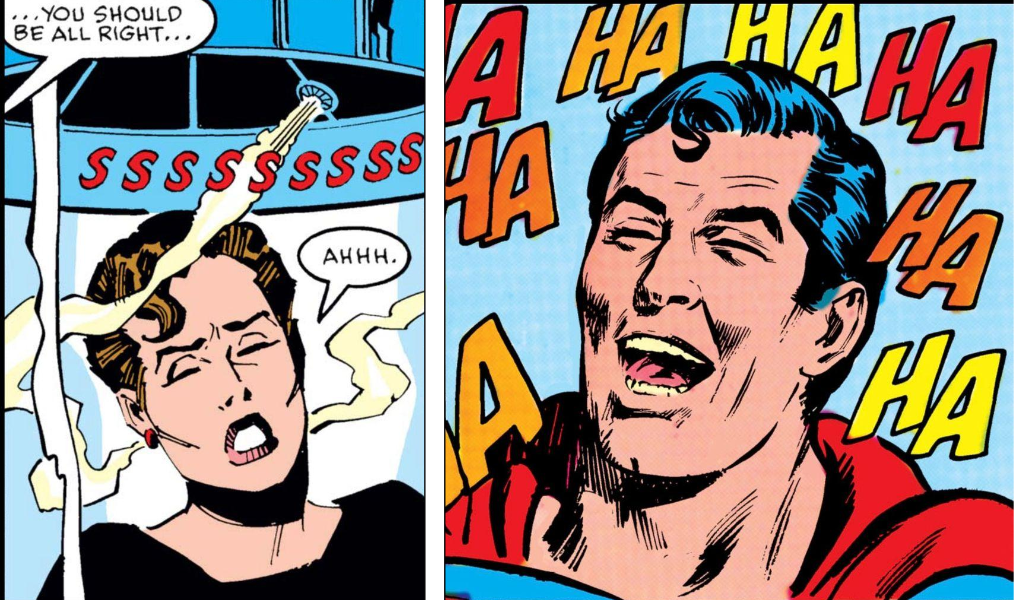
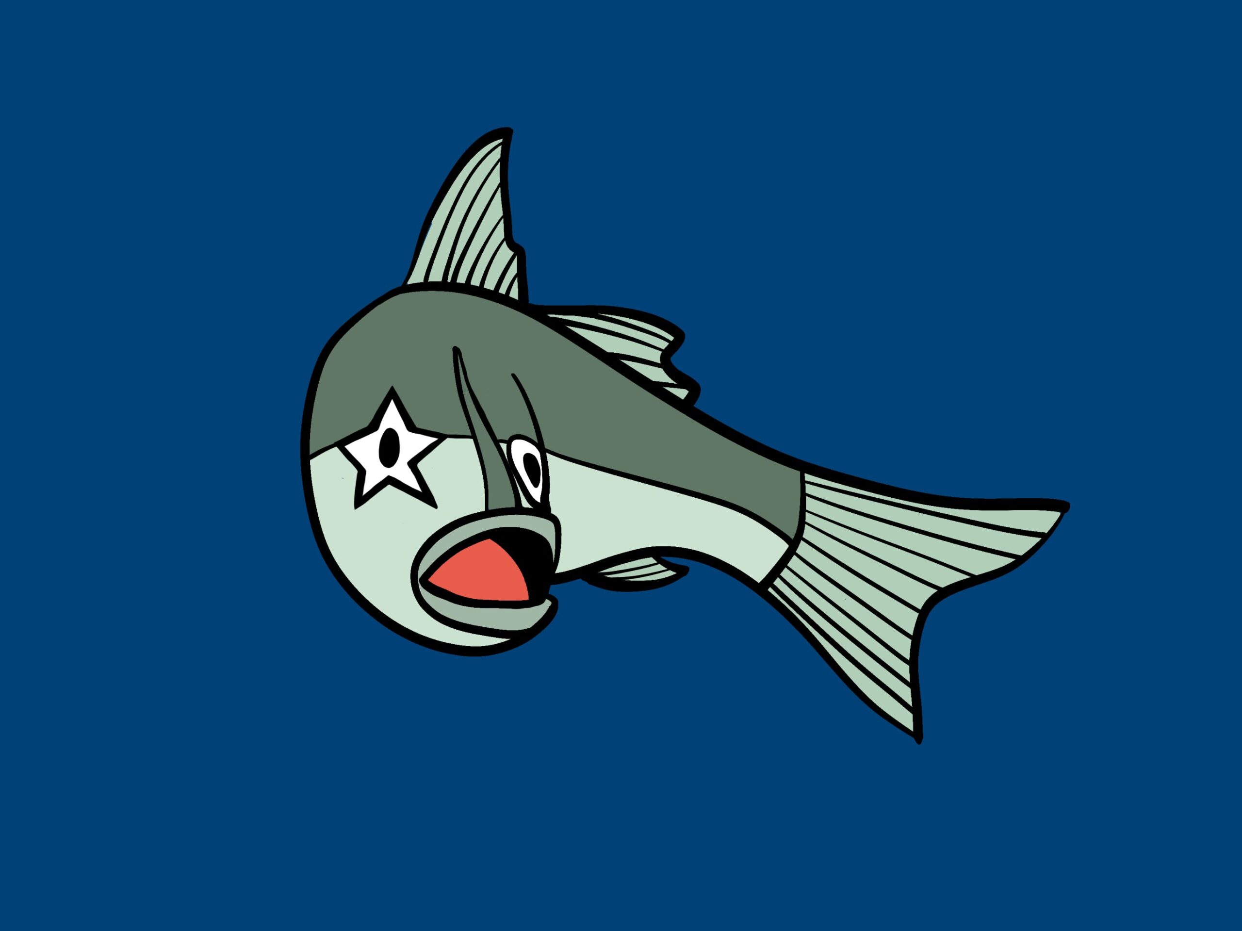
I like the idea of Superman being a merry jerk.
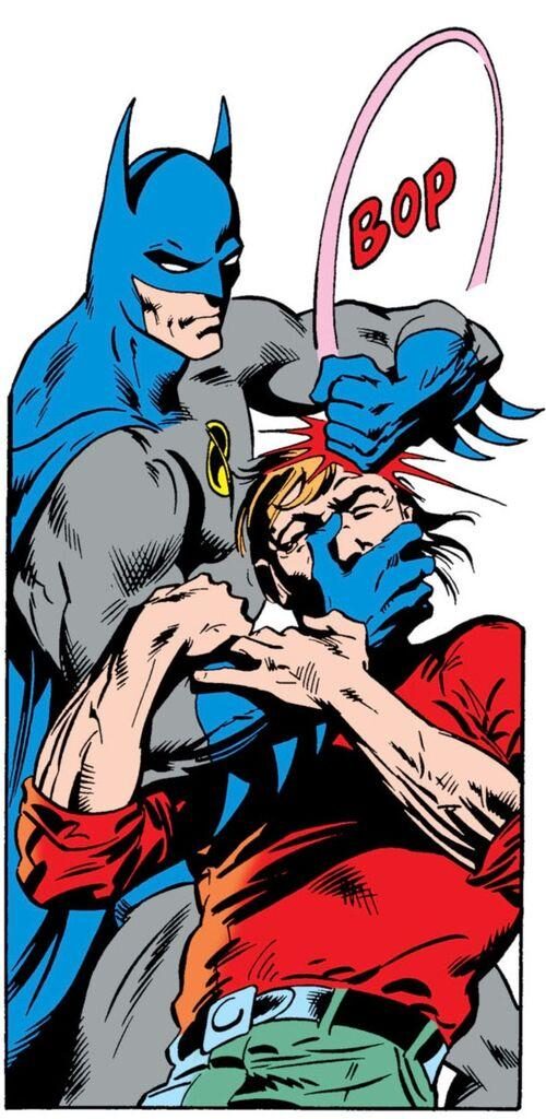
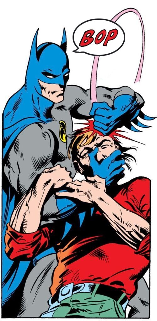
This is a combo I put together of two separate comic book panels posted by the Mastodon account Comics Outta Context.
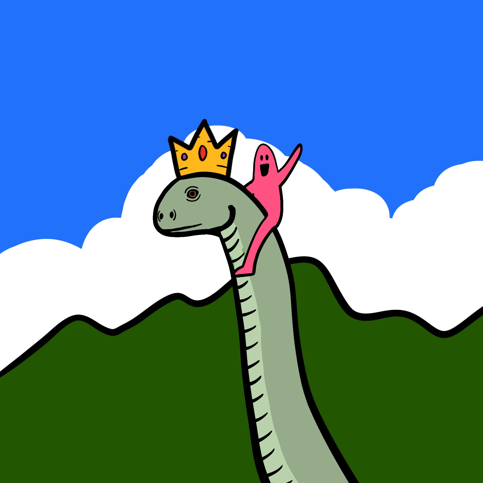
Yes, my first art of a sort in a good while. It’s not quite what I envisioned, but it’s a start. It is also a cat, on a rock.

Before
(provided by Comics without Context on Mastodon)
After
(modified by a friend and really, this should be the canonical version)
I got into a bad habit of waiting till the end of the day to do the prompts, often leading to brain freeze and nothing to show for it. I’m going to work on them earlier going forward and see if I can catch up.
I make no promises. Mostly because I’m really bad at keeping them. But here’s hoping!
Also, I’m going to try to post more. Cue typing cat!

And you can read it here: A cartoonist’s review of AI art
Yes, I missed a few days. I’ll catch up, I swear.
Meanwhile, here’s Day 7’s entry, starfish.
I waited too late and did something quick ‘n abstract.
Okay, so I’m doing this. At least for today. I made the mustache fake because I am no good at drawing them.
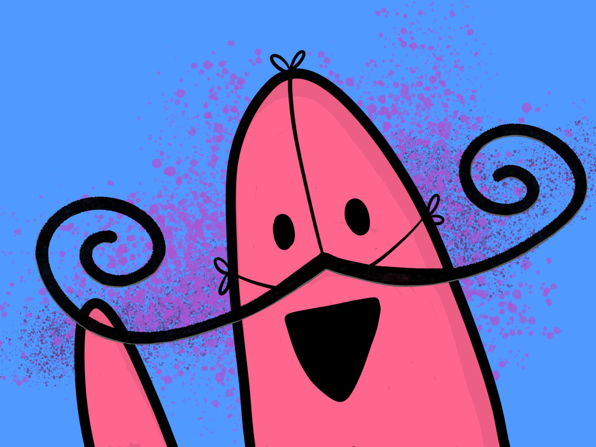
And will I keep making post titles that are questions?
The answer to both is maybe!
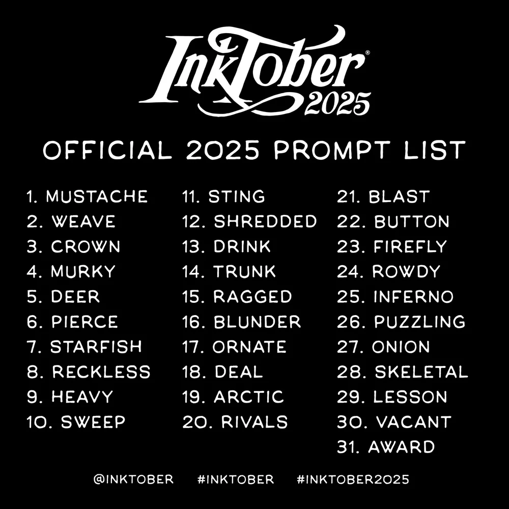
Here’s the 2025 list in case I do start doodling:
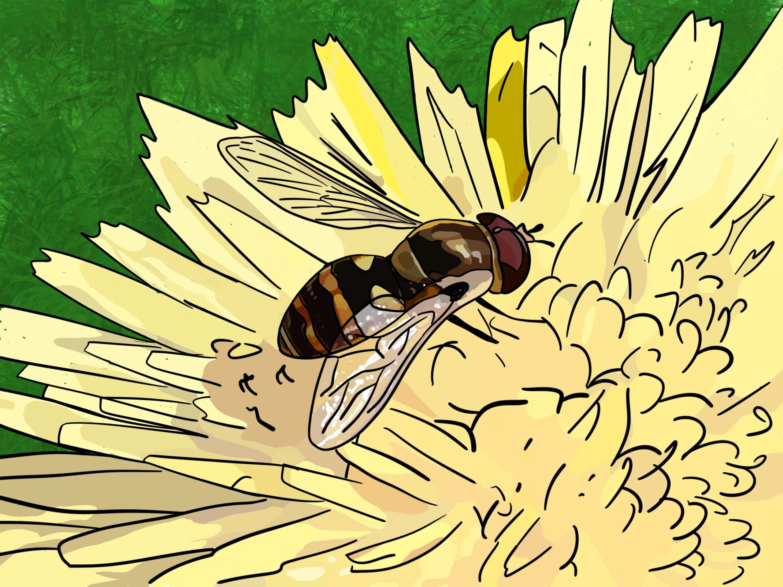
I decided one day to do a doodle of a hover fly I photographed on a flower instead of a bird, as I normally do.
It feels like I spent about 500 hours colouring the flower, and in the end I’m not really that happy with the result. It’s fine. I may go back and tweak it, somehow. But here it is for now.
Note: The gray part of the fly’s abdomen looks unfinished, but that’s actually how it looked in the photo. If I go back, I may use some ol’ artistic licence to address it, because it does look odd.
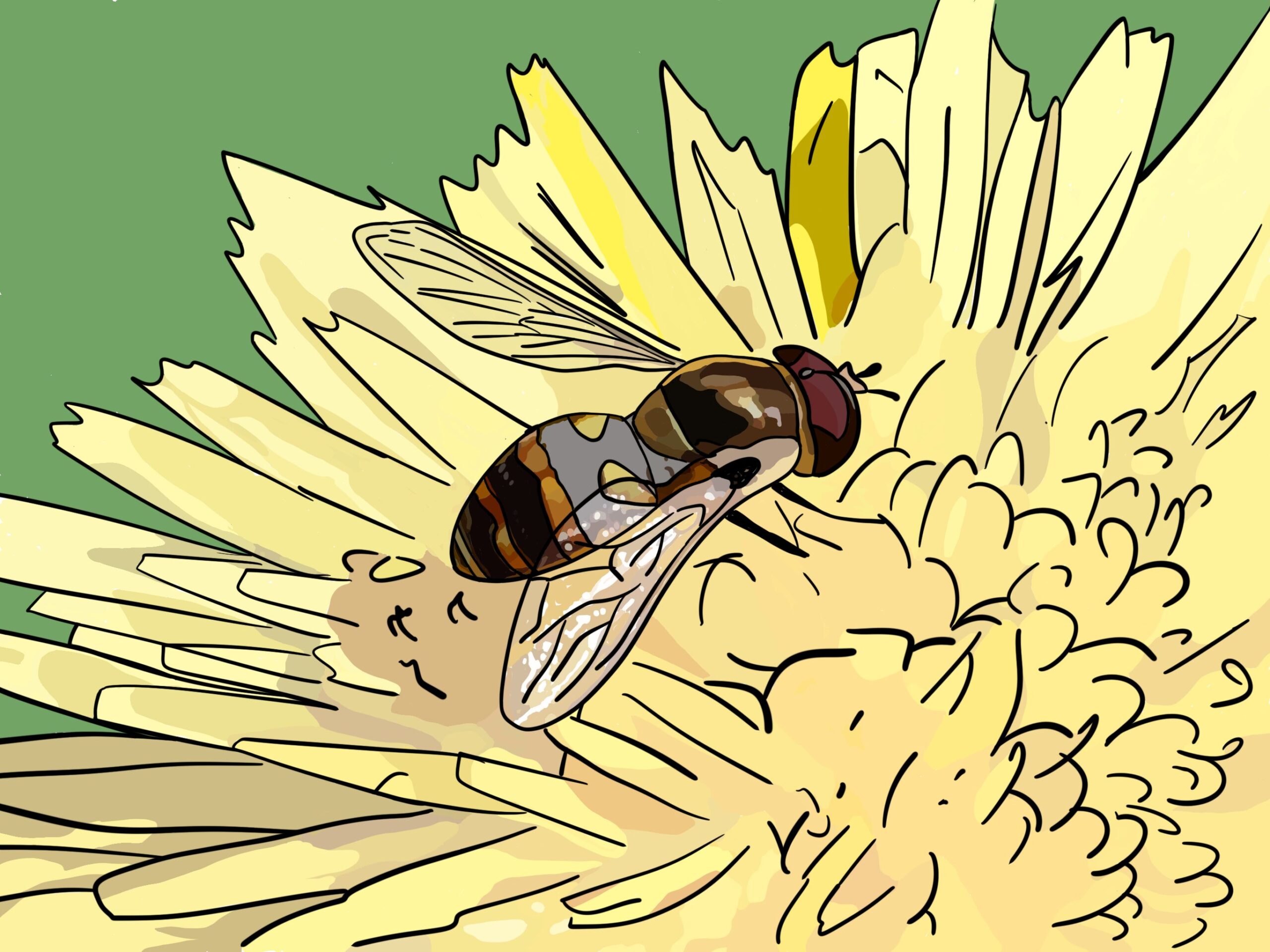
Update:
I have fixed the fly (please have your fly spayed or neutered) and made the background a bit different. It’s an improvement, I think.