There are a bunch of examples for this one, but I came across the one below when I was using the venerable Microsoft Word.
The design problem is especially common on mobile OSes, but as you can see, it’s not limited to smaller screens where companies might argue space is limited and there is a need to compact options down to only showing the most essential out front.
Word checks spelling and grammar using its AI-driven Editor, which is also available in Edge (browser) and the online version of Outlook, among other apps.
It works as expected, highlighting a misspelled word and offering options when you click on the word. Observe:
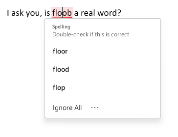
Note the three-dot menu at the bottom, next to Ignore All. What do we have here?
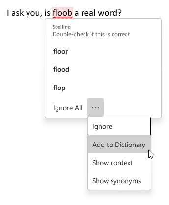
Two of the options, Ignore (basically “ignore this one instance”) and Add to Dictionary are pretty common options for spell checking, and having these in the main pop-up menu would not take up much more room, particularly for a program that is going to be running on desktop and laptop PCs with decent-sized to humongous-sized screens.
So why is the user forced to click on three dots to even see these options? There is no good reason, which is why it’s bad design. It’s simply in line with the current fad of minimizing UI, even when it makes no sense to, and makes the experience worse for the user.
Good design would at least offer the first two options to the main pop-up, so you’d have:
Ignore
Ignore All
Add to Dictionary
Then you could bury the other options behind the three-dot menu, though I think it would be better to just include all four of the sub-menu options in the main pop-up. What if the menu is too long because someone is using Word on a 2005-era netbook they got for $10 at a garage sale? Just dynamically have the pop-up appear above instead of below the misspelled word. Even the tiniest usable screens would be able to accommodate the pop-up menu somewhere.


:no_upscale()/cdn.vox-cdn.com/uploads/chorus_asset/file/22948752/pesposito_170722_4803_0032.jpg)
:no_upscale()/cdn.vox-cdn.com/uploads/chorus_asset/file/22965897/akrales_211028_4820_0523.jpg)