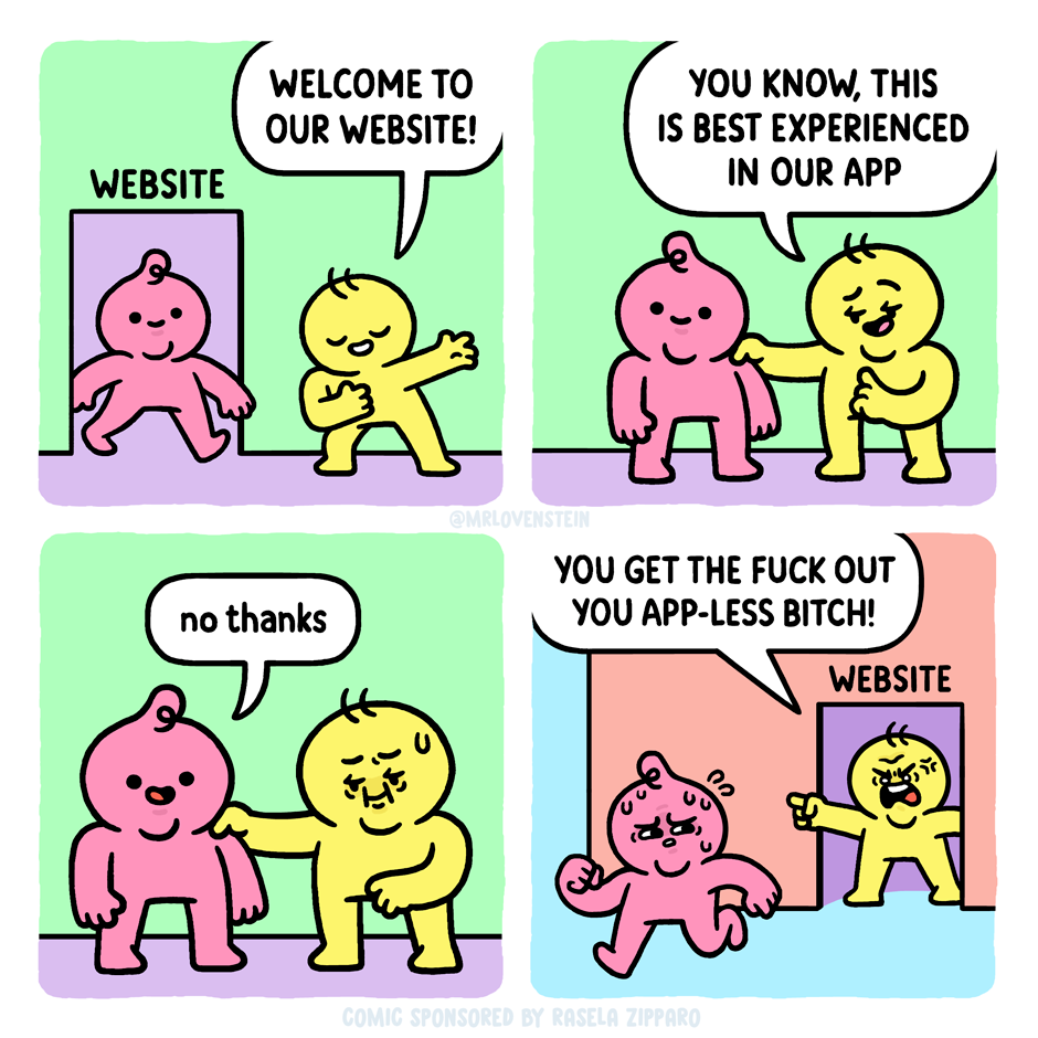
Why? Because so much linked content (on social media, particularly, but not exclusively) is now paywalled, instantly pops-up SUBSCRIBE TO OUR NEWSLETTER RIGHT NOW, has a cascading series of cookie warnings/options, and basically just a lot of clutter and nonsense to sift through before, possibly, getting to what you were actually interested in.
And you know what? I’m actually ok with that! By not clicking, and maybe by other people not clicking, we silently send a message, however vague, to maybe change things on the web to make them less awful, invasive, intrusive and annoying.
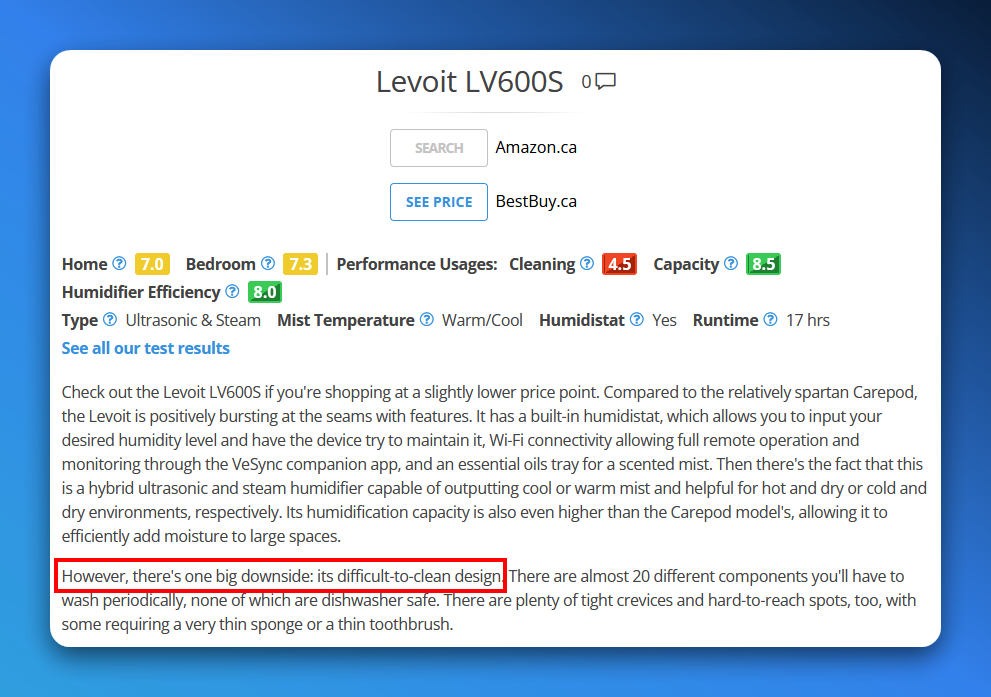
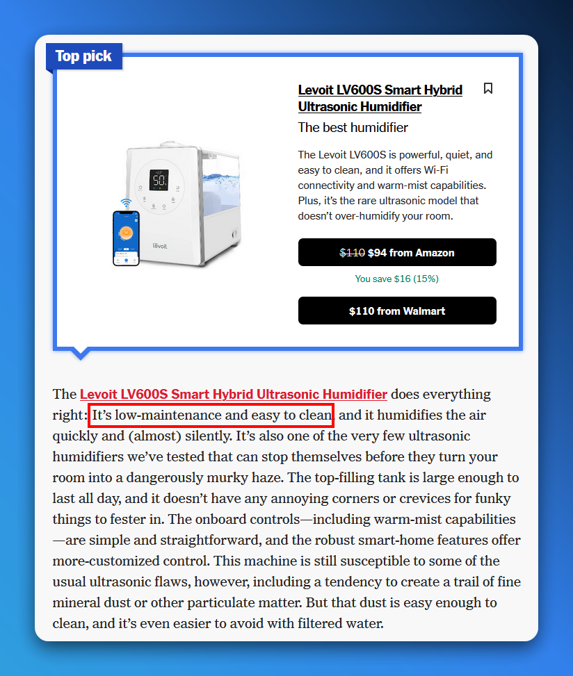
Observe two reviews for the Levoit LV600S humidifier (note: we are in the market for a new humidifier, I don’t just spend my time looking at humidifier reviews because that’s how I get my kicks):
Difficult-to-clean? That’s bad!Oh, but it’s actually easy-to-clean!
I know where you think this is going. You think I’m buttering you up before announcing that I’m raising the price of a Six Colors membership, which has been at $6 a month (or $60/year) since the very beginning.
I’m not.
Instead, we’re doing here what we did over at The Incomparable from the very beginning (and what my pal David Sparks did with his website recently), and adding multiple membership tiers.
The “More Colors” tier is $10 a month, and it includes these things (descriptions excised for space, but check here for full details):
Regular video reports and Q&As
A special section of the Six Colors Discord for More Colors members
Six Colors podcast live stream and bonus material
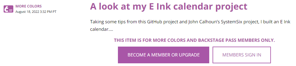
The third item posted after this announcement is shown in the screenshot below:
Now, I can’t say for sure what kind of content this is, because I can’t see it (or even who the author is!), but it looks like a blog post, which is not one of the perks mentioned as part of the $10 More Colors tier. Bonus posts are specifically a part of the now basic $6 a month tier. Except maybe not so much anymore? (I am subscribed to the $6 tier, which until today was also the only tier.)
My reaction was to ask myself a few questions:
Do I have more content to sift through that I can reasonably manage? Yes.
Do I need to pay for the privilege of reading a site that regularly exhorts me to pay even more? No.
And so, while I enjoy Jason Snell’s and Dan Moren’s site and have been a paying member for a while, I found it surprisingly easy to turn off auto-renew on my sub. As of September 12th, I’ll no longer be paying and will eventually probably remove the bookmark. It’s ironic that Snell specifically mentions David Sparks’ multi-tier membership approach, because it was when his site started getting riddled with PAY PAY PAY TO SEE SEE SEE that I opted to DELETE DELETE DELETE the bookmark.
I’m not saying what Six Colors is doing is wrong. I’m saying that I’m not fond of paying and then being presented with locked links saying PAY MOAR. It makes me feel like I’m being squeezed. If they need the money, good luck to them. But they won’t be getting any more from me.
Usually, for reasons of security, some websites will only allow you to automagically login for a limited time. After that, the sites will stop and force you to enter your credentials again. They will then work automagically again for whatever the specified time is.
This is an inconvenience, but a minor one, and I can see the justification for it.
However, a surprising number of websites–so many I won’t even attempt a list–completely mess this up by following this pattern:
You have a link to an interesting article/feature in a newsletter to a site you have an account on. I’ll use Goodreads because their site is generally terrible and it’s the most recent one where this has happened.
When you click the link in the newsletter, you are taken to the site–you can see the article, but over top of it is a pop-up demanding that you log in (or create an account).
You enter your credentials.
You are taken to the main page of the site.
You must now find the article you came to read, or go back to the newsletter and click the link again, which will now take you, logged in, to the article in question.
This is bad design, because it adds multiple steps to what should be a simple click and worse, sends the user off to somewhere they never meant to go, forcing them to retrace their virtual steps to get back. It wouldn’t surprise me if this extra friction results in a lot of people just not bothering at all.
The correct way–and the way all properly managed sites handle this, is to let the user enter their credentials, then keep them on the same page, so they can see the content they had come for. It sounds astoundingly obvious and logical, yet even in 2021 many sites fail to offer this.
The other day I was looking at this-here blog of mine and thinking about sprucing it up a bit. I have several other images I could use for the header, though I must admit I’m still smitten with the clean, crisp look of Buntzen Lake I have up there now. I could adopt a new theme but I blanch at the thought of all the manual tweaking I’d have to do in order to get it look just the way I wanted.
I also gave thought to tweaking the existing theme, perhaps going with a different body font. Right now I use Verdana, which is entirely readable if a bit bland. I experimented with Arial, Georgia and Garamond but none of them quite looked right. I began searching the vast reaches of the Internet and found a site called I Love Typography. I instantly went gaga over the body font used there and used my Interweb sleuthing skills to determine which font it was, as the site did not appear to share this particular detail. My efforts were without success so I sent an e-mail to the author of the (quite lovely) site and to my delight, he replied the same day with a single word response: Scala.
I now had knowledge but was faced with two new problems as a result:
How the heck did he get a font I clearly do not have to render properly on his site? What sort of JavaScript or CSS trickery was involved? I would have to find out.
Scala is a paid font. If I wanted to buy it I’d be looking at about $239 U.S. for the six fonts featured in the FF Scala Web collection. Now, I’m not saying they are not worth it. I’m saying I wish I had $239 to blow on fonts, because I’d probably have enough to buy some nice fudge, too. Mmm, fudge. Lacking both fudge and funds, my alternative is to look for a reasonable facsimile of Scala as a free font. That means combing through roughly one trillion hideous fonts scattered across an equally large number of font websites.