Usually at lunch I walk the loop around the Langara Golf Course. It’s about 2.7 km total and is pleasant enough if the weather is decent. The path does not allow bicycles and there are a few signs to that effect at regular intervals.
Recently the point was made even clearer through the erecting of a pair of gates that are tricky for pedestrians to navigate, but downright hostile to cyclists. These are meant to discourage and turn back cyclists and in theory they should do just that.
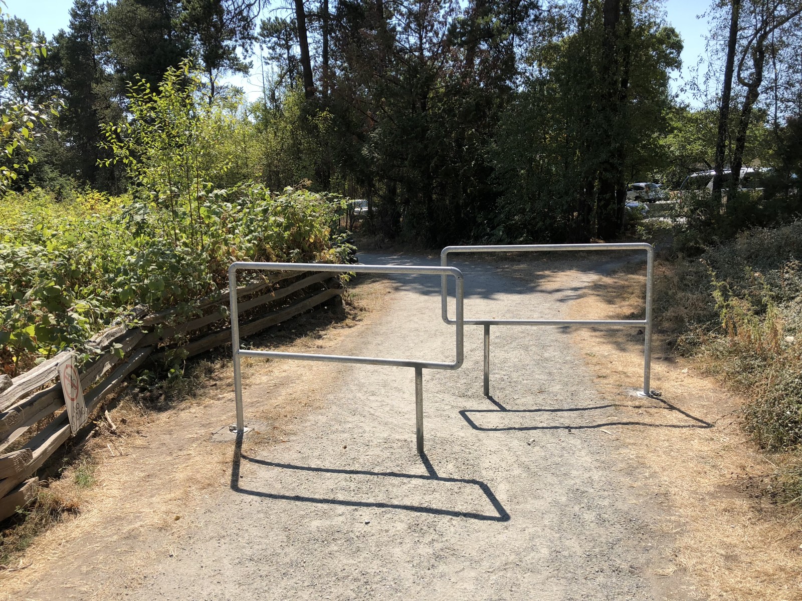
Here’s one of the gates.
To bike: You shall not pass. Bike: Well, actually…
You can clearly see some people are winding their way through the gate. You can also clearly see enough people are walking around it to create two distinct side paths, one on each side. I am one of those people.
I have yet to see a cyclist navigate around this gate, but I’m reasonably confident that in time I will.
The other gate is up against a fence, so only one side can be passed on the outside, and it’s narrower, but people are working on it.
This is bad design.
These are probably prefab pieces or otherwise made to a standard size. But if the actual location they’re being used in makes them trivially easy to avoid (and it is trivial–in the one pictured above a jogger can deke around the gate without slowing down), there’s not much point, really. You’re just adding an inconvenience for all the people who walk the trail.
My preferred solution in this case would be to remove the gates. Unless there is a serious problem with constant crazed cyclists, there’s little value to be had in placing these obnoxious, easy-to-avoid barriers.
(Technically this is not paving, but pouring concrete.)
Here’s something you sometimes see in cities or any urban area that has decent foot traffic. For the most part people walk along sidewalks and stick to them because the alternatives are unattractive for varying reasons–trespassing in someone’s yard and getting eaten by a dog, walking into the street and being run over by a bus, and so on–but sometimes there are routes off a sidewalk people will take, when that route is more direct and without risk of dogs, buses or other obstacles.
This is the sidewalk in front of the Burnaby Public Library on Central Boulevard.
Walk which way?
There are a pair of roundabouts here that bisect the sidewalk. Here’s an image from Google Maps that shows both of them (the one in the photo I took above is on the right):
A decision was made to have the sidewalk in front of the library not line up directly along the street, as would normally be the case. As you can see especially from the photo, people who come from either intersection, where the sidewalk does align next to the street, continue to walk in a straight line, ignoring the sidewalk directly in front of the library altogether.
The unnatural foot path (so to speak) becomes quite muddy and slick in winter, but it’s perfectly fine for most of the year, provided you’re not especially susceptible to tripping on small, exposed tree roots.
Anyone who understands human behavior should have anticipated the development of this foot path when looking at the plans for this block. Sidewalks that deliberately steer you away from getting from Point A to Point B are bad design. People will always take the shortest route if it’s easier and safe to do so.
The fix here would be to add a stretch of sidewalk where the existing foot path lies. The tree roots complicate things, so that may never happen, but the roots will eventually get ground down by the traffic on them, anyway.
Sometimes this bad design, while not anticipated, is still fixed later. Such is the case in Thornton Park in Vancouver. When the park was rehabilitated as part of the redesign of the nearby Main Street SkyTrain station, several pedestrian-made paths were converted into permanent sidewalks. It’s always nice to see recognition of real-life usage and adapting the environment to it where it makes sense.
In the interest of keeping to a complaint-free lifestyle, I’ll emphasize again for Bad Design I am doing a couple of things:
pointing out the bad design as a way to highlight how something should not be done, even if it seems logical or a popular way to go, in the hope that it encourages others not to repeat what I feel are mistakes in design
offering a solution or alternative design that addresses the flaws
And I only pick a lot on Apple because I own and use a lot of Apple products (which I will address in another post) and because as the world’s largest, richest company, they have the power to influence a lot of others (see Samsung and its weird and lawsuit-attracting tendency to follow Apple’s designs very closely).
And with that, I present:
The iMessage fireball
For those unfamiliar with Apple’s message app, it works like most text messaging apps and allows people to send and receive messages across Apple devices, including the iPhone, iPad, Watch and Mac. If you send a message to a non-Apple device, it shows in a green bubble as a regular text message. If you send a message to an Apple device, the bubble turns blue and it becomes an iMessage, sent through Apple’s servers.
With iOS 10 Apple revamped the Message app, expanding what you can send.
When you are in the Message app, tapping on the App Store icon presents a small black window that you can doodle and do other things in (it defaults to this, though tapping the icons to the left or right of the heart will allow you to use stickers from other apps, search for images and more):
By tapping on the horizontal gray line above the window it expands to give you more room and also exposes a small information icon in the lower-right corner that, if tapped, presents an explanation for the various actions you can perform:
The Heartbeat option only works if you are wearing an Apple Watch, as it includes a heart rate monitor.
The first option is Sketch and it seems pretty straightforward. Draw with one finger.
The next option is Tap. What is a tap? There is no explanation.
The fourth option, Kiss, puts a pair of lips in the window.
Let’s go back to the third option, Fireball. This puts an orange fireball-like blob in the window and as long as you keep pressing you can move it around. As soon as you release, the Fireball message sends.
Bad design #1:
Some actions send the message instantly, others require you to tap a send button to send it. This is inconsistent and can result in messages being sent prematurely.
Bad design #2:
There is no explanation for what a Tap is. The others are straightforward, but what is a Tap? It’s a ring that dissolves. If you do a bunch of taps in succession you can send multiple rings–er, taps–but if you pause too long the message auto-sends. I am unsure as to why anyone would ever want to send a Tap.
Bad design #3:
The Fireball and how it is invoked. Like the Tap, I’m not sure why you would send someone a Fireball. It looks more like a glowing orange ball than an actual fireball and it also auto-sends. The worst part, though, is that to invoke it you press your finger on the screen. You might think this is the same thing you do to make a Sketch, but there is a subtle difference. The difference is so subtle that you may find yourself sending off fireballs when you meant to start a sketch, and you may receive fireballs for the the same reason. In fact, since iOS 10 launched I have only sent two fireballs deliberately. The first was to see what it looked like, the second as a joke. Pressing the screen is a very basic gesture and it shouldn’t be tied to a fairly obscure action that few people would seemingly ever use.
Solutions
Bad design #1: Require tapping the Send button for all actions before the message is sent. Give options to edit or cancel the message.
Bad design #2: Rename Tap to Rings. Change text to “Tap with one finger to place one or more rings.”
Alternate solution: Remove this option altogether if it is seldom-used.
Bad design #3: Change the action required to invoke the Fireball to something that is not likely to be used accidentally, like tapping with three fingers.
Alternate solution: Remove this option altogether.
My personal feeling is the Tap and Fireball options could be removed. I have no evidence to back this up, but based on anecdotes and my own experience, neither is used much at all and the Fireball is almost exclusively used unintentionally.
The newest Mark III SkyTrain cars feature a few nice improvements:
all four cars are joined together through an articulated “accordion” section, meaning you are free to move between all cars on the train. This also means there is more room overall for passengers
larger windows provide a better view and the lower frames work better as pseudo arm rests
better fittings all around mean the trains are quieter
roomier design all around, so there is less of a sardine can feeling, even when the train is full
But in among these improvements is another that doesn’t really work, and it’s not the fault of the designers. It’s more of a people problem.
The first and last car on each train has one of the middle sections of seats removed and in its place a single bar that runs underneath the window. This is a designated bike area. Making trains bike-friendly is definitely a nice move, as more people are commuting by bike.
However, there is a problem with the execution: it doesn’t take into account normal human behavior and the general likelihood of bikes being on the train at any given time. This leads to the following:
as the train fills, people move first into the seats
they next stand in the areas that are most open (not between seats), such as the doorways
conveniently the bike space is wide open, so it often fills up with standees before the rest of the train
a cyclist boarding the train at this point will find it impossible to park their bike in the already-occupied space. Even if people wanted to let them, it’s unlikely there is room for the people in the bike space to stand elsewhere; the cyclist typically props their bike in the doorway area, same as they would without a bike space on the train
Given that cyclists are still uncommon on the SkyTrain and that they have no better chance of boarding before anyone else, there is only a small chance they will actually get to use the designated space for their bikes. There’s also no way to keep other people out of the space (nor should there be).
Conclusion: the dedicated bike area is a well-intentioned idea that ultimately doesn’t work. It’s really just a standing room section that would be better serviced by putting the seats back in.
However, there is a better solution that, while still subject to the whims of the crowd on the train, at least doesn’t remove a bunch of seats. Some rail systems have hooks in the ceiling that bikes can be hung on. This works well for a couple of reasons:
the hooks aren’t likely to be used for something else, so they will almost always be free for cyclists to use
the bikes stand vertically as a result, taking up a lot less space on the train
the hook provides a solid anchor for the bike, reducing the chance of it hitting someone or getting away from its rider
I hold out hope that Translink will ultimately switch from the dedicated space to a hook system and am doing my part by suggesting it to them, not just here, but directly via email as well.
Until then, the bike space on the Mark III trains is likely to remain standees-only.
It is a well-established fact that I love donuts. I love all kinds of donuts, too–glazed, cake, jelly, pretty much any donut is good (except maple donuts. Maple and donuts just don’t work together for me. It’s like combining peanut butter and chocolate, but instead of peanut butter you use plaster and instead of chocolate you use motor oil).
However, this donut is wrong.
No, not the decadent but possibly decent Chocolate Cheesecake Donut on the left. I’m talking about the one on the right.
The Angel Cream Donut.
Tip: If your product is using the words “angel cream” you are very likely doing it wrong. The only thing that visually distinguishes this donut from a Boston Cream (mmm, Boston Cream…) is the white icing drizzled across the top. You know, the angel cream. Or maybe the angel cream is inside the donut and it is meant to simulate a pureed form of angel, whipped and blended into a horrifying but richly smooth cream-like substance.
I don’t know. I don’t want to know. The fact that the sign is handwritten suggests this could be a rogue donut named by capricious staff. More likely the official Angel Cream Donut signs haven’t arrived at the store yet because the person who is printing them keeps looking at the sample and going, “Ew!” and never prints anything.
The Dragon Naturally Speaking site has a Solutions section at the bottom of the site that seems to suggest that physicians are not people:
Then again, it does separate business and people, which makes sense, as people are not businesses.
The real problem, of course, is using “people” because no matter which version of Dragon Naturally Speaking is chosen, it’s a pretty safe assumption that it will be used by people rather than cats, robots or giant carnivorous plants.
The solution would be to replace “people” with something that more accurately reflects the product:
Speech recognition — for individuals
Speech recognition — for business
Speech recognition — for medical use
Note that I also changed “physicians” to “medical use” since you kind of need to be in medicine to be a physician and this better aligns with “business” being the other non-individual choice. Note also that the link for Speech recognition – for people actually leads to a page offering Dragon Professional Individual so I’m wondering why I even have to suggest this change in the first place.
Finally, note that there is no way to easily see a list of features to differentiate the many flavors of Dragon Naturally Speaking. What makes Home different than Premium, other than the latter costing $100 more? Premium obviously does more, but to find out what you have to read through a lot of material on the site, where a simple side-by-side comparison of features between versions, like this page showing the differences between Art Rage Lite and Art Rage 5 easily demonstrates what is or isn’t included.
The revised version of Staples’ iOS app lists products but no longer lets you know if a product is available both in-store and online or online-only. This matters when you use the app, find a product, then go to a store and are told, “lol, naw, we only have that online!”
To insure they are not wasting a trip to the store, a customer is forced to call ahead to check for stock, an inconvenience the app should eliminate, not create. This is bad design.
Best Buy’s app, on the other hand, not only tells you if a product is available in-store, it will provide a handy list of storers near you that have it in-stock. That’s good design.
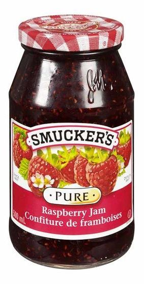
Why am I picking on delicious jam, especially when I have just had a slice of homemade bread lovingly covered with said delicious jam?
Because Smucker’s has made their strawberry and raspberry jam jar designs so similar that it is easy to grab the wrong one, especially if stores shelve them beside each other, which they tend to do (this is also bad design on the part of stores like Save-On-Foods that do this, placing like-colored jams next to each other on a shelf, which is logical enough, but makes it more difficult to tell at a glance that you are looking at different products).
Photographic evidence:
Note that the color difference in the labels is more subtle when you are actually looking at the jars in-person, anticipating their fruity goodness.
Smucker’s has gone with a standard design here, no doubt to reduce costs and provide uniformity, usually considered desirable for a brand. McDonald’s hasn’t messed around with the look of its Golden Arches for a reason.
However, the similarity extends well beyond what is needed for branding and into the sort of obsessive manipulation that is explained in horrifying detail in books like Brandwashed. The logo and typefaces are the same. That’s fine and expected, and Smucker’s certainly can’t be held culpable for both fruits ending in “berry.” But look at the placement of the fruit. Each jar has six pieces of fruit arrayed identically. Further, the size of the raspberries has been boosted to match the strawberries.
Here are some typical strawberries:
And some raspberries:
Raspberries are cute and small. Strawberries are cute and bigger. Strawberries are bigger than raspberries.
Unless they are on a Smucker’s label, then they have been made equals in the world of fruit.
What this means is it’s easy to grab the wrong jar if you’re distracted, in a hurry or if some other evil shopper has mixed the two types of jams together on the shelf.
It could be solved by simply making the picture on each label distinctive while keeping everything else about the label identical. The most obvious fix would be to scale the raspberries to be a bit smaller then slap more of them on the label to compensate. Make it a veritable cornucopia of raspberries. Have them in a cornucopia. Something.
There are, broadly speaking, two types of shirts: with buttons and without buttons.
Putting on a shirt without buttons is easy, you just pull the shirt over your head, stick your arms in the sleeves and you’re done. This can be complicated by having a huge head and the shirt having a tiny neck but it is generally trouble-free.
Putting on a shirt with buttons is not much more difficult, especially if you’re not falling-down-the-stairs drunk. You stick your arms in the sleeves, then button the shirt to the desired level (or sometimes not at all depending on taste/whim/current state of alcohol consumption).
But there is a subcategory of shirts with buttons that is, you guessed it…bad design.
This is a shirt with buttons on the back instead of the front:
Observe how your elbows bend. They bend forward. This is because your hands are made to be used in front of your body. Now imagine you are buttoning up the shirt above. Your hands are twisted around into an awkward position. They are bending the wrong way. It is difficult, perhaps even painful.
Why would someone design a shirt with buttons on the back? To have a clean, button-free look on the front. But there is a solution for this already. It’s called not putting buttons on the shirt.
But what if the buttons are somehow deemed essential to the design? Put them on the front! But what if the designer finds buttons to be hideous and gross? They’re just as hideous and gross on the back, plus they look stupid there. But if the designer absolutely must have buttons and insists that they are ugly, just include a giraffe tie with every shirt to help hide them. Who doesn’t like giraffes?
As soothsayers and Nostradamus wannabes attempt to divine Apple’s product schedule for everything (except the iPhone), let’s pick on the company again for a design that is both ugly and awkward.
This is the Apple iPhone 6/6s Smart Battery Case:
Image courtesy Apple
Or as I call it, “Is that a deck of cards in your case or are you just glad to see me?”
Why it’s ugly: it looks like the case has a large rectangular growth attached to it. I suspect very few would describe this appearance as visually appealing.
Why it’s awkward: Pick up your smartphone right now (if you don’t have one, use your vivid imagination instead) and hold it as you normally would. If you’re like most people, you’ll be gripping at least three fingers along the bottom side edge of the phone. Note in the photo that this would put your fingers right on top of the bulge where the battery pack meets the regular part of the case. Awkward.
This is a surprisingly ugly product from Apple, which usually gets at least the aesthetics right.
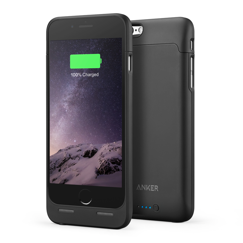
Compare this to the Anker Ultra Slim Extended Battery Case for the iPhone 6/6s:
Sure, the phone is a bit longer as a result but the design actually keeps in mind that people don’t want a lumpy, misshapen phone. It also costs about $80 less than Apple’s battery case while offering 75-90% of the equivalent battery extension.
If you’ve used a USB device over the last twenty years, the following may seem familiar to you:
When it was introduced, the USB port was a major improvement over other means of connecting devices to computers, such as serial and parallel ports. It was smaller, faster and offered support for a much broader array of peripherals.
It did share one aspect with serial and parallel ports, though: it was not reversible. That is, you could only insert a USB cable one way. The right way. Which way was the right way? Looking again at the animation above you might logically think that the right way is the one where the USB symbol is facing up. And you’d be correct–sometimes. Because there was no standard for how ports were oriented. The front-facing ports on my PC, in fact, require the label-side to be facing down. You can tell which way is the right way by examining the port closely but you need to be quite close and most ports are on the back of the computer or are otherwise not easy to eyeball. You could throw out your back trying to figure out how to insert a $10 flash drive.
But even if you know which way is the right way there is something subtly terrible about the way USB plugs works that makes it feel like it’s not going in correctly even when it is. This leads to the triple attempt:
Insert correct way, feel resistance, remove USB cable
Insert wrong way, feel resistance, remove USB cable
Insert correct way again, feel resistance, determine that this is either the actual correct way or you’ve gone mad, decide it is correct and wiggle/push until the USB cable is finally and firmly plugged in
Have a stiff drink at the thought of having to go through this every time you connect a USB device
The newest USB standard, USB-C, is fully reversible. There is the correct way and the other correct way to insert a USB-C cable. I suppose you could try to insert a USB-C cable sideways and that would be incorrect but you would in fact need to be mad or have had too many stiff drinks to think this might work.
Why did the USB spec go through multiple revisions over the course of 20+ years before some clever person said, “Let’s make it reversible”? I do not know. But at least this bad design is now a better one.
See also: every other non-reversible cable in the history of the world.
UPDATE March 30, 2019: The 2019 model of the XPS 13 finally puts the webcam at the top of the screen. The Verge’s review.
In 2015 Dell introduced the XPS 13, a laptop that had such narrow bezels along the sides and top of the display that the 13 inch device was closer in form factor to an 11 inch laptop. This is good design.
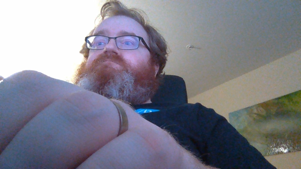
However, a side effect is that the bezel along the top of the display, which normally hosts the webcam, no longer had room for such a device. Rather than skip the webcam entirely, Dell moved it to the lower left corner of the display. This has led to what many have dubbed the nosecam. Peter Bright reviewed the original model on Ars Technica and included this photo of the view the webcam provides:
The webcam that lets you check for ceiling cat
This is one of those “how did this go to production?” things. Except with the refreshed model that came out this year, still featuring the same webcam, this has become a “How did this survive to a second generation?” thing.
Three possible solutions come to mind:
Remove the webcam entirely. If someone wants both a Dell XPS 13 and a webcam, they can buy the webcam separately and clip it to the top of the display, like we did in the olden days with our coal-fired laptops.
Reduce the rather large bottom bezel and expand the top bezel, keeping the total height the same but providing the room needed for proper webcam placement. Obviously I don’t know how difficult the engineering for this would be and perhaps the fact that Dell hasn’t moved the webcam means it is difficult, but even if it is, there’s still option #1.
Put the webcam in a recessed slot on the top of the display. You could press a button/say the magic word and it would pop up, ready to reveal all the embarrassing personal effects in the background you forgot to clear out of sight before launching Skype. There is at least one laptop that uses this design now, though it is possible the XPS 13’s display may be too thin to accommodate this design. Again, there’s still option #1.