An Inspire-d post

After referring to the possibly skeevy nature of the Microsoft Store app Inspire Writer, a fairly shameless Ulysses copycat, I noticed it had a 10-day trial, so I thought I’d download it and have a look. What could possibly go wrong?

The developer is Sunisoft, which describes itself thusly: “Established in 1999, Sunisoft is a developers tools software provider located in Zhu Hai, China. We are committed to providing more effective tools for software developers” (link). It apparently has fewer than 25 employees.

In terms of user interface, this is a straight-up copycat. You have the Library bar on the left, the list of sheets next to it, then the editor next to that. You can toggle these on/off the same way you can in Ulysses.
You can export to multiple sources, including WordPress, which is how I’ve made this post (I’ll edit this if it turns out to not work, and I have to post the old-fashioned way in WordPress).

EDIT: While Inspire recognized all of my settings for my blog (categories, tags, etc.) it produced a simple error dialog every time I tried to export this post to WordPress:
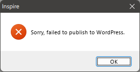
There is an option to configure a proxy, but I have not successfully gotten that to work (yet), either. I'll update this post again if I do. Also, dumping in the straight markdown from Inspire into WordPress leaves a lot of clean-up to do. The rest of my look at Inspire continues below.

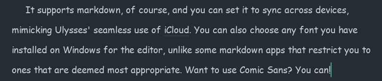
It supports markdown, of course, and you can set it to sync across devices, mimicking Ulysses’ seamless use of iCloud. You can also choose any font you have installed on Windows for the editor, unlike some markdown apps that restrict you to ones that are deemed most appropriate. Want to use Comic Sans? You can!

You know someone will do this.

But there are differences.

Missing features

  • While there is a Dark Mode you can toggle on, there is no support for themes or styles. You get Light and Dark modes, and that’s all. In this way, it feels closer to iA Writer.
  • Some shortcut keys are missing. For example, there is no shortcut for bringing up Preferences. Mac-first apps often use the Mac Preferences shortcut for their Windows versions, which would translate to CTRL-.

Clumsier or simpler features

  • Like Ulysses, Inspire Writer includes a word goal you can modify and invoke by hitting F5. Unlike Ulysses, there is no way to keep the goal open while writing, since its dialog takes control of the UI. You do get a ring icon in the top-right corner of the sheet in the Sheets view, which can be kept open. To its credit, the ring fills dynamically and changes from blue to green when you’ve hit your goal.
  • The documentation is obviously translated, but it’s never difficult to understand, so I don’t knock it too much for this.

Overall, it seems to do all the core things Ulysses does, just without the same degree of polish, and with some “extras” missing. It seems to work well otherwise, but it still feels like it hews a little too closely to Ulysses’ UI and would benefit from breaking free a bit and charting its own course. Ulysses is a fine program, but it’s not necessarily the definitive word on distraction-free writing apps.

I am unsure on what I will do when the trial ends. I really like the way it matches Ulysses’ use of indents, as it’s so helpful when writing fiction and most markdown editors simply don’t include this support or require you to at minimum add in an extra key for it (like hitting Tab), which eliminates the convenience of having indents in the first place.

Why do I care about indents so much, anyway, you may ask. Let me illustrate.
Let’s say there is a scene where two characters are engaged in rapid-fire dialog, like this:

Bob tapped on the desk. “You see this desk here?”
Jim nodded. “Yes. It’s very desk-like.”
“It’s my desk.”
“Says who?”
“Says me.”
“You and what army?”
“The Swedish army!”
“I’m pretty sure Sweden doesn’t have an army.”
Bob sighed. “You need to see more of the world.”
Jim folded his arms. “Yeah? How much more, smart guy?”
“Twelve percent, minimum.”

Now, I was able to write that quickly (never mind the quality) because the indents happen automagically. In most text editors, I’d have to hit Enter twice after every line of dialog to get proper separation of paragraphs. I mean, I absolutely could do this, but having automatic indents is just easier. It’s the one concession to being Word-like that I approve of in a text editor.

All of this is to say, why is is that only a clone of Ulysses matches this feature among all the text editors I’ve tried. I was even hoping Obsidian would somehow have a community plugin that would mimic this, but I haven’t found one. It puzzles me, but maybe it’s a niche feature or considered “wrong” somehow.

Anyway, I will continue to tinker with Inspire Writer during the 10-day trial and render a verdict by the time it ends (curiously, it gives no indication of how much time is left, so I have no idea what will happen when the trial ends. Also, the app has only a single one-star rating on the Microsoft Store, and I’m really curious why).

Addendum: This SEO-y site lists a great big pile of alternates to Ulysses on Windows. I will perhaps go through this list in another post soon.

Totally not a dystopian future thing

Posting “online insults” will be punishable by up to a year in prison time in Japan starting Thursday, when a new law passed earlier this summer will go into effect.

People convicted of online insults can also be fined up to 300,000 yen (just over $2,200). Previously, the punishment was fewer than 30 days in prison and up to 10,000 yen ($75).

The law will be reexamined in three years to determine if it’s impacting freedom of expression — a concern raised by critics of the bill. Proponents said it was necessary to slow cyberbullying in the country

From the story on The Verge: Japan to start jailing people for online insults

Cyberbullying is a real issue, of course. But I’m not a big fan of governments enacting sweeping, yet vague laws that punish people for online behavior. It also doesn’t get anywhere close to addressing what prompts the cyberbullying to begin with. And call me crazy, but in 2022 I am not keen on any allegedly democratic government giving itself this kind of power.

At least our robot overlords are a long way off from being competent enough to take over.

Today’s delightful nugget of irony

I got an email today (which is totally perfect and appropriate for this post) from Medium on various tech stories. One of them is titled We’re Buried Under Email, A Monster of Our Own Creation.

It ends, naturally, with this, which amuses me more than it should:

I’ve been mulling over the whole email thing myself, and my solution lately has been to approach it mercilessly. If I’m getting some kind of flyer that isn’t immediately relevant to me, I unsubscribe or block (blocking only when unsubscribing “mysteriously” fails). This alone has made things more manageable. But it does seem that email is stuck in this weird place, where the general internet is evolving (or devolving) and email mostly stays the same. I don’t have a solution to “fix” email, I’m just content to cut down on what comes into my inbox for now.

My one-emoji review of Apple Books

Ah, Apple Books. I remember when the iPad debuted in 2010 and along with it iBooks, because back then Apple named everything iSomething. Because there were no deals with Canadian publishers in place, the iBooks store in Canada was a virtual empty shelf. This is part of why I ended up buying most of my ebooks from Kobo, something I continue to do today.

But I wanted to give Apple a chance, so once actual books became available, I found one I wanted that was on sale (bonus) and purchased it: Redshirts, by John Scalzi. Now, part of the reason I bought Redshirts is because the publisher specifically sells it without DRM, meaning I could sideload it onto my Kobo ereader and not be stuck reading it only on my phone or iPad. But ho ho, it turns out Apple’s own DRM was still applied, thwarting my efforts and souring me on the experience. I did ultimately get a DRM-free version and read the book on a Kobo device. But it was the last ebook I purchased on Apple Books.

Until today.

BookBub noted that 3,000 Writing & Plot Prompts A-C was on sale for $0.99 from the usual places: Amazon, Kobo and Apple. At that price, it’s an easy impulse purchase because I love lists and some prompts might, er, prompt some writing.

But because it’s only $0.99 (not exactly a huge investment), I thought I’d be wacky and get it on Apple Books. I load up the Apple Books app on my Mac, go to the book’s store page, click the $0.99 button, enter my Apple ID credentials, watch the little spinny circle as the purchase is made, then…nothing. It actually navigates away from the page to a different part of the bookstore. I make my way back to the page with the book of prompts, and it is again showing the $0.99 button. I check my library in Apple Books. The book is not there.

Now, I think I saw something briefly flash on screen after the purchase began, but it disappeared in a blink and never came back. Dare I try the purchase again? Since I had money in my Apple Wallet anyway, I figured what the heck and clicked the $0.99 button again. It spun. I got prompted for my Apple ID credentials. I entered them. I then got another pop-up asking me if I was totally absolutely sure I wanted to buy this book and clicked affirmative. The $0.99 button then changed to a handy READ button because the purchase was now complete.

I don’t know why the second confirmation to buy comes up to begin with, or why it failed to stay up the first time I tried buying (I wasn’t leaning on the mouse or anything), all I know is that when I buy books from Kobo it just works every single time. My experience with Apple on buying books and something not going awry is now 0/2.

Here is my one-emoji review of Apple Books circa 2022:

WWDC 2022 quick ‘n medium-warm takes

I watched the livestream of the WWDC keynote this morning, which was once again an entirely prerecorded presentation. Hooray for multi-year pandemics.

The best part, by far, was the way they really leaned into providing meme-worthy moments with Craig Federgerhi.

At this point, Tim Cook could be replaced by a Tim Cook animatronic figure. He says the exact same stuff every time, the epitome of boring corporate boilerplate. You’re gonna love it (when he stops droning on).

And now the medium-warm takes:

Not surprising:

  • Re-designed MacBook Air. It’s got an M2 chip, it’s $200 more, but still ships with an 8 GB/256 GB ram/SSD combo. Four colors now instead of two, the wedge is gone, MagSafe is back and yes, the notch is there, too. I was not surprised to see they are keeping the M1 Air in the lineup (for now, at least). I predict the M1 version will continue to be the better-selling model, though some might bite on the M2 for one of the new colors. I think those will move people more than the better performance. A shame it still has the same crappy external monitor support.
  • Lock screen improvements for iOS. They’re nice, and continue Apple’s ever-timid move toward more customization.
  • No interactive widgets. I know some were hoping for these, but I was not expecting them. I think there’s a 50% chance they may show up for iOS 17.
  • iPad multitasking. Yes, it’s been improved, with “Stage Manager” that dumps open apps into a column on the left side of the screen, making it somewhat easier to switch between them. The bigger news is that you can now have multiple overlapping and resizable windows open, and there’s full external monitor support (if you have a compatible iPad).
  • Improved watch faces. These were due for a refresh.
  • Improved workout stats, another persistent rumor. They mentioned three for running, which is nice: Stride Length, Ground Contact Time and Vertical Oscillation. I’m still thinking about getting a Garmin watch, though.
  • The Mail app finally gets some updates after a hundred years. This was widely predicted.
  • Redesigned Settings app for the Mac. This wasn’t actually highlighted in the keynote, but was expected. It looks like a Macified version of the iOS Settings app, which will probably work better on the Mac, since the iOS version is a gigantic, disorganized mess.

Surprising:

  • Mac Ventura, not Mammoth. Pretty much everyone got this one wrong.
  • Keeping the 13″ MacBook Pro (with the old design, including the touch bar) and simply putting an M2 in it. With the redesigned Air, I fail to see who would buy the entry level Pro, but someone must, since Apple claims it’s their #2 best-selling laptop.
  • Dropping support for watchOS 9 for the Series 3…then continuing to sell the Series 3. Bad Apple.
  • Dropping support for the iPhone 7 with iOS 16. I thought this might get one more year.
  • Apple has baked in using an iPhone as a webcam into macOS. Less surprising: Belkin is making clips to hold the phone to the top of the Mac’s display.
  • Clock app on Mac. Kind of weird, but why not? Basically the version found on the iPhone.

Somewhat surprising:

  • Not a peep about AR/VR, realityOS or related hardware. I suspect, given the presentation ran a bit shorter than the last few WWDC keynotes, that a segment was cut when Apple realized the hardware needed more time in development.
  • No news on the updated Mac Pro or a replacement for the Intel Mac mini still in the line-up. I assume both are not ready yet, or are being held back for a dedicated Mac event in the fall.
  • Weather app for iPadOS! Hey, it was either this or a calculator. It looks like it’s on Mac, too, though it wasn’t specifically highlighted.
  • Revamped Home app. Some had predicted this, but I was skeptical, since nothing short of a complete rewrite would really fix the Home app–which is what Apple has done!

Overall, the keynote was pretty predictable, with the usual mix of features that look promising. I still don’t get the M2 MacBook Pro, though. Why redesign the Air and keep the Pro untouched? Do they only have enough people to work on one model at a time? 😛

Making your point a little too effectively by accident

I got this in an email today and find it amusing.

When I clicked the broken image link, I was disappointed to find that the article was not advocating a return to rotary phones, but rather how neat it is to use a pen with a notebook. And yes, it’s great, until you want to find something you wrote somewhere in the middle of the 200 pages of notes you’ve scribbled incoherently. And if you keep your paper notes meticulously indexed and organized, YOU ARE A VERY WEIRD PERSON. Not bad, just weird.

Apple: Mucking up your music since 2001

Oh, Apple. How do you manage to take something that works and break it in such wonderful ways?

The other day I went for a run and decided to listen to the Jon and Vangelis album The Friends of Mr. Cairo. I had previously downloaded it from Apple Music onto my iPhone (the downloaded part is important–this saves me bandwidth because I don’t need to stream the music over cell while I’m out running). I had listened to the album on runs before, and had no issues.

This time I noticed something different.

The previous night, I had added two other Jon and Vangelis albums on my Mac–added, but not downloaded. These were faithfully reproduced (but not downloaded–as expected) on my iPhone’s Music app. All good so far.

Except the first song, “I’ll Find My Way Home” was no longer part of The Friends of Mr. Cairo. It was now part of another album, but only listed by itself. The two albums are:

  • The Friends of Mr. Cairo (Remastered) — the one that previously had all the songs from the album, but was now missing “I’ll Find My Way Home”
  • The Friends of Mr. Cairo (2016 Remaster) — which only has “I’ll Find My Way Home” and nothing else

Yes, by adding these other albums, the Apple Music app apparently tried to fix something that was not broken and now has split the single album across two separate albums, apparently pulling from two different versions or just two of the same but with slightly different names. For my run, I had to create a playlist just to play the actual album in order. I guess that helped warm up my fingers. I named the playlist in a crude, but I think fair, manner:

To fix this I had to delete both copies from my iPhone, then download the 2016 remaster, except the first time it only grabbed one song (this isn’t even the downloaded part, just getting the actual list of songs), the second time it grabbed two and the third time, by some miracle, it grabbed all seven tracks and downloaded them without setting my phone on fire.

Now to see if this actually stays in place or if Apple’s secret and evil gnome magic will start splitting it up into multiple albums again.

I could have been eating a cookie instead of doing all this. A yummy cookie.

Bad Apple.

And the music plays on (very briefly)…

Today I was feeling all nostalgic up in the hizzy and dug out two old music players, my 7th generation iPod nano and a Sansa Clip. Here they be:

iPod nano 7th generation and Sansa Clip

The Sansa Clip is the older of the two. It was the first MP3 player I got for running and it worked well, being extremely light, compact and having a clip that let you easily attach it to your shorts, shirt or gorgeously braided hair. I believe I got it in 2009, the same year I started jogging (I ended the year by doing my first 10K run and can’t imagine I would have done so without musical accompaniment). The one downside is the storage was a mere 2 GB, so it could only hold a hundred or so songs–enough for a run, but not a whole lot of variety.

The iPod nano I got in 2012 and replaced a 5th generation one. It featured some nice improvements:

  • Lightning port instead of the 30-pin connector
  • Bluetooth, although I never actually used it
  • Super light and thin, yet sturdy in construction
  • 16 GB of storage, which couldn’t hold my entire music collection at the time but got close enough that I felt I wasn’t really missing anything I’d like to listen to while on a run
  • Built-in Nike+ app that no longer needed a foot pod to track steps/runs
  • It looks like an adorable miniature iPhone (running iOS 6, though it didn’t actually run iOS)

I used the nano (which was the last one Apple made, discontinuing it in 2017) until I switched over to using a smartphone to track runs, the first being an iPhone 5c. I quite liked it, though the touchscreen would go wonky when it got wet, making it less than ideal for soggy runs (not to be confused with having the soggy runs–ew). To be fair, the Apple Watch I now use has the same issues in the rain, although you can turn off the touch to prevent phantom taps and such. In the nano’s favor, it could transfer music about a billion times faster from my PC vs. transferring music from my phone to the Watch, a task that takes so long I have given up on doing it.

I kind of miss these dedicated single-purpose devices. Because they only did one thing*, the UI and buttons were very focused on driving that experience. This was especially appreciated for activities like running where you don’t want to fiddle with multi-level menus and excessive clicks.

Both devices still power up, as you can see from my pic. The Sansa Clip battery appears to be almost completely dead, though. It only stays awake for a few moments before warning the battery is low, even after charging. The nano is better, but even it looks like it would only last a fraction of what it normally might. Not surprising for something 10 years old. I wonder if the battery can be replaced? Hmm.

* Technically the iPod nano could do more than play music, as you could listen to podcasts, watch videos or look at photos, I didn’t do any of these things with mine, however.

My anti-subscription crusade begins anew!

One of the worst parts of Apple’s App Store success has been the move (encouraged heavily by Apple) toward Software as a Service (SaaS). This benefits both the developer and Apple because:

  • The developer gets a continuous revenue stream via ongoing subscription
  • Apple gets a continuous cut as it takes 30% of every subscription collected, in perpetuity (this can drop to 15% under some conditions)

This does not benefit the consumer, as they now might pay $50 per year in perpetuity for an app that once cost $50 total. In theory, the primary benefit to the consumer is ongoing, active development of the application, with the revenue stream providing stability the developers would lack if they sold their programs as a one-time purchase option.

I think that argument is largely bunk, and it made me stop using Ulysses for about a year and a half before I finally acquiesced and got a sub for it at a 25% off rate. But no more!

I have canceled or opted to not renew the software subscriptions I have, with a few exceptions.

A list! That is also a table! This shows the before and after apps, but not in that order.

Subscription-free replacementSubscription-based app that was replaced
Diarium (journaling)Day One
iA Writer, Scrivener (writing)Ulysses
Affinity Photo (image editing)Adobe Photoshop
Affinity Designer (vector image editing)Adobe Illustrator
Obsidian (note-taking)Craft

And the exceptions for which I still pay a subscription:

  • Microsoft 365. This is the family version, so it allows both me and my partner to access all the apps. While I do use Excel and Word sometimes, the main benefit of this is the 1 TB of OneDrive storage.
  • TickTick. I decided to try the paid version for a year, to see how it compares to going free. The calendar view, which is not available in the free version, turns out to be something I literally never use.
  • Todoist. I couldn’t decide between this and TickTick, so I am running both in tandem. It’s silly, but I’m a silly person. In six months I’ll pull the plug on at least one of these.

If you are software savvy™ you might note that some of the software that have subs can be used for free, albeit with some features disabled (Craft, Day One), while others, like Ulysses, cannot be used at all, apart from a brief trial period. Note also that none of the subscription apps are bad–they are all quite good, and some are industry standards (Photoshop, for example). And while it looks like it takes two apps to replace Ulysses, iA Writer and Scrivener have very different focuses and, unlike Ulysses, are cross-platform, which is another thing I’ve decided is critical to the software I use. All the replacement apps are available on Windows and macOS. In fact, they all have iOS versions, too.

If I end up having giant regrets over switching to the apps listed in the table above, I will make a follow-up post, complete with a well-chosen “I’m very remorseful” image. For now, I think this is the right call. I save money and also help support a model I prefer. Win-win!

iPod, 2001-2022

gray ipod classic
This stock photo actually looks just like the one I have! Photo by Pixabay on Pexels.com

As reported all over the internet today, Apple has discontinued the iPod Touch and with it, the iPod as a brand is officially dead. Here’s Apple’s statement, which is a big marketing push for Apple Music and new devices that work with the service, and a brief look back at the various iPod models, in that order.

Although I had used Macs in the past (even way back when they called them Macintoshes), the iPod was my first Apple purchase. I had a 4th generation model with 20 GB of storage. I never filled it up before I got my second iPod, an 80 GB Classic, which I most definitely never filled up. I still have the latter, and it works just fine, though the music on it is frozen in time, consisting entirely of stuff ripped from CDs I stopped buying years ago.

Like most people, my full-size iPod eventually got replaced by a smartphone, but I stayed with the line when it came to a device to use while running, going with the ultra-portable iPod nano. I had the last couple of generations, the weird one that included a video camera of all things, and the final model, that looked a bit like a miniature iPhone, but did not actually run iOS. I always felt the perfect version of that would have been a 32 GB model, but Apple never went beyond 16 GB. Even back then, it forced me to choose what to put on the nano and what to leave off. Although it had issues with the rain, it was otherwise great for running because it was so small, thin and weighed nothing. If Apple made a modern version with 32 GB of storage, Bluetooth and support for Apple Music, I’d totally buy it. But alas.

Farewell to iPod, which helped save Apple and turn it into the soulless behemoth it is today.

Another “No need to read anything but the headline” story, Twitter edition

Elon Musk is buying Twitter. Engadget uses the ultimate Dorsey photo for its story on Dorsey’s endorsement of the move. I mean, come on. I’m not saying I object, but this is “shooting fish in a barrel” territory. Tie-dyed hippie fish.

Engadget story: Jack Dorsey on Musk’s Twitter takeover: ‘Elon is the singular solution I trust’

I have heard Twitter described many ways, but “light of consciousness” was not one of them. I picture someone shining a flashlight up someone’s butt.

Shhh, let people enjoy things

I saw this posted in the comments of this Ars Technica article on mechanical keyboards (I am typing this on my Keychron Q1 mechanical keyboard and the CLACKS are so very satisfying). It was in response to someone writing that “Mechanicl (sic) keyboards are the nerds’noisy crotch rocket.”

It is my favorite thing on the internet today, and something I will try to remember when someone likes something I don’t like.

Credit to Adam Ellis

Know Your Meme explainer: https://knowyourmeme.com/memes/let-people-enjoy-things