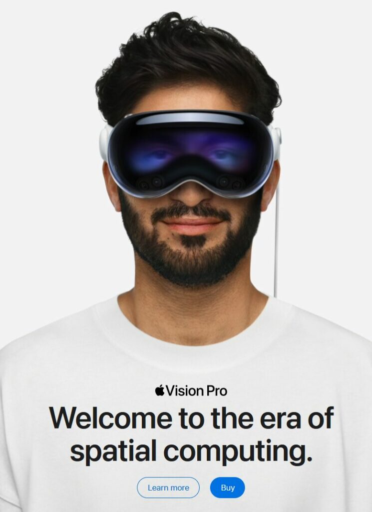
UPDATE, July 133, 2024: Apple is promoting the Vision Pro on the Apple Canada site, as it is now available for purchase by moose and other Canadians.

The image on the landing page is below. It basically reverses everything I list about the original image in this post.

Original post:
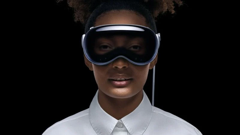
If you’ve seen anything about the Vision Pro, Apple’s new don’t-call-it-AR headset, you’ve probably come across this photo:

I’m here to tell you why it’s creepy and bad, and Apple should feel bad for using it.
In a list, of course!
- The black void behind the person is off-putting. Where is she? Is she just floating in nothing?
- The ultra-white starched dress shirt with the buttons done up to the top. This is incredibly twee and so very Apple. It’s a look that comes pre-dated. No one dresses like this.
- The light around the fake eyes make them look dopey, as if the person is tired and wants a nap. They also look unreal and your brain will constantly be reminding you of this every time you see them.
- The slightly-parted mouth is off-putting. She’s not smiling1You may argue that she is, in fact, smiling, but the fact that we have to debate it proves the point. So says I!, so why is she showing her teeth? It’s like she got a shot of Novocaine and her jaw is hanging slightly slack as a result. Also, the way the light bounces off her lips and chin is unnatural. Is she holding a flashlight at her waist and pointing it up? I used to do that to tell spooky stories when I was 12 years old. I also didn’t need a $3500 headset to do it.
- The hair. It’s hipster hair. I’m willing to let this one go, though, because it is, in the end, just hair.
- The ears do not look like they are part of her head. Again, this is a lighting issue.
- Airbrushing. Yes, every face gets airbrushed in ads, and it still makes the skin look plastic and fake, like a glossy mannequin.
Other than the above, it’s a perfect photo to represent Apple’s Vision Pro don’t-call-it-AR headset (it’s totally AR).
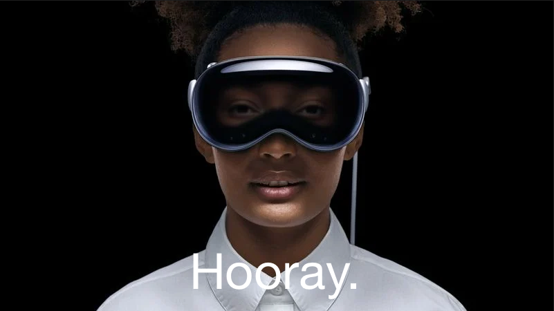
EDIT: I made the following on request.


