
Today, Instagram updated its logo wordmark. CNET had a nice image of the before and after, presented below as after and before:
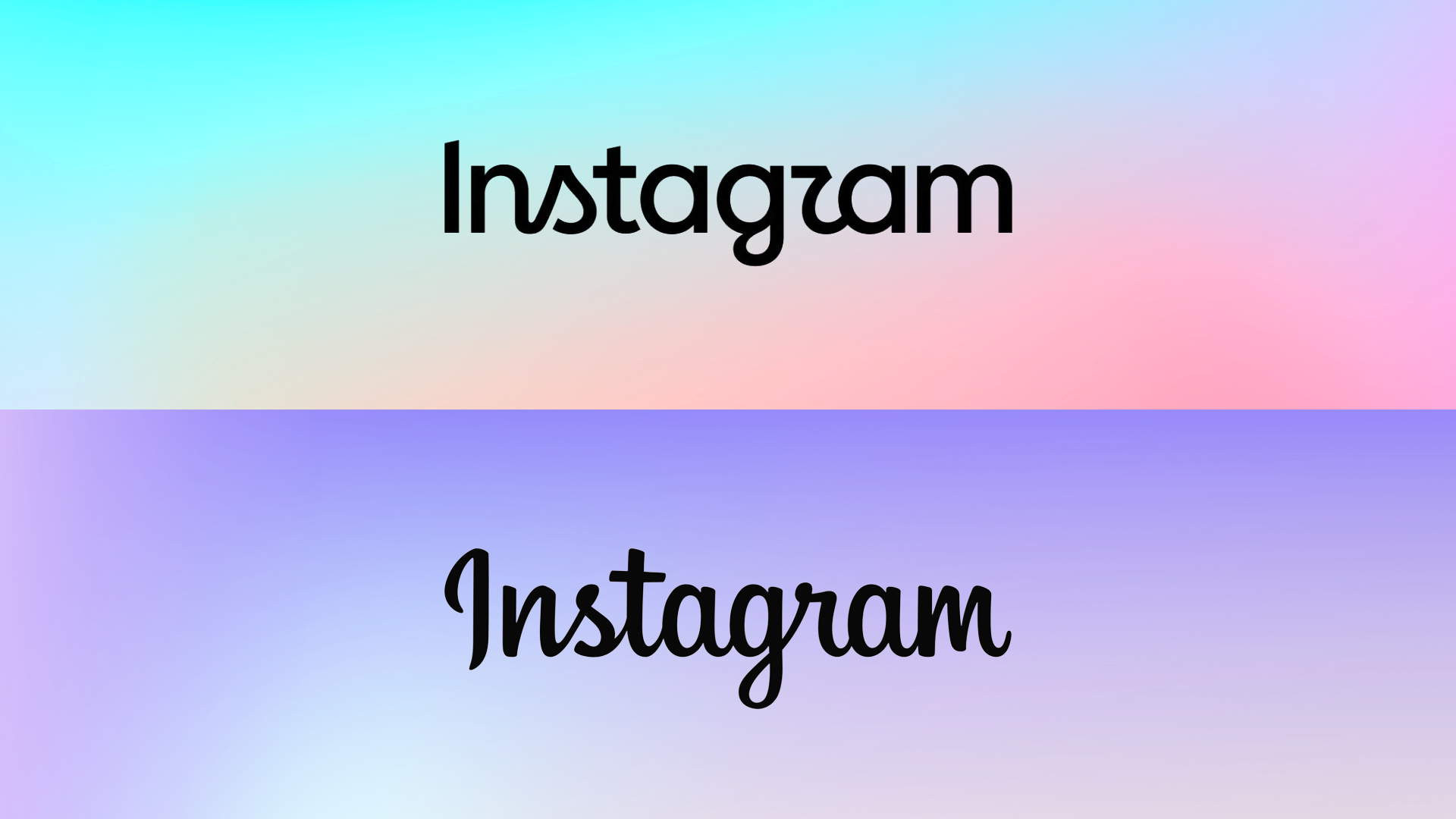
Although I don’t think AI was used in the creation of the new logo, it still smells of it in the way AI messes up things, like:
- Goofy kerning
- Goofy mix of cursive and non-cursive letters (apparently trying to call back to the previous logo the same way someone riding a bike off a picnic table and crashing calls back to Evel Knievel)
- Goofy letters (notably the R, G and S. Someone on Ars Technica commented that the S looks like a side boob and now I can’t unsee it.)
- Despite all the above, still looking limp and bland
Speaking of Ars, their creative director Aurich Lawson wrote a rare and relatively brief article offering his thoughts on the redesign (spoiler: Like most of the internet, he does not like it).
My take? Yes, it’s bad. The old logo is instantly recognizable, legible and stylish. The new one is a graceless “reeks of committee” thing. It’s also exactly the kind of logo I’d expect a big (and awful) tech company like Meta to produce in 2026.
This led me to other logo redesigns of recent years, such as the also awful one for Pringles:
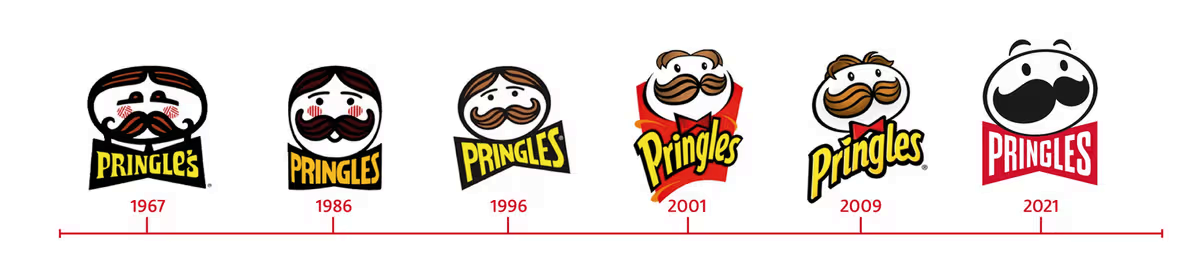
Here, I think they really hit it in 2009, though 2001 is pretty good, too. The flattened, gormless 2021 redesign is so bad that the longer you look at the face, the less it looks like a face and just a set of weird shapes. It also inspired me to do this:

You’re welcome!
Another good (bad) example is Jaguar’s recent logo redesign:
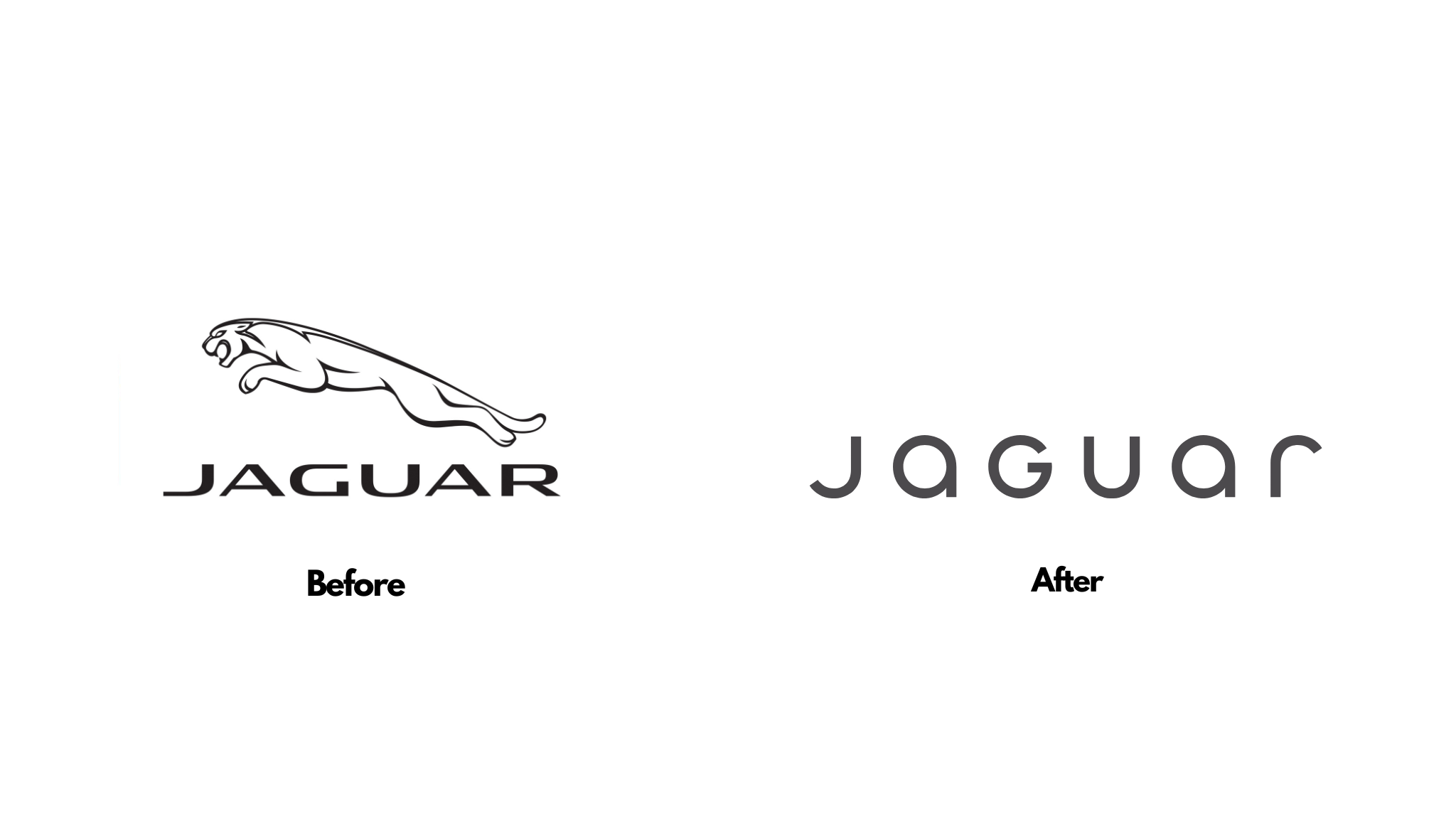
It went from instantly recognizable to something absolutely generic that says nothing (it’s still way better than Instagram’s, even at that).
In conclusion: Logo design is a fine balancing act between art, character, and image (the type you project). We live in an era where almost every logo out there is being flattened, simplified and stripped of all character and identity (see also: Jaguar’s impressively bad update). The only reason I can think why this is happening is companies are going cheap by making logos so simple they can be slapped on anything at any size with no need for adjustment. If it’s not this, then somehow bad design has become good design, the same way 2 + 2 = 5.