Last minute Apple “Far Out” event predictions (updated)

UPDATED: I have updated my amazing predictions, post-event.

Actually, I don’t have any. But I am amused at how pretty much everything gets leaked ahead of time and yet Apple still clings tenaciously to its super-high levels of secrecy, as if they are unaware of the entire rest of the world existing around them (Steve Jobs snarkily acknowledged this in his keynotes, at least).

Apple is big, conservative, and evil, but in a banal sort of way. They are also becoming victims of their own hubris, thinking their Apple Poo™ smells better than other poo. It does not, it just costs more.

Okay, here are some predictions:

  • New iPhone models
  • New Watch models
  • Updated AirPods Pro, with updated (higher) price
  • Previews of Apple TV+ shows that no one will care about (even if they end up watching some of the shows)
  • Tim Cook will tap dance in the opening segment. Okay, he’ll actually just recite corporate boilerplate in that supremely bland way of his, but I would buy a new iPhone if he tap danced instead. UPDATE: No tap dancing, but he did kind of shimmy in place a bit, with lots of hand gestures, which could be interpreted as “white guy dancing”.

WWDC 2022 quick ‘n medium-warm takes

I watched the livestream of the WWDC keynote this morning, which was once again an entirely prerecorded presentation. Hooray for multi-year pandemics.

The best part, by far, was the way they really leaned into providing meme-worthy moments with Craig Federgerhi.

At this point, Tim Cook could be replaced by a Tim Cook animatronic figure. He says the exact same stuff every time, the epitome of boring corporate boilerplate. You’re gonna love it (when he stops droning on).

And now the medium-warm takes:

Not surprising:

  • Re-designed MacBook Air. It’s got an M2 chip, it’s $200 more, but still ships with an 8 GB/256 GB ram/SSD combo. Four colors now instead of two, the wedge is gone, MagSafe is back and yes, the notch is there, too. I was not surprised to see they are keeping the M1 Air in the lineup (for now, at least). I predict the M1 version will continue to be the better-selling model, though some might bite on the M2 for one of the new colors. I think those will move people more than the better performance. A shame it still has the same crappy external monitor support.
  • Lock screen improvements for iOS. They’re nice, and continue Apple’s ever-timid move toward more customization.
  • No interactive widgets. I know some were hoping for these, but I was not expecting them. I think there’s a 50% chance they may show up for iOS 17.
  • iPad multitasking. Yes, it’s been improved, with “Stage Manager” that dumps open apps into a column on the left side of the screen, making it somewhat easier to switch between them. The bigger news is that you can now have multiple overlapping and resizable windows open, and there’s full external monitor support (if you have a compatible iPad).
  • Improved watch faces. These were due for a refresh.
  • Improved workout stats, another persistent rumor. They mentioned three for running, which is nice: Stride Length, Ground Contact Time and Vertical Oscillation. I’m still thinking about getting a Garmin watch, though.
  • The Mail app finally gets some updates after a hundred years. This was widely predicted.
  • Redesigned Settings app for the Mac. This wasn’t actually highlighted in the keynote, but was expected. It looks like a Macified version of the iOS Settings app, which will probably work better on the Mac, since the iOS version is a gigantic, disorganized mess.

Surprising:

  • Mac Ventura, not Mammoth. Pretty much everyone got this one wrong.
  • Keeping the 13″ MacBook Pro (with the old design, including the touch bar) and simply putting an M2 in it. With the redesigned Air, I fail to see who would buy the entry level Pro, but someone must, since Apple claims it’s their #2 best-selling laptop.
  • Dropping support for watchOS 9 for the Series 3…then continuing to sell the Series 3. Bad Apple.
  • Dropping support for the iPhone 7 with iOS 16. I thought this might get one more year.
  • Apple has baked in using an iPhone as a webcam into macOS. Less surprising: Belkin is making clips to hold the phone to the top of the Mac’s display.
  • Clock app on Mac. Kind of weird, but why not? Basically the version found on the iPhone.

Somewhat surprising:

  • Not a peep about AR/VR, realityOS or related hardware. I suspect, given the presentation ran a bit shorter than the last few WWDC keynotes, that a segment was cut when Apple realized the hardware needed more time in development.
  • No news on the updated Mac Pro or a replacement for the Intel Mac mini still in the line-up. I assume both are not ready yet, or are being held back for a dedicated Mac event in the fall.
  • Weather app for iPadOS! Hey, it was either this or a calculator. It looks like it’s on Mac, too, though it wasn’t specifically highlighted.
  • Revamped Home app. Some had predicted this, but I was skeptical, since nothing short of a complete rewrite would really fix the Home app–which is what Apple has done!

Overall, the keynote was pretty predictable, with the usual mix of features that look promising. I still don’t get the M2 MacBook Pro, though. Why redesign the Air and keep the Pro untouched? Do they only have enough people to work on one model at a time? 😛

iPod, 2001-2022

gray ipod classic
This stock photo actually looks just like the one I have! Photo by Pixabay on Pexels.com

As reported all over the internet today, Apple has discontinued the iPod Touch and with it, the iPod as a brand is officially dead. Here’s Apple’s statement, which is a big marketing push for Apple Music and new devices that work with the service, and a brief look back at the various iPod models, in that order.

Although I had used Macs in the past (even way back when they called them Macintoshes), the iPod was my first Apple purchase. I had a 4th generation model with 20 GB of storage. I never filled it up before I got my second iPod, an 80 GB Classic, which I most definitely never filled up. I still have the latter, and it works just fine, though the music on it is frozen in time, consisting entirely of stuff ripped from CDs I stopped buying years ago.

Like most people, my full-size iPod eventually got replaced by a smartphone, but I stayed with the line when it came to a device to use while running, going with the ultra-portable iPod nano. I had the last couple of generations, the weird one that included a video camera of all things, and the final model, that looked a bit like a miniature iPhone, but did not actually run iOS. I always felt the perfect version of that would have been a 32 GB model, but Apple never went beyond 16 GB. Even back then, it forced me to choose what to put on the nano and what to leave off. Although it had issues with the rain, it was otherwise great for running because it was so small, thin and weighed nothing. If Apple made a modern version with 32 GB of storage, Bluetooth and support for Apple Music, I’d totally buy it. But alas.

Farewell to iPod, which helped save Apple and turn it into the soulless behemoth it is today.

On Apple re-using the A15 in the iPhone 14 and other numbers

black smartphone on the table
Will people care what’s inside this slab? Photo by Martin Sanchez on Pexels.com

Mark Gurman on Apple re-using the A15 chip in the base model iPhone 14 this year:

Giving the 14 Pro a speedier chip also adds another bullet point to the list of reasons consumers might choose the $1,000 model over a $700 one. An extra camera lens, ProMotion and a stainless-steel frame instead of aluminum probably aren’t actually worth an extra $300 to a lot of people.

I agree with his take regarding ProMotion (I’d bet most people don’t even know what it is) and the stainless steel frame (it’s a fingerprint magnet, so it never looks nice and if you have a case, you’ll never see it, and it also adds even more weight to an already heavier phone), but I think the better/extra cameras are one of two main reasons people buy the “Pro” models, with the other being that if you want the biggest phone, you have to get the Pro model, there is no other alternative (rumor also has it that Apple will feature a “regular” iPhone model in the larger size this year, so this may change).

But I disagree that making the A16 exclusive to Pro models will move the needle on sales in any measurable way, save for tech nerds who can’t fathom not having the best of the best with their tech, and the reason is that all iPhones have SoCs that are already fast enough with room to spare. The A16 might offer a better specs page than the A15, but in actual use, I would bet virtually no one would be able to tell which is which when using an iPhone.

This is just another way for Apple to save money without passing it onto the consumer–one of the key ways the company has grown so massively big. I submit it will also be a factor in its downfall, though that will happen much more slowly than its near-collapse in the 1990s–but it will happen. I may scratch out some more thoughts on this later.

On the one hand, I think most people won’t care if Apple re-uses the A15 in their base iPhone 14 (they should lose the numbers to describe the phones, too, but that’s another discussion). On the other hand, if the phone has the same design, same A15 and little else in the way of hardware changes, is it even an iPhone 14 at all? Why would someone buy one over the iPhone 13? (Apple will likely take care of this by discontinuing the iPhone 13, so there is no choice to be made). I suspect what Apple will do is present the base model as kind of an “oh, and we still have the great iPhone 14” while quickly glossing over its mostly not-new specs, then spend most of their presentation time lavishing praise on everything the “Pro” models have, and you should totes buy one, or you’re missing out!

And yes, I am putting “Pro” in quotes because of the reason addressed in The Verge article–it’s a meaningless term for a smartphone. It’s just the more expensive, feature-laden model. There’s no “pro” way to use a phone.

Anyway, that’s my long, rambling warm take on the possibility of the iPhone 14 re-using the A15 chip. Why ramble on this at all? I’ve decided if I have thoughts on these things, I’m just going to throw them out there. It keeps me writing and my keyboard makes a pleasant clack when I type.

On the Apple Studio Diplay’s webcam

Jason Snell (emphasis mine):

And yes, there’s hardware beyond the display itself. Most notably, Apple has placed the widescreen 12-megapixel camera that has spread across the entire iPad line in the top bezel of this display and enabled Center Stage. This is the first time that Macs have been able to take advantage of the automatic pan-and-zoom technology—and a desktop monitor is a perfect place for it, since so many of us sit at our desks doing video calls these days.

John Gruber:

I don’t really understand why Apple chose to support Center Stage with the Studio Display, and thus use this ultra-wide angle camera, in the first place. Center Stage feels clever and useful on iPads, which are often handheld and often positioned in all sorts of different angles and dynamic positions. But how is that [Center Stage] a good choice for the camera on a big desktop display that isn’t intended to move around, and which you tend to sit in front of in a fixed position?

Unsurprisingly, the Apple tech crowd have soft-pedaled their criticisms of the monitor, which is in the end an overpriced run-of-the-mill IPS monitor with some nice but strictly speaking unnecessary features (speakers, webcam, microphones) and ludicrously doesn’t include an adjustable stand. Gruber’s indirect reference to this is embarrassing cover for Apple (emphasis mine):

My review unit is the $1600 base model with the standard glossy finish and tilt-only base. On my desk, it’s the perfect height; if I had the model with the adjustable-height base, I’d probably set it at this exact height anyway.

Because everyone in the world is the exact same height as John Gruber, so obviously an adjustable stand is no issue being a $400 extra, amirite? Why include it when the monitor is already THE PERFECT HEIGHT. (Yes, I know Gruber isn’t literally saying this, it’s still stupid.)

Also, the power cord is permanently attached to the back of the monitor. What the actual heck, Apple? Did their design team journey back to the 1980s for reference? Just appalling, lazy, consumer-hostile choices all over the place on this.

UPDATE, March 21, 2022: It turns out you can remove the power cable on the display, if you have a special tool from Apple made just for the task. I think what we are seeing here really is Apple stepping back into the 1980s and the days when nearly everything they made was locked down and/or proprietary.

I kind of hate Apple now, even as they have finally started to turn around Tim Cook’s disastrous stewardship of the Mac.

Hot takes on the future of the iMac 27 inch all-in-one

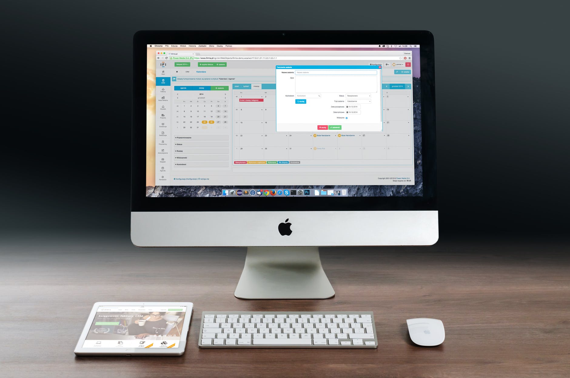
silver imac apple magic keyboard and magic mouse on wooden table
iMac 27″, 2009-2022, RIP. Photo by Pixabay on Pexels.com

After Apple’s March 8 event, they did a curious thing–they removed the 27″ iMac from its site. Apple later confirmed that it was gone, dead, fini.

Here are various Mac dudes from the internet on what they think this means in terms of a potential replacement:

John Gruber (Daring Fireball): I can’t speak to the rumors, but product-fit-wise, I think the 27-inch iMac doesn’t have a spot in the lineup anymore. I think the Mac Studio and Studio Display fill that spot. It even makes sense in hindsight that the consumer-level iMac went from 21 to 24 inches, if it’s going to be the one and only iMac.

Stephen Hackett (512 Pixels): I think it’s more likely that we see the iMac Pro resurrected as an all-in-one companion to the Mac Studio. This could take place even with Ternus’ wink-and-nod show at the end of today’s event.

Jarrod Blundy (HeyDingus): I’m not sure where that puts the future for a larger iMac. The 27-inch Intel iMac is gone from Apple’s website. Maybe they’re going to introduce a larger size with the M2 iMac. Or perhaps they’ve decided that at 24-inches and 4.5K resolution, it handily splits the difference between the old 21-inch (4K) and 27-inch (5K) iMacs.

Jason Snell (Macworld): We’ll see how the Mac Studio performs when it arrives on March 18, but it seems clear that Apple has decided to redefine the iMac’s place in the product line. Instead of packing it full of power, it has left that for the Mac Studio…While I hope that, in time, there’s a larger and more capable iMac for those who want one, I’m happy that the iMac is no longer the compromise users make because they don’t want a Mac Pro.

Mark Gurman (Bloomberg): FYI: Still expecting an iMac Pro, for those wondering. M2 versions of the Mac mini, MacBook Pro 13-inch and 24-inch iMac are also in development.

My take on the takes: Gurman has been pretty accurate with his sources over the last year or so, and I feel like Apple will continue a 27″ form factor all-in-one, but that they didn’t have one ready to go for this event. Why they decided to drop the current 27″ iMac in the meantime, I can’t say. Maybe supply was drying up and they didn’t want to keep making them with an eventual replacement coming?

Of all the takes, Gruber’s is the one that doesn’t immediately hold up as well, because some simple math shows how implausible it is. As Hackett points out, a base Mac Studio plus Studio Display is twice the price of a base 27″ iMac. Now, Apple has done this sort of thing before–the $3,000 “trashcan” 2013 Mac Pro was replaced with a $6,000 version in 2019–but I don’t think that’s what is happening here. In the case of the Mac Pro, they replaced a like model for a like model–a Pro for a Pro. The Mac Studio is clearly meant for professionals where a base 27″ iMac clearly was not, since it cost $1799. One final thing to add here: You could pair a Mac mini with a Studio Display monitor to bring the overall price down, but even that comes out to well above what the base 27″ iMac cost. I just don’t think it adds up–literally!

What this does mean, I think, is Apple is continuing its (absurd) strategy of equating size to “pro” (I guess we should be glad they don’t sell TVs. Anything above a 48″ model would be priced as a Pro model and cost $1,000 more). If Gurman is right, the next 27″ iMac will be more like the (also discontinued) iMac Pro, meaning a consumer-level iMac with larger display is effectively dead, but the 27″ (or larger) iMac will live on as a higher-priced “pro” machine.

UPDATE, February 16, 2024: It's almost a year later and I've changed my mind. The 27" iMac is dead, the only all-in-one model that will persist is the current 24" model. The reason Apple killed the 27" iMac because its price couldn't be justified next to the overpriced and overengineered Studio Display, which is essentially the same 5K display the 27" iMac had, and costs $1600--only $200 less than the entire 27" iMac used to.

My hot take on Apple’s March 8, 2022 event

A list!

  • iPhone SE: Unexciting but necessary update. Bumping the price by $30 seems like classic Apple penny-pinching, but is more likely due to the addition of 5G. The design is looking a tad dated, but for people who prefer Touch ID, this is it.
  • iPad Air: I don’t know why anyone would buy the 11″ iPad Pro now. This should be the “regular” iPad but Apple is pitching it exactly as if it was a “Pro” model. Muddled marketing at its best. Yes, there are differences between this and the 11″ Pro, but they are mostly meaningless. I almost wonder if Apple is going to kill off the 11″ model altogether. They seem to like equating “Pro” to size (which is dumb).
  • Green iPhone 13: It’s green. Do new colors midway between models really goose sales? I guess they must. Also, the sizzle reel showing off the color was almost disturbing with its jagged, sharp-edged imagery that also included a praying mantis because I guess they’re green?
  • Baseball on Apple TV+. Timing is embarrassing, with the season start in limbo due to a labor dispute. Also, boring. Sorry, baseball fans.
  • Mac Studio: Basically a phat Mac mini, but given that the Intel Mac mini lives on in the line-up, this is not intended to be a replacement for a higher end Mac mini, but its own thing, an in-between machine that sits between the mini and the Mac Pro. I think Apple got this mostly right. The top end model is expensive, but cheaper than the current Mac Pro, so I guess that’s some kind of progress. Apple actually put ports on the front. The world did not end. Why did it take decades for Apple to get over its form before function fetish? I don’t know. But this is a solid little powerhouse.
  • On the other hand, the new Studio Display is overpriced and loaded with dubious features (does it really need a good sound system with spatial audio?) The worst aspect is the included stand is literally the terrible tilt-only stand used on the 24″ iMac and if you want something height-adjustable (you know, like every other monitor on Earth) it will cost $400 extra ($500 Canadian). This is obscene and disgraceful. I honestly don’t know how Tim Cook can justify this kind of consumer-hostile bullshit. A height-adjustable stand is table stakes, not a premium extra. Absolutely disgusting, the nadir of everything Apple has come to represent at its worst. I think it casts a pall over everything they announced. Yes, I have strong opinions on this!

Overall, I am getting kind of tired of these events. Really, everything could have been a press release, none of it was particularly noteworthy. The Mac Studio is nice, but not really a revolution, it just demonstrates that Apple can sometimes move beyond its conservative timidity with its product lines. And even now people out there will be crying that it makes the line confusing and no one will know what to buy, etc. Bah.

On a scale of 1 to 10 Polishing Cloths, I rate this event 4 out of 10 Polishing Cloths.

The MacBook Pro Pro

It just occurred to me that the MacBook Pro with the M1 Pro chip can be called The MacBook Pro Pro. I kind of like it, it sounds cute. It also underscores how Apple is bad at names.

Meanwhile, I am still mulling over my Mac situation. After getting DisplayLink (mostly) working with my M1 MacBook Air, I’m seeing my options as:

  • Do nothing
    • Pro: Zero cost
    • Con: All the fiddly bits with using the M1 Air remain
  • Trade the Air for an M1 Mac Mini
    • Pro: Minimal increase in cost, supports two external displays without hacks like DisplayLink, takes up less space
    • Con: Can’t pick up and go for when I want a portable machine. To be fair, the last time I used a laptop outside of home was over two years ago and the Air has never left my desk.
  • Trade the Air for a MacBook Pro Pro/Max 14″ model
    • Pro: Supports multiple displays without hackery, can still be used on the go if needed, more powerful system for video editing, modeling and drawing, all of which I am doing a lot more of now
    • Con: Expensive, unlikely to utilize the actual laptop part, so the snazzy mini-LED display would be largely wasted, may encounter first gen issues
  • Trade the Air for a higher-end Mac mini
    • Pro: All the advantages of the M1 Mac Mini, but with more power
    • Con: Doesn’t actually exist yet, will be more expensive

Options I’m not considering:

  • Any iMac. Despite the simplicity, I already have two QHD monitors and don’t want or need an all-in one computer
  • Mac Pro. Way too expensive, obsolete as it runs on Intel chips and any replacement will be, if anything, even more expensive still
  • Entry-level MacBook Pro. Right now it offers little over the M1 Air and a newer version sounds similarly non-compelling, an awkward compromise between the Air and the high-end Pro laptops.

There’s a rumored Apple event for March 8th, which is supposed to reveal the newest iPhone SE (mega-boring–sorry, SE lovers!) and an updated iPad Air (also boring as it’ll just be a spec bump). Vague rumors suggest some kind of Mac will be revealed. I’m hoping it will be the higher end Mac mini, so I can see what the premium would be over the current M1 and decide if it’s worth it. If not, I may go with the Pro Pro. Because it’s Pro.

Welcome to 1993 (again), courtesy of Grandpa Apple

Apple has awarded the 2021 Mac Game of the Year Award to…

Myst.

Yes, the same game that came out in 1993 for the Mac. This is a full 3D version of the game, but it’s still got all the same puzzles, so it’s really just a nicer-looking version of the same game that came out 28 years ago and ran on System 7.

Is it fair to say this sums up gaming on Macs? Not entirely, but more than a little. Kind of embarrassing, considering there were better contemporary games that could have been highlighted. Apple is devolving into the corporate equivalent of the dad-soon-to-be-grandpa who’s grown conservative, has questionable taste and likes his food packaged and processed, not that hippie natural stuff.

AirPods third generation quick (but not hot) take

Friday’s run was my first using the new third generation AirPods. I resisted getting the AirPods Pro, even though I lusted for their water resistance for my soggier runs, because every pair of earbuds I’ve tried that feature rubber or silicone tips has never fit well for me, regardless of the material or the size of the tip (keep your minds out of the gutter, people). I just have weird ears, I guess.

On the other hand, the basic AirPods actually fit in my ears securely enough that I can wear them while running and never worry about one popping out (and indeed, this has never happened). When it was confirmed the new AirPods would have water resistance but otherwise use the same style of fit (no tips), I decided to take a chance on them.

After a couple of days of use, including a run and multiple walks, I give them a provisional thumbs up that I suspect will convert to a plain ol’ thumbs up over time.

Good:

  • Pairing with my iPhone was seamless, as expected
  • Fit seems fine, no looseness or jiggle while running. I’ve not yet been concerned one might pop out.
  • Sound is as good as the previous generation. My lab-certified terrible ears can’t really detect anything better about the sound (some people say it has better bass), but maybe I just haven’t listened enough.
  • Water resistance should prove handy when it rains, hooray. This has yet to be tested, but I don’t anticipate any issues.
  • Works with the Find My app if an AirPod does eventually pop out
  • Shorter stems look less silly than previous generation

Not really good but not necessarily bad:

  • Those same shorter stems make these AirPods a bit trickier to put on and to remove from or place back into the case. You have less to hold onto, so it feels like they are easier to drop or lose hold of.
  • Still overpriced, really
  • The touch/squeeze controls seem better-suited to walking than running. I can’t confirm this yet as I haven’t used the controls while running, but I wonder if squeezing the stem to play/pause/skip could lead to accidentally pulling one of the buds out.

I will have further thoughts on these soon, but for now I give them a solid 8 out of 10 boilerplate Tim Cook answers to puffball questions.

Bad Design: Mac bezels (2021)

In which I argue you Apple made the bezels on the new 24″ iMac white for reasons of fashion, not functionality.

Earlier this year Apple revealed their first M1 iMac, a 24″ model that replaced the Intel 21.5″ one. It comes in a bunch of colors. All of them have white bezels, as show in this image from Apple:

Image from Apple

This week, Apple introduced the first M1 MacBook Pro laptops. Here’s an image that I grabbed from the Apple site:

Image carefully pruned by me from Apple

As you can see, the bezels are black. What you can’t see in the shot above is the notch housing the camera that is at the top of the display. Apple is not shy about making it as close to invisible in their promotional shots because secretly they know it looks dumb. Because it’s dumb.

But I’m not here to rage against the notch, I’m here to rage about bezels.

The closest Apple comes to describing the white bezels of the iMac in the initial press release is:

iMac features softer colours and thinner borders on the front to allow users to focus on their content, while the back pops in bold, saturated colour.

Thinner borders, softer colors. To allow users to focus on their content. Remember that.

So why aren’t the bezels on the new MacBook Pros white as well? Shouldn’t white bezels there also allow users to focus on their content? Or is black now a “pro” color?

I believe Apple actually wants people to think that.

The actual reasons for black bezels continuing on the MacBook Pro are more likely:

  • MacBook Pros are used for video and photo editing and white bezels can be distracting, whereas black bezels tend to blend into the background, allowing the user to focus on the content they are editing. Notice that every professional monitor in existence (that I have seen, though I admit I have not seen every single one) has black bezels, including Apple’s own Pro Display XDR. To put it differently, no one ever averts their eyes while shouting, “That black t-shirt is blinding me!”
  • The black bezels are necessary to help hide the notch/camera module as much as possible

Rumors are suggesting the redesign of the M1 MacBook Air will also feature white bezels. If this is true, it further underlines that Apple sees the white bezels as being a “consumer/non-pro” thing.

If true, this is dumb, because the practical arguments on black vs. white bezels stand regardless of how Apple positions its computers. Someone editing photos on an iMac will still notice a white bezel more than a black one. A minor distraction, sure, but still there.

I admit some bias because I think the white bezels look cheap and plastic.

Still, this seems like an affectation and I hate when Apple does this kind of design, because it almost always looks bad.

At least the Mac mini has no bezels.