UPDATE, September 30, 2023: New deficiencies/regressions are being added to a list at the bottom of the post as I encounter them.
UPDATE, November 15, 2023: WordPress 6.4 is out and at least one of the regressions has been addressed. The Open in new tab option for links is no longer buried, as seen in the screenshot below. Yay.

I try to avoid spending too much time complaining. Who wants to read some random dude’s complaints, after all? I mean, if they’re clever enough, sure. But this is not particularly clever, so I’ll be brief1In retrospect, this was a massive lie. Apologies for massively lying to you!.
WordPress 6.3 brought a few tweaks to the UI of the editor/block editor, resulting in inconsistency, adding extra steps to do the same tasks as before, and generally made the experience of doing stuff other than just basic text entry more cumbersome, with no discernible benefits that I can see as a trade-off.
There has been a lot of hate for the block editor, and rightly so2Not even a humble opinion, no sir.. It made it easy to drop in or move around blocks of “content”, but made it harder to actually just write, like in the olden days when blogs were all the rage.
I flirted with the classic editor plugin (5+ million installs) and have the classic editor block I can always use in a pinch, but my preference is to use software as intended, not install a bunch of hacks or workarounds to bend it to my will. The assumption is that the software will work the way I expect it to (mostly), and stay out of the way.
WordPress 6.3 does not stay out of the way. It blocks (ho ho) your way. It is anti-way.
None of what I’m about to detail is going to cause meteors to fall out of the sky or give someone a bad rash. These things don’t make WordPress unusable. But they make it clunkier, they add friction where there was no friction before, and they speak to a trend in design that suggests things may get worse still.
The three issues covered here:
- Preview is now hidden behind a terrible, tiny, and meaningless icon.
- If you want a caption on an image, you now have to specifically toggle captions on.
- Setting a link to open in a new tab is now a multi-step, cumbersome process.
NOTE: I have added a pretty blue border around a lot of the shots below to make them stand out better. They are not this pretty in real life.
In order:
Preview’s new icon
Preview used to be a button that looked like this:

It is now this icon instead:

I believe it’s supposed to be an icon representing a laptop. Or maybe it’s an old-fashioned hand iron. Who knows? And if it’s a laptop, what does that have to do with Preview, anyway? And why is Preview now an icon, but Save draft and Publish aren’t? It’s not like there isn’t enough space. It’s inconsistent, vague and looks amateurish. And ugly.
Caption an image
Back in the olden times of WordPress pre version 6.3, you would add a caption to a photo by simply typing it into the caption space below the image. If you left the caption space blank, the space would not render. Simple!
Now when you want to caption an image, you must specifically choose the option from the toolbar while the image is highlighted, like so:
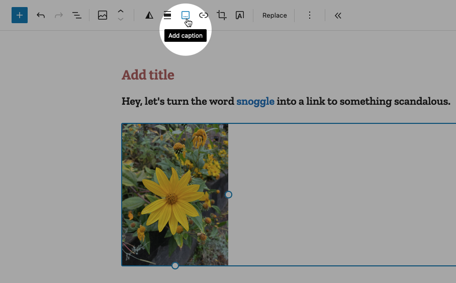
This puts the caption area below the image:
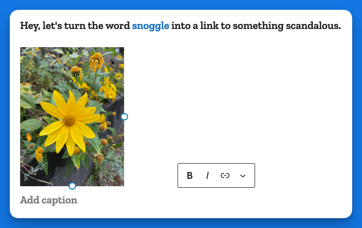
In some crazy parallel universe where everything is opposite, this makes sense. Here, it just adds busywork to a task that literally had no steps to it, you just started typing!
Making a link open in a new tab
In the previous version of WordPress, if you wanted to make a link open in a new tab, it was a checkbox item right there below the URL, like so:

Now, when you go to add a link, you get this (in the example below I have highlighted the word snoggle for the link):

You get a blank text box, and nothing else. So let’s type something in there:

Now we have a link, Hooray!

But how do we have the link open in a new tab?
Well, you click on the link (you naughty person) and get this:

The two icons above are, respectively, Edit and Unlink. So you click Edit and you get this:
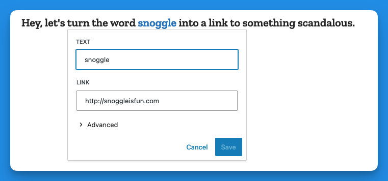
Then you click on > Advanced and get this:
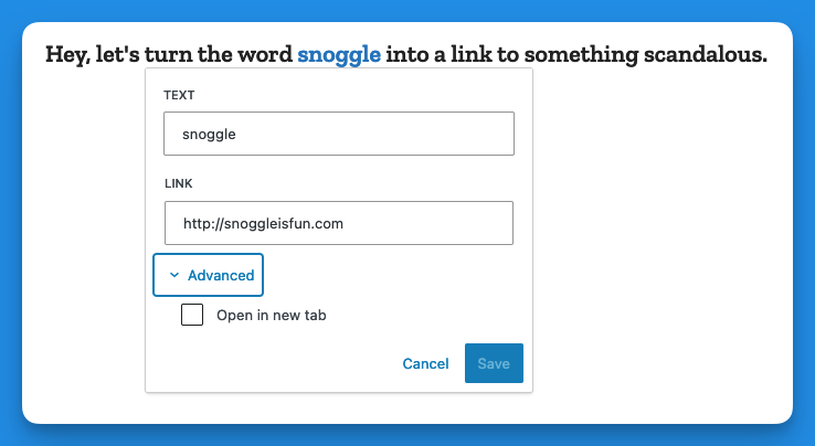
That’s right, the Advanced menu gives you one option: Open in new tab.
I don’t have the proper vocabulary to express how cosmically dumb this is. If there was a universe-wide contest for really, really bad UI, this would finish in the top three.
Now, go back and add up the number of images I’ve used to illustrate the new way of opening a link in a new tab vs. the old way. Explain this madness. You can’t. There is no explanation. Perhaps it’s meant as a joke, a cruel joke on us pathetic humans.
Theses are only three obnoxious things I’ve found in WordPress 6.3 so far. There may be more. And I haven’t even listed the remaining issues with the block editor (or other parts of the UI). But I have written enough on this, and now it is time for chocolate.
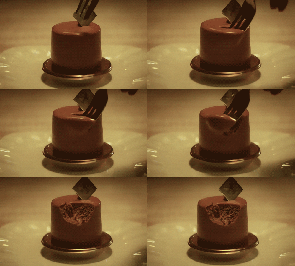
Post-chocolate:
Additional 6.3 regressions
- Previously when using the Preformatted block, if you copied the text from a Preformatted block, then pasted it elsewhere, it would remember the formatting (bold, etc.). It now strips this formatting. Even better, it does this inconsistently, so sometimes it will strip, and other times it won’t.
- Previously, a selected image would show you its dimensions under Width and Height. This information is no longer present, though the Width and Height properties are still shown.

