My site here runs on WordPress, but I started it back in 2005 when WP was at version 1.2 (it just hit version 7.0 a few weeks ago). To say it was a simpler system then would be correct.
Reading through PoT’s post, I found myself nodding in agreement and considering myself lucky that my site has pretty much been in maintenance mode for years now (backend-wise–I still churn out nonsense regularly), running the same theme (GeneratePress) and a handful of plugins. Things generally just work.
Except recently, I had a plugin update go haywire for the first time in ages. This led me to disabling all plugins until I (relatively quickly) found the rogue one. But instead of re-enabling all the plugins I’d been using, I only re-enabled the ones I considered essential, even if they were fairly frivolous 1Like Modern Footnotes, which allows me to place pop-up style notes to offer witty little bits as I see fit.. It made me think again about my failed search for a WordPress alternative. My needs seem simple on the surface:
A space to write, with the usual formatting options
A space to post photos, including galleries
Something that doesn’t require a lot of coding, as I’m not a programmer (I can handle some CSS and the like)
But I am also a bit of a weirdo, as I like having more precise control over the text and photos than most blogging platforms allow. WP, as awful as it is, gives me that flexibility, and I’ve grown familiar with it and accustomed to its general awfulness. But now I wonder if I should again renew my search?
If anyone happens to read this and has a suggestion, hit me up on Mastodon, email me or otherwise reach out as outlined here.
Last year, I began my search for a WordPress replacement in earnest, and signed up for a yearly plan using Ghost via https://www.magicpages.co/.
I have no complaints about the service or support, but 20 years of using WordPress proved a bigger hurdle to overcome than I thought. I really like some aspects of Ghost, but just as often I run into limits. It’s possible some of the limits might be theme-related, or could be overcome with CSS or something else, but I find I have little patience anymore to go down these rabbit holes to get things to work the way I want. WP is far from perfect (I could write a book–probably just from my posts highlighting WP’s issues) but I know it and have adapted to its flaws and weird bits.
I feel Ghost is close, but not quite it. Or maybe it is and I’m not willing to put in the effort.
Either way, I’m sticking with WP for at least a little bit longer. I’ll continue to ponder a move, but the urgency is no longer there.
An update from my perspective, having blogged on WordPress for just under 20 years:
I turned off the WordPress news widget in my WordPress dashboard, because it is now filled with unhinged posts from the co-founder of WordPress.
I am still actively looking for a place to move to, away from WordPress. It’s now a question of where I’ll land, not if.
To that end, I realized I had been consistently mistaking the name of a possible new platform as Blogtastic, when it is, in fact, Blogstatic. I am smart.
I have backed up everything on this blog, including all one billion images, of which 990 million are cats.
When you have an entire website (not hosted by WordPress) devoted to every time you have “lied, misrepresented or behaved in a questionable manner”, you may not be charting the best course forward possible.
Another excuse to post an old-timey typewriter photo. Photo by Min An.
Short: I still haven’t found one.
Longer: The ones I’ve tried so far don’t have the right level of flexibility and customization that I want.
There are a lot of blogging platforms out there and they all excel at letting you put words onto the internet.
But I want more than words. I am a visual person, so I like including photos, images and things. Some blogging sites focus only on words, some allows images with limits, but very few seem to just let you freely mix both with abandon.
I want abandon.
Ghost probably comes the closest, but it’s $9/month (US, so closer to $12 per month for me) and that’s the basic plan, which doesn’t even let you use custom themes.
There’s Blogtastic, which sounds good on paper, but there’s no way to try it out other than paying, and I have enough doubts about performance, etc. to hesitate.
Beyond that is the world of static site generators, but I don’t want to host, configure and deal with backend nonsense. I do enough of that now. I just want to post words and pictures, to do so at reasonable cost and in a way that lets me relatively easily export my work if I decide to pull up stakes.
Summary: I continue to ponder. I am feeling an urge to start some kind of more focused writing project, though. Maybe I should just write a short story. 😛
UPDATE, September 27, 2024: Fixed some details. Also, here is a longish piece by Josh Collinsworth that covers the whole sorry affair in detail. The only thing missing is Mullenweg's announcement to give WP Engine a four-day "reprieve", written in the same churlish tone as everything else he's put out recently. I would not invite this guy to your next birthday party.
It seems that a dispute has erupted between WordPress and WP Engine, a company that makes use of WordPress in ways that the WordPress founder and CEO Matt Mullenweg apparently does not like. There are cease and desist letters, lawyers and all that involved now.
This has led to a couple of unusual entries in the normally quiet WordPress Events and News section of my blog’s dashboard, as seen below.
Clicking the links (you can’t click them in the image, sorry!) will lead to the WP founder saying mean things about WP Engine, even calling it a “cancer.” He had threatened to bad mouth WP Engine at a major public WP event (ironically sponsored in part by WP Engine) if WP engine didn’t share some of their sweet lucre with him through some vaguely defined licensing something-or-other that Matt appeared to have invented very recently. WP Engine asked for more time, Matt took that as no and the bad-mouthing took place). It’s ugly all around.
And what this person–the CEO and founder of WordPress–has done has made people start to question the actions of WordPress as an organization, and how much it can be trusted moving forward. It takes a long time to build a good reputation, but only moments to ruin one.
I was already revisiting my (ever)quest to move my blogging, and this is…helping. I’m not sure if that’s the outcome Matt Mullenweg was looking for.
In WordPress, if you publish a post and later make changes to it, the Publish button changes to Update, to let you know that you’re, well, updating the post.
But in version 6.6, just released, that Update button now says Save, which is more old school, but actually makes less sense in terms of publishing something (as opposed to saving a file like a word processing document). I don’t hate the change, but it seems a bit weird and doesn’t really improve anything.
However, they haven’t made anything else objectively worse with this update (that I’ve found), so kudos for that!
Also, yes, I’ve kind of stopped looking for other alternatives to WordPress since finally committing to my site redesign. I still might resume that search, but it’s on the back burner again for now. Apologies to anyone waiting for me to render a verdict!
Pretend it’s me blogging on WordPress. I would be wearing socks, though. God, I love stock photos. Photo by Canva Studio on Pexels.com
EDIT: Shortly after posting this, I came across a list of blogging platforms in a post on Mastodon. Coincidence or serendipity? Or both? Coincendipity?
This isn’t a complaint about WordPress! WordPress is a rich, diverse tool that can sing, dance and probably rub its belly at the same time. I’ve been using it for this blog since 2005–around 19 years! Obviously, it’s been doing a decent job of letting me get my inane thoughts online, or I would have switched to something else by now1Or become a crazed hermit living in the mountains, eschewing all technology, perhaps.
So why am I tired of it?
It’s big, bulky, and jammed full of features, many of which I don’t use. Its company, Automattic, is increasingly pushing even standalone blogs like this one toward monetization, with plugins like Jetpack having more and more paid features under the premise that if you are using WordPress, you are intending to make money from it, otherwise why aren’t you just posting your cat pictures to Facebook for the price of free2Not counting the price of YOUR ETERNAL SOUL?
What I yearn for is something that is light, clean and simple to use, yet still allows me to do the bloggy things I like:
Write down my inane thoughts
Write lists, like this one
Post photos and drawings
Present these things in some kind of organized manner
I feel that WordPress has moved away from the simplicity of humble, handcrafted artisanal blogging. I want to get back there again. I want to touch (virtual) paper.
Where to go next
(I didn’t really need a subheading here, but you see them a lot on important blog think pieces, and I’m always keen to look fancy and smart.)
My choices are roughly as follows:
Keep using WordPress and just shut up about it. It works, right?
Actually switch to a WordPress alternative.
Stop blogging altogether.
Post my cat pictures on Facebook for free3I would also need to get a cat.
I’m actually unsure which option to pursue. The last few years I’ve been, in some ways, reconstructing many aspects of my life, and I don’t always know where these things will lead. I suppose this makes it exciting. Whee!
I’m like Steve Martin in The Jerk1Yes, I am referencing a movie that came out in 1979. I am old. when the new phone book arrives2Remember phone books? I do, due to the aforementioned condition of being old.. So very excited!
Actually, I confess, I am not excited. The new features sound good, but I am concerned about further UI regressions. I see the Preview “hand iron” icon is still there, so that is not promising.
But I will maintain a positive outlook, because it feels like I’ve been crabby lately, and I don’t need to be crabby to drive engagement, because I don’t have engagement! I can be free to be positive, or thoughtful, or rambling, whatever I choose to be.
I have gotten off-track a bit.
Apparently, you can apply lightbox effects to images now. Let’s try that! I have checked the new Expand to click option for the image below, which should make it full-screen and all immersive up in the hizzzy.
Brunette River, going full fall
It seems to work. I’m not sure if I prefer this over the FooBox lightbox. Let’s try that one below and compare for science. Same image:
Brunette River, still going full fall
It looks like both pretty much give you the same larger image, but FooBox dims the rest of the browser window, retains the caption, and adds a border. On the other hand, the built-in lightbox plays a zippy animation when expanding the image to the larger size and feels all dynamic and modern.
On balance, I think I prefer the FooBox version, but I appreciate the new option1.
Just like the footnotes WordPress added previously, which I occasionally use now, especially if I want my posts to look like high-falutin’ essays. ↩︎
UPDATE, September 30, 2023: New deficiencies/regressions are being added to a list at the bottom of the post as I encounter them.
UPDATE, November 15, 2023: WordPress 6.4 is out and at least one of the regressions has been addressed. The Open in new tab option for links is no longer buried, as seen in the screenshot below. Yay.
I try to avoid spending too much time complaining. Who wants to read some random dude’s complaints, after all? I mean, if they’re clever enough, sure. But this is not particularly clever, so I’ll be brief1In retrospect, this was a massive lie. Apologies for massively lying to you!.
WordPress 6.3 brought a few tweaks to the UI of the editor/block editor, resulting in inconsistency, adding extra steps to do the same tasks as before, and generally made the experience of doing stuff other than just basic text entry more cumbersome, with no discernible benefits that I can see as a trade-off.
There has been a lot of hate for the block editor, and rightly so2Not even a humble opinion, no sir.. It made it easy to drop in or move around blocks of “content”, but made it harder to actually just write, like in the olden days when blogs were all the rage.
I flirted with the classic editor plugin (5+ million installs) and have the classic editor block I can always use in a pinch, but my preference is to use software as intended, not install a bunch of hacks or workarounds to bend it to my will. The assumption is that the software will work the way I expect it to (mostly), and stay out of the way.
WordPress 6.3 does not stay out of the way. It blocks (ho ho) your way. It is anti-way.
None of what I’m about to detail is going to cause meteors to fall out of the sky or give someone a bad rash. These things don’t make WordPress unusable. But they make it clunkier, they add friction where there was no friction before, and they speak to a trend in design that suggests things may get worse still.
The three issues covered here:
Preview is now hidden behind a terrible, tiny, and meaningless icon.
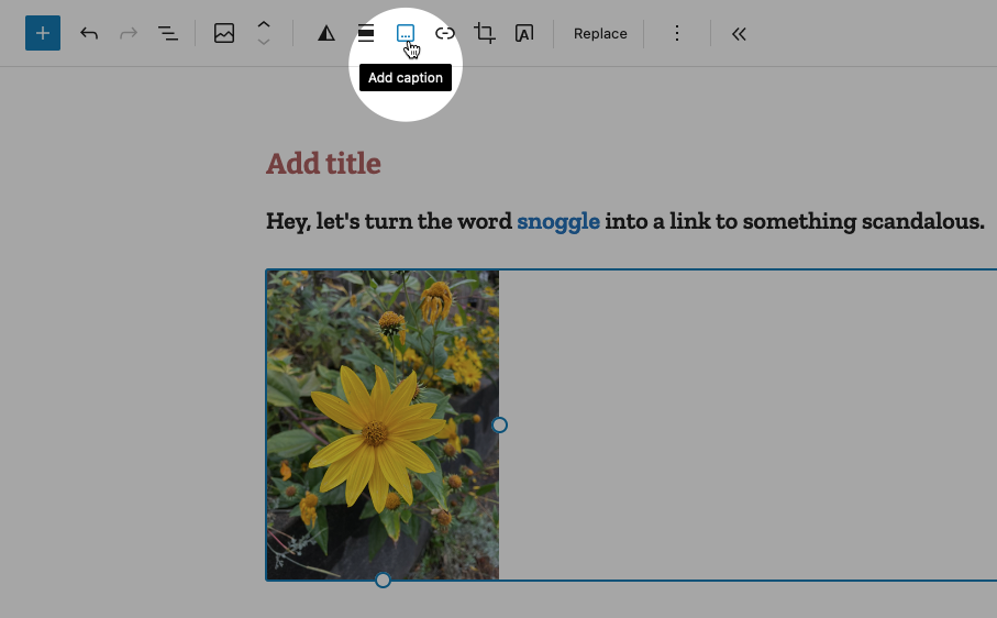
If you want a caption on an image, you now have to specifically toggle captions on.
Setting a link to open in a new tab is now a multi-step, cumbersome process.
NOTE: I have added a pretty blue border around a lot of the shots below to make them stand out better. They are not this pretty in real life.
In order:
Preview’s new icon
Preview used to be a button that looked like this:
It is now this icon instead:
I believe it’s supposed to be an icon representing a laptop. Or maybe it’s an old-fashioned hand iron. Who knows? And if it’s a laptop, what does that have to do with Preview, anyway? And why is Preview now an icon, but Save draft and Publish aren’t? It’s not like there isn’t enough space. It’s inconsistent, vague and looks amateurish. And ugly.
Caption an image
Back in the olden times of WordPress pre version 6.3, you would add a caption to a photo by simply typing it into the caption space below the image. If you left the caption space blank, the space would not render. Simple!
Now when you want to caption an image, you must specifically choose the option from the toolbar while the image is highlighted, like so:
This puts the caption area below the image:
In some crazy parallel universe where everything is opposite, this makes sense. Here, it just adds busywork to a task that literally had no steps to it, you just started typing!
Making a link open in a new tab
In the previous version of WordPress, if you wanted to make a link open in a new tab, it was a checkbox item right there below the URL, like so:
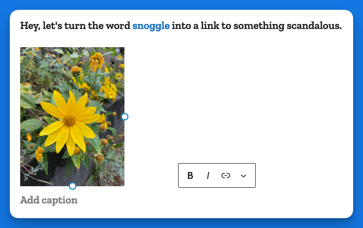
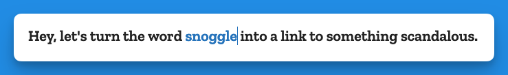
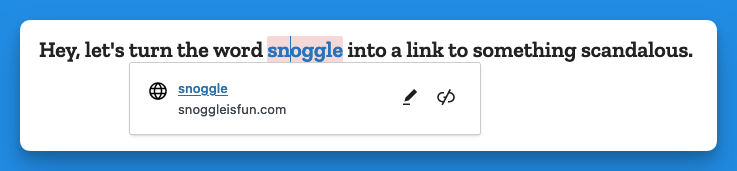
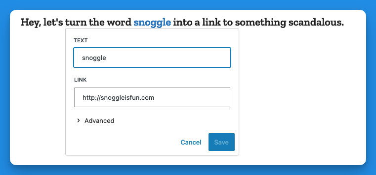
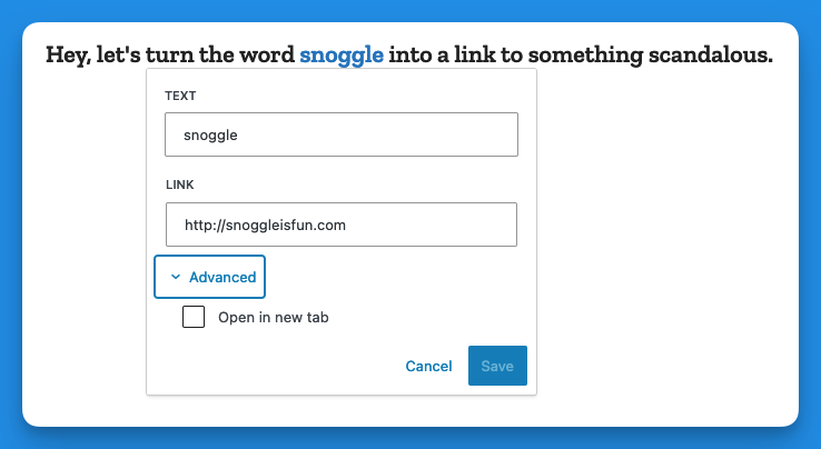
Now, when you go to add a link, you get this (in the example below I have highlighted the word snoggle for the link):
You get a blank text box, and nothing else. So let’s type something in there:
Now we have a link, Hooray!
But how do we have the link open in a new tab?
Well, you click on the link (you naughty person) and get this:
The two icons above are, respectively, Edit and Unlink. So you click Edit and you get this:
Then you click on > Advanced and get this:
That’s right, the Advanced menu gives you one option: Open in new tab.
I don’t have the proper vocabulary to express how cosmically dumb this is. If there was a universe-wide contest for really, really bad UI, this would finish in the top three.
Now, go back and add up the number of images I’ve used to illustrate the new way of opening a link in a new tab vs. the old way. Explain this madness. You can’t. There is no explanation. Perhaps it’s meant as a joke, a cruel joke on us pathetic humans.
Theses are only three obnoxious things I’ve found in WordPress 6.3 so far. There may be more. And I haven’t even listed the remaining issues with the block editor (or other parts of the UI). But I have written enough on this, and now it is time for chocolate.
Post-chocolate:
Additional 6.3 regressions
Previously when using the Preformatted block, if you copied the text from a Preformatted block, then pasted it elsewhere, it would remember the formatting (bold, etc.). It now strips this formatting. Even better, it does this inconsistently, so sometimes it will strip, and other times it won’t.
Previously, a selected image would show you its dimensions under Width and Height. This information is no longer present, though the Width and Height properties are still shown.