After some more time using Linux Mint, which I’ve done more often the past few days as Windows 11 is perpetually applying updates that require a reboot (thus making it easy to select Mint from the boot menu), I’ve encountered a few things that have made the experience a little less smooth vs. the Mac or Windows:
Music: My music library is a local folder on the PC and while I might be able to find a way to access the files remotely, right now the music player in Mint wants to just redownload everything, which is not an idea solution (though it works fine if you let it do its thing)
OneDrive: There is a paid solution (InSync) and while I can access my OneDrive folder on the PC through the Mint file manager, it obviously does not actually sync changes or anything. For that, I need to use the web version, barring setting up an open source/free alternative.
Microsoft Office: While I generally only use MS Word when I have to, Office is not available on Linux, requiring me to use workarounds like saving in .docx format in LibreOffice, or using the web versions, where it’s surprisingly easy to come across something the web version doesn’t do.
Journaling: My go-to journaling app, the unfortunately named Diarium, is available on every platform–except Linux. And there’s no web version.
TickTick: My to-do app of choice also has no Linux version, though the web version works decently, at least.
Pixelmator Pro: This is my primary photo editing app and is Mac-only.
On the plus side, it still feels snappier and more solid than my current Windows 11 install. I’ve actually toyed with the idea of completely nuking all 3 terabytes of storage I have on the PC and just starting over. I don’t know if that would actually fix or improve anything, but it appeals to my urge to cull cull cull.
In the meantime, I’ll continue to juggle between all the OSes like a big dum dum.
For the past month, I have been generally ignoring the Linux Mint installation, because my desire to explore strange new OSes apparently ended shortly after I had completed the initial set up.
However, Windows has been driving me mildly batty lately for a few reasons, some more important than others:
Less important: The desktop wallpaper keeps changing on its own. I’ve spent more than a fair share of time troubleshooting this, to no avail. It’s simple to correct, but it’s maddening that it happens. Probably related, Windows will also move my desktop icons from one monitor to another, then back, seemingly at random (not on the fly, but after a reboot or when it is awakened from the screensaver). Multiple monitor mayhem? Maybe!
Somewhat important: General slowness all around the OS. The Start menu hesitates when I click on it, or icons take a few extra moments to load. Nothing feels “tight” or snappy. I almost feel like Windows 11 has regressed to that “time to reinstall the entire OS” version of Windows we used to go through in order to regain lost performance. And that was way back in the Windows 98/XP era. Yeesh.
More important: File Explorer is crazy slow, even at simple things. I have always found File Explorer slow (this is one of the few ways I find the Mac’s Finder to be superior) and it often wants to (slowly) refresh a folder that hasn’t had any changes made to it. Bleah!
Anyway, enough kvetching about Windows 11. I have updated Mint and installed a few apps:
Firefox (actually, it’s pre-installed, but I have updated it)
Obsidian (initially as an AppImage file, then as an actual installed app)
Discord
Those three apps alone give me most of what I need. I have also spent some time tweaking the settings, look and feel of the desktop, and have run into a few kinks with permissions to the non-Linux folders on my PC. But still no need to use a command line yet!
As a bonus, Linux also hasn’t changed my desktop wallpaper arbitrarily. What a treat. For maximum lolz, I am using the AI-interpreted version of the original Bliss/XP wallpaper that you can find on Microsoft’s site here.
My desktop (click for full size):
At this point, I’ll probably keep using it until I need another OS for something specific (Windows for gaming, Mac for photo/image-editing). Maybe I’ll find yet another OS to install. Maybe I’ll just start doing everything on a used Commodore 64 and pretend it’s 1985.
Right now, Mint does feel faster than Windows, but it’s also only a month old and has minimal software installed. We’ll see how it goes. Stay tuned for Part 3, in which maybe I have to use the command line or something horrible like that.
Yes, a literal clickbait title. And yes, the fun part is sarcastic.
The network went down here this morning, which I found out in the usual way–something not loading in a browser. A restart of the router/hub/magic box fixed most things quickly, and this time it went about a month between drops, which is better than the usual two-week average. Still, it’s always “fun” to see what doesn’t quite work right and requires some Tech Troubleshooting 101 to resolve.1Turn it off and on, of course One day I’ll be able to stomach trying to contact Telus support to look into this again, but today is not that day.
As a bonus, Bitwarden2Yes, I’ve really gotten into the Dvorak thing of bolding key words for no particular reasonis not loading on Windows. Wait, I rebooted. Let me try again right now!
It works! Rebooting fixes everything. EVERYTHING. I’m a professional, you can trust me.
Everyone is talking about the Apple Vision Pro and will keep talking about it…until the end of the week.
Here’s my summary in handy list form, after watching the WWDC keynote:
MacBook Air 15 inch: Appears to be exactly that, the same M2 Air but with a bigger display. Price is reasonable! Keeping the M1 Air in the line-up when it’s only $100 less than the M2 version is odd. Apple does this sort of thing a lot. Apple is odd.
Mac Studio with M2: Nice to see this new product getting updated. No price change on the default config, but it should still come with a 1 TB SSD standard (it comes with 512 GB).
Mac Pro: WTF LOL etc. After being very late in completing their transition to Apple Silicon because of the Mac Pro, what they released is kind of baffling. First, they re-use the Intel case from 2019. OK, no real issue there, but in terms of specs, this is a Studio with some PCI slots, a few more Thunderbolt ports and it costs…$3000 more. Also, unlike the Intel version, you can’t have separate graphics (integrated on the SoC, like the Studio) and ram is limited to 192 GB instead of 1.5 TB (!). In several important ways, this is worse than the Intel Mac Pro and unless you absolutely need PCI slots for…something (other than graphics cards), it’s a terrible value and not really expandable in the way a traditional desktop PC is. Apple should just kill the Pro, they have basically been botching it for a decade now. Also, I predict this Pro will receive no updates, just like the last two Pros they released that were left to wither and die.
Mac gaming for real this time! Proof: Another four-year old PC game is getting ported, this time it’s Death Stranding.
iPadOS: The pattern is now clear: This gets one or two token new features, then last year’s leftovers from the iPhone. Apple can and should do better.
Speaking of better: They didn’t really show it, but Stage Manager sounds like it’s close to the state it should have been when they introduced it a year ago.
iOS: Some nice little things, nothing really outstanding. I think it’s due for a major redesign, but Apple is probably too conservative now to do that.
watchOS got a new widgets interface that look interesting. I’m not sure about devoting a button to Control Centre, considering how seldom I used it when I had various Apple Watches.
macOS: I had to actually edit this back in, after forgetting about the Mac completely (I am even typing this on a Mac, ironically). Again, a few nice little things added (widgets again, so Dashboard has been sort-of revived), but nothing remarkable.
The Home app was not mentioned and remains bad.
You can now say Siri instead of Hey Siri. But is Siri itself any better? They didn’t really say!
The Journal app1Cleverly called Journal (iPhone only) sounds kind of creepy, drawing from other apps on your phone to suggest/cajole. I don’t need my phone watching me and making suggestions on what to do or write about.
Craig is the only one who seems natural at presenting and obviously loves the meme-generating moments. He also has a boffo announcer-style voice.
The Vision Pro headset is even more expensive than the rumours suggested, at $3500. This is ultra-niche territory, and I have a hard time thinking how Apple could scale this down to something “affordable” for a non-pro version. And Apple’s idea of affordable is probably $2000, anyway.
The fake eyes on the Vision Pro are super creepy.
Apple showed nothing that came even close to a killer app for the thing. In fact, they didn’t show ANYTHING that was compelling, just “all the stuff you normally do, but now in 3D floating in front of you!” Some have suggested watching movies/TV will be the killer app, but for $3500? No.
The Vision Pro has two hours of battery life, which means you could watch the first two-thirds of the regular version of The Fellowship of the Ring before it dies.
The media is saying it’s the best VR headset out there. I mean, for $3500, it kind of better be.
The stuff with Bob Iger was cringy and fake. And that sweater looked weird, not causal.
But hey, you can now have Snoopy on your watch face.
I think Vision Pro is going to amount to a whole lot of nothing2Yes, I am ready to be openly mocked if I turn out to be completely wrong about this. It’s vastly too expensive and inessential. When Apple can shrink this down to a pair of discreet-looking glasses and cut the price by $2000, then, maybe it will become a thing. And we’re probably 10 years out from that.
Overall, lots of nice little updates and tweaks, the new hardware is fine, if unexciting (save for the Mac Pro, which they should have just sent off to join AirPower in the Apple graveyard), and the Vision Pro is, I think, going to be the first major new Apple product to not really have much impact.
EDIT: Honeybog in the comments on Ars Technica actually says some things about the Vision Pro that make sense to me. I’ve almost changed my mind. What he said is below. The Ars article is here.
I wasn’t very enthusiastic about Apple getting into AR/VR, but one thing that really impressed me with that keynote presentation was how thoroughly they made a case for using these, which is something no other company has been able to do beyond gaming. Facebook’s most compelling case was what if your employer subjected you to living in a world that was part 2006 Wii graphics and part 1984.

In some ways, Apple being able to make a case for why this space should exist is a bigger deal than the technology behind it or how many they sell.

It made me want to work on my Macbook on a plane and not have the person next to me or behind me viewing my screen.

It made me want to have a workspace with adjustable windows, have a standing desk just by standing, not have to deal with monitors.

It made me want to watch a movie on this.

It really made me want to smoke some pot, put on some music, and look through old travel photos with this.

I don’t want any of these things for $3,500, but I don’t think that matters. Apple managed to make the first non-gaming compelling case for these, and I don’t see that genie getting put back in the bottle. It’s too expensive for most people, but I think the fact that they started with “Pro” tells you everything you need to know about how this is going to get segmented. Apple is clearly starting at the high end, because they can’t afford a flop, but I have no doubt we’ll see a version below $2,000 (I think the sweet spot is $1,200) within a year or two.
UPDATE, June 1, 2023: Here's a link to the original post on Mastodon by Matt Birchler that started this. If you can't follow the link, he's updated his original post to confirm from a member of the Ulysses team that this was indeed a joke and is riffing off a previous newsletter in which Fehn had raised the ire of Musk fans by criticizing Musk:

Me just opening my newsletter for updates from my writing app:

Editing for visibility: I’m choosing to assume this is a joke that didn’t land. The Ulysses newsletter has gone off the rails recently though, so it’s all just weird.

Edit 2: got confirmation this is a joke. Apparently the Elon trolls came for Marcus recently, and this was a sarcastic response to them. Sounds like many readers didn’t have that context, and this read like a normal Elon Stan letting their freak flag fly ?

This is why you don't try to be funny in a company newsletter!
I begrudgingly use Ulysses. It’s a fine app–in some ways even a great app–but I was not pleased when it went to a subscription model and mused at the time that they would have trouble adding genuinely useful features to “justify” the sub. And I think that happened.
But this post isn’t about the subscription model Ulysses uses. It’s their choice to charge a sub, just as it’s my choice to pay for it. I grumble, but for now, I pay, as I’ve yet to find another program that does everything that Ulysses does in a way I like. What this post is about is the Ulysses newsletter the company sends out periodically to its customers. More specifically, it’s about the current newsletter May 2023), which I think is attempting some ill-advised humour that may result in them actually losing customers.
I think it’s safe to say that most people don’t love email, they tolerate it. And when it comes to newsletters, I’d also reckon a lot of people may sign up for one (no harm, no foul), but then unsubscribe when they realize the newsletter isn’t providing enough value. I have culled a lot of newsletters in the past year for this very reason!
The current newsletter, which was sent out today, is written by Ulysses GmbH & Co. founder and creative director, Marcus Fehn. He is German. Is this important? Maybe, if you think some of what I’m about to highlight can be explained by differences in language, culture and things getting lost in translation.
Hello, fabulous subscriber of our newsletter,
This is Marcus from Ulysses, and I’m about to tell you something newsworthy. But first I need to make a statement:
**I love Elon Musk**. Elon is one of my favorite people on Earth, on the Moon, and of course on Mars. He’s a great innovator, probably a fantastic lover and an overall nice guy. I wish I was as smart as him. Or just 1% as smart as him. I also love Twitter and what he has done with it. Twitter was great before Elon, and it’s much better now. It’s a haven for free speech, a civilized marketplace of ideas, and it should be the blueprint for all social media apps going forward. I also applaud it for teaching kids how to behave in public.
Marcus Fehn, Ulysses founder and creative director
There is some debate on Mastodon on whether the above is:
Very obviously a joke and meant to be funny (the haha kind of funny)
Meant to be sincere praise of Musk and Twitter
There is no debate, however, on this being a baffling and just plain odd way to start out a newsletter to customers of a subscription-based markdown writing app. If it’s a joke (and I think it is), it’s executed just clumsily enough to make people think it might be legit. You could argue that just makes it more like satire, which is like funny jokes for sophisticates. Or grumps. (I like satire.) But even as satire, this is a completely tone-deaf way to start a newsletter. As a Ulysses user, I don’t care what Fehn thinks about Musk or Twitter, unless it somehow impacts Ulysses. I get that Fehn may have opinions or just likes writing things, but starting a company-based newsletter with this is bad form all around. This is why blogs exist, Marcus!
The rest of the newsletter continues in a jokey manner, with Fehn talking about 20 years of Ulysses and “20 years of hate mail, but that’s a different story” and that he’s visiting San Francisco and will be “the one in the bullet-proof vest, just in case.” I think he’s just trying hard (too hard?) to be funny, and a lot of it comes off flat or weird. The newsletter does exude with his personality, but that again is debatable on whether it’s a plus or minus.
For me, the whole thing is weird and off-putting, and it’s made me once again start looking for alternatives to Ulysses, preferably something that works on both Windows and Macs. And isn’t Scrivener. 😛
I started trying out the Arc browser a few weeks ago (it is currently Mac-only, though a Windows version is expected by year’s end), and I’m still not quite sure how I feel about it.
I’ve been using it more, though, because WordPress on my own blog is choking in Firefox. I’ve checked and this appears to be an issue specific to the Mac version of Firefox, so I’m not sure how or if I can fix this.
Unlike other browsers like Vivaldi, which do basically the same stuff as most browsers, but allow for greater customization, Arc tries to do some things differently. For example, there are no tabs. Well, there are, but they are in a sidebar that houses other things, and unless you pin a tab to the top, where it changes to a small icon, it will be gone the next day. All open tabs get purged every night in an attempt to avoid going tab-crazy or something. I imagine this would drive the “100 Chrome tabs open, I don’t care if it’s murdering my computer and draining all resources” people up the wall, probably a deal-breaker. But I am not one of these people.
Still, it feels a bit disjointed to move between the pinned tabs at the top and ones below that look more like vertical tabs. There’s also no way of knowing which tabs are open, other than the pinned tab you are currently looking at will have its icon highlighted. But maybe it doesn’t matter, because you just click an icon and if the tab is already open, it’s there waiting for you. Arc seems designed around removing visual clutter–probably not a bad thing.
You can also “boost” a site, which is a weird way to describe being able to customize a site through a few simple GUI controls that let you alter the fonts, colours and also “zap” elements, in much the way the uBlock Origin extension lets you use a picker to remove items from a page. All of this works well, though the font choices tend toward being fruity and not so practical. I guess they were going for whimsy or something. Speaking of extensions, you can also install any extension from the Chrome web store, since Arc runs on Chromium. I’ve not encountered any issues with the new extensions I’ve tried so far.
There’s lots of other stuff I’ve either not looked at or have only glanced at, so can’t really comment on. You can create “spaces” like some other browsers, making it easy to segregate work and home browsing, for example. You can create easels, which are free-form pages where you can enter text, make basic shapes, add images and then share them, because why not?
As I poke around more, I’ll come back with another post to say whether I’ve become an Arc convert or decided to just put up with the buggy yet familiar Mac version of Firefox. Change is hard, but I give credit to the team behind Arc for trying some genuinely new things with the browser.
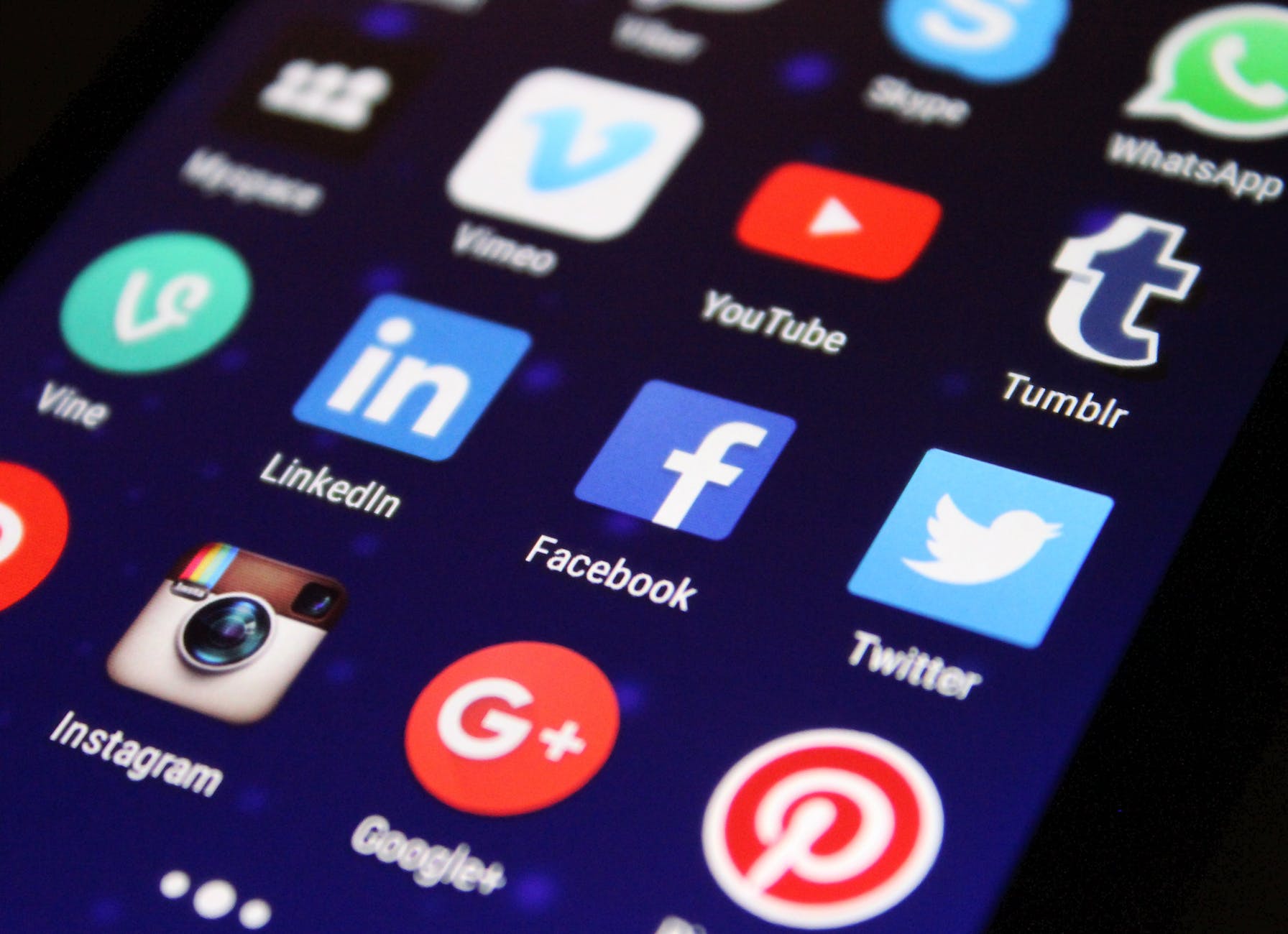
Really, I just like the Google+ icon. Photo by Pixabay on Pexels.com
As I do periodically, I had a thought. This one was about social media. There is a lot of analysis out there concerning social media. I’ve posted a bunch about it myself, including just last month. A recent U.S. surgeon general’s report on social media said it’s pretty much bad for kids, but with a few positives, which sounds like a precursor to government action of some sort. But maybe not.
Last year, I wrote about how I use social media. It hasn’t really changed in the past six months, though I do check in on Mastodon a bit more now, and check in on Instagram and Facebook less, especially since I no longer have a regular routine for doing so. I used to check them before bed on my iPad, but the blue light issue turned out to be a real thing, so I stopped with the late night internet socializing.
Now that the routine has been broken, it’s made me take another look at the two main sites I use to visit every day (if however briefly, much of the time) and think, “What am I really getting out of these?” Let’s have a look!
Instagram:
I get to see Nic’s birb photos, which are spiffy and nice. But although IG was created around posting photos, they actually look better on Facebook.
Tim posts sketches he’s started doing recently, including ones from a high school yearbook he found from 1960. These are great, and he only posts them on IG.
A gaming friend in Santa Cruz, Mike, posts occasionally, sometimes about surfing, sometimes local scenery (Santa Cruz is a pretty seaside town), and he has a dry sense of humour. He has his IG posts automagically repost to FB.
A metric ton of ads and reels, which I do not want to see. The reels (short videos) are especially obnoxious. I think I watched one about an airplane that was flying or doing some other airplane-like thing (keep in mind that on IG these videos autoplay as they scroll into view), and now IG is constantly shoving airplane videos into my face, no matter how many times I click on NEVER SHOW ME THIS AGAIN YOU GODLESS MONSTERS.
That’s pretty much it!
Facebook:
Mike’s posts on FB are the same as the ones on IG
Nic’s are also mostly reposts from IG, though he posts memes as well
Tim tends to post more personal stuff on FB, like photos of the family, but also memes and weird/kitschy stuff
A few other friends and relatives post nearly 100% memes or content they’ve seen elsewhere
FB also has reels, but they mercifully do not autoplay (yet). I keep hiding them, they keep showing up.
FB also has a metric ton of ads, and these do autoplay. I hate all of them.
To give you an idea of the ratio of ads to “content”:
On IG, it feels like about 50% ads, 30% content and 20% short videos (I’m not calling them “reels” anymore–take that, Zuckerberg!). It’s pretty awful. The one small mercy is the feed is actually in chronological order, and there’s a link to go to older posts if you missed something.
On FB, it’s about 45% ads, 45% “content” and 10% short videos or “People you may know” which also keeps popping up no matter how often I tell it to go away. Also, FB has this weird thing where it randomly starts shuffling stuff around. Old posts will suddenly come back, even though nothing has changed (no new comments/edits), while new stuff will get buried. I’ve sat back and watched the scroll bar in the browser jerk up and down for 10–15 seconds as it spazzes out. It’s both annoying and weird, but not the good kind of weird.
On balance, the only things I find especially worthwhile are:
Nic’s photos
Tim’s sketches
Mike’s photos
These three things form a tiny slice of what I actually see in the feeds, which are mostly ads and “hilarious” memes being reposted for the ten thousandth time (that day).
Can I go without these things I enjoy? Probably. Am I considering pulling the plug on the sites for a while as an experiment? Definitely.
I’ll probably decide in a few days whether to try it out. If I do, I’ll post my findings when the experiment ends.
Until then, NO I DO NOT WANT TO SEE MORE AIRPLANES THANK YOU.
I started this blog in February 2005, which means it’s 18 years old. In Canada, that means my blog can drive, vote in federal elections and join the army. It has to wait a bit longer before it can gamble.
But I don’t have to wait, and gamble I did!
Since WordPress has no easy way to work in a staged environment, when you want to make changes, you either have to go through the rigmarole of setting up a local server, or just make changes on your live site and hope for the best.
Which is what I’ve been doing the last few days.
What I have learned:
After 18 years, my site has accumulated a lot of legacy cruft
This cruft can do interesting and/or alarming things when you poke at it
Different parts connect in unexpected ways. Imagine if your elbows connected to your knees, it’s kind of like that.
Things that should work logically will often defy logic
Sometimes it turns out to be user error
More than a few times, really
But not always!
Planning ahead is a good thing to do
I should have planned ahead, which I did not do
But even just starting on this journey, I have cleaned up a lot of that cruft:
Old, inactive widgets have been purged
Outdated links and thingies have been removed
Legacy stuff has been converted over to blocks where possible
I’ve backed up all the weird CSS changes that are in Simple CSS
I’ve documented every weird thing I’m likely to forget
I’ve experimented with colours, but right now it’s just a sedate green/grey combo
I will actually need to figure out what I want to show up front and what will be tucked away
Currently, the site looks a lot more green. I added some nice rounded corners on the individual posts because round corners are the new hot thing. But it’s otherwise pretty stripped down and ready for more serious remodelling. This stuff takes a lot of time, so I’m not sure how quickly it will happen, but at least I’ve started.
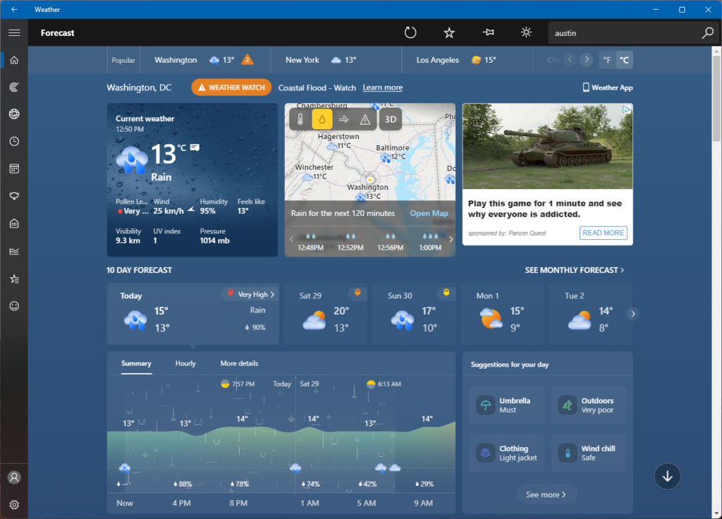
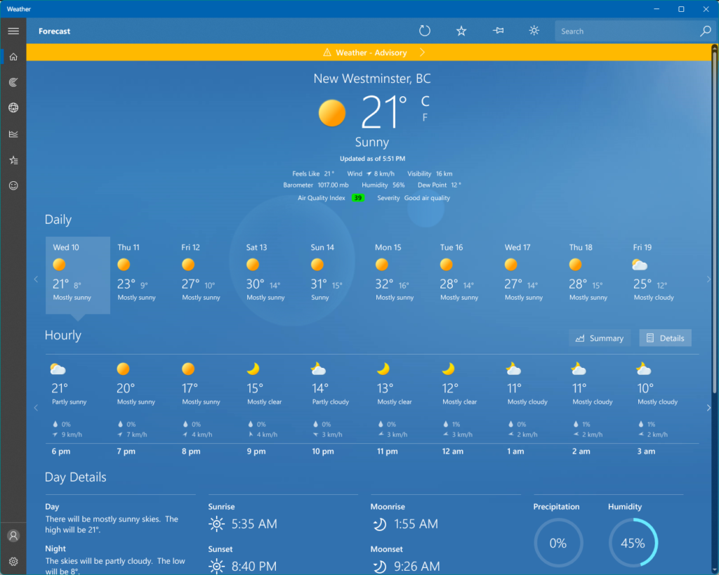
I’d been using my Mac for the past few days and didn’t realize Microsoft had updated the weather app in Windows 11. This is actually a surprisingly comprehensive and handsome-looking app, showing the kind of taste that Steve Jobs said Microsoft never had.
The updated version of the app is terrible. It’s pretty much exactly what Steve Jobs said about Microsoft having no taste–cluttered, ugly, and on top of that, it now has a large ad stuffed into it. It’s a built-in app, so it would be nice to escape ads while I’m using it. What next? Calculator sponsored by Crest? Terminal with a 10-second rolling ad before you can type anything?
Fortunately, I used my internet smarts to do the following:
Uninstall the odious new app
Download the old version and re-install it
Disable auto-updates in the Microsoft Store, hopefully insuring the new app will not come back on its own
Provide feedback through Microsoft’s handy Feedback Hub to tell them to stop stuffing ads into every corner of Windows
It’s like Microsoft has resigned itself to most people just switching to Macs, so they’re going to squeeze the remaining few for everything they’ve got with ads and monetization.
This is the kind of thing I would think of, and now with AI art, the dream can be (sort of) real!
As seen on reddit and using Midjourney for the art, this is one of the best things I will see on the internet this week. Or for the rest of the decade.