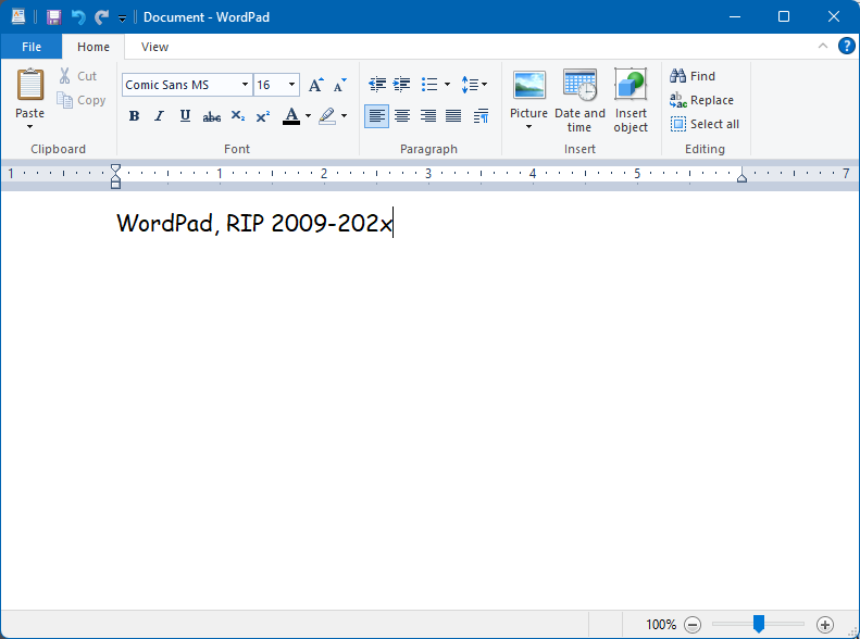
Ars Technica has the story confirming Microsoft’s plan to eventually deprecate WordPad and I have to admit, much like in September 2020, I still never used it, so its absence won’t be felt by me. Some people in the reader comments of that article do raise some legit concerns about its removal, so I’m wondering how MS will address those (if at all). The main thing WordPad had was RTF1Rich Text Format support, which is used by probably five people across the planet today. Still, it would be nice to have some built-in support in Windows, even if WordPad itself goes away. One suggestion was to add a rich text mode to Notepad that could be toggled on/off. Plus, MS has been tinkering with Notepad a lot lately and a lot of nerds are already upset over changes to it, so strike while the nerd rage is hot!
Why? I can’t say, precisely. I feel I didn’t fully test it out last time. This time I want to try to meet some of the challenges I encountered and find ways to work around them. Or something like that.
Also, I may be a bit of an idiot.
But this time it’s installed on its own separate drive., so reverting to Windows-only in the future should be easier, if I decide to do so.
The Verge1Not singling them out, since every tech site will have the same vapid article had an article on what to expect at Apple’s next event, revealed today to be on September 12, 2023. They said there would be a new iPhone announced. You know, like what Apple has done every year for the past million years. The new phone will have stuff and blah blah blah.
I mean, I’m not expecting dramatic innovations in smartphones, especially from Apple, a company that gets more conservative and convinced of its own brilliance the richer it gets, so I suppose my complaint (because let’s face it, complaining is what I am doing here) is how the announcement of a slightly improved iPhone is still an “event” at all. I know, the hype machine must be fed. Everyone does it. But it just feels so tired and late stage capitalism-y. Look at the new shiny! Buy it even though you don’t need it! Watch Tim Cook continue to show the fire and emotion of a bucket of water! You’re going to love it, it’s their best iPhone ever! And so on.
I have an iPhone 12 and I think the only thing that would make me upgrade to something newer is a super fantastic camera. It can’t be just super, or fantastic, it must be BOTH! And then I may consider getting a new phone.
To amuse me. If it makes me laugh (or smile), I’m good.
Yesterday, a discussion in Discord lead to speculation over whether the Sasquatch had arrived in Australia via dugout canoe1This started when someone in my gaming group, who is going on a trip to Australia soon, noted “my research has indicated that there’s a Bigfoot like cryptid called the Yowie that lives in Australia“. I asked Adobe Firefly to produce illustrated proof of this, and behold:
Also, I just generally love the way Firefly depicts the Sasquatch
This is all I really need AI to do when it comes to art. Sasquatches in canoes.
Yes, I literally checked it out. And then I went on to other things. I could spend time “curating” a list of people/organizations to follow, as I did on Mastodon, but:
Am I really going to get something on Threads that I don’t get on Mastodon, other than whatever their algorithm serves me?
It’s busier, with more posts and more replies. My time is not infinite, do I really want more social media stuff to sift and sort through?
The thing is, I don’t have a need for Threads. I still check in on FB occasionally because it’s the “everyone is there” place, and IG sometimes, if I post photos. Mastodon is the only one I visit to actually check out stuff I might be interested in, to see new ideas or art or whatever. It’s not perfect, but I can overlook its flaws. It’s enough. I’d rather noodle around on this blog and be content with the handful of LLMs that check it out, really.
Don’t get me wrong, though, I’m not saying social media is bad/evil/wrong (though it probably needs a new name to describe what is has evolved into), I’m not calling for a return of the olden times when we all read newspapers that were 50 pages of dense print, and we called each other on rotary phones to talk about a TV show on one of the 13 available channels. I’m just saying, for me, a little social media goes a long way.
Am I going a little loopy? Have I been bribed by the Linux penguin? Do I like mint so much that I want an OS named Mint, too?
The answer is: I’m not sure!
After my PC experienced a near-death experience on Saturday (August 20, 2023, for people or bots reading this in the far future) I had time to think about my options while waiting for its miraculous recovery:
I currently can’t afford a new PC, so I was hoping I’d only have to replace some of it to get it going again (fortunately the miracle recovery meant I didn’t need anything)
It made me wonder how much some aspect of Windows, specifically, was responsible for The Incident
It made me further wonder if I had been running, say, some version of Linux, if The Incident would have happened at all.
The answer to the latter is I just don’t know. My theory, that some app or process pegged the CPU at 100%, causing the system to overheat and the fans to spin up and roar like supersonic jets, is just that, a theory. I will probably never know precisely what happened. But it really has me thinking more about ditching Windows for good, and how to best address the deficiencies I previously found in Linux Mint.
Windows launched way back in 1985, when I was still using a Commodore 64 and PCs were all of four years old–barely out of diapers. The GUI or Graphical User Interface, has changed a lot over the years and I thought it might be fun/horrifying to rank every major version of the Windows GUI, from Windows 1.0 in 1985, to Windows 11 as of 2023.
I’m rating not based on how the system looked at the time (you can do only do so much with CGA/EGA graphics, after all), but how they look now. Is this fair? Probably not, but as always, I make the rules!
The rating system is based on a scale of 1 to 10 Clippys, with 10 being best.
NOTE: I am skipping over all versions of Windows NT because it follows the look of other versions mentioned below.
Overall Rankings:
Windows 11
Windows 2000
Windows 95/98/Vista/7
Windows 10
Windows 3.0/3.1/XP
Windows 8.1
Windows 8
Windows 2.0
Windows 1.0
Windows 1.0 (1985) Rating: 1 Clippy
In 1985, Windows ran on top of DOS, had drop-down menus, fixed windows, and CGA graphics. In a way, the extremely limited colour palette actually made it more colourful. Perhaps too colourful. This is pretty ugly all around. If you are a fan of this, you probably wear plaid bow ties unironically.
Windows 2.0 (1987) Rating: 2.5 Clippys
This is where Windows goes from hideously ugly to just unattractive. The menu bars and arrows have been refined a little, and now you get resizable windows. It’s like a colour Macintosh, but hit with an ugly stick. And still needs to run on top of DOS.
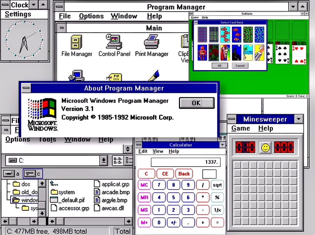
Windows 3.0 (1990) Rating: 6 Clippys
Microsoft makes a big leap with Windows 3, the first version to offer a coherent GUI, with pseudo 3D elements for buttons and scroll bars. Support for VGA graphics also means the cartoony look has gone away, making it look that more professional. It still needs DOS and has that weird File Manager/Program Manager split. Oh, and Minesweeper.
Windows 3.1 (1992) Rating 6 Clippys
Windows hits the big time. This is the version where it was clear Windows was the future and DOS was the past. Windows 3.1 actually doesn’t look much different than 3.0, though, so it rates the same.
Windows 95 (1995) Rating: 7.5 Clippys
With Windows 95, Microsoft managed to produce a version of its OS that scared Apple so much they ended up bringing Steve Jobs back, along with his own operating system, NeXTSTEP. Windows 95 introduced the taskbar, the Start button (it’s even labelled Start, how quaint!), a proper desktop and a continued refinement with the 3D bevelled look. The GUI is also simplified in some ways, with the title bar widgets all getting moved to the top-right corner. Icons are more detailed and colours are overall more subdued.
While it looks dated to our 2023 eyes, this GUI remains just as clear and functional today as it was 28 (!) years ago.
Windows 98 (1998) Rating: 7.5 Clippys
Windows 98 basically looks the same as Windows 95, but Microsoft did add a stylin’ gradient effect to title bars. It’s not enough to change its rating over 95, though. Sorry, MS!
Note: I am skipping Windows Millennium Edition (Me) because while it had changes under the hood, visually it is pretty much Windows 98 Third Edition.
Windows 2000 (2000) Rating: 8 Clippys
I admit bias here. First, this is essentially a version of Windows NT, which I said I wouldn’t be rating. Second, it really just brings the 95/98 look to the NT version of Windows. But this was the first version of Windows that tried to bridge the gap between consumer and business versions–and it mostly worked (if you could get it at a discount, like I did at the time). I give it a slight edge because they changed some of the icons, improving them, in my view. It also had a generally more sophisticated veneer–the last version of Windows to really use this approach for many years.
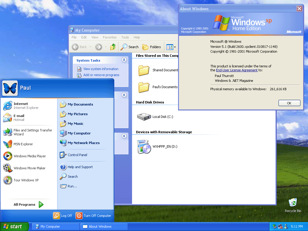
Windows XP (2001) Rating: 6 Clippys
Our first regression! Windows XP gave us a pretty wallpaper (probably the most famous OS wallpaper ever) and there’s something I find pleasing about the look of its buttons and most of its icons. The bevelled look, combined with much brighter colours, though, gives the OS a decidedly less serious look. I’m not sure what Microsoft was going for, but I don’t think “cartoony” is what they had in mind. Not a total disaster or anything, but kind of goofy-looking in hindsight.
Windows Vista (2006) Rating: 7.5 Clippys
With Vista, Microsoft sought to strip away the bright, simple colours of XP in favour of a glossy 3D sheen. For the most part, I think it works, though transparency does get a bit out of hand at times. I like how the Start button now looks more like a button. Icons are cleaner and more detailed. This is Microsoft saying Windows is all grown up now. Too bad about all the driver issues and steep system requirements.
Windows 7 (2009) Rating: 7.5 Clippys
As you can see, Windows 7 is pretty much Vista, but with the transparency toned down. This is welcome, but it’s not enough to change its rating over Vista.
Windows 8 (2012) Rating: 5 Clippys
And here we have a major step back. Microsoft somehow thought that in 2012 everyone would be using tablets with swipe gestures, and designed Windows 8’s GUI around this. They also elected to do away with finely-detailed icons in favour of simple, single-colour tiles and widgets. But the tiles could be one of many colours (and sizes), so you ended up with a crazy quilt look (see the screenshot below for a representative example). They got rid of the Start menu and the Start button. This is ugly. If you like Windows 8’s look, you are a bad person. You are the one Steve Jobs was talking about when he said Microsoft had no taste.
Windows 8.1 (2013) Rating: 5.5 Clippys
Windows 8.1 made some changes, such as adding back the Start button and including the option to boot to the desktop, but the GUI was mostly the same, and just as ugly.
Windows 10 (2015) Rating: 6.5 Clippys
Windows 10’s main mission was to undo Windows 8. It brought back the Start menu, it made the desktop the central part of the UI again, and it tamed some of the tile experience, though the flat look still persisted. This frankenOS approach means it feels like a cross between Windows 7 and 8. It’s not bad, but it’s also clearly the result of yanking the Windows GUI off in a new and unplanned direction.
Windows 11 (2021) Rating: 8 Clippys
There are things to critique about Windows 11–its security requirements, the all but mandatory MS account, a push toward oversimplification of the Start menu. But in terms of GUI, this is probably the most refined the OS has been since 2000. It also restores a cohesion to the look of the OS that had been missing since Windows 7 in 2009. Sure, it’s clearly aping macOS in some ways, like the rounded corners on windows, but everything looks very clean. I actually would give this version the nod, aesthetically, over the current version of macOS (Monterey as I write this)–though not by a lot. The biggest knocks are its lack of customization (in some regards), removal of features (the taskbar can no longer be moved to other edges of the screen) and Microsoft’s annoying habit of adding more intrusive bloatware, pop-ups and other distractions. Looks-wise, though, it’s pretty nice!
Overall, the versions I feel Microsoft got right (and iterated on) were:
Windows 3.0
Windows 95
Windows Vista
Windows 11
The ones that struck out were:
Windows XP
Windows 8
The early versions (1.0 and 2.0) were hamstrung by the technology at the time, while Windows 10 had to pick up the pieces from Windows 8.
Rumours say Microsoft is working on Windows 12. If so, I wouldn’t expect it to depart visually from Windows 11, but you never know.
Today, I girded myself for the troubleshooting I’d need to do to figure out what had possibly killed my PC. Here are the steps I took:
Unplugged everything.
Plugged the PC into my old 24″ monitor.
Attached a wired keyboard and mouse.
Turned the PC on.
PC booted up normally, no error messages or anything.
Yes, it acted like nothing had happened. I took it back into the office, reconnected it, and I am currently typing on it. Event Viewer in Windows doesn’t reveal anything particularly revealing to suggest what happened. My best guess is that after I left early in the morning to go birding, something bad happened and since I was out all day, it was unable to resolve itself.
What happened? No idea. Vague theory:
A program or process pegged the CPU at 100% and kept it there indefinitely. This caused the CPU fan to spin up to jet speed and it kept spinning like that.
As the PC grew ever-hotter, it began to shut down applications and functions, until basically the PC was on, but nothing was actually running.
When I got back and shut down the PC, it was too hot to power back up.
Giving it time to cool off allowed it to reboot normally. Since the rogue app or process would have been killed in the process, it started up as if nothing had gone wrong.
Now, I don’t know if this is really what happened, but it feels right, or at least right-ish.
The question is, do I shut down my PC at night and start it up in the morning, or just keep running it 24/7 as per usual and assume the shutdown/freeze was a one-time thing? Decisions!
But at least for now, it is working, and that deserves a cat:
While I like to think I’m being dramatic with the title of this post, it is quite possible my current PC, which I built in the Before Times of April 2019, may, in fact, be dead.
When I went out birding yesterday around 8 a.m. it was working normally. When I returned around 4:30 p.m. I heard a loud fan roaring in the bedroom office. My first thought was the actual Dyson fan, but it was still set to a low speed and barely audible. The noise was coming from the PC. I observed a few things:
The displays had switched from the PC (on DisplayPort) to the Mac (on HDMI).
The aforementioned high-pitched fan noise.
The CTRL keyboard was off–it was still connected to the PC, but the backlight was off, indicating it was getting no power.
The CPU’s RGB lighting (a rather ominous-looking red ring) was still on.
I tried turning the PC off using the power switch on the front. No response. I tried the reset button, also no response.
I then hit the power switch on the PSU itself, and this did power the PC off.
It has yet to restart since. It appears to be getting no power at all, so my suspicion is either the PSU died (bad) or the motherboard or some component on it went (worse). I’ll be doing some testing today. I’m sure it will be a delight.
For the moment, though, I am a Mac-only guy1Technically I still have my ThinkPad X1 Carbon, but other than the keyboard, which is a decadent luxury for a laptop keyboard, I don’t really enjoy using it much.
No actual yelling on the phone took place. Also, I don’t have nice hair like this guy. Or hair. Photo by Moose Photos on Pexels.com
First, let me start by saying that I worked many years in tech support and have spent a lot of time trying to help people. I know a lot of people suck, but I also know that reps, whether for tech or customer support, are often obligated to stick to scripts, ask certain questions and say certain things.
I get it.
It’s still bloody annoying.
Recently, I decided to make some changes to my Telus Optik TV package. They allow you to make changes to your plan online–I had done so in the past. Now, all I would get when clicking the appropriate link from my online account is an error message. This one:
I tried again today…same error. So I called the 800 number and girded myself. My request was simple: “I don’t watch regular TV, so I would like to cancel my Optik TV package but keep my internet service.”
This is how it went:
I call, and I am put on hold for a few minutes. This is not bad. However, extremely loud hold music plays while I’m waiting. I turn my phone volume down. Remember the olden days when your only option was to hold the receiver away from your ear? Dark ages!
The customer representative (henceforth “rep”) greets me and asks for my account-related info.
Rep audibly gasps when I say I want to cancel my TV service. I don’t know if this is scripted or just a dramatic bonus.
Rep: “Please wait while I check your account” and “I’ll call YOU back if we get disconnected.” I never find out what exactly she was checking for, but I have theories1.
10 minutes of silence follows. No hold music plays, so I don’t think I’m on actual hold. About eight minutes in, she pops up to assure me it will just be a few more minutes (this is accurate).
Rep moves to next stage: retention/talking me out of cancelling. Rep offers other TV plans/bundles, including one that vaguely sounds like I’d pay less for the internet part (good) but still pay for the TV part (bad). I decline all offers.
Rep switches to offering other services, like security cameras, etc. I decline these.
By now I am visibly annoyed. I tell her to stop trying to upsell me stuff and to just cancel the TV service, or I would ask to speak to a manager.
Rep finally relents and tells me how to return the PVR after I get confirmation by email on the cancellation. She seems unfazed by the whole thing, as if we’d just started the call. Rep tells me service is now cancelled and tells me to have a wonderful day.
Total time: Felt like forever.
I got two emails shortly after, one saying I’d been removed from the Optik TV service, and another confirming the cancellation. I checked the TV and verified that, yep, I no longer had access. Fast! In a day or so, I’ll receive another email with a waybill I can print in order to ship the PVR and remote back to them (no charge).
As I said, I appreciate that these people have to follow a script, but the whole process is repellant and a waste of time. A few clicks on their website would have worked, but it’s been broken for months (and I had a long chat with another Telus rep about it; she finally advised me to just call to make changes to my account if the site remained broken. Great show of confidence in your web team! And justified, as it turned out).
Theory 1: Simply hoping I’d get tired of the silence, hang up, and the rep would “forget” to call back, ensuring no cancellation takes place. Unethical and probably illegal, so not very likely. Theory 2: She is checking past bundles and packages I’ve had in preparation for the next part of the phone call: convincing me to not cancel. ↩︎
Back in 2019 I got the CTRL keyboard. It defaults to a strobing rainbow lighting effect when you first plug it in. This is very dumb, but it’s an otherwise very fine keyboard.
In 2022, I got a Keychron Q1 with knob. It is also a mechanical keyboard, but is in many ways a very different thing altogether. For some time now, I have used both, usually swapping them out after a few weeks or so, but I find myself gravitating to the CTRL more often now. Why is that? Let’s compare!
CTRL keyboard
Type the rainbow!
This is a tenkeyless design, meaning it’s like a regular keyboard, but with the numeric keypad lopped off. It comes with hot swappable keys that are backlit. The backlighting shines directly through the keycaps, which means the keys are actually difficult to read if the lighting is turned off–an issue for a non-touch typist like me. Here are its main features that matter to me:
Adjustable backlighting
Halo Clear switches (more on these later)
Two USB-C ports, one on either end
Pros:
I really like Halo Clear switches. They have some of that familiar CLACK you get with blue switches, but it feels softer and smoother.
Keys are big enough and spaced in a way to mostly work with my fat-fingered typing style
The rainbow lighting (non-strobing variety) eventually grew on me
Relatively light, but not so light that it slides around
Cons:
The magnetic feet are all but useless, popping off when you stare intently at the keyboard
The aforementioned keys pretty much requiring the backlighting to be on. Granted, this could be fixed with different keycaps.
No knob or other special features. It’s just a solid tenkeyless keyboard.
Default keycaps don’t have media controls listed on them and I can never remember the proper FN-key combos to use them, so I always do it from the software.
Keychron Q1 with knob
This is the same colour as mine, but I have a red ESC key. Also, my desk does not have any mini cowboy hats on it.
I specify “with knob” because you can get the same keyboard with a key in place of the knob. This is also a tenkeyless keyboard, but goes a step further, by lopping off most of the keys that normally sit to the left of the numeric keyboard. You still get arrow keys and a few others. It also has that programmable knob, which I’ve used mostly for adjusting volume.
Features:
Adjustable backlighting
Gateron G Pro Blue switches
One USB-C port
Pros:
Built like a tank
Gateron G Pro Blue switches are pre-lubed, so have a velvety smooth feel when typing
Switches are also relatively quiet for blues
The knob adds versatility
Convenient switch on back to flip between Mac and Windows keyboard layouts
Comes with both Mac and Windows keycaps
South-facing backlight means the keys work fine with backlighting turned off
Cons:
Doesn’t include silly little removable feet, but also doesn’t include any way to adjust the angle of the keyboard at all, which I think is a mistake
The keys feel smaller to me or are arranged more tightly, so I find myself making a lot more errors when typing vs. the CTRL
The space bar is noticeably louder than the other keys
The keyboard is so heavy you never have to worry about it sliding around the desk, but it’s also so heavy that it’s just plain awkward to pick up and move, even a little
I don’t care for most of the backlighting options, and settled for a rather muted green as the least weird-looking choice
Verdict
In the end I find myself sticking mainly to the CTRL, for two reasons stated above:
I prefer the Halo Clear switches to Gateron G Pro Blue, though both are very nice. Halo Clears feel more “solid” to me.
The size or position of the keys on the Keychron Q1 has consistently confounded my fingers. I try to get used to it, but never quite get there. It occurs to me now (seriously, I just edited this in after publishing this post) that the slightly upright position of the Q1 may be throwing my fingers off. I use the CTRL laying flat on the desk. There’s no way to adjust the angle on the Q1, so I can never adjust it to my liking.
Both keyboards are excellent, but each has its own flaws–at least for me (though I do think the magnetic legs on the CTRL are pretty silly). If someone took away my CTRL keyboard and hid it in a very clever place, I imagine I’d eventually get used to the different keys of the Keychron Q1. But I’d probably spend a few nights having typing-related nightmares along the way. Maybe the ghost of Mavis Beacon would show up.
For the past week or so, my brain has just not been cooperating with this blog. Giving myself permission to write about anything I want here was liberating, but even that freedom hasn’t been enough the past few days. I stare at the blinking cursor, and then I feel my mind drifting off, not to some great blog topic, but just weird little mundane things and thoughts. Nothing that I’d want to share in this space.
I do have a backup–a collection of blog ideas saved in Obsidian. But a lot of the topics I’ve jotted down no longer appeal. A lot of them are Apple kvetching, and I exceeded my quota on that at least 50 years ago.
So I end up doing these meta posts.
Oh, I just thought of a topic: Mastodon clients!
Mastodon is the only social media I use semi-regularly right now and I like it because:
No ads
No “reels” or other unavoidable short form videos
No algorithm–I only see the people/orgs I choose to follow
Not overwhelming. I like that I can easily keep up with what I’m following. It feels cozy and approachable.
I also don’t visit Mastodon on mobile. It’s strictly on my Mac or PC. On the Mac, I use the Mona app, which is a one-time purchase (hooray) and works well. On Windows, I use an alternate web version currently in alpha called Elk. It improves on the web interface and is pretty good, with only a few minor shortcomings. Still, I’d rather use a dedicated client, but all the Windows clients seem to have some flaw, the most common of which is they are ugly as butt. Windows apps don’t have to look ugly, but so many do. Every Mastodon client I’ve tried has been butt ugly. So I use Elk.
I don’t know why, exactly, the odds of a Mac app looking better than a Windows app is so high, but I suspect that it has something to do with the Mac GUI always being “good” and remaining fairly consistent over the years, with few dramatic changes. There’s a polished kind of consistency.
With Windows, well, just look at the GUI for different flavours:
Windows 1.0. I mean, yikes. But it was also 1985.
Windows 3.0. Pretty slick for the time, but crude by today’s standards.
Windows 95. Pretty decent, really.
Windows XP. Changed pretty much all UI elements in a way some liked, but others didn’t, feeling it was too “cartoony.”
Vista. Ignoring the initial quality of the OS, it again completely revamped the look, giving everything a pseudo-3D effect and having a glossy, reflective sheen to it.
Windows 8. Another complete change, flattening everything and subbing in garish colours and simplified icons.
Windows 10. A hybrid of 7 and 8 that reverses some of 8’s design.
Windows 11. A refinement of 10 that again changes the look of many elements, though perhaps not as dramatically as before.
Basically, if everyone followed the design language of Windows 11, apps would look pretty good. But a lot of apps seem to be weird hybrids of older versions of the OS and that’s when you get butts meeting the ugly.
Oh well. In the end, we’re seeing fewer native apps on both Windows and Mac as more devs use tools like Electron to make apps that look and feel the same (and don’t feel particularly native) on all platforms. I guess that’s the future.