By way of Tom Scott, I came across MetroDreamin’, a site that allows people to design the transit system of their dreams anywhere in the world.
I was curious to see if anyone had done anything with Metro Vancouver, where the actual transit authority, Translink, has timidly expanded its rapid transit program over the last 38 years. And they had!
This is my favourite example, which includes tram lines and SkyTrain everywhere.
Here’s an image of the map for the click-averse, but the link above is better (and doesn’t require an account).
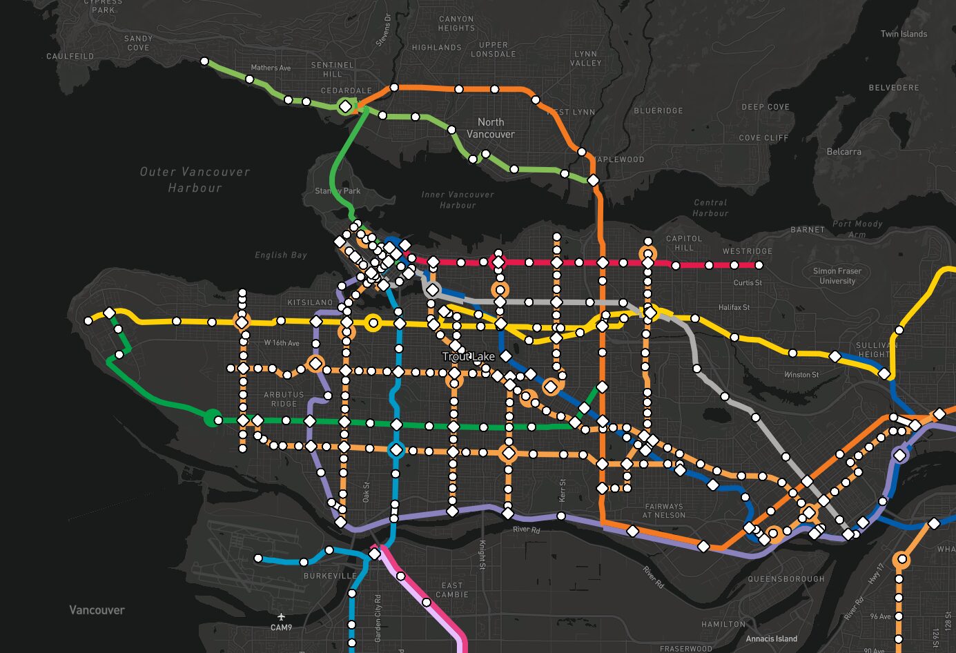
And a close-up of the dense section around Vancouver proper:
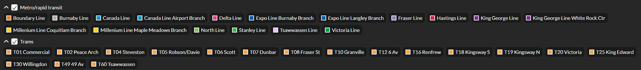
And not forgetting the legend that details the various lines, both existing and imagined:
I love this kind of stuff. It’s too bad this remains a fantasy, because there are a ton of good ideas here, but no political will (including the financing) to make it real. Metro dreamin’ indeed.
There are various issues with the location and design of stairs and escalators across the entire SkyTrain system and I have posted about issues specific to the Canada Line, but for this I am going to focus on the station closest to where I live, as it is a good example of bad design.
First, let me note that the Millennium Line, opened in 2000, is overall an improvement to the Expo Line and its stations. The Millennium Line stations are spacious, completely covered for inclement weather (important for an area that gets a lot of rain), feature glass-enclosed elevators for better security, and each station has its own unique look, getting away from the cooke-cutter design of the Expo Line.
One area in which they went cheap was escalators. A lot of stations follow the one staircase/one escalator rule, where there is an up escalator to get people up to the platform, and a staircase to get them down. As cost-cutting measures go, it’s not the worst, but they are moving away from it now, because crowded stations and stairs are inefficient for getting people in and out quickly (see Lougheed Town Centre station, which added a down escalator at the north end, around the same time its third platform opened for the Evergreen extension).
At Sapperton station, both sides feature the one staircase/one escalator design. The problem here is that designers did not anticipate how people act. A lot of people will—quite logically, you could argue—take the path of least resistance. In this case, when someone exits a train, they will veer toward the closest route that will get them off the platform and out. At Sapperton this is the staircase, as it is closer to the platform than the up escalator. The up escalator requires the person to cross over the platform.
Now, you could argue the logic of this design is that having the staircase closer to the platform is more important, because it makes it easier for people to board a train. And that’s true. However, by putting the staircase closer, you inevitably increase the number of people using it and ignoring the escalator, which is farther away.
The end result is you get people both going up and down the stairs. This impedes people trying to get to the train, the very thing the designers were presumably trying to avoid. It also creates cross-traffic on the platform itself, as people exiting a train and using the up escalator must cross in front of the stairs.
During busy times, it’s a bit of a mess.
Now, if the stairs and escalator were reversed, you’d encourage people to take the escalator to leave the platform, plus you’d keep them from getting directly in the path of people coming down to board. People coming down would have to move slightly farther to get to the staircase at the top, but this would almost always be more efficient than putting them into the direct path of people leaving the platform.
Unfortunately, this design will never get fixed in existing stations and really, it’s too expensive to be worth the improvement in traffic flow, as nice as it would be. More happily, as mentioned earlier, it appears Translink is largely scrapping the use of stairs. An example is the remodelled Metrotown station, which previously had a single staircase and escalator at its east end. It was a huge bottleneck. The remodel opened up the west end of the platform and now there are four escalators (two up, two down) at both ends, vastly improving the efficiency in getting people in and out of this often crowded station.
So this is a case of bad design, but bad design recognized. Thumbs up, I say.