Maybe it’s me (it’s probably me), but when I saw this ad in an unnamed email flyer, I thought:
a) That annoying art style I so fervently dislike b) The person done in that art style, with the spaghetti limbs, is shaped…sort of like a swastika?
So I looked up an actual swastika to compare. According to Wikipedia, the left-facing swastika is “a sacred symbol in the Bon and Mah?y?na Buddhist traditions.”
It looks like this:
And if you tilt it 45 degrees, the legs work, but the arms are bent the wrong way, because that would be a very odd way for someone to hold their arms while running.
Still, it made me think of a swastika, and I can’t be the only one. I mean, yes, I totally can, but I’d like to think I’m not (fake edit: apparently this has been discussed on social media of some sort and the consensus is totes a swastika).
Dear advertising wizards: Don’t make your stuff look like swastikas. And pay more attention in history class!
Let’s say you are selecting a large swath of text in the Apple Notes app on your iPhone. First, I am very sorry for you because doing this is a tedious and finicky task. And let’s say once you select the text, instead of tapping Copy you hit something by mistake and delete the text. How do you get the text back? Simple, just tap Undo!
Except there is no undo option. It turns out there are two ways:
Shake the phone vigorously. This assumes that you have the option enabled and that you are shaking the phone in the correct way.
Tap on the Markup icon at the bottom of the screen. Next, look at the top of the screen and tap the now visible and visibly tiny Undo arrow.
Neither of these are anything even remotely close to being discoverable or obvious. The second one doesn’t even make sense. Why is the Undo option that works on text buried under a completely unrelated function? If you look at the Notes app, there is plenty of space for Undo/Redo icons at the top of the main screen. Why aren’t they there? Who knows! But hooray for Apple being so stupidly big they can’t keep themselves from making idiotic UI choices like this. Maybe invest a few tens of billions into fixing these kinds of things.
For the past week or so, my brain has just not been cooperating with this blog. Giving myself permission to write about anything I want here was liberating, but even that freedom hasn’t been enough the past few days. I stare at the blinking cursor, and then I feel my mind drifting off, not to some great blog topic, but just weird little mundane things and thoughts. Nothing that I’d want to share in this space.
I do have a backup–a collection of blog ideas saved in Obsidian. But a lot of the topics I’ve jotted down no longer appeal. A lot of them are Apple kvetching, and I exceeded my quota on that at least 50 years ago.
So I end up doing these meta posts.
Oh, I just thought of a topic: Mastodon clients!
Mastodon is the only social media I use semi-regularly right now and I like it because:
No ads
No “reels” or other unavoidable short form videos
No algorithm–I only see the people/orgs I choose to follow
Not overwhelming. I like that I can easily keep up with what I’m following. It feels cozy and approachable.
I also don’t visit Mastodon on mobile. It’s strictly on my Mac or PC. On the Mac, I use the Mona app, which is a one-time purchase (hooray) and works well. On Windows, I use an alternate web version currently in alpha called Elk. It improves on the web interface and is pretty good, with only a few minor shortcomings. Still, I’d rather use a dedicated client, but all the Windows clients seem to have some flaw, the most common of which is they are ugly as butt. Windows apps don’t have to look ugly, but so many do. Every Mastodon client I’ve tried has been butt ugly. So I use Elk.
I don’t know why, exactly, the odds of a Mac app looking better than a Windows app is so high, but I suspect that it has something to do with the Mac GUI always being “good” and remaining fairly consistent over the years, with few dramatic changes. There’s a polished kind of consistency.
With Windows, well, just look at the GUI for different flavours:
Windows 1.0. I mean, yikes. But it was also 1985.
Windows 3.0. Pretty slick for the time, but crude by today’s standards.
Windows 95. Pretty decent, really.
Windows XP. Changed pretty much all UI elements in a way some liked, but others didn’t, feeling it was too “cartoony.”
Vista. Ignoring the initial quality of the OS, it again completely revamped the look, giving everything a pseudo-3D effect and having a glossy, reflective sheen to it.
Windows 8. Another complete change, flattening everything and subbing in garish colours and simplified icons.
Windows 10. A hybrid of 7 and 8 that reverses some of 8’s design.
Windows 11. A refinement of 10 that again changes the look of many elements, though perhaps not as dramatically as before.
Basically, if everyone followed the design language of Windows 11, apps would look pretty good. But a lot of apps seem to be weird hybrids of older versions of the OS and that’s when you get butts meeting the ugly.
Oh well. In the end, we’re seeing fewer native apps on both Windows and Mac as more devs use tools like Electron to make apps that look and feel the same (and don’t feel particularly native) on all platforms. I guess that’s the future.
PROGRAMMING NOTE: This is not actually about programming. I just wanted to pre-apologize for YANP (Yet Another Negative Post). I'm still recovering from a surprisingly long illness and am kind of grumpy about it. I promise to be more charitable, loving, etc. soon™.
The Browser Company, makers of the Mac-only (but eventually also Windows) browser Arc, sends out a periodic newsletter with updates on all Arc things. This is good! The newsletter is full of pictures and animations and is written in a fun, engaging style. This is also good!
The newsletter is written in 10 pt. Courier. This translates to around 13px.
I have a pair of monitors that run at 2560×1440. 13px type looks like this relative to the screen size (it may look larger or smaller depending on the resolution of the device you read this post on, but for reference, it is, on my displays, SMALL):
Most of the email I get is in some sans serif font, like Arial, and in sizes ranging from 14px up to 18px. The reason why most email uses these settings is because it makes the text clear and readable.
Tiny Courier is the opposite. It’s also ugly as heck. It’s not 1986. Stop trying to be cute and “retro.”
And yes, I did complain (tactfully) to Arc about this.
If I do a search for “the best” on engadget.com, I get 10 results in the portion of the site that is revealed without further loading:
The best iPad accessories for 2023
The best laptops for 2023 (twice)
The best early Prime Day deals for 2023
The best 2-in-1 laptops for 2023
Fisker gives the best look yet at its 600-mile range Ronin EV (twice)
The best wireless earbuds for 2023
The best projectors you can buy in 2023, plus how to choose one
The best budget wireless earbuds for 2023
The story in bold doesn’t really count, as it’s using “best” differently.
These are the exact kinds of articles you find on pages that exist solely to be SEO results in Google web searches. And engadget is now stuffed with them.
What makes this funnier (or sadder) is that engadget has recently started recycling a number of these SEO-friendly articles, constantly bringing them back to the front page, often with few or any updates, seemingly to push this kind of SEO stuff to the top (I can’t say what their actual motives are, of course, this is just my best guess).
For example, their article on running watches, cleverly titled Best GPS running watches for 2023 does recommend the current Apple Watch Series 8 (though keeping in mind it’s nearly a year old and one might argue the Apple Watch Ultra is better for running), but then it recommends the Garmin 745 for triathletes. The problem here is while Garmin does still sell the 745, it’s now an old model that is not getting replaced with a newer one. The Forerunner line has been simplified and the upper end, once held by the 245/745/945 is now represented by the 265/965, with the 265 (and the 255 before it) absorbing features of the 745. Any of the 255/265 or 955/965 are better options for triathletes, in terms of price, functionality and longevity (the 55 and 65 series are mainly differentiated by the display, with the 65s using AMOLED).
The story has a byline of June 9, 2023, yet the first comments date back to March 2022, belying its recycled history. The comments are almost uniformly critical of the choices, too, pointing out issues of comparing old Garmin vs. new Apple. And the article is by the editor-in-chief, so there’s no ambiguity about whether engadget is okay with this sort of thing.
It’s transparent and kind of gross and makes engadget seem less interested in being about quality news and reviews and more about ranking high in Google search for the $$$. Which is a thing, I guess.
UPDATE, June 26, 2023 (a day later): YouTube changed Appearance to Device theme again--and is once again blinding white on Windows 11.

Conclusion: YouTube is bad and should feel bad.
Or maybe I don’t understand it (this is possible–see below for details).
When I watch YouTube, I do so primarily on two devices:
My Mac Studio
My custom-built PC running Windows 11
Each respective OS allows you to choose an overall theme for the interface, and each OS refers to these as Dark and Light. I have both macOS and Windows 11 set to Dark because I find it easier on my old man eyes and particularly for working on images, photos or watching videos.
YouTube seems to go slightly crazy now every time I open the site on a different device and chooses to reset three settings each time:
Appearance changes from Dark to Use device theme
Always show captions gets checked ON
Inline playback gets set to ON
Also, why is one of these a checkbox and the other a toggle? See screenshot below.
YouTube being bad and it should feel bad. Because it is bad.
It also turns Ambient mode on, and this can only be toggled back off when you click on an individual video. It then remembers the setting for all videos, which is ???
Anyway, the issues I have are:
YouTube arbitrarily changing all of these settings
Changing them on what is now a regular and perpetual basis
But mostly:
What is “Use device theme” and why does it exist as a choice when the only themes the OSes come with are Light and Dark, both of which are covered?
Why does it switch to “Use device theme” and make the YouTube interface bright as the sun when I have all OSes set to Dark?
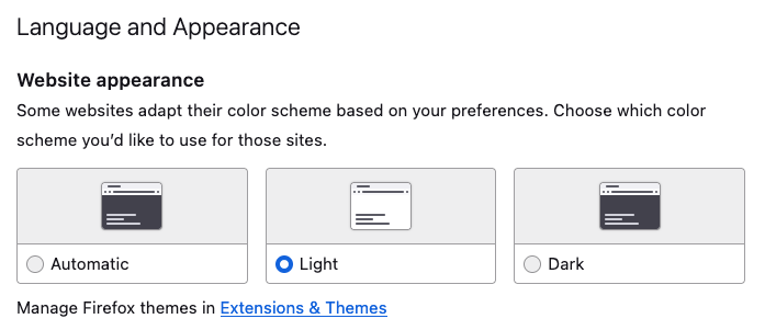
I thought it might refer to using one theme or the other and then customizing it somehow, like choosing Dark but having hot pink window borders or something. But while I do something like that in Windows 11 (well, not the hot pink), YouTube still interprets Use device theme as Light mode, which is wrong, and you know, as I’m typing this I think I may have discovered the issue. All this time I thought “device” meant hardware, but it may in fact be software–specifically, the browser. Because in Firefox, I have it set like so:
A few sites will impose their dark theme on you unless you specifically set the above to Light, so this is my way of insuring these sites stay light. YouTube may be using this setting. I am going to change this to Automatic, set YouTube to use Dark for appearance, and see what happens.
I will update this post with exciting details in the near future.
If it works, YouTube is still bad, because the language it uses is ambiguous–and it still changes three other settings willy-nilly on its own, anyway. But it won’t be quite as bad.
Addendum: If I was obscenely rich, I would totally start a competitor to YouTube.
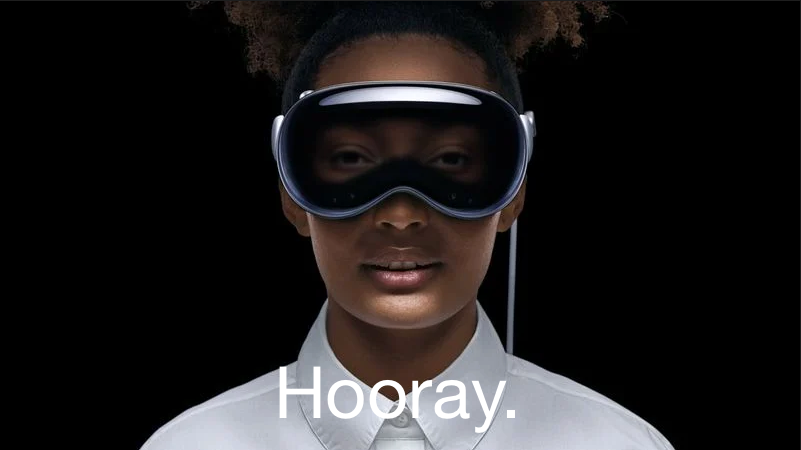
UPDATE, July 133, 2024: Apple is promoting the Vision Pro on the Apple Canada site, as it is now available for purchase by moose and other Canadians.

The image on the landing page is below. It basically reverses everything I list about the original image in this post.
Original post:
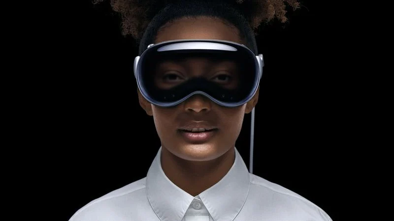
If you’ve seen anything about the Vision Pro, Apple’s new don’t-call-it-AR headset, you’ve probably come across this photo:
I’m here to tell you why it’s creepy and bad, and Apple should feel bad for using it.
In a list, of course!
The black void behind the person is off-putting. Where is she? Is she just floating in nothing?
The ultra-white starched dress shirt with the buttons done up to the top. This is incredibly twee and so very Apple. It’s a look that comes pre-dated. No one dresses like this.
The light around the fake eyes make them look dopey, as if the person is tired and wants a nap. They also look unreal and your brain will constantly be reminding you of this every time you see them.
The slightly-parted mouth is off-putting. She’s not smiling1You may argue that she is, in fact, smiling, but the fact that we have to debate it proves the point. So says I!, so why is she showing her teeth? It’s like she got a shot of Novocaine and her jaw is hanging slightly slack as a result. Also, the way the light bounces off her lips and chin is unnatural. Is she holding a flashlight at her waist and pointing it up? I used to do that to tell spooky stories when I was 12 years old. I also didn’t need a $3500 headset to do it.
The hair. It’s hipster hair. I’m willing to let this one go, though, because it is, in the end, just hair.
The ears do not look like they are part of her head. Again, this is a lighting issue.
Airbrushing. Yes, every face gets airbrushed in ads, and it still makes the skin look plastic and fake, like a glossy mannequin.
Other than the above, it’s a perfect photo to represent Apple’s Vision Pro don’t-call-it-AR headset (it’s totally AR).
This has always been a pet peeve of mine and while it seems less common now, I still see it more than I’d like (which is never!)
I won’t call out specific sites since I can illustrate this directly. Observe!
Let’s say I am writing an article about how a Mac Finder window does not show the + (plus) sign to open a new tab until after you have opened at least two tabs. I provide an image to illustrate this, like so:
This is a tiny screenshot. You can probably make out that there’s a window being shown, and multiple tabs, but that little + symbol? Maybe if you have superhero vision.
But this can be solved by making the image clickable! Go on, try clicking on it.
I have not enabled the ability to do this, so it remains tiny. Some sites go halfway on this if you right-click the image and choose Open Image In New Tab. Go ahead, try it!
Nope, the image is just plain tiny and largely inscrutable. This is bad design.
Good design is making the image pop-up in a lightbox that keeps you on the same page, lets you view the image in all its loving detail, then close the image and continue reading the web page in delight and/or wonder, like so (bonus points, though this is optional, the author can add a caption to indicate you can click):
Click image to embiggen
And that’s it! Make this a priority for Web 4 or whatever is coming up before AI runs amok and destroys everything.
Who is this type of graphic supposed to appeal to?
This is featured in a Dreamhost article on blogs and I assume it comes from a stock library of images, since there’s no attribution. But look at it.
What I see is random gigantism. This woman has absolutely massive arms and hands (her fingers can probably crush that laptop’s keyboard with a firm press), relatively normal legs and a freakishly small but happy-looking head. Is this woman cheerfully looking up cures for gigantism? Maybe methods on how to placate the menacing mint green blobs looming behind her?
I don’t know. But I do remember I’d seen a video on this art style before, and you can learn more about Alegria/Corporate Memphis and more via this excellent struthless documentary on the topic, appropriately titled “The world’s most hated art style”:
Yesterday, Apple updated its base iPad and iPad Pro models, along with the Apple TV box, via press release and tweet. Speaking of tweets, here’s one showing how you charge the Apple Pencil on the 10th generation iPad (that’s the one they announced yesterday if you aren’t a hopeless tech geek like me):
I had the 10.5″ iPad Pro from 2017 and it used the first generation Pencil–it charged just like in the Old shot above, though I used the female to female lightning adapter to charge it via cable rather than risk it snapping off while plugged into the iPad in what was an ill-considered charging scheme.
Speaking of ill-considered, the new iPad still only supports the first-gen Pencil, but eliminates the lightning port in favour of USB-C, thus creating a situation where there is no way to charge the Pencil (the 2nd gen Pencil charges via induction by magnetically attaching to a side of the iPad).
Apple’s solution is to now include (another) adapter with the first-gen Pencil that allows it to connect to a USB cable, which then plugs into the iPad. This is also how you pair the Pencil. It’s cumbersome and requires two separate items (the adapter, the cable) in exchange for previously needing none.
It’s silly and dumb and Apple is rightly getting roasted for it.
Some are speculating that Apple did this because they finally moved the front-facing camera to landscape mode and couldn’t figure out a way to also includes the magnets in the same space to allow induction charging. That’s possible. Did Apple make the right choice? Will more people use the front-facing camera than a Pencil? I really don’t know. It seems like six of one, a half dozen of the other to me, but I can’t help thinking Apple either should have found a way to make induction charging work, or not move the front-facing camera until they could. This solution is an awkward, muddled compromise.
And it’s an excellent example of the current state of Apple.
Also note: The iPad Pros announced do not get the landscape camera, because they’re just getting a spec bump. Fair enough, you might say, but people are inevitably going to wonder why the low end model now has a superior camera to the high end, and rightly so. Apple wasn’t forced to spec bump and release the updated iPad Pros at the same time–but they chose to.
This is also an excellent example of the current state of Apple.
(I didn’t even mention the absurd $120 increase in price for the base iPad, which Apple acknowledges by keeping the old $329 model in the line-up. We’re at a point now where it makes more sense to buy older Apple stuff than the latest, because the latest is overpriced, even by Apple’s lofty standards.)
Oh, Apple. Why are you always such an easy, juicy target?
The iPad copied the iPhone when it came to front-facing (selfie) camera placement, by putting them at the top of the device when holding it in portrait orientation.
It makes perfect sense for a phone, since you are basically never going to hold it in landscape mode when taking a selfie, which is what most people will use their phone’s front camera for.
No one takes selfies on an iPad. Okay, there are obviously some (odd) people who do, but for most the front-facing camera is used for a couple of things:
Face ID to authenticate on the iPad Pro
For video meetings using Zoom, Teams, FaceTime, etc.
For video meetings, it makes little sense to have the camera at the top, because most iPads are in landscape mode for these meetings, which means the camera is now off to the side. The same applies to Face ID, which often has trouble “seeing” my face when I have the iPad on my desk, usually forcing me to lean to the side that the camera is on to get it to work. It’s a minor but persistent annoyance.
In a rare display of independence, Samsung has actually moved the front-facing cameras on its tablets to the top when in landscape mode–like they should be!
Apple should do the same. They should have really done it about ten years ago, but doing it now will suffice. They have a chance this month when the rumoured revision of the base iPad is released. Will Apple do the sensible thing? (lol no)
UPDATE, October 18, 2022: lol yes! Apple announced the 10th generation iPad via press release and it has a front-facing camera in landscape mode! They also raised the price from $329 U.S. to $449, so, uh...enjoy the new camera placement, if you can afford it!
When you speak to old Mac geezers (OMGs), they will often wax poetic about Snow Leopard as being the best version of OS X (and remind you it’s the Roman numeral 10, not the letter X), not because it came with a boatload of new features, but because it didn’t. Apple advertised it as having “0 new features” because it focused on improving existing features and fixing bugs found in Leopard, the previous version of OS X.
Back then (roughly the first decade of the 2000s) Apple released its updates on a “when they are ready” schedule, which meant you could go almost two years between updates. That changed in 2012 when Mountain Lion (OS X 10.8) came out a year after Lion. Henceforth, all Mac OS updates would come out on a yearly basis, ready or not.
Ready or not.
iOS updates and the rest of Apple’s lowercase-Uppercase OS releases followed suit, and now yearly releases are the norm.
And they are a bad idea, bad for the industry, bad for users, and Tim Cook should feel bad.
Why? One word: Bugs.
Apple has tacitly admitted it can’t keep up with yearly releases, because it now regularly leaves out major features until “later”. Just this year they delayed iPadOS 16 altogether from September to October just to get things working properly. Yearly releases are not sustainable, they’re dumb, and serve no one when they come with incomplete or missing features and copious glitches. Apple is the 800 pound gorilla in consumer electronics, so if they change course, the industry is likely to follow. And they should!
And the thing is, if Apple switched to updates every two years or “when they’re ready” people would still buy tens of millions of iPhones, plus oodles of iPads, Macs and AirPods, not to mention staying subbed to the cash cows that their services have become. But Apple is not only gigantic, they are incredibly conservative and unlikely to change course unless forced by circumstance or the law (but mostly the law).
Why do I think this? Why am I posting now?
Because watchOS 9 is a bug-riddled mess and since I use my watch for my running workouts, the glitches affect me on a regular, ongoing basis. None of these issues happened before watchOS 9 was released (Apple eventually forces updates, so you can’t even just stay put, eventually you’ll need to upgrade).
Among the bugs I’ve encountered:
Stuttery or missing animations (not a big thing, but annoying)
Unreliable heart rate monitoring, especially at the start of a run (this is a big thing)
Music playback on the watch being permanently muffled when interrupted by a notification. It happened today (again) and even closing the music app did not fix it. I restarted the app and tried three albums before the music finally popped back to regular volume.
Pausing music playing from the watch via the AirPods (clicking the touch control on one of the earbuds), then unpausing, and the playback switches to whatever you were previously listening to on the iPhone. It’s like having someone come into your living room, quietly pick up the remote, change the channel from whatever you were watching, then just as quietly leaving the room.
I suppose I should be happy most things are still working. But bleah, the yearly updates are clearly not going to improve, so I really wish Apple and the whole industry would move away from them.