Seriously, this should be a solved problem, but the only way to get consistent performance on a mouse when I’m using any Mac (I have owned three in the past four years) is to use one that plugs in using old-fashioned cables.
Tonight I have been using my MacBook Air with the Logitech Marathon mouse and it started out fine, but over time the mouse cursor starts to become slow and then erratic, glitching across the screen. It improves for a bit, then starts glitching again. If I dig out one of my old wired mice it works just fine, so it seems like there’s something up with both Bluetooth and Wi-Fi connectivity on Macs.
This never happens in Windows. In fact, I can take this exact same mouse and use it in Windows right now and it will operate perfectly fine. My regular Windows mouse is a Logitech G703 wireless gaming mouse. It works perfectly when untethered.
I just don’t get it. It’s like Apple optimizes the OS to only work with their mice and nothing else. It’s incredibly annoying and reminds me why I never manage to make it long whenever I try using the Mac. For an OS that gets lauded for its stability and design, it has some pretty deep flaws.
At least the keyboard works properly. Oh wait, it’s plugged in. Bleah.
Conan Exiles is a survival/crafting game that is sort of like an MMO, with servers, private and public, in which you create a barbarian (complete with endowment if you like) and go forth into the desert and jungle terrain, building, hunting and gathering. You can even craft a wheel of death. It’s very pretty and there is always satisfaction in making stuff.
But the UI is not great. The crafting part of it tries to be so helpful it actually confused me, because it includes a non-interactive “demo” of the crafting UI next to the actual crafting UI and I tried interacting with both until I realized that only one worked. Sure, I was being a bit of a noob, but at the same time it’s a cluttered mess.
But the worst part are the keybindings.
You can rebind most keys to your liking, which is good. Way back in 2001 I switched from the classic WASD layout to the default used in the game Tribes 2, ESDF. You can argue over which is better, but WASD is still the default for moving around, and so it is in Conan Exiles. I changed it to ESDF and called it good.
Then I discovered that when you open a box or container, there are certain shortcut keys to do things, like Loot the selected object or Loot All to take everything.
The Loot All key is set to F by default. You see the problem here. If I looked into a box filled with a dozen items and then stepped to the right, I would grab everything as I shifted slightly over. I did this a few times before wondering why my barbarian was becoming spontaneously over-encumbered.
I went into the keybindings to change this and, oddly, could not find a key for Loot All. Because there isn’t one.
I could not believe there was no way to re-bind the key, so I hit the internet and DuckDuckGo led me to a Steam Community Forum post that gave me the info I needed–buried deep within the game’s subfolders is an input.ini file, and you can manually edit it to change these otherwise un-bindable keys. The Loot All key looks like this. I set mine to P for Please Don’t Loot All Anymore:
This is bad design for two reasons:
Burying some of the keybindings in an ini file that must be edited manually
Allowing the player to re-bind a key to one that can only be changed through the method described above
The Solution: Add another section to keybindings, titled Containers or something to that effect, and allow players to easily change these keys–and when you use a key that is already bound to something, tell the player and then unbind it if they confirm the new binding.
As terrible as 2020 has been, we still have modern conveniences, like toasters, washing machines and keyboard shortcuts for formatting when writing text on the web.
Unless you use Goodreads’ “What did you think?” text box to add a review of a book you’ve read. In this case what you get is a text box that could have existed in 1998, unchanged.
Here’s the set of formatting tips it includes, which could have been cribbed from Learning HTML for Dummies, 1999 edition:
They do have a few concessions to the 21st century, mostly related to allowing easier linking to content on its own site (a coincidence, to be sure), and if you use a proper link, it will automatically make it clickable, a true miracle of modern web magic.
But looking at the warning about improperly nesting tags really does take me back to when I was building websites in HTML by hand and yes, it really was in 1999.
Given how trivially simple it is to offer simple and easy formatting controls (keyboard shortcuts and a formatting bar, both of which are available to me as I write this post in WordPress), the only reason I can think for a massive site like Goodreads to not offer the same is sheer laziness. And that’s not a good reason. It’s bad design.
I click the link because the title interests me enough to expend the effort to find out more. I get this:
Indeed, using the search bar I am able to find other books by Jeremy Robinson, and none of them are named Flux. (The books is available on amazon.ca at a current discount price of $5.99, so I bought it there.)
So why was Kobo recommending a book that was clearly no longer in the store? That simply shouldn’t happen.
It reminded me of another deficient part of Kobo’s site. If I leave a book in my cart for [x] amount of time, later buy the book (while it is still in my cart), I will get an email a day or so later urging me to buy the book, because their system obviously checks value [x] but does not check value [y] (has the book been purchased since [x]?)
These are both examples of not just bad design, but actively making the user experience worse and undermining the user’s confidence in the stability of the Kobo ebook store.
I accidentally turned off live photos on my iPhone 8 the other day when fiddling around with some settings in the camera app. I discovered I had done this when I took a picture while on an early evening stroll tonight and heard that horrible fake shutter sound go off after snapping a photo of a flower.
I checked the photo in the Photos app, and sure enough, it looked like live photos was turned off. For those not familiar, live photos basically starts recording a short video snippet just before, during and after taking a photo. These snippets can be treated like animated GIFs, or you can grab a still from the stream if your main/actual photo didn’t turn out the way you liked. I actually used this once for a selfie where the main photo had my eyebrows up and the frame just before had them down–and looked better.
But the main perk in having live photos is it kills the phony shutter sound that otherwise plays when you take a picture.
Now, I get why Apple added the sound. Back in the early days of iOS Apple design traded heavily on skeuomorphism, and this is the audio equivalent of that. What happens when you click to take a picture with a camera? You hear the shutter activate! Ergo, simulating this sound will reassure the user that the phone captured the photo and remind them that their expensive slab of glass is also a camera.
Except the sound is so meticulously loud and overdone it feels like the phone is mocking me. Every time I snap a photo it feels like the phone is announcing to everyone within hearing distance, “Hey! Taking a photo here! Did you hear that? You know what it is? Photo-taking! Yep, right here. Hope we’re not disturbing you! Photo in progress, lol!” I don’t really have a need to discreetly take photos–I’m not a private detective chasing down philanderers–but I don’t have any need or desire to draw attention to taking a simple picture, either. It’s obnoxious and unnecessary.
Currently there are two workarounds:
mute the audio on the phone
enable live photos
If you don’t care about any audio on your phone, the first workaround works. If you like live photos, the second workaround is fine.
But there shouldn’t be any need for workarounds. The shutter sound shouldn’t exist at all.
But I’m willing to compromise. Apple could offer an option in the Camera app settings: Enable shutter sound Y/N.
Attempt #1: Kool Aid Attempt #2: Cooler Attempt #3: Containers. Hooray.
I pronounced the word “container” the same way, with the same inflection each time. This is why the reports that say Siri is better than Alexa ring false to me (or they are testing something else, like depth of trivia knowledge). When Alexa fails, it’s usually because it can’t process the command, either because I’m asking something impossible, or just phrasing it in a way that it’s not been programmed to recognize. It could be as simple as omitting a key word.
Siri is different. Siri will sometimes just fail completely, offering up a baffling “no internet connection” error when the internet is right there, or asking me to try again later because maybe someone at Apple has tripped over the server’s power cord again or worse, insisting that I have no such list to add an item to, after which I will ask Siri to show me that list and it does–then still refuses to let me add items to the list because it still doesn’t exist. But more often than these, Siri will misinterpret what I am saying, giving me Kool Aid instead of containers.
It does this often enough that it doesn’t surprise me. It doesn’t even bother me, really, I just accept that it’s part of the whole Siri experience. But Siri has been around since the iPhone 4S (2011)–it really should be a whole lot better than it is. Bad Apple.
I subscribe to the Bookbub newsletter, which delivers a daily list of bargain-priced ebooks covering any genres you highlight as your favorites. It’s a handy way to find the occasional bestseller for cheap, but better still for finding new authors with minimal financial risk. I’ve started reading several new authors, so can recommend at least checking it out.
This post is not about the Bookbub newsletter.
Rather, it’s about the coveted ad space that appears at the bottom of the newsletter. This is where authors can highlight their efforts and reach a potentially wide market.
Most of the ads are new, but I’ve seen a few repeats. This is about one of them. It is a bad ad.
Here it is:
Why is it a bad ad?
The image of a young woman with blood splattered on her face and finger is obviously meant to be provocative, but something about it just screams stock photo. Visually, I find it dull. I guess the story is about a murderer?
There’s no description of the story, not even a pithy little blurb or one of those mash-up quotes. “It’s Jaws meets the Stepford Wives!”
There’s no title. What is this story called? Beats me. You have to click the link (where does it go?) to find out. But why would I? If the author can’t be bothered to even include the title of their own novel, how much should I care about it?
The quotes feel a little too selective. “Evocative of Stephen King” sounds positive, but for all I know the rest of the quote could be, “but fails to match the horror master’s craftsmanship.”
Also, the author expects people to know what KU is. I do, because I’ve been a longtime Bookbub subscriber, have read up on self-publishing and am familiar with Kindle Unlimited. But what about someone who is new to Bookbub? I’ll concede this part may be aimed at a more specific segment of the Bookbub readership.
This ad has come up a few times and I have yet to click on it. I was tempted to for this post, but still couldn’t be bothered enough. It’s a mystery, but not one I care to solve.
It is a bad ad.
UPDATE: But it is also a ubiquitous ad, as it ran for the next week in the Book Bub newsletter. This prompted me to finally click the link and discover that I had actually checked out the book before, then forgotten about it. I don’t blame the book for this, just my addled mind.
It’s called The Demon King and the basic plot reads a lot like Stephen King’s IT, which is where they “evocative of King” quote likely comes from. It’s also the first book of three in something called “The Bloodletters Collection”, is rated 4.5 out of 5 stars on amazon.ca, and costs $4.25 in Canada thanks to our lowly Canadian dollar. Each book appears to be longer than the previous, also evocative of King. The price is fine, but I ain’t committing to a trilogy from an author I’ve never read that spans over 2,000 print pages. But I’ll probably remember it now.
Today Apple released the updated 13 inch MacBook Pro. As updates go it was pretty tepid. The lower end version is essentially unchanged, still shipping with 8th gen Intel processors, but now with more base storage and the revised Magic keyboard. The magic part is that it’s not prone to fail like the butterfly keyboard. The higher end models include 10th gen processors, but are otherwise pretty much the same as well.
This has led people to speculate that another update is coming later this year, that may include a larger display and other niceties. We shall see.
The important thing here, though, is that with today’s update, Apple is no longer selling any laptops with the butterfly keyboard. From the introduction of the new MacBook in 2015 to today that means that users have been suffering through one of the worst keyboards to ever be fitted into a laptop for five years.
Watching Apple’s flailing attempts to fix the design (multiple times) was painful. And nothing could fix the actual typing experience that some loved, but many actively disliked, or even found uncomfortable (raises hand).
At long last, though, the butterfly keyboard is dead. Hopefully it has taken along with it the obsession with thinness over function that seemed to have Apple designers in its thrall. Yes, the butterfly keyboard was thin. It was also terrible. I still find it amazing that it made it into an actual shipping product (ironically that first product, the new MacBook, was killed after only four years).
Anyway, good job, Apple, for finally purging the butterfly keyboard. But next time don’t make your users suffer through years of a deeply flawed product, OK?
I did a search for “network cable” (note the singular) on the following sites and here’s what came up:
Best Buy Canada: network cables
London Drugs: network cables
Memory Express: network cables
Canada Computes: network cables
Amazon Canada: network cables
Staples Canada: tables
One of these things is not like the other. I tried doing the search in a second browser that had never been to the staples.ca site before to see what would happen and the same thing comes up–tables. Table is highlighted as the search term in each result:
Here is the URL showing the search terms:
Now, if I do a search for “network cables” (plural) the site will pull up…network cables. But when you look at the results you’ll see the items listed are in the singular:
This is inconsistent and illogical.
Is it too much to expect a search of “network cable” to not show a bunch of tables? We are 30 days away from the year 2020. I do not think this is an unreasonable thing to expect. I’m just glad I wasn’t searching for a hard disk.
The Photos app Apple has is roughly the same on all of its devices, if you are on the latest version of the device’s OOS–in this case I refer to iOS 13.x, iPad OS 13.x and macOS 10.15x (Catalina), but for this post I am specifically referring to the iPhone version.
Generally for looking over your photos, sharing them with friends, cursed social media or other apps, the Photos app works well enough. iOS 13 even adds a surprisingly robust set of editing tools, so the typical user will never need to use another app to apply hideous, Instagram-style filters. Smiles all around, as they say.
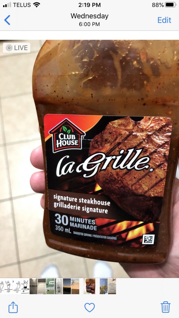
But let’s say you want to do something like duplicate the photo, because you want to keep two copies–the original, and the version you have applied hideous Instagram-style filters to. Let’s take this image of me holding a bottle of delicious Clubhouse La Grille Signature Steakhouse marinade. This marinade is so good I want to, I don’t know, add stars to the image or something. So I tap on the square with the arrow pointing up. This opens the share sheet, which gives you options for sharing the photo (and lots of other stuff).
And here you can see some share options (I have obscured two AirDrop contacts in keeping with Apple’s much-ballyhooed privacy). This is mostly a list of other apps. Where’s the ability to copy, duplicate or do other things? They are not here. I am very sad.
But wait, those options are actually here. Do you see the sliver of white at the bottom of the screenshot, with the rounded corners? That’s the rest of the interface, almost completely obscured from view. In fact, if you wiggle the page slightly you can make that small visible portion completely vanish, while still showing everything above it. This is bad design.
If I swipe down I get so many additional options I have to swipe again to see all of them. This is what the first swipe gets me on an iPhone 8:
This is a perfectly clear, usable list of options. Apple has listed everything in plain text with a little icon for easy visual scanning. This is all really nice–if you actually scroll down and find it.
Obscure UI is something that has been discussed a lot with the touch interfaces used on phones and tablets. Without the “traditional” scrollbars, arrows and so on, a lot of the options you may have at your disposal are effectively hidden like treasure, waiting to be uncovered by swiping or long-pressing or tapping x number of fingers on the screen, or something else entirely. Some suggest that Apple’s own 3D Touch (or Force Touch) was removed on the 2019 phones (replaced by “Haptic Touch”, which is just a long press with a bit of vibration attached to it) because no one knew it existed. Most discovered it by accident–by pressing harder than needed for a long press and invoking the 3D Touch pop-up.
3D Touch is pretty handy once you know to look for it, but even then it’s not a system-wide feature. Apps don’t have to support it, and since Apple always sold phones that didn’t include it, a lot of app developers ignored it. And now it’s gone, with a lot of people never knowing it existed.
But back to the Photos app–burying a long list of options at the bottom of a page is not a bad thing in itself. Where Apple fumbles here is not giving the user any concrete visual clue that the options are even there. A few obvious fixes come to mind:
Add a “More options…” button to the initial photo screen. Currently there are three choices: Share sheet, Favorite and Trash. They could squeeze in another icon here.
Another choice would be to add it after tapping the Share sheet icon. And look! Do you see at the top where it clearly says Options already? You might think that’s where you would find all of these extra options. But instead it’s where you find exactly two options concerning sending the photo as “automatic”/an individual photo/iCloud link and whether to include location/all photo data. The additional options could simply be added here. But this has two problems of its own: it adds an extra tap to get to the options, and it doesn’t necessarily address the original issue, which is the options not being clearly visible.
A third choice, then, is to make the additional options more obvious. One way would be to turf the AirDrop contacts, since there’s already an AirDrop button and I suspect people are not AirDropping photos all over the place, anyway (I could be wrong). This would leave enough room for the list of other options to be more visible.
A fourth choice would be to provide a visual indicator that there are more options available if you swipe up. This could be done several ways:
Adding a scroll bar. This will never ever happen.
Adding a floating arrow pointing down to indicate you can swipe to see more. This has the advantage of being something that could be used universally, much like scrollbars.
Some other visual indicator that I haven’t thought of. Let’s face it, I’m not a UX/UI designer, I just know bad design when I see it.
I have no expectations that Apple will move away from the “obscure gesture” interface. One need only look at iPad OS to see how, if anything, they have embraced it even more. There are now large swathes of the iPad interface that most people don’t know about–and never will. This is in part due to obscurity, but also in part due to questionable interface choices. But that’s a whole other post. Soon™.
First up, Microsoft wants you to get a Surface Laptop 3…maybe never? As of this post, trying to order some Surface devices from the Microsoft Store site still gives Invalid Date for when you might receive them. This seems to be related to new Surface devices, so maybe the store is just reflecting the general glitch level of the new Surface devices.
Next is this promotion to get a flu shot. Every time I look at this it reads to me as FU season is here! Which, if you end up getting the flu, is perhaps not an inaccurate way to describe it.
This one is old as the hills, but tech companies are still trotting out the “enticing sale with decent discounts that excludes almost everything you’d actually want to buy” offer. This particular offer also has a bonus loot box component where the promotional email gives you a random code for a discount between 10-25%.
In this case, the offer came from Logitech. My alleged discount was 25%.
I clicked the enticing CLICK TO REVEAL button and was given the 25% off code. I’ve been thinking of acquiring a full keyboard with keypad again for times when I might want the keypad and the Logitech Craft gets good reviews–but is also ludicrously expensive, selling for around $200 Canadian most of the time. This discount would bring it down to a more palatable $150.
I then read the not-so-fine print at the bottom of the email that lists the items excluded from this offer (remember, the discount starts at a not-exactly-gigantic 10% off). There are not 33 items on the list (which would already be a lot), but a combination of 33 individual products and entire product lines:
You can buy anything that is old and cheap, however.
The Craft keyboard is among the impressive list of exclusions. Almost anything new or on the pricier side has been left off the sale. Why? Because Logitech wants you to pay full price for those. Perfectly understandable. For-profit companies like profits.
But this promotional offer–even if you overlook the skeevy loot box “What did I get?” aspect still stinks. The unspoken hope here is that the potential buyer will not read over the list of exclusions and if they try to buy something that isn’t part of the promotion, well, they’re already on the Loigtech site, so maybe they’ll end up buying something else. Or shop around and get ideas, even if they don’t buy something right then. This is questionable marketing at best, and dishonest at worst. It trains customers to not trust you when you offer something. If I got another offer from Logitech, I’d immediately ask myself, “But what’s the catch?”
But that won’t happen, because I’ve already rewarded Logitech by unsubscribing to their offers. Well done, marketing geniuses.
(The unsubscribe option is simple and didn’t even ask for a reason, which is too bad, because I wanted to tell them!)