I put “AI” in quotes because it’s not really about intelligence at all, people just glommed to the term because it:
Already existed
Sounds futuristic
Sounds high-tech
Google released an ad that has been airing during the Paris 2024 Summer Olympics (as an aside, this is the first Olympics that has been known probably as much for its meme generation as the athletic competition) which showed a father helping his young daughter write a fan letter to Olympic athlete Sydney McLaughlin-Levrone–by using Google’s Gemini AI.
The ad (and Google’s defense of “it tested well”) is wildly tone-deaf and a prime example of how people don’t want AI to work. Leave the creative stuff to humans, AI can handle the drudgery. And yet a lot of the big AI push is the exact opposite.
I’m not saying I wish I had to defrag disks again, mind you. This just recalls a simpler time and, perhaps, one where you were more directly in control with what happened on your home computer1Speaking of nostalgia, I remember when people consciously drew a distinction between a work computer and a home computer.
First, the name is twee and annoying to type, so I give them some credit for so effortlessly mimicking one of the worst aspects of Apple. But it is a superficial aspect, so let’s move on.
Installation
I have a spare 1 TB M2 SSD (holy initialisms1Yes, I am finally learning to stop using ‘acronym’ when the letters don’t actually make a pronounceable word, like SCUBA or NASA, though I suppose there might be someone out there who pronounces SSD as ‘sssdee”, Batman) in an enclosure and attached to my PC via USB 3.0, so transfer speeds are not terrible. I chose Advanced options during install and was able to get the OS in place without consulting any documentation. Victory!
What I didn’t realize at the time is that Pop!_OS doesn’t install a boot manager when you install it alongside another OS, so every time I restart my PC, it automatically boots into Pop!_OS, which is nice for it, but bad for me, because my primary operating system on the PC is still Windows 11. The interim fix is to tap F8 while rebooting, then select the Windows drive. Windows 11 loads normally after this. There are methods of creating a boot manager with Pop!_OS, but none are exactly simple, so I’ll probably leave it for now.
This does mean that removing the OS later will be simpler, since all I’ll need to do is boot into Windows 11’s recovery mode and execute this command at the command prompt:
bootrec.exe /fixmbr
As mentioned in a previous post, I kept getting pop-ups that the OS wasn’t working during install and had to keep dismissing them. This was annoying, but only added a bit of time to the install. Once done, it was simple enough to download my most-used apps from the Pop app store:
Thunderbird
Signal
Discord
Some apps I use are already included, most notably Firefox, but the list of apps I use that aren’t available at all in Linux remains a little too long:
Diarium (daily journal)
TickTick (to do list/reminders)
Affinity Designer (vector drawing)
Affinity Photo
Pixelmator Photo
Media Player (yes, I like it and use it!)
There are other apps I use, but haven’t installed yet. I used the Pop!_OS ISO with Nvidia drivers included, so this in theory means gaming should be simpler to set up. I’ll find out when I install Steam.
Built-in applications
Other than Firefox, you get the LibreOffice suite and a bunch of usual utilities like a calculator and such. I may tinker with LibreOffice to see how well it works with Word and Excel files (which I regrettably still use with others).
A lot of the included applications are more like applets–minimal, but functional. There is a built-in weather app, but it’s much simpler than the one in Windows 11 (though it doesn’t run ads, which the one in Windows 11 now does, to my noted chagrin). I may have more thoughts on these as I poke around.
User Interface and Design
The closest comparison to the GUI Pop!_OS uses is probably macOS. There is a dock, and also a bar that runs atop the display, reminiscent of the menu bar on Macs. It offers a decent amount of customization and in the end it didn’t feel like it was blatantly copying macOS. The “super” key (Windows key) defaults to a command line launcher, which is one of those handy things I now miss when it’s not available in any OS.
The system defaults to dark mode, but I’ve recently become a light mode convert, and switching over is easy. The title bars on windows still remain dark, which is a style choice I’m not sure if I agree with. I haven’t looked too much into customization here, so I’ll definitely have more thoughts on this later.
The system itself felt reasonably responsive, with moving windows, clicking and dragging all feeling zippy enough. My hardware was all configured automagically, including:
Bluetooth
Wi-Fi
Brother printer
Mouse (settings for this are minimal, we’ll see how that works out)
More to come
The fun par comes the next time I restart the PC and see if Pop!_OS loads smoothly or blows up. I’ll post more thoughts then, from within the OS itself (yes, I am being all ironic by writing this post on the Windows 11 side of things).
I got in a silly mood again and decided to mess around again with Linux. That can only lead to trouble!
This time I decided to swap out of Linux Mint and try Pop_OS, a distro made by System76, a company that sells PC hardware with the OS pre-installed, so you know they’re committed!
I made a boo boo when removing Mint. The proper order is:
Remove the GRUB bootloader that gives you a menu to choose Mint or Windows when restarting the PC
Remove or format the Linux partition (in this case, a separate SSD)
I did this in the reverse order, which meant I had to do a bunch of other stuff to fix things. Thank you, internet, for still being at least useful enough to provide the steps to take!
Once I had Linux Mint gone, I booted from the Pop_OS USB stick and the installation went fine-ish. I would keep getting “Pop_OS has stopped working” pop-ups during the process and would have to wait before I could click them away. They would often come back multiple times, but in the end it was annoying and didn’t kill the process or anything.
I’m typing on Pop_OS now!
Why did I switch? A few reasons, but mostly to try something different as a point of comparison, and also because Pop_OS is different. Mint follows a lot of Windows conventions, for better or for worse, where Pop_OS does things a little differently with its UI. It’s maybe a bit more Mac-like, but not really Mac-like. It’s more its own thing, and I like that they are trying something a little different.
Now, the scary part: I haven’t rebooted to see what happens. In theory, I should get a menu and be able to choose Windows or Pop_OS. If that doesn’t happen, I may need to do the old bootrec.exe /fixmbr again, or other trickery to get Windows to load, because as nice as Pop_OS might be (I perhaps have a few more reservations than initially), it ain’t gonna replace Windows. Not yet, anyway.
In my next Linux update, I’ll talk a bit about new apps I’m testing to replace some of the Windows and Mac apps I regularly use. Fun! Sort of!
This is mainly for myself, but also for anyone reading this. It’s true, not all comments are bad, but this morning I found myself reading a brief article on The Verge about running macOS on an iPad (the article was short because the real “article” is a YouTube video). There are dozens of comments from readers and while none are offensive or particularly displaying ignorance, it’s a rehash of all the same old Mac vs. iPad arguments I’ve seen before, and it made me realize I could be spending my time in other, possibly more productive ways
Like writing this blog post warning others not to spend time doing what I just did.
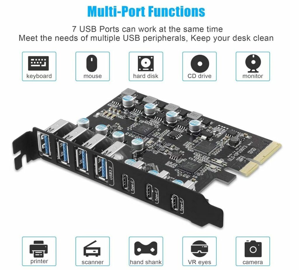
It had been a while since I’d looked at USB-C PCI cards for my PC (which does not have any built-in USB-C ports), so I thought I’d look again and found the one below. It’s compatible with a wide range of devices and peripherals, including, of course, the hand shank.
This blog post doesn’t really say anything new (Facebook is bad, and overrun with bots and AI sludge), but I do like the images the author chose to highlight, especially the cats on a rollercoaster, billed by the bot posting as “Great photograph.”
In WordPress, if you publish a post and later make changes to it, the Publish button changes to Update, to let you know that you’re, well, updating the post.
But in version 6.6, just released, that Update button now says Save, which is more old school, but actually makes less sense in terms of publishing something (as opposed to saving a file like a word processing document). I don’t hate the change, but it seems a bit weird and doesn’t really improve anything.
However, they haven’t made anything else objectively worse with this update (that I’ve found), so kudos for that!
Also, yes, I’ve kind of stopped looking for other alternatives to WordPress since finally committing to my site redesign. I still might resume that search, but it’s on the back burner again for now. Apologies to anyone waiting for me to render a verdict!
I didn’t make this (one of my interweb friends did) and yes, it’s poopy AI art, but it still amuses me. I’m also mildly impressed it translated the prompt literally and correctly.
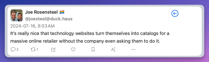
I cancelled Amazon Prime a little while back, so I am unable to partake in all the “Prime Day” deals that are on offer today and tomorrow. Which is fine, because Amazon is a horrible, abusive company, and I have been able to find alternatives without too much trouble. There are still a few things that can be tricky to source elsewhere, such is the power of Amazon’s crushing monopoly. This is bad for consumers and businesses alike.
Kudos to Ars Technica. As I write this at 8:24 a.m. Pacific time, they don’t have any stories about “Prime Day” deals on their main page. This may change over the course of the day, but it’s still nice to see. UPDATE, July 17, 2024: It did change. Day 2 has a featured story on the main page with links to deals provided by Wired magazine, another Conde Nast property. Still, it’s just one story and easy to ignore if desired.
The Verge has five stories, and Engadget has six before you even get below the “fold” (start scrolling). I stopped counting after that. There may be other tech sites that have even more, but I have some standards.
Also, Joe Rosensteel, a VFX artist, posting on Mastodon: