I try to avoid ordering from Amazon at all now, but occasionally they really seem to be the only option for certain items. When I order, it pleads with me to resubscribe to Amazon Prime by interrupting any purchase with this screen:
The part I need to click to continue with my order is that blue text toward the bottom left (I have made it considerably larger here for legibility):
After this, the observant shopper might notice the total price seems higher than it should be. That’s because if you’ve added enough to your cart to qualify for free shipping ($35 or more), Amazon will still select paid shipping for you, so you can save two entire days time in getting your items1Which is not guaranteed, of course. After selecting the “No, I prefer free and waiting an entire 48 hours longer” option, it will finally let you process the transaction.
I would not object to federal legislation that:
Banned this screen altogether
Or forced Amazon (or any offending company) to make the “No thanks, SKIP” option the top and largest thing on the page. The page would look like this:
Anyway, Amazon is a bad company and every executive that is part of it should feel bad. I also feel bad. I’ll buy something local and artisanal next time to compensate.
I am in a quandary. I thought that researching the supposed finalists would clarify things, but I feel I am no closer now to making a decision.
I looked at what I felt were the two best choices–write.as and blogtastic. They have many broad similarities, not the least of which is an apparent fear of capitalization (or love for e.e. cummings). blogtastic has an advantage in price–at least until April 1, 2024, when their pricing increases.
I was leaning toward blogtastic, partly due to that price advantage, but then I checked its showcase page. And…it’s not good. It’s filled with blogs that have clearly been abandoned, or only ever had a few posts. Only one has a post from 2024. All of them have slow-loading images that draw onto the screen like a JPEG on a Pentium in 1998. blogtastic also features testimonials elsewhere on their site. One writer spoke highly of blogtastic. I click on the link to his site–and it’s very fast! Images load instantly. It’s also running on Ghost. Hmm.
Meanwhile, write.as doesn’t show many examples at all. One is in Japanese, and it looks…OK? It’s hard to get a handle on how sites typically look. To be fair, Matt Baer, who created write.as, does have a link to his own personal blog, and it looks perfectly fine. write.as also lets you have three blogs for its price, which is a nice bonus. The editor is clean, but also very spartan. Maybe a little too spartan. blogtastic leans a little more heavily on what I’d call extra features, like footnotes and things. I love that kind of stuff.
After looking over both, I came away completely unsure on whether either would meet my needs.
Here’s a look at pricing, with Ghost thrown into the mix, as it and blogtastic will be pretty close after blogtastic’s price increase. All prices are per year.
Ghost: $108 ($9 per month)
write.as: $72 ($6 per month)
blogtastic: $49 ($4.08 per month). This changes to $99 if you purchase after April 1st ($8.25 per month)
All three let you do a limited-time trial, so you can test drive each. Since I have no idea how any of these will actually feel in practice, I’m going to do that next.
I do most of my social networking on Mastodon these days and I’ve talked a bit before about why I like it. Here are a few tips on making it a better experience and a recap on why I like it.
Why I like Mastodon
It’s smaller. Sometimes smaller is better. I can comfortably work through my feed and leave Mastodon for a while and not feel that weird and unhealthy FOMO. It’s easy to dip in and out of, not a central part of my life.
The decentralized nature of it means it’s not subject to the whims of a giant corporation or a giant corporation headed by a narcissistic racist piece of work, or, as is sometimes the case, both! It is subject to the whims of the server you choose, but (with a certain degree of bumpiness) you can move to another server if things get really bad.
Due to its non-corporate nature, it has no ads. It runs off of donations, like it’s the web from 2003 or something. No ads is a benefit I cannot overstate enough.
There is no algorithm. For some people who just want an endless slurry of things to look at, this is a downside. To me, it means you can choose exactly what type of content you want to see, which is far more preferable.
Tips for a better Mastodon experience
The official phone app and web client are fine, and you have to use them to adjust certain settings, but there are a lot of third party clients that make the experience better:
The Mac has a ton of options covering paid, subscription-based and free. Some popular choices include Mona, Ivory and Ice Cubes (all can be found on the App Store). There are many others.
Windows has fewer to choose from. A decent one is Whalebird.
Any OS (including Linux and phone browsers) can use one of several fine web clients. Two popular ones are Elk, which has a Twitter-like look and feel, and Phanpy, which goes for a minimalist look and has some interesting twists, like boost carousels.
Use filters! You’ll need to set these up in the official client. Go to Preferences and Filters. You can use this to filter out content you’re not interested in. For example, if you don’t want to see something associated with a particular tag, just add the tag here. If you hate all manner of dogs, add dogs and anything tagged #dogs will not be shown in your feed. You can also specify how granular you want the tag to be filtered out (you can still allow it in conversations, for example).
Use hashtags! This one is simple–follow hashtags that appeal to you. I follow #sketch, as an example.
Use hashtags (yes, again)! If you post, use an appropriate hashtag, so others can find your post if they’re interested in the topic.
Avoid or reduce exposure to politics. Political debates exist on Mastodon, and you’ll generally not come out of them feeling better. Why do that to yourself? On the other hand, if this is what you groove on, go nuts! #uspolitics exists for you.
It may be obvious, but follow people you know (or whose posts you enjoy).
Boost stuff you like! Boosts will show up in the feed of anyone following you. It’s an easy way to share. Just don’t, you know, boost literally everything you see.
If you don’t want to choose a server, go with the default mastodon.social. It’s big and well-managed.
Be nice! Don’t deny people their experience or be an over-explaining jerk.
Approach Trending/Explore/For You (depending on the client you use) with caution. You might find stuff you like, you might not. It’s probably better to spend a little time tweaking your feed using hashtags and following people you know.
Remember to go outside, hug kittens and do other offline stuff. Mastodon, like any social media, should not be the thing your life revolves around.
In Part 2, I offer some takes on platforms I skipped, summarize my experiences with ones I’ve tested, and offer some alternatives to blogging altogether.
Not for me, but still good
Here are a few sites I skipped because they focus on text over images, though some do support images.
Scribbles. This one is still in early access, but the editor is very nice. There are no real themes to speak of, but the whole thing is well-designed and fast. If you just want text, this is a very good choice.
Bear (not to be confused with the note-taking app). Comes with some themes, supports markdown and images (as a paid option), but is extremely minimalist. It’s free for basic features and $5 per month/$48 per year for paid (paid covers things that are server-intensive).
omg.lol. This is a weird grab bag of stuff for a mere $20 per year. They now include a blog option which is currently in beta, uses markdown, and is the most “to the metal” of the three listed here.
Sites I’ve tried so far
Scribbles: If the image support was a little more refined, I might stick with it. I don’t knock it for this, though, it’s not their focus.
Bear: Fast and light, but again, image support is not quite there for my needs.
Pika: This was on my short list from Part 1 and…it’s so close. Images are constrained to the theme, so you have to right-click and “open image in new tab” to see them full-size. I can understand why it’s set up this way, but it’s just not right for me.
Alternate solutions to blogging platforms
Some of these may seem pretty obvious, I include them, anyway.
A journaling or diary app.
Pros: Completely offline, entries could be entire books if you are very silly and wordy
Cons: It’s for you and you alone, unless you publish your collected writings at a later date. This is also a pro to some people.
A paper journal. The pros and cons are the same as the electronic version, with the bonus of never needing electricity or battery power to write, just enough natural light and your favourite pen/pencil/crayon.
A note-taking app like Obsidian, Bear or one of the other billion options.
Pros: Lightweight, local, fast.
Cons: That sharing thing again. But wait! See the next bullet item…
A writing app that also lets you publish to the web. Some of these include Ulysses, Mars Edit and iA Writer (the Mac in particular has a lot of options).
Pros: An excellent writing environment, and they allow you to share your posts relatively easily.
Cons: You still need a site to share to. Also, while the writing experience is often quite nice, once you move beyond that with photos and heavier formatting, the process tends to start breaking down a bit.
Dictating into a voice-recording app or voice recorder device.
Pro: It’s as easy as just opening your mouth and talking.
Cons: Cleaning up the dictation later could prove clunky or messy. You have to decide where to put the transcripts, unless you just want an audio version of your life (which might be interesting!)
For Part 3, I will be doing more research and narrowing down my choices a bit more.
Here is another cat GIF. The cat is industriously working away on its blog, All the Mews Fit to Print.
Keep using WordPress and just shut up about it. It works, right?
Actually switch to a WordPress alternative.
Stop blogging altogether.
Post my cat pictures on Facebook for free (after getting a cat).
I have narrowed down these options to one (and a half):
Actually switch to a WordPress alternative.
Move some of my bloggy stuff to an offline journal (probably the running/exercise posts)
The next question is: Which WordPress alternative? Because it turns out there are a lot of options. Like, a lot. Oodles. Too many.
But since my needs are specific and known, I can winnow down the list. If your needs are like mine, this might be useful for you, too. If not, there is an animated GIF of a cat at the end of this post.
What I want
My needs (also in the linked post above, but paraphrased here):
Blog posts, both long and short.
Photos, along with galleries to keep them organized.
A general means of blog organization, like categories or tags.
An easy-to-use editor that makes me feel warm and fuzzy and want to share with the world.
Pretty basic stuff, really. If I eliminated photos (I will not do this, but let’s pretend), my choices would be nigh-infinite. I could go for one of many super-minimalist blogging sites. But having no photos would also mean no drawings, which are like photos I put together with my hands and brain instead of a camera. This is a dealbreaker. I don’t want to revive my old Flickr account.
That clears out the wide array of minimalist, text-only sites. What’s left? Still oodles!
What I’ve found
Important note: I am omitting blogs that lean into more technical, nerdy skills to set up or maintain, so there's nothing here that installs from a command line or runs from a folder or requires scripting, etc. These follow the flow of:

Write a post  Click a button  Your thoughts are on the internet
And a quick summary of them, with some emphasis on what I’m looking for:
Ghost
This is probably the most WordPress-like, and it takes the most direct aim at WordPress and its features, claiming to be better/faster and, in some cases, cheaper.
The biggest con is that it’s $9 U.S. per month minimum1All prices listed here are in U.S. dollars. This is a lot of money to record my inane thoughts that could just as easily be typed into Notepad for free. You can also self-host Ghost, which is cheaper, but not exactly a simple process.
Ghost does have another notable pro, though–it can import from WordPress, so the nearly 4,000 inane posts I’ve made here could be carried over.
Micro.blog
This is reasonably priced at $5 a month, but has an emphasis on community (not a bad thing if you’re looking for that) and while longer pieces are possible, the focus is more on short, quick posts.
write.as
There’s a free plan, with some reasonable limits, so you can try before you buy (note: as of this post, the free plan is listed as “Closed for now”), and it’s $6 per month after if you pay annually. It supports not just photos, but albums. It has a blog community and supports newsletters, which suggests it has started moving away from its personal blog roots.
Pika
Pika has a free plan that is essentially a trial–you can make 50 posts, and then you’re done. So if you only ever have 50 things to say, you don’t have to pay! It’s otherwise $6 a month. It emphasizes a great writing experience, has some simple themes, and supports images. It’s also really new, as it just launched at the end of January 2024.
Blogtastic
With a name like Blogtastic, you would expect this to be a good blogging platform. It has multiple plans, including Starter for $20 and Expert for $50. Prices are going up on April 1st, though (no foolin’), with new names like Hobby for $50 and Startup for $100. I don’t think the old $20 and new $50 plans match up, though their chart doesn’t make it especially clear.
Anyway, this platform seems to offer everything and has been running for about three years, so it’s still relatively new. It feels like a Ghost competitor and, indeed, they compare themselves directly to Ghost, stating that they are more focused on writing and less on “secondary” things. They claim their gallery management is “robust”!
Posthaven
There’s a $5 per month Founder Plan (good for 10 blogs) and–that’s it! No other options. It keeps things simple. Posthaven bills itself, somewhat weirdly, as “the blogging platform designed to outlive us.” I mean, OK, but I’m not sure if I care much about my blog a hundred years after I’ve departed the Earth for parts unknown.
A major caveat for me is image sizes seem to be limited due to their theming. They mention 800 pixels max, which is tiny and probably a dealbreaker.
Having gone through these, the ones I feel can be eliminated are:
Ghost (too expensive)
Micro.blog (cheap, but a different emphasis than what I’m looking for)
Posthaven (great, until you get to the tiny images)
This leaves Pika, write.as and Blogtastic. Currently, only one offers a free trial of sorts, so I’ll give Pika a test-run and do more research on write.as and Blogtastic.
Coming up in Part 2:
Some alternatives I rejected, but are still pretty good
It was cheap (they were having a sale that turned out to be 42% off).
It intersects nearly perfectly between tech/geek and silly for me.
My name was available (Creole Ned is not, you may be shocked to learn, my real name).
It’s like having a little box of nerd toys to play with.
It has to be renewed every year, so I’ve got 11 months, 3 weeks and 6 days as of this post to decide if I want to keep it or not. In the interim, it’s play time. I’ll have more on this in the next week.
(Also, the status you should see in the right sidebar is courtesy of omg.lol)
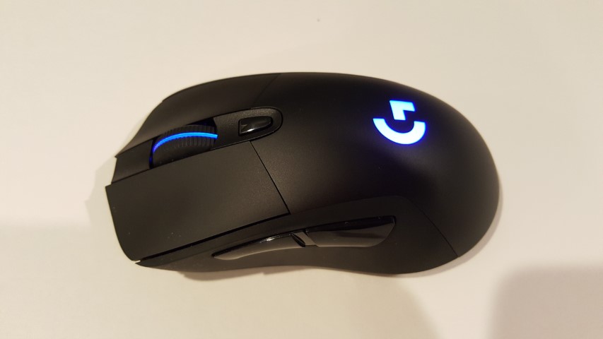
A shot of the Logitech G703, my current and now slightly malfunctioning mouse.
It seems that the switches on my trusty Logitech G703 mouse are finally starting to go, particularly those under the left button, as it is starting to register double-clicks, no clicks or some random combination of the two.
I can’t remember when I got the mouse, so I suppose I’m not too upset, but, unlike days of yore, I’m not looking forward to looking for and getting a new mouse, I’d rather one that worked just magically appeared on my desk.
Sine that seems unlikely to happen, what I may do instead is switch to one of my backup mice (yes, I have multiples) and use one of those in the interim and begin a search for a new mouse. I could also swap out the G703 with the G403 currently on the Mac (they are the same mouse, the G403 is the wired version). That would likely mean using a wireless mouse on my Mac, which would be bad because they kind of suck (unless you use Apple’s mouse).
I checked Logitech Canada’s site and the G703 is still available…for $129.99. I must have bought mine on sale or in an alternate dimension because I know I didn’t pay anywhere near that for it (nor would I ever pay that much for a mouse).
In service to our great AR/VR future, Samuel Axon tested the Apple Vision Pro outdoors and in public settings. My favourite part may be that he opened the Music app and placed the window in a neighbour’s yard, then had to leave it there, because you can’t easily take windows around with you (to be fair, this is not something you should normally expect to do with the Apple headset)1.
And yes, technically, you could argue this is not a review. But you could also have a chocolate chip cookie instead, and you would enjoy that more. ↩︎
I find this kind of message depressing (it’s from Mastodon, the site mentioned is focused on Mac and Apple stuff):
The implied message, of course, “If you PAID me money, you could be watching this video from the future RIGHT NOW.” Instead of waiting a single day.
I don’t begrudge anyone asking for money for videos or writing they produce–if they think their work has value, go ahead and charge for it. But releasing the paid members version a day early is nothing more than a tribute to the vanishing attention spans prevalent in a social media-addled society where everything must be NOW and also, QUICK CUTS and SHORT and MORE, MORE!
I mean, the only thing that would be worse is if the presentation were photorealistic. Because legless torsos are terrifying.
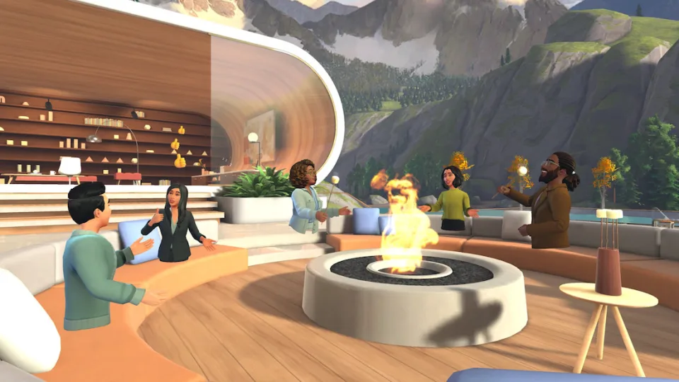
Really, examine the shot. It looks like all these engaged, happy cartoon people had their legs cut off and their upper body stumps were cauterized and plopped down onto the furniture. Except for the ones that just magically float like ghosts. I mean, only the furniture is casting shadows, so maybe they’re all ghosts–ghosts of workers who got chopped up while on a team-building exercise in the woods, and now they exist in this perpetual otherworldly realm, unaware that their mortal days are done, and that they no longer have to pretend to be interested in slide decks and Excel spreadsheets.
It’s 2024. Why is this Mesh1You know I was going to do this at some point the best a company recently valued at $3 trillion U.S. can do?
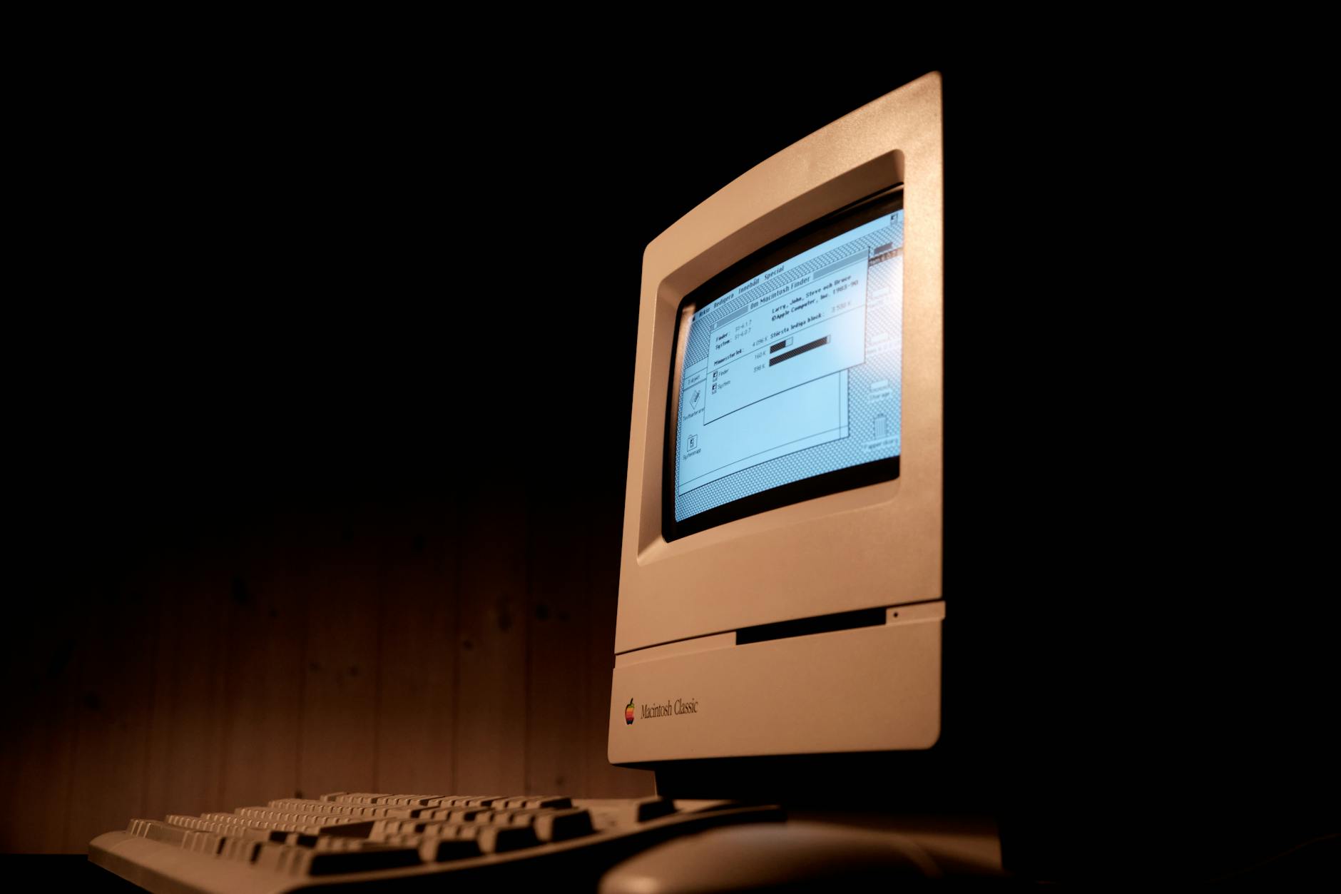
Kids, ask your parents about floppy drives. Photo by Sidde on Pexels.com
Because everyone else on the internet is doing it.
I did not use a Macintosh in 1984, My home computer at the time was a Commodore 64, which, at $200 U.S., was somewhat more affordable than the $2495 Macintosh.
But I did use a Macintosh in 1985, when, as part of a job entry program, I was placed into a small advertising firm that was outfitted with Macs and a LaserWriter. The LaserWriter fascinated me as a child of dot matrix printers that were slow, loud and mangled paper as soon as you turned your back to them. The LaserWriter was silent1OK, silent-ish and sexy.
I remember three things from my time in that early Macintosh office:
I didn’t have a lot to actually do, so I spent time writing a parody screenplay for a Friday the 13th movie I called “Friday the 13th, Part VII: Orville Finds a Meat Cleaver.” I printed out a copy on that sleek LaserWriter and still have it today.
I am left-handed but learned to use a mouse right-handed because the mouse cord was not long enough to place the mouse on the left side of the Macintosh. I still use mice right-handed today.
The owner of the company, a serious young man named Arnold Brown, got mad at me for adding helpful directions into a database of local businesses. I remain as adept with databases today. I could have easily fixed the entries, but he insisted on doing it himself, perhaps as penance for having agreed to bring me on.
My own Mac journey is thus (edit, April 26, 2026: I somehow forgot the MacBook Pro I got in 2016. I have since added it.):
2013: I got my first Mac, a MacBook Air. This was just after they got bumped to 8 GB of ram. They still come with 8 GB of ram, more than 10 years later. I didn’t really like macOS back then and traded the Air for a Microsoft Surface Pro 3. There are people out there who are probably wondering what kind of madman I was, but the SP3 had a better display, pen support (I used it for doodling at times) and I was able to crank out an entire novel on it.
2016: MacBook Pro (base model). In 2016 Apple introduced all-new designs for the MacBook Pro, which brought about the butterfly keyboard, the touchbar, stripped away all ports but USB-C/Thunderbolt and made everything generally lighter. The model I got was the “low end” version that omitted the touchbar, which I felt was a silly gimmick. It turned out that the butterfly keyboard was kind of cursed and could fail even with mere specks of dust getting underneath. Apple put a four-year keyboard program in place for EVERY model that had one, meaning if the keyboard failed up to four years after purchase, they’d replace it at no cost. I kept this for nearly four years as my main laptop, trading it in just under the four-year mark for the 2020 entry below. It was generally fine, though I never cared much for the weird low-travel keys.
2018: I got a Mac mini. It had the flakiest Wi-Fi and Bluetooth I have ever encountered in a computer. I got rid of this, too.
2020: MacBook Air M1. Finally, a Mac I genuinely liked! The one-monitor limitation was stupid, but I used a USB adapter to work around it. I used it exclusively at home, so eventually sold it, as it seemed silly to have a laptop that sat on the desk 100% of the time.
2022: We arrive at my fifth Mac. We’ll see how long this one lasts. It’s a Mac Studio with the M1 Max SoC. It generally runs everything very well. It is silent. The design is surprisingly ugly (a stretched up mini is not much to look at). Bluetooth is better, but also still flaky. It’s like Apple keeps the secret sauce to how it works for their own peripherals. The worst thing, though, is the way software will randomly crash out with no warning. This happens across all apps, including Apple’s own. I reboot the Mac every once in a while and just hope for the best. It’s a fine machine, otherwise, and while macOS has regressed in some ways recently, it’s better than it was in 2013. UPDATE: As of April 26, 2026, it is currently unplugged, with updates turned off.
Bonus story with me and a Mac in it: Four days before Christmas 1998, someone broke into my apartment while I was at work and stole my PC (a Celeron something or other, whose processor I had upgraded just a few weeks earlier) and my roommate’s strawberry G3 iMac. I think my roommie eventually got another Mac, though I have no recollection of what it was. The strawberry iMac was much prettier than my PC.
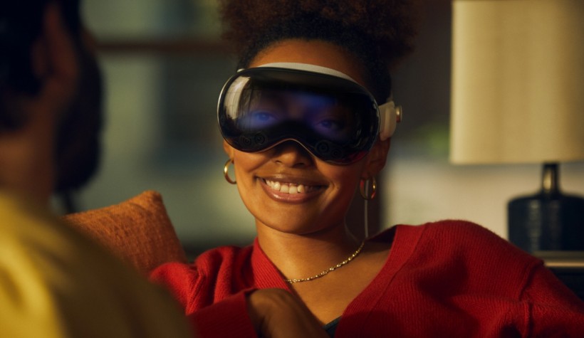
Apple wants everyone to refer to their Vision Pro headset as a “spatial computer”, not an AR/VR headset, because Apple loves twee-sounding names (that sometimes stick, but mostly just look vaguely silly years later, like “Dynamic Island” does and will). Verge writer David Pierce, in this article, refers to it (cheekily) as a “face computer” and it makes me smile every time I see it.
Also, the image below will always make me giggle. Apple is desperately trying to make wearing a VR headset (sorry, face computer) a perfectly normal, everyday thing, not something out of a Black Mirror episode where the eyes staring back out of the headset display start shooting death rays or something.