Apple wants everyone to refer to their Vision Pro headset as a “spatial computer”, not an AR/VR headset, because Apple loves twee-sounding names (that sometimes stick, but mostly just look vaguely silly years later, like “Dynamic Island” does and will). Verge writer David Pierce, in this article, refers to it (cheekily) as a “face computer” and it makes me smile every time I see it.
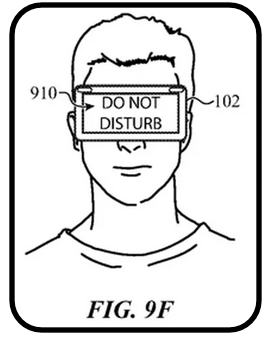
Also, the image below will always make me giggle. Apple is desperately trying to make wearing a VR headset (sorry, face computer) a perfectly normal, everyday thing, not something out of a Black Mirror episode where the eyes staring back out of the headset display start shooting death rays or something.
NOTE: This post is updated semi-regularly with any relevant news on the mentioned newsletters.
Substack has been in the tech/media news lately, for all the wrong reasons. Their position on moderation can be roughly summed up as:
Sex is bad
Incitement to violence is bad
Everything else, including actual Nazis, is OK!
After re-affirming that they would not actively moderate content on their platform, and only offering to remove a few newsletters specifically brought to their attention, a number of prominent newsletters opted to leave Substack, with most moving to Ghost, which, unlike Substack, is not a platform, just a company that provides a blog/platform service and that’s about it. Others went to Buttondown1My own piddly newsletter, recently renamed Doodlings and Noodlings, is debuting on Buttondown this very month, Beehiiv, other hosts or moved to self-hosting.
My stance on this situation is:
Substack is free to choose whom they host on their platform
I, likewise, can choose to not have any paid subscriptions on Substack, since my payments are helping to fund a lot of hate. See here for details: All the garbage I found on Substack in 1 hour
I also can choose to move my own newsletter elsewhere, which I have done
I’ve gone a step further now, by unsubscribing to all free Substack newsletters. In every case, I have written a polite message to the newsletter author letting them know why I have unsubbed. I’m hoping some of them will switch to other hosts, but at this point I think the ones who haven’t are probably leaning more toward not moving. And that’s their choice–as is mine to unsub!
I’ll update this post with any word back I may hear from these newsletters. The two I most recently unsubbed to are:
Austin Kleon (paid)
Experimental History (free)
UPDATE, January 29, 2024: Apparently I subscribed to a lot of Substack newsletters! 😛 Here’s more I’ve unsubscribed from:
Design Lobster (free–no pay option exists)
Links I Would Gchat You If We Were Friends (free–no pay option exists). UPDATE, January 29, 2024: The author wrote me back to say she has been in touch with Substack execs and is looking into moving to a different platform. Good to hear!
The Status Kuo (free, paid option exists)
GameDiscoverCo (free, paid option exists). I didn’t email to explain why I was unsubscribing, probably because I doubt they will move.
I’m Fine I’m Fine Just Understand (free, paid option exists). This one is weird, because it’s a comic about a person transitioning and Substack famously already had an exile a few years back for hosting openly transphobic writers. I also didn’t explain why I’m unsubscribing here.
Jason Snell, former editor of Macworld, posted a link on Mastodon to a story he wrote on his own site, Six Colors, about automations. So far, nothing abnormal here.
When I went to read the story, a newer one had been posted in the interim, about how the soon-to-be-defunct news app Artifact had one killer feature, as summed up in the headline of Jason’s story:
Jason: “…what I loved about Artifact was that you could take a meaningless clickbait headline and have the app read the story and write a new headline based on its contents.”
Also Jason: “…in the era of the web and news aggregators, headlines that give away pertinent information have become a lost art. Whole generations of editors have been trained to write coy headlines that will earn a click, even if the people who are clicking will be immediately disappointed by the truth of the story.”
Scroll a little down from this story, and you’ll find another piece linked from Macworld that Jason wrote. The headline on Macworld is a bit different, but essentially the same:
That’s right–it’s a classic clickbait headline, posted on the same day that Jason was complaining about…clickbait headlines. I guess writing good headlines truly is a lost art. 🙂
Proton (who is not an entirely unbiased source–they provide email and other services) provides a take on how the new Outlook is another vector in Microsoft’s ever-growing data harvesting/advertising empire. I don’t live in Europe or the UK, so I get none of the opt-out options the people there do to help control how much of their info gets hoovered up by Microsoft and its 722 (!) partners.
I have email accounts from multiple sources:
My main outlook.com account
My vestigial gmail.com account
My account for creolened.com
My account for protonmail.com
Probably a few others I’ve forgotten about or haven’t used since 1887
This means any solution that can’t incorporate multiple accounts is a non-starter because I don’t want to log in to a bunch of different webmail interfaces. I’m trying to work smarter, not work…more.
Since Outlook works with everything but Proton (I am on Proton’s free plan since I don’t use it much, and you need a paid plan to get access to third party clients) I’ve been using it, and it works well enough. The UI is a bit different between Mac and Windows (I prefer the Mac version), and there is no Linux version at all, but it mostly works.
But reading stuff like the Proton article made me think I should try Thunderbird again, since it will work with everything (save Proton) and has clients for Windows, Mac and Linux. Great!
There’s only one problem: It has been hit with an ugly stick, repeatedly and at length.
I am willing to overlook aesthetics to a certain degree. My journaling app, Diarium (that name) is great, but it really is nothing to look at. But it’s plain, not ugly. Functional.
Thunderbird is functional, but ugly. So, so ugly. Everything about the way it looks rubs me the wrong way. The size of elements, the various layout options, the colours, the fonts, the use of (or lack of) white space. It looks like something designed in the 1990s and has never been touched since.
But this time I was determined to make an effort into fixing it up. I opened it alongside the “new” Outlook app (really, just a standalone version of the outlook.com web interface) as reference and went to work making Thunderbird less ugly.
The good news is, I succeeded enough that I have now switched to it as my email client. Go me! (And go away to Microsoft and its 722 partners.)
Here’s what it looks like now, with certain info redacted. I am still tweaking, and it’s still not 100% where I want it, but it is no longer ugly1This is subjective, of course, and my taste may not match yours. For example, I don’t think plaid socks are a bold fashion statement..
I have pixelated most of the info, but you get the idea.
I’m sure there are Mac users who would still sniff in disdain at this, but it’s good enough for now.
Here’s what I did:
Switched to the built-in light theme (dark is OK, but light looks better to me). Note: If you don’t enable any theme, it will use the theme/colours of your OS.
Under Layout, I enabled Vertical View, Folder Pane and Message List Header
Under Folders I enabled All Folders and Favorite Folders, then collapsed All Folders and selected the Inbox for each (plus Junk for my primary account) as a Favorite. This allows me to compact what would otherwise be a crazy-long list of subfolders.
Density is set to Relaxed
Under Message list display options I chose Table View
Under Message List I chose Name only
Font size in the main view is 15 point, and the font is set to Aptos (this is the new default font Microsoft uses in Office and I like it!)
I have replaced the default set of gray icons with Phoenity icons, which is installed as a Thunderbird extension. This not only adds a splash of colour, I feel the icons are easier to scan.
I’ll continue to tweak, but I already find Thunderbird much more readable for when new mail comes in, both in the taskbar (there is a badge for new mail) and in the folder view, so I’m already benefitting from the move. As a bonus, this also seems to have fixed an issue where images were very slow to load into Outlook (maybe the hundreds of trackers get priority now), as images are working normally again.
Next up: Seeing how easy it is to replicate this on macOS and Linux Mint.
In November 2022 OpenAI revealed ChatGPT, a Large Language Model (LLM) chat interface that would answer questions, write poetry, whistle and dance, all based on data it had scraped and trained on from the internet (copyright be darned). It can be useful (it helped me write some code for this blog) and it can be silly/weird/dangerous (giving famously bad answers, of which there are too many examples to name).
But it also, more insidiously, provided a new tool to spammers, scammers and their ilk.
People were already complaining about Google search results getting worse, and now it’s filling up with AI-generated junk. That same junk is also serving to help train future LLMs and you see where this is going: an internet-wide ouroboros of spammy, misleading nonsense choking out anything written by actual humans.
My observation on this, coming as we near mid-January of 2024, is already old news. I just wanted to record it here for posterity. Let’s check back and see how things have evolved by year’s end.
This, of course, doesn’t look anything like me, and the hands are the usual nightmare stuff that screams “AI-generated”, but I still kind of like the composition.
These days I am restricting most of my social media stuff to Mastodon, and lately I’ve started doing non-posts. They go like this:
See an interesting post from someone I follow, or someone whose post has been boosted by someone I follow.
Start writing a reply to the post.
Question whether the reply adds anything of value.
Exit out of the reply, opting not to post it.
Repeat Steps 1-4.
Why do I do this? I’m not entirely sure, but I think it’s related to this latent fear of saying the wrong thing, somehow, of offending or coming across as weird or odd. I am a fairly shy person in face-to-face interactions, and I think this might be the online equivalent to that. I just prefer to watch others talk. Or type, in this case.
Proving this, I was originally going to make this a post on Mastodon, then changed my mind and posted it here instead.
I asked Adobe Firefly to create a scene of hide and seek in a mansion and, really, I should have known what I would get. I mean, it did nail the hiding part.
I chose this generated image because you can’t see the freaky fingers
Well, as many thoughts as a smartwatch can have.
My Garmin Forerunner 255 got a software update recently that allows it to track naps. I don’t take naps very often, but I did take one after a run last week and sure enough, the watch tracked the nap. It said I picked a good time to nap, but napped too long.
Today it tracked my second nap. Except I was awake the entire time. And I was playing a computer game.
Apparently, PowerWash Simulator (which is exactly what it sounds like) is such a mellow game that my watch thought I was napping while I was playing it. It also said I napped too long again. I can verify it is indeed a relaxing game, but now I’m curious about what my stats (heart rate, etc.) look like when I’m playing. Is the nap-tracking glitchy, or do I enter such a relaxed state that playing the game is effectively the same as sleeping? Questions!
It is time again for me to randomly go through old issues of The Computer Paper on The Internet Archive and delight in the old-timey world of tech print ads.
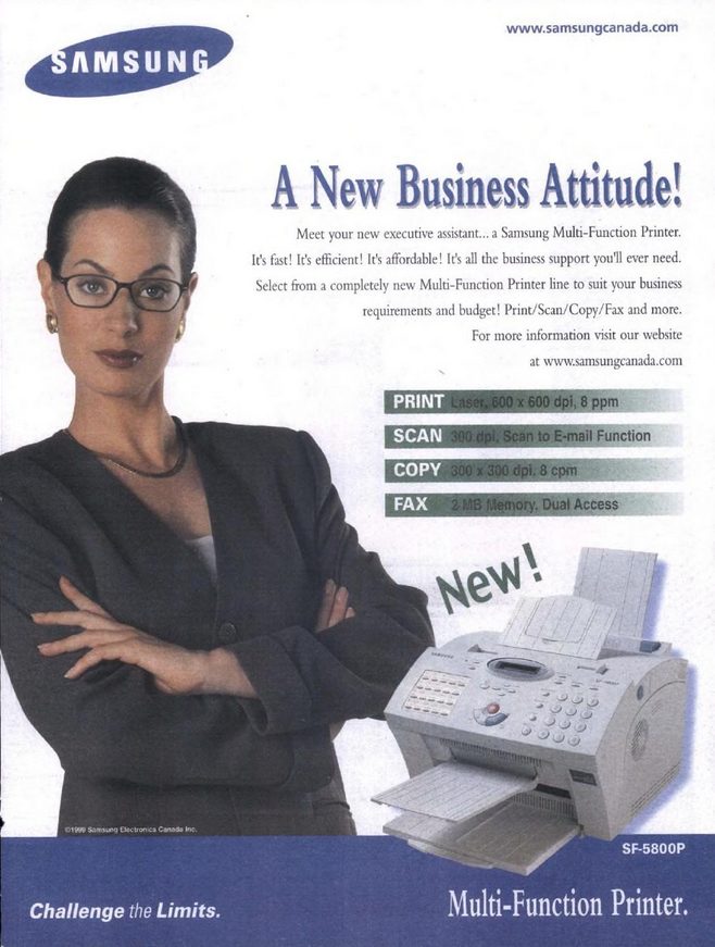
Behold, an ad from the November 1999 issue for a Samsung multi-function printer:
Business woman has her arms crossed and means business. Also, is she leaning on something we can’t see or just have good balance? My favourite part may be the single word New! callout, as if it’s a feature. I can’t mock too much, though, because my current Brother multi-function printer can still fax, too.
Fun facts (fax?):
The samsungcanada.com URL is actually available. It doesn’t even redirect! (The current URL is samsung.com/ca.) With the way companies scarf up addresses, this kind of surprises me.
As near as I can tell, Samsung no longer makes printers of any sort. They do offer a smart fridge, though.
Bonus:
In the same issue is this ad for Stupid Computers. It is amazing. stupidcomputers.com does not have a website, but according to dan.com (“a GoDaddy brand”) it has been sold.
Also, uh, what kind of gun is space chick holding there?
I am a visual person and aesthetics matter to me. Sometimes they matter (a little) more than functionality.
One of the nice things about the federated social media platform known as Mastodon is that it allows for a host of third-party clients to view its content.
I tried several Windows-specific clients and found all of them to look kind of ugly. I don’t want to use an ugly app, even if it’s functional. It’s 2023, we’ve evolved beyond MIDI files and poorly compressed animated GIFs. I eventually settled on a web client called Elk. It looks a bit like Twitter and is nice enough. Then I came across Phanpy, which, despite its terrible name, looks *really* nice, even if it’s perhaps a bit too aggressively minimalist. But it looks so nice!
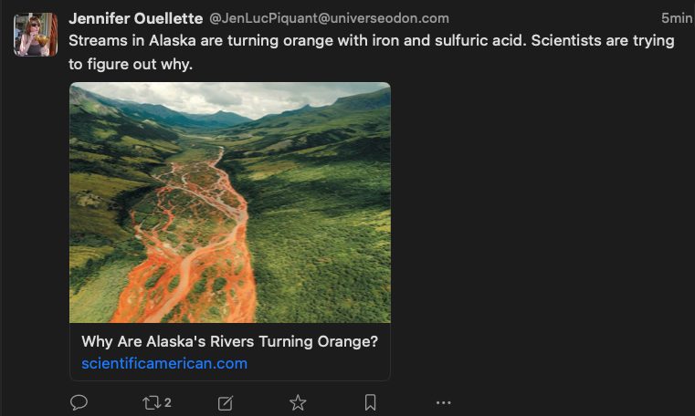
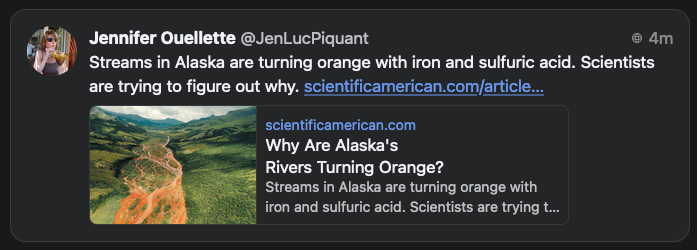
In fact, I like its look so much I’ve actually started favouring it on the Mac, where I own the Mona Mastodon client. Here’s how each looks, along with the official Mastodon web client, focusing on one post, all of them running in dark mode, because light mode makes me run and hide under the bed. No scaling has been applied to the images.
Mona (Mac client):
Mastodon (official web client):
Elk (web client):
Phanpy (web client):
Some thoughts:
Overall layout: Phanpy is by far the most compact, but that doesn’t necessarily mean better. It does put posts in a nicely rounded box, though, which is a pleasing visual touch. Phanpy puts the image inline with the story title and subhead, which reduces the size of the image. The others are all very similar in layout. Oddly, even though Phanpy offers the most compact layout, I think it does the best job in terms of spacing around the content, giving it a lighter feel, even in dark mode. This is done mostly by simply making the interface wider, allowing everything to spread out a bit more. Compare this to Mona, which has a bunch of empty space sitting to the right of the image.
Phanpy also does the best job of implementing a card-style interface, where each post is clearly separate from the next. Mona is also pretty good, though the contrast between posts and the background is more subtle (a to-taste thing, really).
Colour: The official web client uses a more purple-black, keeping with its theme colour, which is purple. Phanpy is a bit lighter than Elk or Mona, and I think looks a bit better.
Text: Mona wins here, with the sharpest text of the bunch. Elk is probably the worst, but still not actually bad.
Iconography: Phanpy requires you to open a post to see any icons, part of its minimalist thing. The others are all clean and functional, but not exactly delightful. They do their job. Note that several clients allow you to customize the icons. The official client probably has the least attractive icons of the bunch, but again, they are perfectly serviceable.
Options: Elk and Phanpy offer minimal options. Mona is the clear winner here, as it has options out the wazoo. It probably has options for the wazoo.
Conclusion: No one client does everything perfectly. I think my ideal would be Mona’s text/icons/non-minimalism, combined with Phanpy’s aesthetics and use of white space.
This post prompted me to dive into Mona’s options and tweak its interface again, bringing it closer to Phanpy’s. We’ll see if it sticks. The nice part is simply having the abundance of choices to start with. Now, if only a Mona-quality app existed on Windows…
Mona (after tweaking the UI per the above paragraph):