UPDATE, November 19, 2023: They announced Procreate Dreams, which is a standalone, non-subscription animation app. So I was totally wrong!
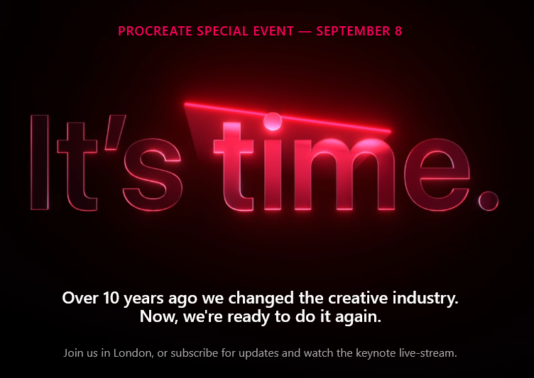
I got an email from the team behind Procreate, the terrific drawing app available on the iPad that I use for all of my digital sketching. It talks about an event on September 8, 2023 and if you click the “Learn more” link it takes you to a page where you can subscribe and shows you the following, with “cool” laser light effects:
Procreate is a one-time purchase that currently goes for $12.99 Canadian in Apple’s App Store. It’s a great deal. There are no in-app purchases, nothing to unlock.
But I look at the above, and it is clearly setting up something the developers of Procreate think is Big.
And all I can think is…subscriptions. That they will announce a brand-new version of the app (the old one will be rebranded as Procreate Classic or something similar) and this new app will come with a mandatory subscription with either a) a free trial period or b) a stripped down set of features that can only be unlocked by subscription.
I am so certain this will happen that I’d bet my iPad on it. And it makes me sad.
But maybe I’m just being cynical.
And to be fair, I would happily pay another $12.99 (or whatever reasonable price they ask) for a new version of the app. I just don’t want to keep paying for it, forever.
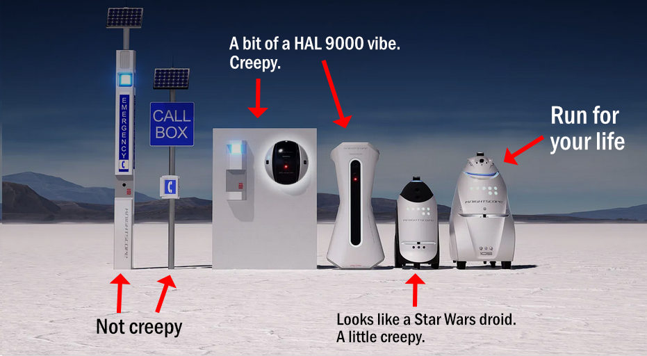
A company that makes security robots has a photo on their website (you can find it if you’re diligent–I have faith in you!) of several of their models. I have added some text to better provide how I, as a common non-robot human being, rate their creepiness factor.
I came across ooh.directory, which is a site that aggregates blogs (1,966 as of this post). It’s a pleasant and consuming way to find writing focused on a particular subject or theme that isn’t beholden to algorithms and all that.
Also, I love the bizarre, bold combination of colours it uses: dark green, orange and light purple. And light pink, I think, for text, which somehow works with everything else.
At the time, I was checking the usual sites irregularly, as I’d switched to a bedtime routine of reading actual books. Since then, irregularly has become rarely. I just haven’t missed Instagram and Facebook, so this has been a kind of unintentional culling.
The reasons for why I haven’t missed them are summed up pretty much in the post linked above: Once I broke the routine of checking in every night, I found the content was just not interesting enough for me to tolerate the endless piles of “reels” and ads. Instead, I have been spending a bit more time on Mastodon, which has no ads (by design) and no algorithm (also by design). I only see what I want to see. I follow people, then unfollow if they don’t make my socks roll up and down. That is my bar now–you must magically animate my socks or off with you.
It’s worked out decently so far.
Part of me does kind of miss posting my photos regularly, but they were only seen by a handful of people anyway, and now I can focus on posting billions of photos to my blog instead! I think in some small way this may have slightly improved my mental health, too (not visiting FB and IG much, not the posting billions of photos to my blog part, though who can say for sure!)
I never used Twitter much and was kind of annoyed years ago when I had to use it for Nike tech support. For the most part, it was always just there, popular among journalists and some celebrities, and used as a quick ‘n easy way for people to make announcements, because on a microblog, you don’t have room for much else. People defeated this by posting tweets with images that would contain 2,000 words, but still, it stayed pretty much a place to link and post blurbs/memes.
In 2022 Elon “Galaxy Brain” Musk decided he wanted to be on Twitter’s board, then no, he wanted the whole thing! He waived due diligence, offered an outrageously good offer to buy the company ($$4 billion, vastly more than it was worth) and, following their fiduciary responsibility, the company’s executives presented it to the board, which promptly voted to accept and cash out.
Someone or something got through to Musk, and he realized he’d overpaid on a colossal scale, then tried to back out of the deal. Twitter sued and just before the case went to court–which Musk was all but guaranteed to lose–he agreed to have the deal go through and became owner/CEO of Twitter in October.
To say it has been all downhill since then is to insult hills that go down.
I’m not sure what exactly is going on in his mind, but whatever it is has seemingly steered him to make about the worst possible decision at every turn, chipping away at every positive aspect of Twitter. As a result, users are leaving, advertisers are fleeing, hate speech is on the rise, actual Nazis post their actual Nazi thoughts, the site is glitchy and breaks down occasionally, thanks in part to its gutted workforce unable to keep things running smoothly as most institutional knowledge has left (quit or been fired). Attempts to gain subscription revenue have generated peanuts. Basically, nothing has improved and a lot of things have gotten much worse.
The Twitter brand has been permanently tarnished in the eyes of many.
But wait! That brings us to the title of this post. A few days ago, Musk decided it was time to rebrand Twitter itself as X, his most favourite letter. Tweets would become X’s. And so on. To a 15-year-old boy this would be very cool, perhaps even rad, and since that’s where Musk’s apparent mental age seems to have stopped, it has come to pass.
There are too many articles, opinions and hot takes to link even a tiny percent of them here. Let me just say that I think it’s a dumb idea to spend $44 billion on a company whose value is in its user community and brand identity, then actively drive away the former and completely abandon the latter. It actually goes beyond dumb, but there is no word in English I can think of to adequately describe it.
However, changing Twitter to X frees Musk (at least in his own mind) from having the site/company “be” Twitter anymore. He can literally do whatever he wants with it–it’s X now!
This isn’t the first time a social media site has stumbled and (probably) died. Let’s not forget Friendster! But it is probably the biggest and, culturally, the most significant. This is all a good illustration of why allowing individuals to have access to absurd amounts of power and money is a bad thing. Musk is an idiot, and he has destroyed Twitter because our system gives him the power to do it.
(As a side note, the rebranding has been as chaotic, dumb and ill-planned as literally everything else Musk has done at Twitter.)
Here’s one link on the rebranding and the whole thing that I found worth reading, where author John Scalzi explains why he is (mostly) leaving Twitter after its turn to X: Preparing my X-it
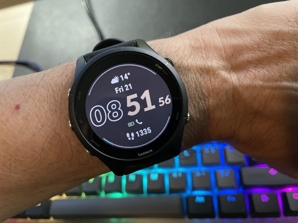
Last fall, I got a Garmin Forerunner 255 to better track my running and sleeping vs. the Apple Watch (Series 5) I had previously. Generally, I quite like it. It’s not as “smart” as an Apple Watch, but it’s smart enough for me, and the battery life is insanely better. I charge it when I jump in the shower and never have to think about it otherwise.
This faboo battery life means I use it to track my sleep and while I’ve heard that smartwatches in general are only about 80-85% effective in terms of accuracy when it comes to sleep-tracking, I feel my watch knows me, almost too well.
This morning it told me my sleep suffered due to stress, and I was indeed stressed out last night. If I start stressing out about something in the moment, the watch will jump in and suggest a breathing exercise. If I get super-stressed out (this has only happened once) and my heart rate gets above a certain threshold, my watch blares an alarm at me in warning (which is somewhat ironic), so I can maybe try to calm down a bit.
Anyway, thanks, Garmin watch, for staying vigilant and reminding me to chill the heck out. I promise to do better!
Bonus points if you recognize what cartoon this is from
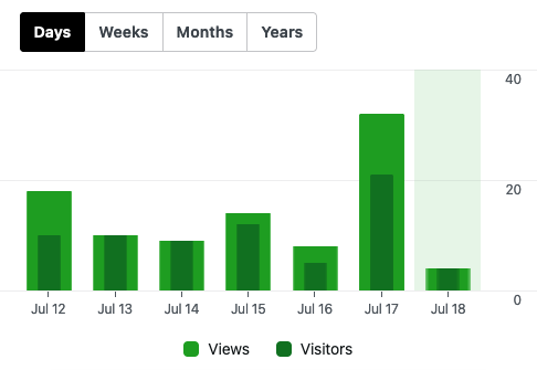
Very slightly more seriously, Jetpack offered me these stats for the past month:
320 visitors 375 views
Sure, it may not seem like a lot, but it’s 100% organic! Just like the ingredients in the imaginary beer I’m offering.
Jetpack shows I’ve barely hit double digits this week, though:
That’s actually better than what the site has done historically, where it’s usually been in the single digits. The only thing I can think is a couple of LLMs are now scraping the site and hoping I don’t sue them like Twitter did.
If none of this makes sense in the future, welcome to the world of 2023.
UPDATE: I have turned radical and am now using the serif typeface Bitter for headings. Anarchy!
I’ve been thinking about my blog redesign, as I do periodically, and have read several articles arguing in favour of using serif fonts for body text on websites. The old belief was that text on screen evolved to be mainly sans serif because low resolution screens made serifs harder to read, as they couldn’t be rendered well. Now with fancy™ screen technology and higher resolutions, that’s not a problem, so it’s time to return to serifs for body text, following the lead of virtually all novels and most books in general.
And yet I cannot find a serif I like. They all look too thin or too fat, or too fancy. Part of it is laziness, because the theme I use, the excellent GeneratePress, offers a list of dozens of Google fonts, but it isn’t trivially easy to deviate from the list. And I am lazy, so trivially easy is important. But I will keep poking at it.
For now, I am using Heebo for body text again, because it’s a clean-looking sans serif font, plus the name is adorable.
Also, I’ve tried going through some “best fonts” lists and as you might imagine, a lot of them are SEO-driven junk. But there’s a few out there! I will expand on this post later.
(And yes, I know the difference between a typeface and font, but that battle is long since lost for the pedants.)
At the time I read Elizabeth Lopatto’s Summer of spam piece on The Verge, there were 37 comments. After a bunch of people commiserating with their tales of spam, or offering suggestions on how to fight it, I came to what was then the last comment:
Yes, spam. I’m curious what the spammer had to edit. Maybe they got the link (which I have redacted) wrong? It’s also cute that they have deliberately altered “job” in the hope of bypassing automatic spam filtering. (I am the one who reported the message as part of my internet civic duty.)
As for the article, go read it and likewise commiserate. I’ve noticed an uptick this week in both spam phone calls and spam in my Outlook account (which still gets mercifully little junk). Fighting spam is not an easy j0b!
Related: Alex Leonard has an article on LLMs and how they are generating spam, using vast amounts of energy and generally making the web a terrible place. Worth reading: On the weird plague of LLM (aka AI)
When Amazon started its “Prime Day” deal a few hundred internet years ago, it was obvious what would happen if it became a success:
Amazon would expand it to be more than just a single day to better milk it. (Done. It’s now spread over two days.)
Other stores/sites would shamelessly copy it and cleverly call their versions something different (“48-Hour Sales Event”, “Black Friday in July”) but you totally know it’s their version of “Prime Day.” (Done. Two-day sales are everywhere now during Amazon’s event.)
Amazon would start to make the deals worse because now they have the inertia and know people are going to look and buy, anyway. They’d also start making it harder to get good deals by making them time-limited (even within the two days of the sale) or require you to reserve a spot to qualify to give them your money. (Done and done.)
Every tech (and many other) sites would report on “Prime Day” as if it were legitimate news. It is not legitimate news. (Done x1 billion.)
A lot of those same tech (and other sites) would be filled with articles on the “best deals” for the entire two days, crowding out more interesting content. Or just any content. (Done. My favourite punching bag, engadget, has 17 hits for “prime day” on its main page–which actually seems on the low side!) EDIT: Just for fun, The Verge has 10 hits, Ars Technica has 2.
I would complain about “Prime Day” in a blog post and refuse to write it without surrounding it with quotation marks, implying I’m saying it with sarcasm. (Boy howdy, done!)
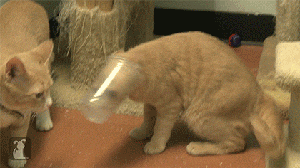
Here is an image of a prime cat for your viewing pleasure: