Today I cancelled a Substack newsletter and a streaming service:
Sweary History (after not quite a year)
Netflix (after being subbed for many years)
The reasons were a bit different for each, but both are part of my ongoing digital decluttering process.
For Sweary History, I actually quite like James Fell’s foul-mouthed writing style, and his personal posts (which require a paid sub) were especially enjoyable and informative. But as someone who chronicles human history, and given how dark and awful so much of human history is, Fell often wrote about unpleasant people doing unpleasant things. And in the same way that actively seeking out current news was making me generally unhappy, I found getting a dose of daily “look how terrible people have been throughout history” started having the same effect. This morning I started to read the latest newsletter and just stopped partway through, like a little switch in my brain flipped. I unsubscribed.
Netflix was different. I found that I just wasn’t compelled to watch any of the current stuff on it (Archer has grown stale, Stranger Things is something I want to catch up on, but it seems the season four episodes are long, and it’s more of a commitment than I’m willing to make right now), plus Netflix seems to think they can keep raising their prices and make up declining subs by squeezing their most loyal subscribers that much harder.
Didn’t work for me! I checked “too expensive” as my main reason for dropping the sub, and it’s true. If Netflix was cheaper, I’d probably just keep it, but it’s $18.47/month after taxes and that is too much for the very minimal use it gets.
For streaming, I still have Prime Video (as part of Prime), Disney+ and Apple TV+ (as part of Apple One), so depending on how things go, I could potentially get down to just a single service. And more time to draw.
These companies are making it easy for me to slim down my reading list.
In the case of Pocket, it’s ironic, because they’re all about providing reading lists.
A while ago, Pocket switched from a weekly newsletter to a daily one, with an option to change the frequency, so you could go back to a weekly newsletter if daily was too much.
I stuck with daily for some time, but eventually did decide it was too much. I switched to weekly, which seemed more manageable. It was fine at first. But then I got my weekly newsletter, and it was “sponsored” by The Wall Street Journal. This means every article was from…The Wall Street Journal. I subscribe to the Pocket newsletter to get stories from a number of sources, not just one. I don’t know if their answer is to go back to daily (which I won’t do) or pay for the premium version, which will somehow spare me the sponsored newsletters.
This morning, my weekly Pocket newsletter was again sponsored, this time by MarketWatch. I don’t even care about MarketWatch! Or its stories.
So I unsubscribed.
I’ll still use Pocket to occasionally capture interesting stories I want to read later. It works well enough for that, though it would not surprise me if the free version eventually gets crippled in some way to make it too annoying to use. Which may make you ask, why not pay for the premium version? And the answer is I don’t use it often enough to feel it’s worth the money (it’s $4.99 US per month or $44.99 annually). If they did make it horrible to use the free version, I’d probably just create a temporary bookmark folder as a “read later” dumping ground. Not ideal, but it would be functional.
So thanks, Pocket, for helping me in my ongoing quest to digitally declutter!
FAKE EDIT: I also emptied the Pocket folder in Outlook, deleted its category, then deleted the Pocket folder itself. Doing these things was strangely satisfying.
UPDATED: I have updated my amazing predictions, post-event.
Actually, I don’t have any. But I am amused at how pretty much everything gets leaked ahead of time and yet Apple still clings tenaciously to its super-high levels of secrecy, as if they are unaware of the entire rest of the world existing around them (Steve Jobs snarkily acknowledged this in his keynotes, at least).
Apple is big, conservative, and evil, but in a banal sort of way. They are also becoming victims of their own hubris, thinking their Apple Poo™ smells better than other poo. It does not, it just costs more.
Okay, here are some predictions:
New iPhone models
New Watch models
Updated AirPods Pro, with updated (higher) price
Previews of Apple TV+ shows that no one will care about (even if they end up watching some of the shows)
Tim Cook will tap dance in the opening segment. Okay, he’ll actually just recite corporate boilerplate in that supremely bland way of his, but I would buy a new iPhone if he tap danced instead. UPDATE: No tap dancing, but he did kind of shimmy in place a bit, with lots of hand gestures, which could be interpreted as “white guy dancing”.
DISCLAIMER: Technically, I am talking about personal knowledge management (PKM) tools, which act like your own little personal Wikipedias, and not just plain note-taking apps. My main purpose for using a PKM is note-taking, though, and I make the rules here! Am I using a hammer instead of a screwdriver? Probably. Read on, anyway!
I love fiddling around with new stuff. It’s why I have three mice sitting on my desk (computer mice, not the living kind) and a bunch more stored away. It’s why I have more keyboards than I could ever need in five lifetimes, stuffed into drawers and scattered about my place.
And it’s why I’m a sucker for a shiny piece of new software, which leads to this post’s topic: note-taking apps.
Even if you have absolutely no interesting in note-taking apps, you probably still have one, anyway, whether it’s Notepad on Windows, the Notes app on Macs, or some built-in app on your iPhone (Notes again) or Android device. They are ubiquitous. And now, with the whole second brain1Go ahead, try looking up what a “second brain” is. Your actual brain will explode. thing being the new hotness, note-taking apps have started popping up like bunnies. Note-taking bunnies.
I noticed that after expressing some interest in technology on Medium (via my preferences), it started offering me stories on note-taking apps. I believe there are roughly a trillion of these articles on Medium, which nearly matches the number of note-taking apps themselves.
I thought to myself, “Self, you need to be more organized, somehow. For some reason. You need a note-taking app that will let you consolidate all your notes in one place, so you never need to figure out where your notes are. This future of unparalleled organization will be awesome.”
It’s a good theory. My notes were previously scattered all over. I used:
Paper. Actual paper, like cave people used to do
Drafts. An app on my iPhone that can send to other apps.
OneNote. I kind of stopped using it a few years ago and I’m not sure why.
Microsoft Word. Because I had it, so why not?
Apple’s Notes app on various Apple platforms. Because it’s there.
iA Writer. Not really built for notes, but…
Ulysses. See above, plus a subscription. Ew.
There’s more I’m forgetting, and this was all before the current explosion of note-taking apps. Since then I’ve tried:
Craft
Notion
Obsidian
And contemplated a million others, while absolutely only positively ruling out a few, like Evernote, usually due to what I deem excessive pricing.
For a time I thought I had settled on Obsidian. It supports markdown, is free, can work between Mac, PC and (somewhat) with iOS (it really wants you to use iCloud for your “vault”). On (virtual) paper, it provides everything I’d need in a note-taking app and also has all the second brain stuff, like backlinks and things.
I feel like I’m grossly under-utilizing it by not making proper use of links (back, forward or any other direction), tags and other means of keeping things organized. I mean, look at this guy wax poetic about how useful Obsidian is. It makes me want to install it again right now!
While I’m clearly not tapping into Obsidian’s potential, I am big on bullet lists, because I love lists. So now, as I think about whether to stick with Obsidian or not, I wonder: Why do I take notes? The answer is in a list. Right below!
Track ideas. These can be ideas for:
stories
blog posts
game design
comics
drawings
General reminders (I have moved these to actual to-do apps)
WIP stuff on my newsletter (five issues so far, published very intermittently)
Book and movie reviews (that get posted to my blog, Goodreads or elsewhere)
Random tips and tricks, usually associated with tech
Everything that doesn’t fit into the above
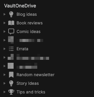
And Obsidian has worked reasonably well here. I’ve added plugins to expand on what it can do. Look how organized everything appears to be (I have redacted a few items, but it’s nothing scandalous, like panda porn or something, just stuff regarding the condo or other personal yet banal items):
And yet I feel like:
I am underutilizing Obsidian to the point where I probably could just use Notepad, for all the difference it would make
Maybe I don’t have the kind of personality to connect the dots, or in this case, the notes?
Maybe I actually don’t have a compelling reason to use backlinks and I’m overthinking things, as is my way
But it all seems so useful. There are so many articles! I want to do more! Yet I am not feeling there is a yawning chasm in my life because I have only clicked a backlink maybe once in Obsidian, and that was just to see if it worked (it did).
Anyway, have a look, there’s plenty to choose from!
I know where you think this is going. You think I’m buttering you up before announcing that I’m raising the price of a Six Colors membership, which has been at $6 a month (or $60/year) since the very beginning.
I’m not.
Instead, we’re doing here what we did over at The Incomparable from the very beginning (and what my pal David Sparks did with his website recently), and adding multiple membership tiers.
The “More Colors” tier is $10 a month, and it includes these things (descriptions excised for space, but check here for full details):
Regular video reports and Q&As
A special section of the Six Colors Discord for More Colors members
Six Colors podcast live stream and bonus material
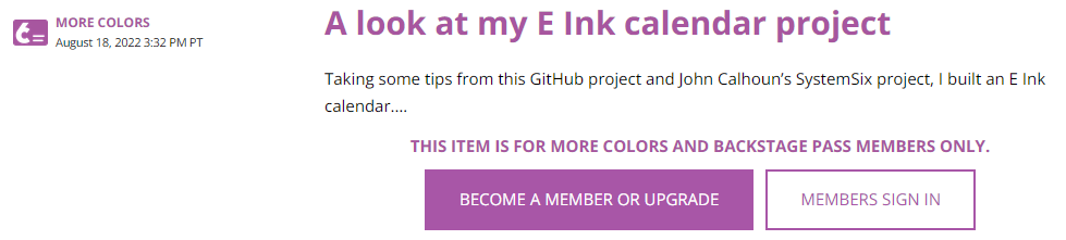
The third item posted after this announcement is shown in the screenshot below:
Now, I can’t say for sure what kind of content this is, because I can’t see it (or even who the author is!), but it looks like a blog post, which is not one of the perks mentioned as part of the $10 More Colors tier. Bonus posts are specifically a part of the now basic $6 a month tier. Except maybe not so much anymore? (I am subscribed to the $6 tier, which until today was also the only tier.)
My reaction was to ask myself a few questions:
Do I have more content to sift through that I can reasonably manage? Yes.
Do I need to pay for the privilege of reading a site that regularly exhorts me to pay even more? No.
And so, while I enjoy Jason Snell’s and Dan Moren’s site and have been a paying member for a while, I found it surprisingly easy to turn off auto-renew on my sub. As of September 12th, I’ll no longer be paying and will eventually probably remove the bookmark. It’s ironic that Snell specifically mentions David Sparks’ multi-tier membership approach, because it was when his site started getting riddled with PAY PAY PAY TO SEE SEE SEE that I opted to DELETE DELETE DELETE the bookmark.
I’m not saying what Six Colors is doing is wrong. I’m saying that I’m not fond of paying and then being presented with locked links saying PAY MOAR. It makes me feel like I’m being squeezed. If they need the money, good luck to them. But they won’t be getting any more from me.
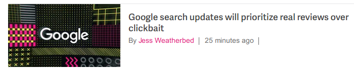
It shouldn’t surprise me that in 2022 this is a news headline, but Google is now saying it will prioritize real reviews over clickbait, something you might have assumed they’d be doing all along. But apparently not!
Click the image to see the Verge story
I’ve been using DuckDuckGo for my interweb searches for a few years now, and it’s fine. A lot of the results are still clickbait and garbage, but that’s because companies have spent years investing in gaming all search engines, it’s just Google still dominates search, so it has outsized influence.
One day, the elders will gather round to tell their grandkids how they would search (“What’s a search engine, Grandpa?”) for “best toaster” and get actual results comparing toasters, instead of thousands of pages of SEO-optimized garbage posing as information on toasters. And then the grandkids will go back to hunting mutant cows across the radioactive wastelands.
When logging into My Fitness Pal to record my food and exercise for the day, I see this under the section for food entries:
The idea that I’ve earned one whole extra calorie to burn as I see fit amuses me. I could make a list of things to do with that single, precious extra calorie:
Exhale
Blink my eyes once or maybe twice
Shift slightly in my chair
Think hard for several seconds
(After a minute or so, MFP synced with my watch and bumped the calorie burn up to something with four digits instead of one.)
To be accurate, the emoji are not actually 3D, they’re just shaded to give a 3D appearance. Microsoft recently made them open source via Github for anyone to use. And I want to use them (okay, maybe not all of them) because they’re just so adorable, odd or both.
Yes, it’s come to this. I mistype the word “humidity” so often, and I’m now talking about it so much, that I’m now using the Mac’s built-in text replacement tool to fix my persistent misspelling of the word:
I will always regret not taking that typing class in high school. With real typewriters and everything. I wonder if schools expect kids to start Grade 1 as advanced typists now. “Todd, you can’t take recess break until you hit at least 75 wpm!”
Current humidity is 55%
UPDATE: It’s not working! Apparently the text expander doesn’t work in Firefox or browsers or something. I am sad. And full of typos.
Here’s a comparison of the original photo of a jet flying overhead that I recently took with my Canon EOS M50 camera, and then a version of the photo after I tweaked the contrast and color a bit in Luminar AI:
The changes are pretty obvious:
The sky is no longer completely blasted out, allowing the mix of high cloud and blue to show
The blue of the aircraft underside has been boosted a bit, not to exaggerate it, but to make it look more as it actually appeared
The overall contrast of the jet was adjusted, to better bring out detail in the structure (when looking at a smaller version of the photo, it may simply look darker; the detail is best seen at full or near-full size)
Now, you could argue that the bright, overexposed sky of the original works because it puts the jet in stark contrast to it, effectively highlighting it more than my tweaked version. And I would agree–but it’s also a matter of preference. Overall, I like the tweaked version because to my eye it’s a better representation of what I saw, and does not try to misrepresent the object(s) depicted. For example, Luminar AI lets you add giraffes to the sky (yes, it really does), but I did not add any giraffes! Or hot air balloons, or bald eagles, or any of the other silly things you can put in to spice things up.
Tweaking photos is now something I find almost as enjoyable as the actual shooting of the photos themselves. Maybe I just have a need to fix things.