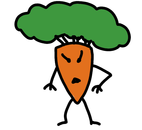
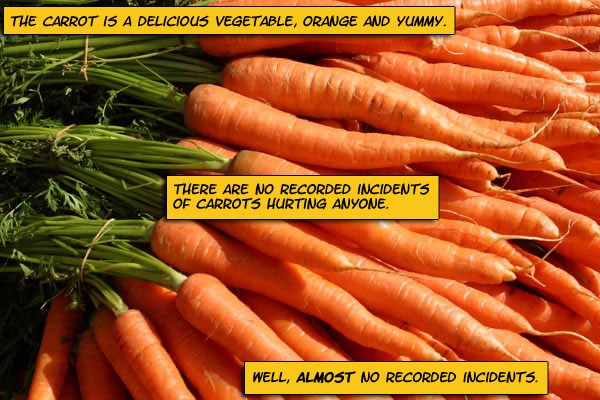
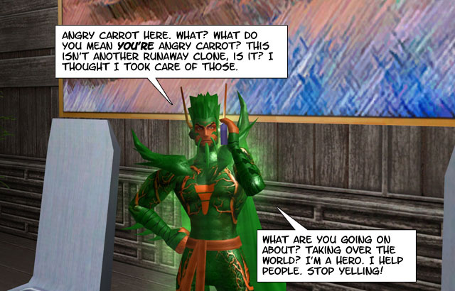
The updated HD version of Angry Carrot vs. Quirky Bastards, Episode 1 (2024)

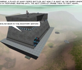
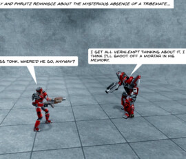
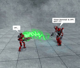
I finally finished going through Episode 1 of Angry Carrot vs. Quirky Bastards, reworking the comic to make it more palatable in the age of high-resolution monitors. I tried not to George Lucas it up by drastically changing the artwork and making this a Special Edition™, focusing more on preserving the original art, just making it smoother and more refined.

You can view the updated episode in the gallery below or on the AC vs. QB page linked above.

Issues with the HD version of Episode 1:

  • Continuity: The QBs are Blood Eagle (red), but in several panels the tower is shown as also being red, meaning under QB control, despite it being claimed by Angry Carrot. Whoops!
  • The line thickness on AC and minions varies a bit from panel to panel. I went back and redid a few, but the rest I declare just part of the charm.
  • The word balloons and text are sometimes a bit too big/spacious. This was a result of changing the font from Verdana to Back Issue BB, which have very different properties. In a few cases, I manually chopped down the size of the balloon and had to paint over the old balloon underneath to keep it from rudely poking through.
  • I dropped the outline on the balloons as it was too much work to easily replicate.
  • I adjusted the brightness of the shots to try to make them as even as possible, but a few are still too dark or too bright. Again, part of the charm!

On the plus side, the improvements:

  • Panels are now 1920×1440 instead of a tiny 640×480.
  • Redrawn Angry Carrot and minions have much more refined line work than the originals, with far fewer jaggies.
  • I forgot to give Angry Carrot arms in a few panels where he clearly should have had arms. This has been corrected.
  • The Back Issue BB font gives the episode more of a comic book look (this is a matter of taste, but I’m including it here).
  • I redid the first panel to make it match all other episodes, tweaking the fonts where necessary.

How I redid the episode:

  • I started by using Pixelmator Pro’s Super Resolution feature to preserve detail while increasing the images from 640×480 to 1920×1440.
  • Every panel featuring Angry Carrot and/or minions was brought into Procreate, where I retraced and recoloured over the original art. These were then exported as Photoshop (PSD) files to preserve layers.
  • I loaded all the upscaled art into Affinity Photo, then redid the text and word balloons, and made other minor tweaks to colours and other bits.
  • I saved these as Affinity Photo files to preserve the layers.
  • All panels were then batch exported as PNG, WEBP and JPG files. Although the WEBP files were smallest, they subtly toned down the colours of Angry Carrot in a way I didn’t like, so I went with the JPG versions.

Angry Carrot vs. Quirky Bastards, Episode 6.5 redone!

Yes, this is a weird choice for updating the comic, a brief “Where are they now?” update I slapped together while I pondered where to take the comic (nowhere, ultimately!)

I got the idea to redo the strip because the original panels (as mentioned previously) are absurdly tiny on a typical widescreen monitor, at a mere 375 x 281 pixels.

It was a fun little experiment to modernize the comic, as I had to redo some of it from scratch and probably redid some of the panels significantly faster than originally when I handcrafted them from the chunky pixels and stone tools of 2002.

Angry Carrot vs. Quirky Bastards page to see the new and original versions of the episode.

The higher resolution gallery:

Notes on what I changed:

Globally:

- All panels increased to 1920x1440 resolution
- Main font changed from Verdana to Back Issues BB for a more comic book look
- Revised characters were drawn in Procreate on an iPad Pro
- Revised artwork, text and dialog balloons were added in Affinity Photo

Individually:

1. Completely redone.
2. Used screenshot taken from Diablo II: Resurrected.
3. Resized the dialog balloon to make it smaller. Painted over the old balloon, then copied and pasted parts of the background to better blend everything in. I was helped here by how crude and low resolution a blown-up image from Jedi Knight (1997) looks in 2024.
4. Found new still life for background, made the pepper look less still, more peppery, since that seemed a likely reason for him being fired. A “still” version of the pepper also exists in a hidden layer in the original Procreate sketch.
5. New background, new lighting effect added in Affinity Photo. Celery characters were traced over from the originals. Evil version has a tweaked goatee.
6. Changed GIANT Chinese Egg Attack!! to the less culturally insensitive GIANT Evil Egg Attack!! Redid the eggs to look angry/evil. Open mouths reveal yolk-filled innards.
7. Completely redone with new colour image of Freud (same pose) and new background.
8. Completely redone.
9. Completely redone.
10. Completely redone. Figures were traced from originals and refined a bit.
11. Completely redone.

I am planing to at least take another look at the high-resolution version of Episode 1 I also did recently, to see if I want to tweak that one (and maybe others) as well.

Everything old is new again

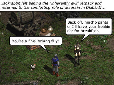
In another case of nostalgia gone horribly weird, I’ve started perusing the old Angry Carrot vs. Quirky Bastards comics I did a quarter of a century ago and realized that the images are super tiny because back in 2000 everyone still had 15-inch monitors. Observe a random panel from Episode 6.5:

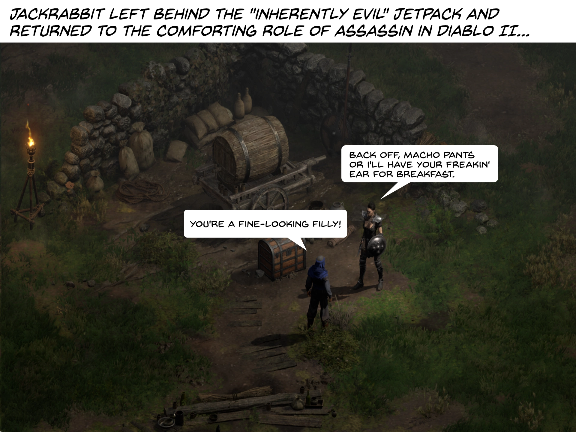
Squint to see the filly.

This shot is shown at its full resolution–a whopping 375×281 pixels. It’s like a Diablo II postage stamp.

I decided to super-size all the images to 1920×1440 using the Super Resolution™ feature in Pixelmator Pro for the main comic panels (which are 640×480, so large postage stamps) and it worked surprisingly well, even preserving the text balloons decently. But some have required more fiddling and none of these panels were made with fancy layer technology, so it’s a bit like fixing up an old painting–you need to be careful to not muck it up.

This is mucking it up.

What I have found is in some cases I need to actually redo pretty much the entire panel. For example, here’s the Diablo II panel above in its shiny new 2024 version:

Even shrunken down for the post, it’s still four times bigger than the original.

Upscaling the original panel looked grossbuckets. The shot above is from Diablo II Resurrected, which offers much better graphics than the original, though I could have toggled on the original 2000 era graphics for maximum fidelity, but that many giant pixels would look very chunky at 1920×1440. I also changed the font to one more befitting a comic. This means I have to change the font in every panel now. Whoops.

And while it’s a bit silly to go back and do all this work for something very few people will see, I’m enjoying it, and it’s fun to revisit the old comics and make them a little more presentable for our shiny modern age.

Recent vegetables I have drawn

Using Procreate and mainly the Studio Pen brush.

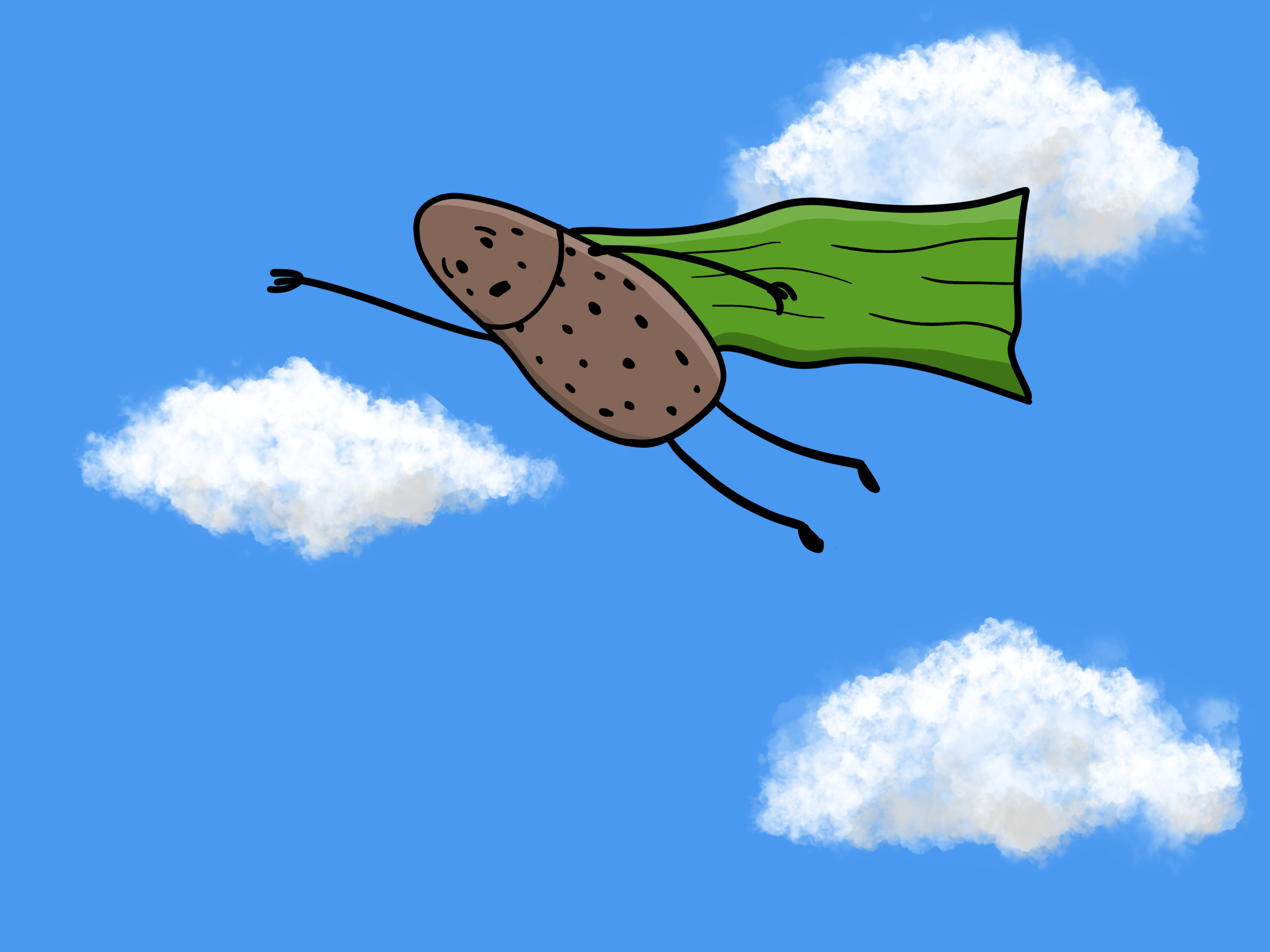
Super Spud:

Perpetually worried he may spot a crime in progress.

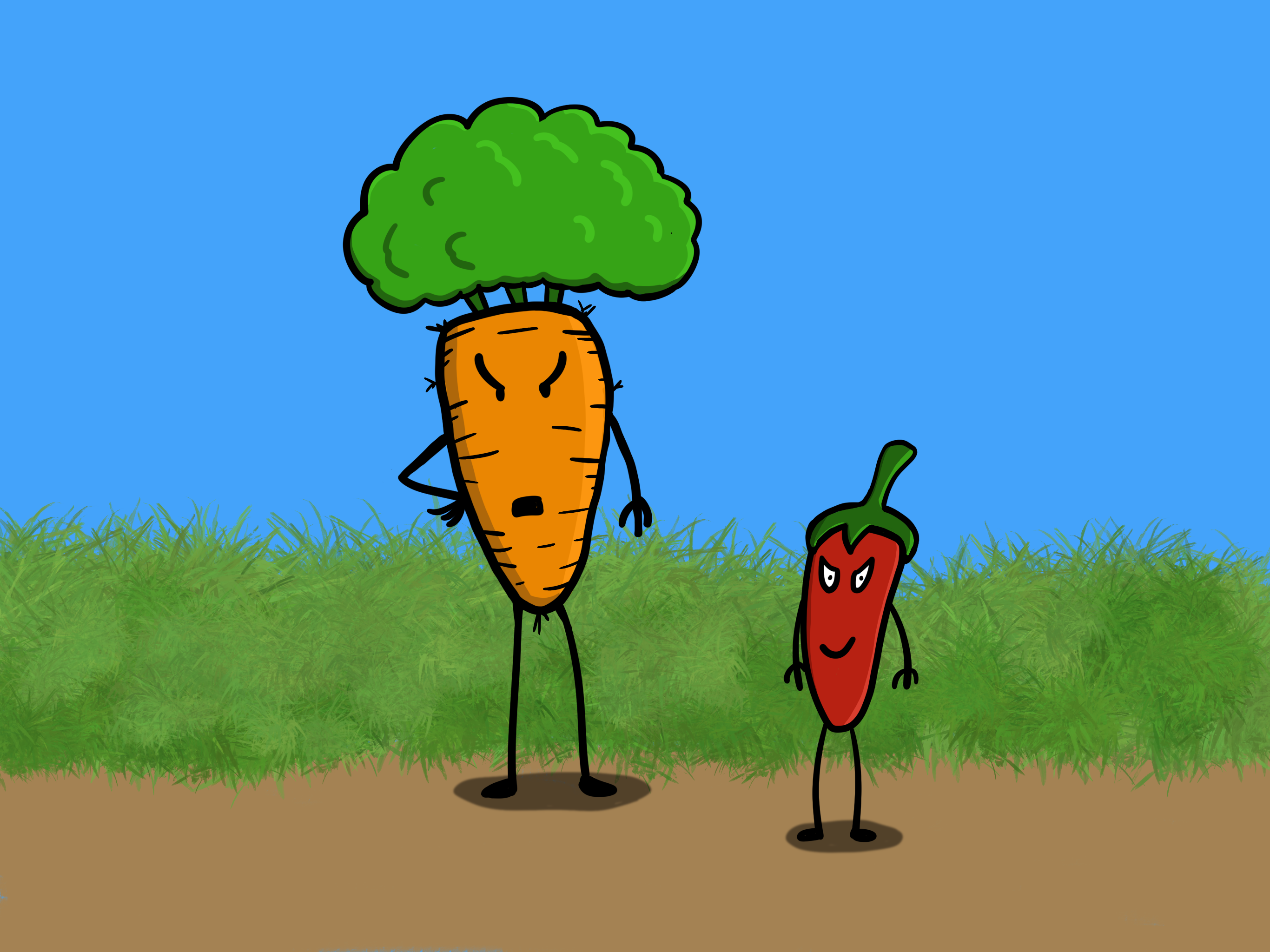
Angry Carrot and his henchpepper:

Still figuring out shadows and shading.

Looking at Angry Carrot now, I think the body lines may be too thick. I’ll try them thinner next time. Overall, I’m pleased with how these turned out, considering how little I’ve been drawing lately. I shall draw more.

Angry Carrot on a new Surface

Behold my masterwork, Angry Carrot as drawn using the stylus that comes with my Surface Pro 3 and using Corel Painter Essentials 5 software. I did no editing, as is rather obvious. Some day soon™ I may try a better drawing than this quick proof of something or other.

Angry Carrot Surface quick doodle
Angry Carrot quickly doodled on a Surface

Angry Carrot in 3D (special glasses not required)

Do you ever get the urge to go back and finish some project you started years ago? I do from time to time but the reality is even if I decide to, I rarely complete a once-abandoned project, probably because I had a good reason for abandoning it.

A few years ago I began making a model of my cartoon character Angry Carrot out of plasticine. I only had green and orange plasticine, so I couldn’t do the black bits (face, arms, legs). Instead of going to a store to get the missing black, I just put what I had started in a cupboard and let it sit there for a couple of years.

Today I suddenly got it into my head to check the art supply store DeSerres while I was out. I figure if any place would have black plasticine, it would be an art store.

And lo, they did!

It was a brand they are not carrying anymore, so it was on clearance for, as you can see, $1.95. The clerk told me there would be no refunds or exchanges because of this. I’m thinking, “Dude, it’s modeling clay and it’s less than two dollars. Who would bring it back for a refund? Someone who thought it was licorice?” I then realized this is exactly what would happen, so I simply smiled politely at the clerk.

For reference, here is a panel from an Angry Carrot comic:

I realized a couple of things as I slapped on Angry Carrot’s limbs:

  1. He would fall down and not get up in real life. If real life featured man-sized sentient carrots with anger management issues, that is. As it was I had to insert a bit from a screwdriver and lean him against a wall to keep him from tipping over.
  2. I need a better workspace than the tiny spot I can clear next to my keyboard.
  3. I need better tools for the actual sculpting.
  4. I need better lighting.
  5. I need more practice! He’s not the right shape and his stalk is too small.

Still, for a ‘proof of concept’ it’s not too bad. It is recognizably Angry Carrot.

Close-up:

Scary perspective shot from below!

And one more from above:

It was fun exercising my fingers without using a keyboard for a change. I’ll probably start another model of Angry Carrot from scratch with some sculpting tools and a better workspace and see how that goes. My ultimate plan would be to use actual modeling clay, probably the self-drying kind as I don’t have a kiln handy.