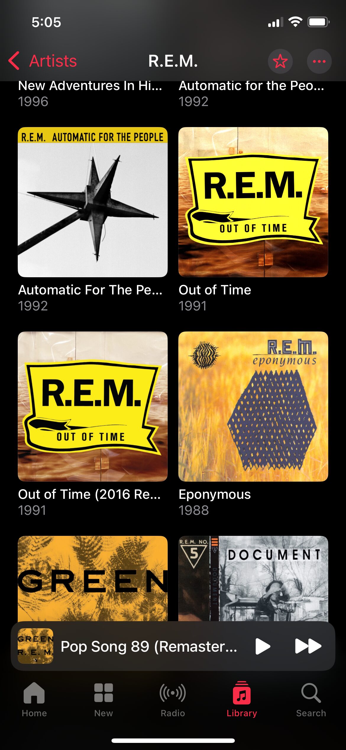
When I went jogging today, I opted to listen to the 1991 R.E.M. album Out of Time. I have this album on CD and had ripped it many years ago for my music-listening pleasure.
Apple Music doesn’t care about that on an iPhone, because it installs its own version of the album. Fine, same music, what’s the difference?
Except today when I go to play the album I see this:
Curious! There are two versions listed, mine and a 2016 remaster.
I check mine:
The first track, “Radio Song” is strangely absent. I check the other version of the album (reader, I knew what I was going to see):
Oh, there’s “Radio Song”, all by itself in its own album. Why did this happen? I don’t know. I know it’s happened before and I’ve seen others report similar issues. The thing to note here is that you have no ultimate control over what happens in Apple Music–Apple does, along with the record labels. This wasn’t a licensing issue where the album got pulled, though–and even if it was, I actually own the album outright, anyway.
Instead, Apple Music apparently got “confused” and took a perfectly working album and split the songs between two different versions. How do you then reconcile this?
The fix was to delete both albums, then add the 2016 remaster to my library. The version on my PC is unaffected and works the same way it has for the past million years. Well, at least the past 20.
I ended up listening to Green1I have downloads over cellular disabled (1988), which Apple Music has so far chosen not to mangle. I should probably go check now, though.
I have avoided discussing this in much detail, but in brief: I don’t like Liquid Glass. Like, at all. I think it’s glitzy, half-baked trash from people who don’t understand or care about good UI. But author Matt Gemmell put it better on Mastodon:
Liquid Glass is the kind of thing that would happen if someone with no UX design experience was put in charge of design, had no opinions on the matter so asked for suggestions, then approved the ideas from the youngest and least design-experienced people who could implement the most flashy demo.
It is thus, comprehensively and multifariously, Not What Apple (Used To) Do. An emblem of the sickness in the company, driven by moribund leadership, dilute focus, and ever more stagnant insight.
Here’s another thing: the degree of vacillation on design in public betas is disgraceful. About 5% of the time, when you change something due to feedback, it’s because you’re responsive and democratic. The other 95%, some highly-paid and ostensibly professional people did not sufficiently consider what they made. Design is intention and anticipation. Aesthetic fuckery is just playtime. When you then make multiple significant changes in successive betas, it’s no less than rudderless farce.
Apple may be starting to see the consequences of its own actions. Every new platform it has launched in the last decade — the iPad, Apple Watch, Apple TV, and now Vision Pro — has struggled to gain meaningful developer support. Why? Because developers are tired of being in an abusive relationship.
If I were starting fresh today, I wouldn’t build my business on Apple’s ecosystem.
Instead, I’d consider web development, where you can control your own distribution, pay no platform commissions and not deal with a mercurial gatekeeper. Or perhaps focus more on cross-platform development, so you’re not locked into a single company’s walled garden.
Finally even becoming a content creator, on a platform like YouTube, seems like a more stable way to make a living these days.
The reality is that Apple’s development ecosystem has become a high-risk, high-maintenance environment. New developers looking for a sustainable career path would do well to consider alternatives that offer more control and fewer headaches.
I think the iPad has done better overall with support than stated here, as there are some notable iPad exclusives (such as Procreate1Yes, there is Procreate Pocket for the iPhone. No, I don’t count it., which is quite literally the only reason I keep my iPad), but if you go by the last five years or so, it hits closer to the mark. As Apple continuously fiddles with the iPad’s UI and how much (or little) the iPad is meant to do, devs have started to shy away from making exclusive apps for it.
I happen to also agree that the yearly update cycle is bonkers and serves no one but Apple. So Apple will continue to go with them, introducing new bugs that never get fixed, releasing new software that never gets fleshed out or is forgotten, all while keeping the eye on the main prize: services, which Apple makes a ton of money on, while offering poor value and uneven reliability (iCloud, iCloud Drive) to its customers.
Basically, Apple is too big to need to worry about developers–or customers. If iPhone sales dropped by 50%, they’d still be selling hundreds of millions of them. Captive market. Their focus now is on an insatiable drive to make even more money, because that’s what giant publicly traded tech companies do. And with a corrupt regime in power in the U.S. Apple will be happy to play them to get what they want, regulations, environment or customer needs be damned.
If Apple had leadership with a moral compass aligned to what they claim to believe, things would be fine. But instead we have its CEO donate $1 million to Trump’s inauguration, as close to a straight-up bribe as you can get. And it will make no difference unless they keep offering fealty to the king. Maybe they will. Probably they will, and they’ll become ever-more corrupt and uninterested in doing what is right or best, and simply in doing what will extract the most money from the most people.
What I’m saying here is this: Don’t buy Apple products. Don’t support them, don’t believe them. Yes, every tech company is pretty much evil these days, so you have to sometimes choose the lesser evil. Apple is no longer one of the lesser evils.
This concludes my 2025 Apple Rant. Unlike Apple, I do not intend to roll out a new rant every year. But hey, you never know.
I rarely open the iCloud program on my Windows PC, but when I have recently, this is what I see:
The circle of coloured dots slowly spins mesmerizingly as it teases that it’s “Signing in…” but it never signs in. Until I go to icloud.com in my browser, relaunch the program, and then it works. I don’t know if this is a coincidence, but it has “fixed” the issue each time.
More quality work from the company devoted to squeezing as much as it can from its customers, because tens of billions in pure profit is not enough. I know I promised not to gripe about Apple as much on this blog anymore, but they make it so easy now.
But I do promise to not gripe as much going forward. For reals. If for no other reason than I use Apple devices increasingly less these days.
Yes, I’m afraid this is a complaint. I promise an adorable kitten at the end.
I updated to the latest version of Mac OS yesterday (I am no longer going to write out Apple’s stylized “macOS” anymore. I also say iPhones plural, so take that, Apple marketing department!), which is 14.1.1 as I type this. The update did not go smoothly.
It took multiple reboots to get everything working again. Why, I do not know. But now, the Photos app, which has always had stupid syncing settings on the iPhone, seems to have adopted these stupid, idiotic settings on the Mac.
I noticed that the last few photos from the phone hadn’t synced. I tried restarting the Photos app, to no avail. It said the last sync was yesterday and that was that.
I turned the Mac off, and went back to my Windows PC, which still behaves like a normal computer.
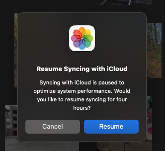
Today, I turned on the Mac and the Photos app presented me with this prompt:
Some context: I am using a Mac Studio with an M1 Max SoC. This is a desktop computer. At the time this prompt appeared, I had two photos to sync.
Two.
I am curious how much system performance optimization was achieved by not syncing TWO photos.
And look, Apple is being generous. If I really MUST sync, I can go ahead…for the next four hours, after which I guess I get this prompt again?
This isn’t just bad design, it is TERRIBLE design, and the people who coded and approved this are trying way too hard to be smarter than the user.
Here is your adorable kitten:
BONUS CONTENT:
I decided I should at least offer a solution or two instead of just griping!
Make this a setting the user can control
Allow granularity/context in the controls. Some examples:
Always sync photos
Never sync photos
Only sync when system has been inactive for [xx] minutes
Normally, if you want to repeat/shuffle music in your favourite music app, you just click or tap the appropriate control right there in the interface where you play the music.
Observe in Windows 11’s Media Player, the control to repeat is right there with shuffle/back/play/forward:
Easy peasy!
Even the desktop version of Apple Music–not a great app, by any stretch, puts the option right there with the main playback controls, albeit shoving those controls way up in the upper-left corner of the UI, for some reason:
But if you’re using Apple Music on your iPhone, behold the steps, taken straight from Apple’s support page:
A couple of points:
What should be a single tap is three
The controls for repeating or shuffling music are hidden behind another control
That control itself is hidden inside another option you must first tap
This isn’t just bad design, it’s shamefully bad design. It baffles me how Apple can do such a shitty job1You know I am ruffled when I start a-cussin’ on one of their core apps–and one that can also feature a monthly subscription fee–so millions of people are paying for this experience!
What makes it even worse than it already is: the present UI has plenty of room to have controls like shuffle and repeat right there in the main music player UI. Look:
A metric ton of unused space, let’s hide common controls! – some Apple design genius, probably
Yes, I realize that the Bad Design category here has been almost exclusively Apple, but that’s because they are so huge and carry an equally outsized amount of influence in design. And for most of the last decade, it’s been (IMO) largely in the wrong direction.
Let’s say you are selecting a large swath of text in the Apple Notes app on your iPhone. First, I am very sorry for you because doing this is a tedious and finicky task. And let’s say once you select the text, instead of tapping Copy you hit something by mistake and delete the text. How do you get the text back? Simple, just tap Undo!
Except there is no undo option. It turns out there are two ways:
Shake the phone vigorously. This assumes that you have the option enabled and that you are shaking the phone in the correct way.
Tap on the Markup icon at the bottom of the screen. Next, look at the top of the screen and tap the now visible and visibly tiny Undo arrow.
Neither of these are anything even remotely close to being discoverable or obvious. The second one doesn’t even make sense. Why is the Undo option that works on text buried under a completely unrelated function? If you look at the Notes app, there is plenty of space for Undo/Redo icons at the top of the main screen. Why aren’t they there? Who knows! But hooray for Apple being so stupidly big they can’t keep themselves from making idiotic UI choices like this. Maybe invest a few tens of billions into fixing these kinds of things.
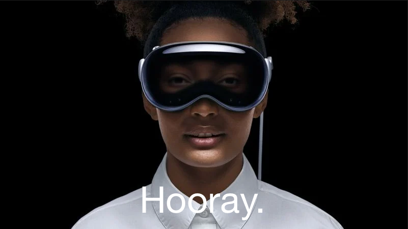
UPDATE, July 133, 2024: Apple is promoting the Vision Pro on the Apple Canada site, as it is now available for purchase by moose and other Canadians.

The image on the landing page is below. It basically reverses everything I list about the original image in this post.
Original post:
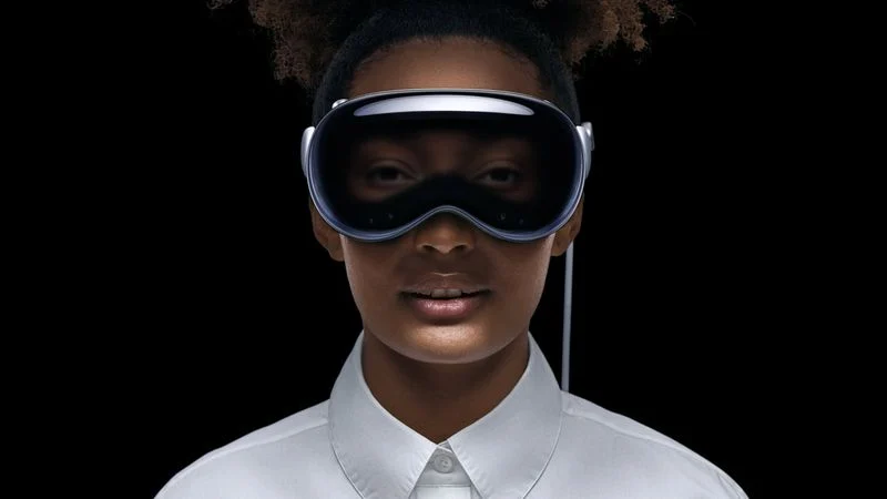
If you’ve seen anything about the Vision Pro, Apple’s new don’t-call-it-AR headset, you’ve probably come across this photo:
I’m here to tell you why it’s creepy and bad, and Apple should feel bad for using it.
In a list, of course!
The black void behind the person is off-putting. Where is she? Is she just floating in nothing?
The ultra-white starched dress shirt with the buttons done up to the top. This is incredibly twee and so very Apple. It’s a look that comes pre-dated. No one dresses like this.
The light around the fake eyes make them look dopey, as if the person is tired and wants a nap. They also look unreal and your brain will constantly be reminding you of this every time you see them.
The slightly-parted mouth is off-putting. She’s not smiling1You may argue that she is, in fact, smiling, but the fact that we have to debate it proves the point. So says I!, so why is she showing her teeth? It’s like she got a shot of Novocaine and her jaw is hanging slightly slack as a result. Also, the way the light bounces off her lips and chin is unnatural. Is she holding a flashlight at her waist and pointing it up? I used to do that to tell spooky stories when I was 12 years old. I also didn’t need a $3500 headset to do it.
The hair. It’s hipster hair. I’m willing to let this one go, though, because it is, in the end, just hair.
The ears do not look like they are part of her head. Again, this is a lighting issue.
Airbrushing. Yes, every face gets airbrushed in ads, and it still makes the skin look plastic and fake, like a glossy mannequin.
Other than the above, it’s a perfect photo to represent Apple’s Vision Pro don’t-call-it-AR headset (it’s totally AR).
Generic photo of outdated Apple products. Burn! Photo by Pixabay on Pexels.com
And yes, even its shiniest, newest products, like the Apple Watch Ultra, are ho-hum.
I used to get at least a cheap thrill from some of the Apple rumours that would come out, but Apple has fallen so madly in love with its image as a “premium” brand that I now no longer look forward to anything, knowing how absurdly high-priced it will be. I feel like the entire company is in a funk, even as it hits massive new profit and revenue records. It’s also boring and cut through with a deep cynicism.
Both of its monitors are overpriced and its “consumer” monitor is an overengineered and actually pretty ordinary 27″ LED display ($1600 US with no way to adjust the height without paying extra)
The Apple Silicon era started impressively in late 2020, with the M1 MacBook Air, but there were disappointments right from the start, such as reducing ports on the Mac mini and restricting the M1 to only a single external display (technically two for the mini). Since then, it’s been a decided mixed bag, In two years Apple has only released a single new SoC, the M2, with some minor improvements, and has yet to update its entire line. The Mac Pro is still MIA, the higher end Mac mini is still an Intel machine, they nuked the 27″ iMac with no replacement. The M2 MacBook Air clearly shows cost-cutting shortcuts, despite costing $200 more.
The iPad line is a muddled, confusing mess, filled with a confusing array of features sprinkled across its low and high-end offerings. And dongles!
The iPhone 14 is about as close to an incremental upgrade as you can get without actually not updating at all. I’m not sure why it even exists. The “Dynamic Island” of the 14 Pro is not only the most twee name Apple has come up with in many years (and Apple is generally terrible and wildly inconsistent about names1Explain the difference between Pro, Plus, Max, Extreme and Ultra.), it’s also bifurcating the UI experience between product lines, which is bad design. Users should not have to pay more to get the “best” UI experience.
And then the price hikes as the US dollar strengthens, making its stuff even less affordable around the world.
And of course, let’s not forget the real legacy of Tim Cook: hitching Apple’s success to China and bowing obsequiously to its government’s every request as it continues to be an oppressive force against its own people. But hoo boy, that supply chain is efficient!
And yet…record revenue, record profits. Apple is secure. If they ever fall, it will be, as I’ve said before, a slow descent (though it will quicken at the end).
And I really do think it will fall, eventually. The company is no longer hungry, it’s fat (and nakedly greedy–I don’t think the company has ever been more transparent in trying to squeeze as much from their customers as they can), content and full of itself, convinced of its own greatness. It displays naked hypocrisy and misrepresents reality all the time to make its case on whatever the topic may be (like claiming a forced USB-C connection on the iPhone will stifle innovation, even though their lightning port has remained unchanged for the past ten years). Only direct government action, such as the changes mandated by the European Union, will actually push it to change. And, like a petulant child, it will only do the absolute minimum it can get away with.
One rumour going around is that Apple will allow third-party app stores to comply with upcoming EU regulations, and it’s all but expected that Apple will make such stores as unappealing as legally possible, such that no one will ever want to use them, technically complying with regulations, but completely thumbing its nose as their intent.
And so I end here, disillusioned by a company that once tried to position itself as the ones who did things differently. Apple has eaten itself. It’s time for others to show real innovation and kick it to the curb.
* My last Apple rant for now, though I really do not plan to write more. Honest!
Yesterday, Apple updated its base iPad and iPad Pro models, along with the Apple TV box, via press release and tweet. Speaking of tweets, here’s one showing how you charge the Apple Pencil on the 10th generation iPad (that’s the one they announced yesterday if you aren’t a hopeless tech geek like me):
I had the 10.5″ iPad Pro from 2017 and it used the first generation Pencil–it charged just like in the Old shot above, though I used the female to female lightning adapter to charge it via cable rather than risk it snapping off while plugged into the iPad in what was an ill-considered charging scheme.
Speaking of ill-considered, the new iPad still only supports the first-gen Pencil, but eliminates the lightning port in favour of USB-C, thus creating a situation where there is no way to charge the Pencil (the 2nd gen Pencil charges via induction by magnetically attaching to a side of the iPad).
Apple’s solution is to now include (another) adapter with the first-gen Pencil that allows it to connect to a USB cable, which then plugs into the iPad. This is also how you pair the Pencil. It’s cumbersome and requires two separate items (the adapter, the cable) in exchange for previously needing none.
It’s silly and dumb and Apple is rightly getting roasted for it.
Some are speculating that Apple did this because they finally moved the front-facing camera to landscape mode and couldn’t figure out a way to also includes the magnets in the same space to allow induction charging. That’s possible. Did Apple make the right choice? Will more people use the front-facing camera than a Pencil? I really don’t know. It seems like six of one, a half dozen of the other to me, but I can’t help thinking Apple either should have found a way to make induction charging work, or not move the front-facing camera until they could. This solution is an awkward, muddled compromise.
And it’s an excellent example of the current state of Apple.
Also note: The iPad Pros announced do not get the landscape camera, because they’re just getting a spec bump. Fair enough, you might say, but people are inevitably going to wonder why the low end model now has a superior camera to the high end, and rightly so. Apple wasn’t forced to spec bump and release the updated iPad Pros at the same time–but they chose to.
This is also an excellent example of the current state of Apple.
(I didn’t even mention the absurd $120 increase in price for the base iPad, which Apple acknowledges by keeping the old $329 model in the line-up. We’re at a point now where it makes more sense to buy older Apple stuff than the latest, because the latest is overpriced, even by Apple’s lofty standards.)
Oh, Apple. Why are you always such an easy, juicy target?