The evidence:

I didn’t even know I had 21 apps on my phone.
The evidence:

I didn’t even know I had 21 apps on my phone.
And yet I do. And yet I must, because the machines we use that are “smart” or “advanced” are designed by humans, and we are imperfect, and the devices we make are in our own image.
But in olden times I actually kind of enjoyed hunting down a solution to an issue, fixing it, and basking in the glory of the fix.
Today I just want things to work, so I can look at more cat pics.
I think both viewpoints are valid.
But I prefer more cat time today.
Here’s one now:

I find, especially using light mode, it can be difficult where across the vastness of my two 27 inch monitors my mouse pointer is. I do have the feature enabled where if you tap the CTRL key twice it gets a nice spotlight on its location, but I wanted something that didn’t require extra effort on my part, because I am lazy.
I went into the Accessibility options and made it look like this:

I like it! It’s sort of hideous, yet delightful. And much easier to see.
As a bonus, I also get a lime green pointy hand.
Maybe it’s just me, but seeing this in the update notes does not inspire confidence.

I use a spelling checker (specifically LanguageTool) in Firefox because I type like a caveman and make a lot of typos. But sometimes, whether it’s LanguageTool or the spelling checker in some other program, the checking just…stops. I type a word I know is spelled wrong, but it doesn’t get flagged or highlighted in any way.
I then wonder how many typos I’ve been churning out and will now have to find on my own, unaided by technology (the horror). And then for a little while, I no longer trust the software to work correctly, always questioning what exactly it might or might not be doing.
And I think, you’d have to be a real jerk to deliberately build these unpredictable malfunctions into your software. But I could totally see some people doing it for the laffs.
Remember, Bad Software comes from Bad People. This has been your Trust No One PSA for today.
(Also, the spelling checker1Or spell checker, if you prefer. Both are valid, because English makes its own rules. Then breaks them, Then repeats. worked fine for this post.)
Ars Technica has a story on how Linux has now surpassed the Mac on Steam, thanks to the popularity of the Steam Deck, which uses Linux as its OS. The race between Linux and Mac is close, but compared to Windows, it’s like a 100-meter dash where the first runner finishes in 10 seconds and the other two cross the finish line an hour later1Windows:: 96.21%, Linux: 1.96%, Mac: 1.84%.
But this post is about that old internet maxim, “Never read the comments.” On Ars, you can vote a post up or down. Too many down votes and the post gets hidden (though you can always click to see it). You know you’re in for a fun ride when the first four posts in a comment thread are hidden:

The first post was a benign but contentless “Ok…”, the second post a comic that Wheels of Confusion points out may have gotten the order of the panels wrong (and for proper comic effect/ting, he is right). The third post was the word “green” (presumably a suggestion for the colour of the dragon, another content-free contribution), while the fourth was the following insightful reflection on the first post: “Sensing pissy Mac fan boy. Could be wrong, could be right.”
It’s actually not nearly as bad as I would have guessed!
For context, here is WoC’s post, which includes the comic in question, in case you are lazy, like me, and don’t want to click links and stuff:

I have to admit, when I started this post, I hadn’t looked at the comments and thought they’d be particularly dumb/juicy. Instead, they’re just kind of lame. This will teach me to look for blog gold in a pile of…stuff that isn’t gold.
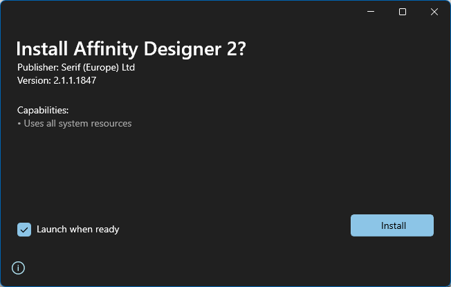
Since I “reset” Windows, I’ve been re-installing apps as I need them, and the time came today to re-install Affinity Designer 2. It presented this dialogue:

Uses all system resources? At least leave enough free so I can use IRC1I’m kidding, I haven’t used IRC in years. I’m not kidding about not using all resources, though. That just seems greedy..
Also, I installed a font today, and it wanted me to restart my PC after. Welcome to the future.
Or is this just a Microsoft Store app update?

I remind readers again that I am easily amused.
It’s 2023 and that means the big thing is AI (that’s Artificial Intelligence, not some guy named Al). If you are reading this in some other year, you may be wondering what the fuss is all about from your tiny, climate-ravaged hovel. Or you may be wondering the same as a gleaming machine built on AI yourself! Who can say what the future holds?
As for the present, it started in 2022 when AI-generated art became a thing. That’s still ongoing (see the controversy over Marvel using AI-generated art for its opening credits to Secret Invasion), but things kicked into high gear right near the end of the year when OpenAI unveiled its ChatGPT website to the public, allowing you to query an AI built on all kinds of data scraped from the internet through 2021. You could ask for recipes, have it write haikus, or generate code, or just write your crappy books and list them on Amazon for you. There are concerns, as you might imagine.
Given the recent implosion over at Twitter over what Elon “Galaxy Brain” Musk has called “extreme levels of data scraping”, I wondered, might my own humble blog be subjected to the same? It is, after all, a treasure trove of my collected thoughts and wisdom, stretching back 18 years! In internet time, that’s like going back to the dinosaurs. Or at least mastodons (not to be confused with the social media platform). What can I do to protect my sacred words from evil, exploiting AI? How could I stop some young lad from going down the wrong path by using text from creolened.com to, in some small way, help write his homework, leaving him bereft of critical thinking and writing skills, and therefore destined to a life of petty crime and indolence?
I have the answer.
I’ll fill every post with words I’ve made up. Eventually, Nedlish will become the universal language Esperanto could only ever dream of becoming. This is a perfect plan. Let’s get started.
More to come. Get to work, AI, on the glorious Nedlish future!
As seen on Mastodon:
I’m feeling more and more that smartphones are an enemy of creative thinking. If creativity requires boredom, a device that ensures you’re never bored is an effective barrier.
The internet is wonderful, but never being left to your own thoughts breeds conformity.
Ben Werdmuller
Werd, Ben1I swear I didn’t do this entire post just for this horrible bit of wordplay. But I maybe did just a little..
I’m not sure if I’d say the lack of boredom leads to conformity, per se, but I think it does dull the mind, and easy access to the internet 24/7 can train you to perpetually stimulate your brain, even if it’s with vacuous nonsense, which is found on the internet (and for most people via their smartphone) in quantities that are effectively endless. The smartphone makes it all the more insidious because of its ubiquity. Everyone has one, and it’s always right there on your person, in your pocket, or in your hand and…hey, put the phone down and look at me! Have you ever noticed how often people will take the slightest gap in a conversation as an opportunity to pull out their phone and start interacting with it? Think of those halcyon days of yore, where a few moments of thoughtful silence were just that.
Writer/artist Austin Kleon has written about the need for boredom as well: Boredom is a pit stop.
Being bored sometimes is good. Having a few minutes to just lose yourself in your own quiet thoughts is good. The next time you feel restless and pick up your phone, set it back down and give yourself a few minutes to just marinate in your own thoughts. You might come out of it pleasantly energized. And if you can’t set the phone down, maybe consider one of these.
UPDATE, June 26, 2023 (a day later): YouTube changed Appearance to Device theme again--and is once again blinding white on Windows 11.

Conclusion: YouTube is bad and should feel bad.
Or maybe I don’t understand it (this is possible–see below for details).
When I watch YouTube, I do so primarily on two devices:
Each respective OS allows you to choose an overall theme for the interface, and each OS refers to these as Dark and Light. I have both macOS and Windows 11 set to Dark because I find it easier on my old man eyes and particularly for working on images, photos or watching videos.
YouTube seems to go slightly crazy now every time I open the site on a different device and chooses to reset three settings each time:
Also, why is one of these a checkbox and the other a toggle? See screenshot below.

It also turns Ambient mode on, and this can only be toggled back off when you click on an individual video. It then remembers the setting for all videos, which is ???
Anyway, the issues I have are:
But mostly:
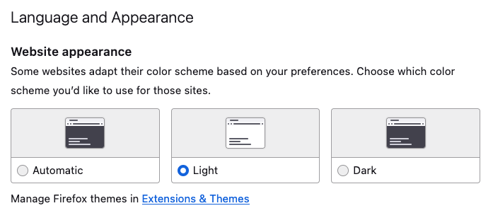
I thought it might refer to using one theme or the other and then customizing it somehow, like choosing Dark but having hot pink window borders or something. But while I do something like that in Windows 11 (well, not the hot pink), YouTube still interprets Use device theme as Light mode, which is wrong, and you know, as I’m typing this I think I may have discovered the issue. All this time I thought “device” meant hardware, but it may in fact be software–specifically, the browser. Because in Firefox, I have it set like so:

A few sites will impose their dark theme on you unless you specifically set the above to Light, so this is my way of insuring these sites stay light. YouTube may be using this setting. I am going to change this to Automatic, set YouTube to use Dark for appearance, and see what happens.
I will update this post with exciting details in the near future.
If it works, YouTube is still bad, because the language it uses is ambiguous–and it still changes three other settings willy-nilly on its own, anyway. But it won’t be quite as bad.
Addendum: If I was obscenely rich, I would totally start a competitor to YouTube.
Just give your tots some crayons and let them go at it!

OK, it’s actually from this article. But it could totally be a Tesla Cybertruck (after crash) colouring book.