Microsoft decides Windows users want ads everywhere, all the time

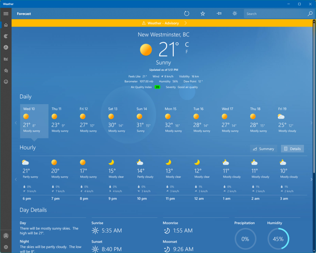
I’d been using my Mac for the past few days and didn’t realize Microsoft had updated the weather app in Windows 11. This is actually a surprisingly comprehensive and handsome-looking app, showing the kind of taste that Steve Jobs said Microsoft never had.

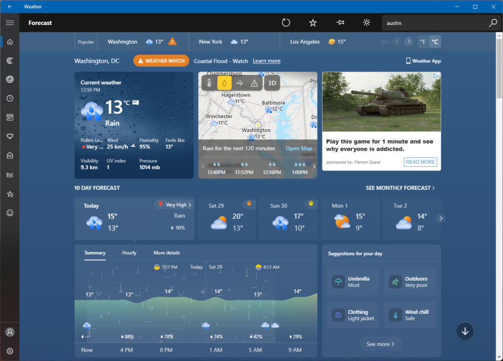
The updated version of the app is terrible. It’s pretty much exactly what Steve Jobs said about Microsoft having no taste–cluttered, ugly, and on top of that, it now has a large ad stuffed into it. It’s a built-in app, so it would be nice to escape ads while I’m using it. What next? Calculator sponsored by Crest? Terminal with a 10-second rolling ad before you can type anything?

Fortunately, I used my internet smarts to do the following:

  • Uninstall the odious new app
  • Download the old version and re-install it
  • Disable auto-updates in the Microsoft Store, hopefully insuring the new app will not come back on its own
  • Provide feedback through Microsoft’s handy Feedback Hub to tell them to stop stuffing ads into every corner of Windows

It’s like Microsoft has resigned itself to most people just switching to Macs, so they’re going to squeeze the remaining few for everything they’ve got with ads and monetization.

Bah. Bad Microsoft!

Here’s a shot of the new version:

Tanks for the updated app! (ho ho)

And here’s the lovingly restored old version:

Yes, it’s looking to be a tad warm this weekend

Make-your-own weather warnings, Windows 11 edition

For awhile now, the Windows 11 weather app (which I quite like–it covers all the basics and has a pleasing, subtle aesthetic) has been missing text for weather warnings or alerts. For example, right now I see this:

I mean, it’s nicely minimalist, but some text describing these dire-looking warnings would be handy!

(And yes, I used the Feedback app to report the issue, like a good interweb citizen.)

Hyberbolic tech headlines of 2022, Verge Edition

Here we go:

Maybe the definition of “amazing” has changed, but here’s what you can do on the iPhone’s lock screen with IOS 16:

  • Change the wallpaper
  • Add 1-4 widgets in a row directly under the time, visible only in black and white
  • Add a weather widget beside the date
  • Choose from 8 fonts for the time and change the color of the font

Here’s what you can’t do:

  • Add widgets from many of the built-in apps (they don’t exist)
  • Add widgets to any other part of the screen
  • Add more than four widgets
  • Have color widgets

Now, I will grant one thing from the article (found here), it’s nice to be able to customize the lock screen and wallpapers easily now, without having to go into the Settings app. This also encourages people to have different lock screens, whether for variety or other purposes (maybe a work/play split). But none of this is “amazing.” Also, the article mentions vibes multiple times. How very 2022!

Really, I just take issue with “amazing.” The improvements are welcome. They’re nice. They’re good.

They are not amazing.

Also, I’m kind of grumpy right now. That’s my vibe. RAARR.