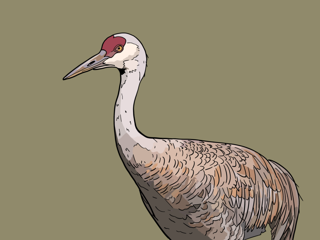
This is me promising on the internet to do something. Maybe not today, but soon, as defined as “in the next couple of days.” In the meantime, to help inspire me, my bird art of a Sandhill crane:
This is me promising on the internet to do something. Maybe not today, but soon, as defined as “in the next couple of days.” In the meantime, to help inspire me, my bird art of a Sandhill crane:
With the site redesign mostly complete, I think I need a new logo, something that isn’t just literally the name of the site. Yes, I know it’s clean and efficient, but it’s also sterile and blah.
I still want something sleek and uncluttered. I will ponder.
When I tinkered around in Canva, I ended up with this:
It both does and doesn’t speak to me. It’s also full of hidden meaning that no one else would ever figure out.
But the actual logo will probably not feature a jar of pickles.
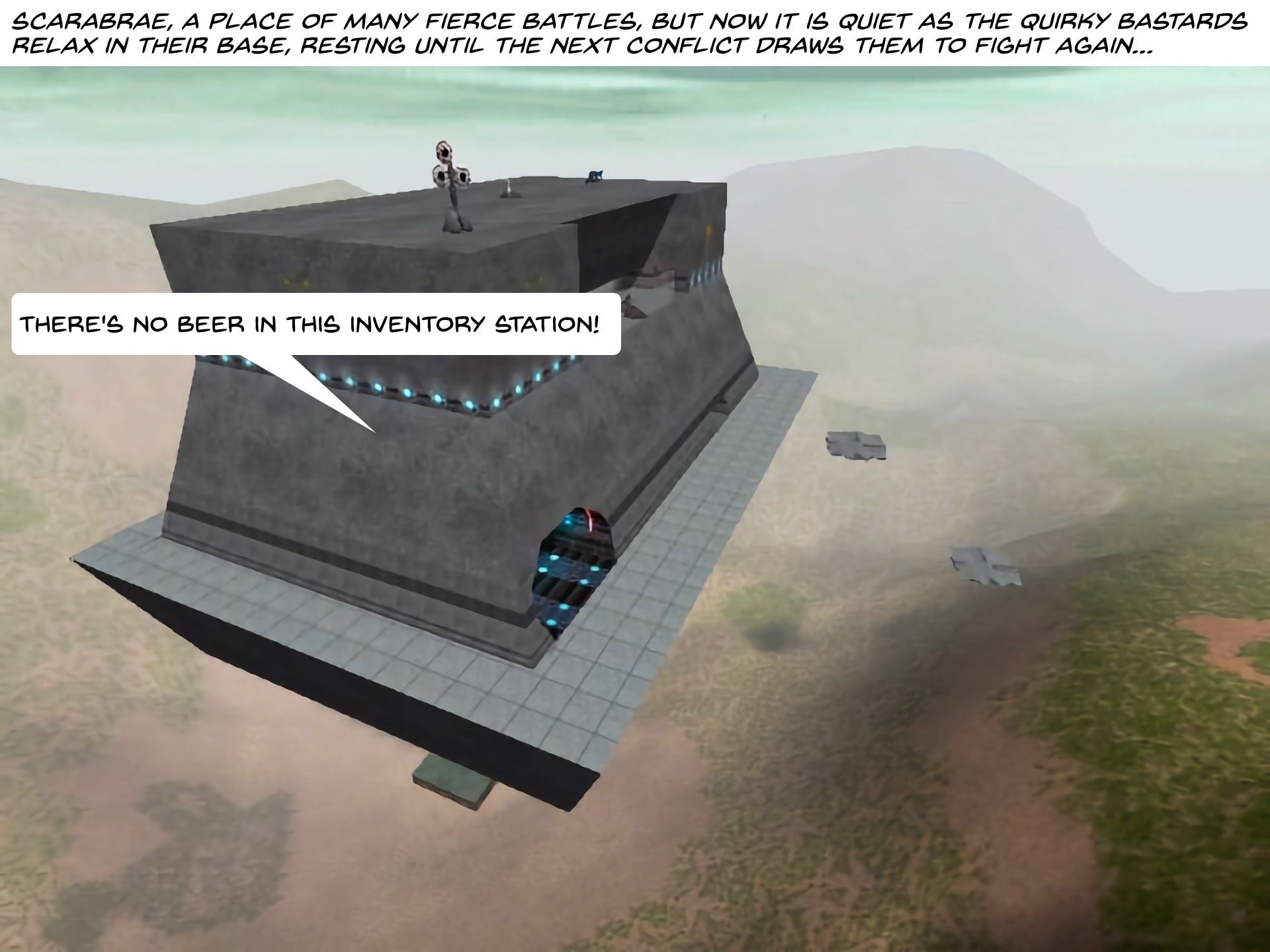
I finally finished going through Episode 1 of Angry Carrot vs. Quirky Bastards, reworking the comic to make it more palatable in the age of high-resolution monitors. I tried not to George Lucas it up by drastically changing the artwork and making this a Special Edition™, focusing more on preserving the original art, just making it smoother and more refined.
You can view the updated episode in the gallery below or on the AC vs. QB page linked above.


Issues with the HD version of Episode 1:
On the plus side, the improvements:
How I redid the episode:
Yes, this is a weird choice for updating the comic, a brief “Where are they now?” update I slapped together while I pondered where to take the comic (nowhere, ultimately!)
I got the idea to redo the strip because the original panels (as mentioned previously) are absurdly tiny on a typical widescreen monitor, at a mere 375 x 281 pixels.
It was a fun little experiment to modernize the comic, as I had to redo some of it from scratch and probably redid some of the panels significantly faster than originally when I handcrafted them from the chunky pixels and stone tools of 2002.
Angry Carrot vs. Quirky Bastards page to see the new and original versions of the episode.
The higher resolution gallery:


Notes on what I changed:
Globally:
- All panels increased to 1920x1440 resolution
- Main font changed from Verdana to Back Issues BB for a more comic book look
- Revised characters were drawn in Procreate on an iPad Pro
- Revised artwork, text and dialog balloons were added in Affinity Photo
Individually:
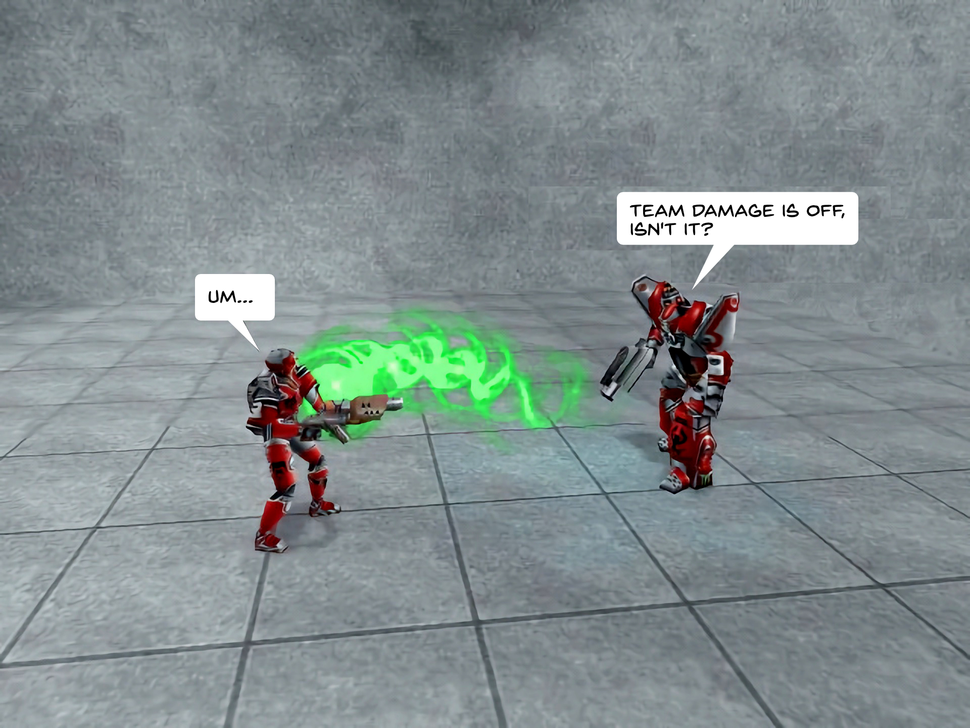
1. Completely redone.
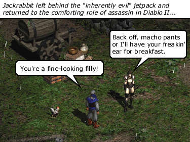
2. Used screenshot taken from Diablo II: Resurrected.
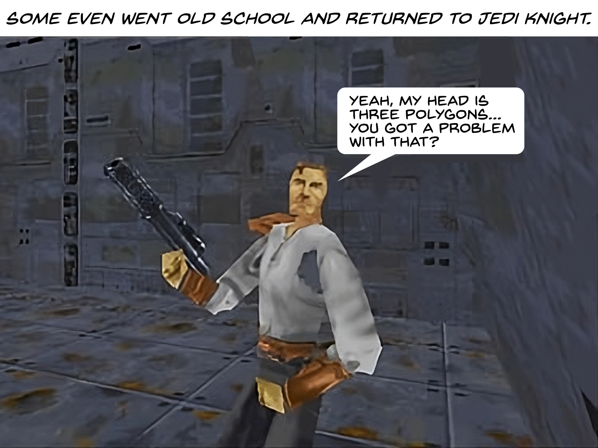
3. Resized the dialog balloon to make it smaller. Painted over the old balloon, then copied and pasted parts of the background to better blend everything in. I was helped here by how crude and low resolution a blown-up image from Jedi Knight (1997) looks in 2024.
4. Found new still life for background, made the pepper look less still, more peppery, since that seemed a likely reason for him being fired. A “still” version of the pepper also exists in a hidden layer in the original Procreate sketch.
5. New background, new lighting effect added in Affinity Photo. Celery characters were traced over from the originals. Evil version has a tweaked goatee.
6. Changed GIANT Chinese Egg Attack!! to the less culturally insensitive GIANT Evil Egg Attack!! Redid the eggs to look angry/evil. Open mouths reveal yolk-filled innards.
7. Completely redone with new colour image of Freud (same pose) and new background.
8. Completely redone.
9. Completely redone.
10. Completely redone. Figures were traced from originals and refined a bit.
11. Completely redone.
I am planing to at least take another look at the high-resolution version of Episode 1 I also did recently, to see if I want to tweak that one (and maybe others) as well.
In another case of nostalgia gone horribly weird, I’ve started perusing the old Angry Carrot vs. Quirky Bastards comics I did a quarter of a century ago and realized that the images are super tiny because back in 2000 everyone still had 15-inch monitors. Observe a random panel from Episode 6.5:
This shot is shown at its full resolution–a whopping 375×281 pixels. It’s like a Diablo II postage stamp.
I decided to super-size all the images to 1920×1440 using the Super Resolution™ feature in Pixelmator Pro for the main comic panels (which are 640×480, so large postage stamps) and it worked surprisingly well, even preserving the text balloons decently. But some have required more fiddling and none of these panels were made with fancy layer technology, so it’s a bit like fixing up an old painting–you need to be careful to not muck it up.
What I have found is in some cases I need to actually redo pretty much the entire panel. For example, here’s the Diablo II panel above in its shiny new 2024 version:
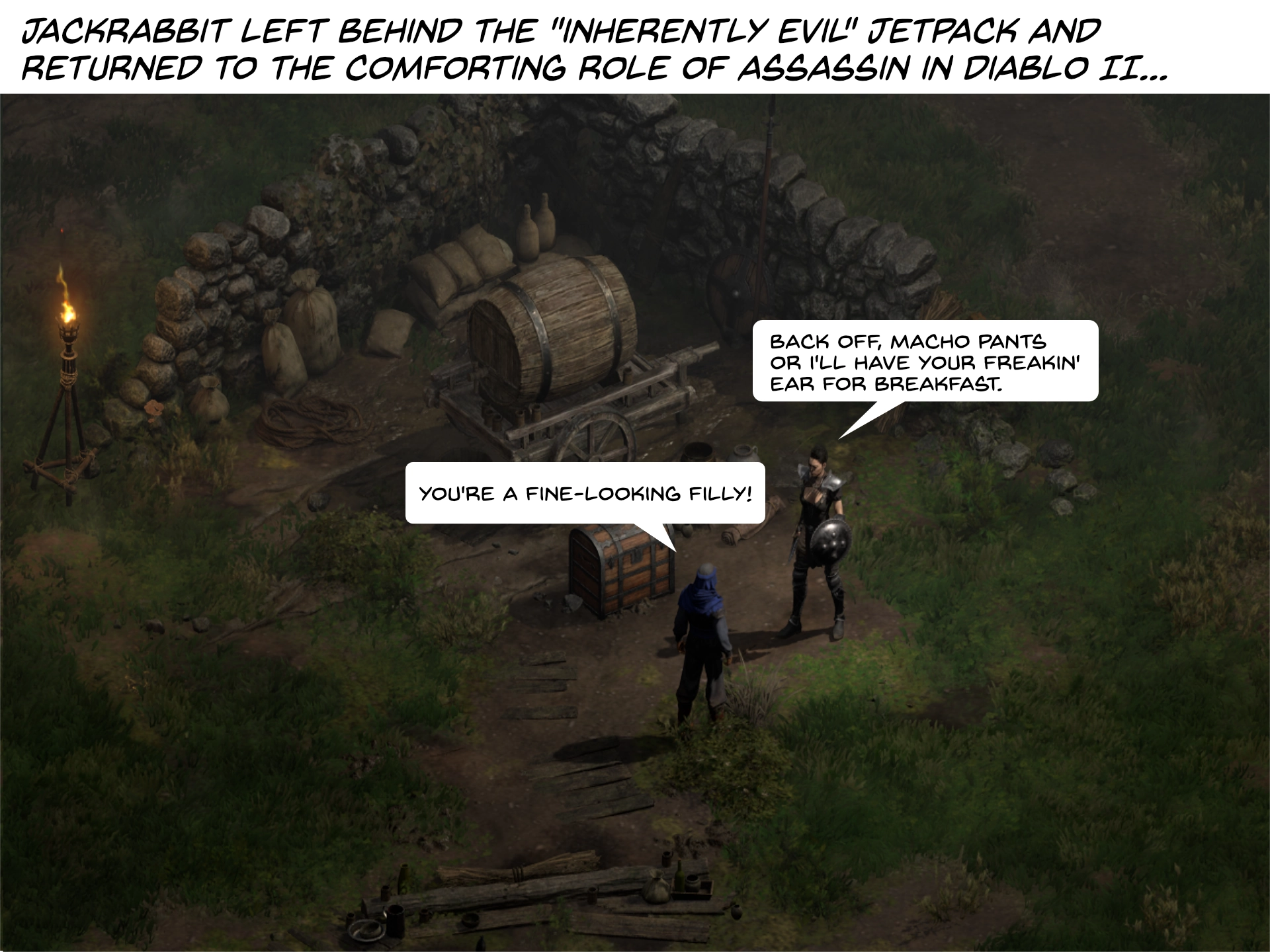
Upscaling the original panel looked grossbuckets. The shot above is from Diablo II Resurrected, which offers much better graphics than the original, though I could have toggled on the original 2000 era graphics for maximum fidelity, but that many giant pixels would look very chunky at 1920×1440. I also changed the font to one more befitting a comic. This means I have to change the font in every panel now. Whoops.
And while it’s a bit silly to go back and do all this work for something very few people will see, I’m enjoying it, and it’s fun to revisit the old comics and make them a little more presentable for our shiny modern age.
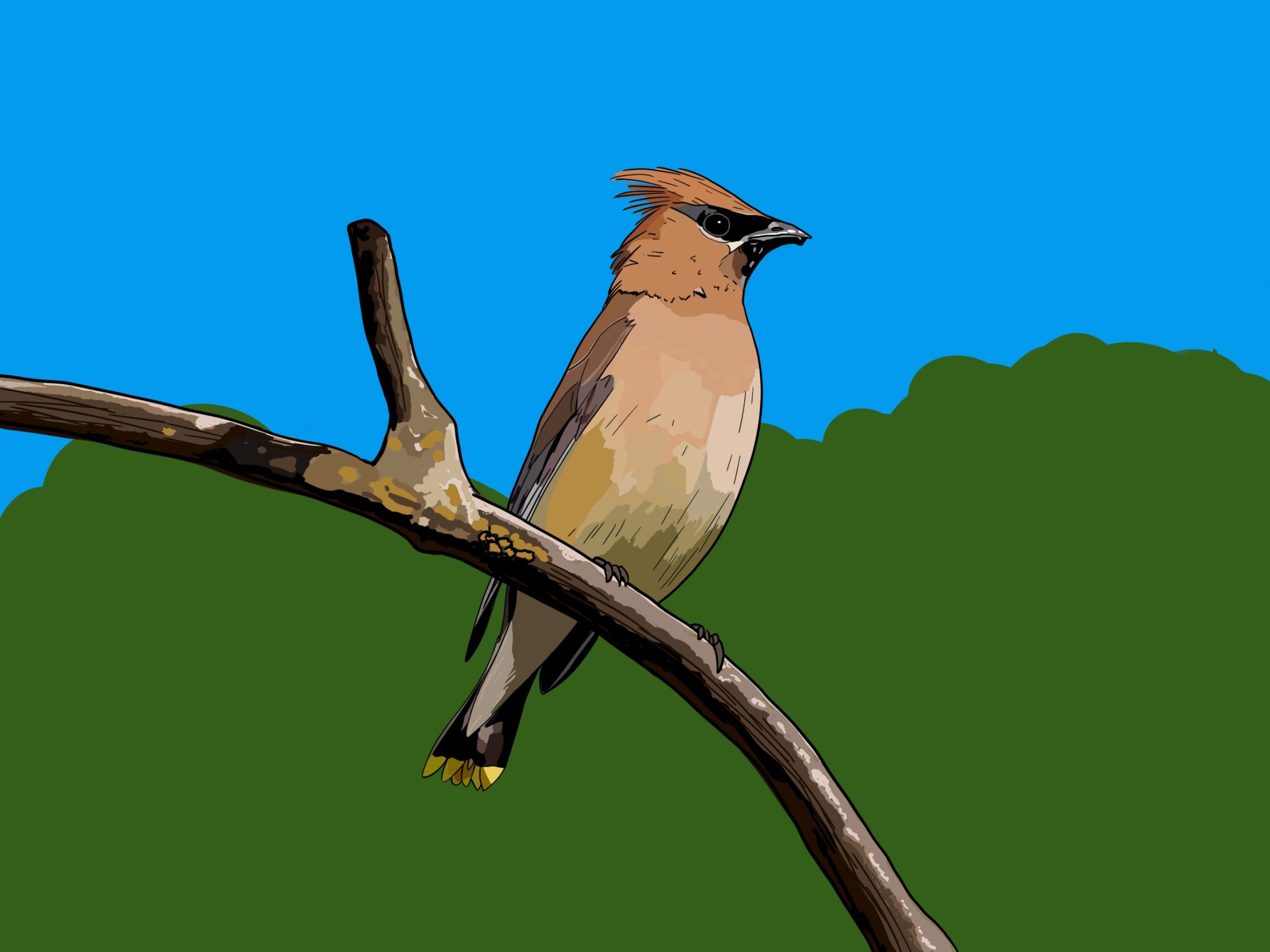
I finally got to drawing one of these pretty boys, based on a photo I took on July 8, 2023 at Tlahutum Regional Park.

If I touched it up, I’d probably adjust the background colours and spend a little more time on the branch. But it’s fine-ish.
A short time later, this alternate (updated?) version:

Or maybe the original green with the updated blue? I’m going to bed now. 😛
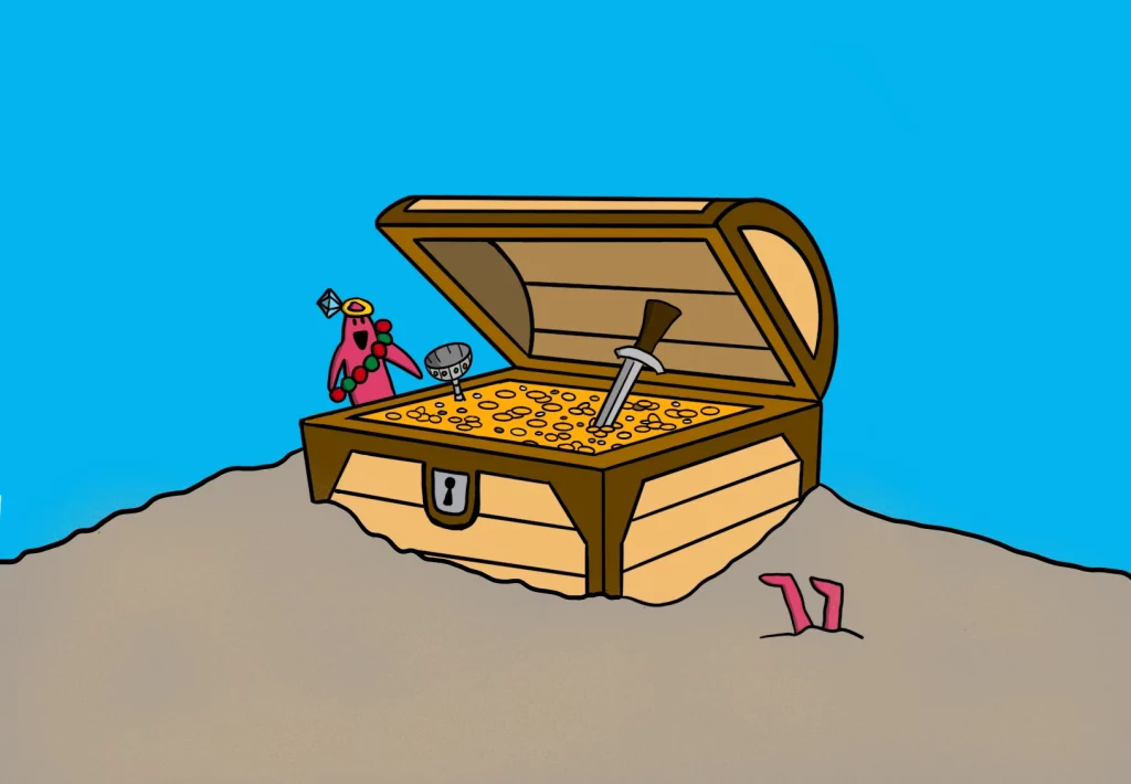
Back in Inktober 2019 I drew this sketch for the prompt TREASURE:

Recently, and randomly, I decided to colour it (maybe I just like colouring books) and, as I’ve done before with other GGP sketches, ended up refining it at the same time. The lines of the chest are straight now, but if you look closely1Maybe not even that closely, really you can see the chest is not quite straight. But I kind of like it that way. Also, I admit to largely giving up on the coins. Maybe in the next revision.
Both drawings done in Procreate on my iPad Pro.
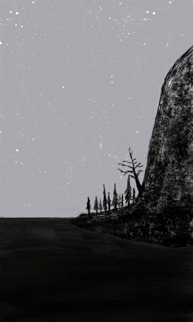
Another late night doodle. I couldn’t figure out what to do with the mountains, so just left them mostly black.
(It’s saved as a WEBP file because they seem to magically use a lot less space than a PNG.)
I doodled this in Procreate1This is still a terrible name for an illustration program while in bed over two nights, plinking away at it. It’s the first sketch I’ve made in a while. I will continue to make more. Probably when I’m not in bed, since bed is not an optimal art-making location.
It’s incomplete and may never be finished, so I’m not posting it, but I was inspired to finally doodle something after being inspired by Chris Silverman, who makes drawings in Apple Notes, which is just as weird as it sounds. He also draws weird things, which I love.
You can see his work at notes art.
I did not use Apple Notes, I used Procreate on my iPad Pro, but I mimicked the look and feel by using the same 3″ x 5″ canvas and using a combo of pencil and charcoal brushes. It was fun, and I’ll be doing more, which I will actually post. I’ll also mix things up as I progress, so the work becomes less homage and more my own. (I drew a night scene showing a cliffside beach against a gray and foreboding sky.)
Here’s a piece of one of Chris’s recent drawings to give a taste. I highly recommend visiting the site, checking out his work and his process.

Today, the Super Bowl took place. Two teams played, one team one, etc. I don’t have all the details, I didn’t watch the game. I’m not really into sports ball.
What I do have is this AI art of an eldritch Super Bowl. Enjoy!

It’s been a while since I did one of these, and I figured I should get one more in before the end of the year. It’s not perfect, but it’s snow goosey enough. Based on a photo I took at Iona Beach on October 22, 2023.
