I asked Adobe Firefly to create a scene of hide and seek in a mansion and, really, I should have known what I would get. I mean, it did nail the hiding part.

I asked Adobe Firefly to create a scene of hide and seek in a mansion and, really, I should have known what I would get. I mean, it did nail the hiding part.

Well, as many thoughts as a smartwatch can have.
My Garmin Forerunner 255 got a software update recently that allows it to track naps. I don’t take naps very often, but I did take one after a run last week and sure enough, the watch tracked the nap. It said I picked a good time to nap, but napped too long.
Today it tracked my second nap. Except I was awake the entire time. And I was playing a computer game.
Apparently, PowerWash Simulator (which is exactly what it sounds like) is such a mellow game that my watch thought I was napping while I was playing it. It also said I napped too long again. I can verify it is indeed a relaxing game, but now I’m curious about what my stats (heart rate, etc.) look like when I’m playing. Is the nap-tracking glitchy, or do I enter such a relaxed state that playing the game is effectively the same as sleeping? Questions!
It is time again for me to randomly go through old issues of The Computer Paper on The Internet Archive and delight in the old-timey world of tech print ads.
Behold, an ad from the November 1999 issue for a Samsung multi-function printer:
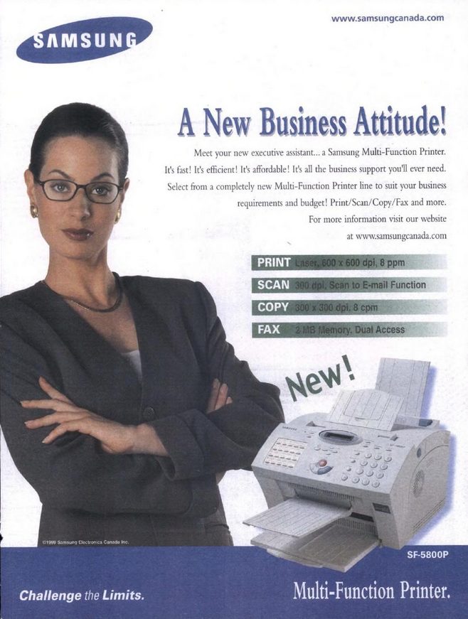
Business woman has her arms crossed and means business. Also, is she leaning on something we can’t see or just have good balance? My favourite part may be the single word New! callout, as if it’s a feature. I can’t mock too much, though, because my current Brother multi-function printer can still fax, too.
Fun facts (fax?):
Bonus:
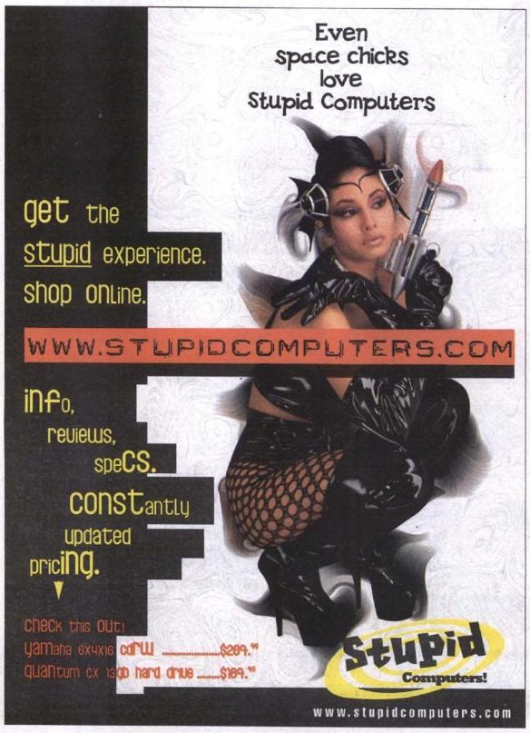
In the same issue is this ad for Stupid Computers. It is amazing. stupidcomputers.com does not have a website, but according to dan.com (“a GoDaddy brand”) it has been sold.
Also, uh, what kind of gun is space chick holding there?
I am a visual person and aesthetics matter to me. Sometimes they matter (a little) more than functionality.
One of the nice things about the federated social media platform known as Mastodon is that it allows for a host of third-party clients to view its content.
I tried several Windows-specific clients and found all of them to look kind of ugly. I don’t want to use an ugly app, even if it’s functional. It’s 2023, we’ve evolved beyond MIDI files and poorly compressed animated GIFs. I eventually settled on a web client called Elk. It looks a bit like Twitter and is nice enough. Then I came across Phanpy, which, despite its terrible name, looks *really* nice, even if it’s perhaps a bit too aggressively minimalist. But it looks so nice!
In fact, I like its look so much I’ve actually started favouring it on the Mac, where I own the Mona Mastodon client. Here’s how each looks, along with the official Mastodon web client, focusing on one post, all of them running in dark mode, because light mode makes me run and hide under the bed. No scaling has been applied to the images.
Mona (Mac client):
Mastodon (official web client):

Elk (web client):

Phanpy (web client):
Some thoughts:
Overall layout: Phanpy is by far the most compact, but that doesn’t necessarily mean better. It does put posts in a nicely rounded box, though, which is a pleasing visual touch. Phanpy puts the image inline with the story title and subhead, which reduces the size of the image. The others are all very similar in layout. Oddly, even though Phanpy offers the most compact layout, I think it does the best job in terms of spacing around the content, giving it a lighter feel, even in dark mode. This is done mostly by simply making the interface wider, allowing everything to spread out a bit more. Compare this to Mona, which has a bunch of empty space sitting to the right of the image.
Phanpy also does the best job of implementing a card-style interface, where each post is clearly separate from the next. Mona is also pretty good, though the contrast between posts and the background is more subtle (a to-taste thing, really).
Colour: The official web client uses a more purple-black, keeping with its theme colour, which is purple. Phanpy is a bit lighter than Elk or Mona, and I think looks a bit better.
Text: Mona wins here, with the sharpest text of the bunch. Elk is probably the worst, but still not actually bad.
Iconography: Phanpy requires you to open a post to see any icons, part of its minimalist thing. The others are all clean and functional, but not exactly delightful. They do their job. Note that several clients allow you to customize the icons. The official client probably has the least attractive icons of the bunch, but again, they are perfectly serviceable.
Options: Elk and Phanpy offer minimal options. Mona is the clear winner here, as it has options out the wazoo. It probably has options for the wazoo.
Conclusion: No one client does everything perfectly. I think my ideal would be Mona’s text/icons/non-minimalism, combined with Phanpy’s aesthetics and use of white space.
This post prompted me to dive into Mona’s options and tweak its interface again, bringing it closer to Phanpy’s. We’ll see if it sticks. The nice part is simply having the abundance of choices to start with. Now, if only a Mona-quality app existed on Windows…
Mona (after tweaking the UI per the above paragraph):

I’m typing this in Firefox running on Linux Mint. I am also thoughtfully stroking my neckbeard as I gather my thoughts. Well, not really, but I do need to shave.
I occasionally think and write about making choices on who I do business and interact with, especially on the internet where the products are more intangible–software and services, not physical locations and goods. Avoiding a bad restaurant saves me gas (in multiple ways), avoiding a bad service or software is more about staking out a moral or ethical position, usually accompanied by me noting the fact somewhere online (this blog, social media, etc.) with the intent to broadcast my position to let others know where I stand, and to influence them to join me (JOIN ME), because if I think a company is evil, you should, too!
(I realize it is more nuanced than that, but go with it for now.)
The thing today, though, in 2023 and soon to be 2024, software and services have increasingly been consolidated into an ever-smaller number of mega-corporations, all of which, to varying degrees, engage in platform decay or, as Cory Doctorow more colourfully calls it, enshittification. Basically, this means most of your choices are bad, the degree just varies.
Possible solutions:
I’m opting for #3.
I’m writing about this now because I have come to another one of those points where I have to decide if I want to make a stand against a particular service/platform/piece of software, and it’s made me think about the whole thing and how so much of what we do online is wrapped up in one of the big tech companies. For me, this includes:
There’s more, but you get the idea. In terms of hardware, I’m deep in the Apple ecosystem and software and services-wise, I am beholden largely to Microsoft. On the plus side, as giant evil tech companies go, I would rank both as less terrible than others, like Google and Meta. Microsoft, who for a time, had almost rehabilitated their reputation by embracing open source, Linux and giving out Windows 10 for free, has fallen in the last few years by going hard into ads, trying to monetize everything (the weather app in Windows 11 now has ads) and junking up their otherwise good Edge browser with shopping and other clutter/services. They have also junked up Windows 11, too (though have also continued to make improvements). Apple touts privacy and security, but it’s really about lock-in and making sure you never step outside their walled gardens, where they control everything. Some people see this as a positive!
I have made efforts to move away from the big tech companies–as mentioned, I’m making this post in Linux Mint–but my efforts are a bit scattershot, a bit piecemeal. I am always looking to improve.
And now I’ve reached a point where I’m making another small step to move away from a service that has adopted policies and positions I fundamentally disagree with. It’s not even the first time this particular company has garnered press over their stance.
I’m speaking of Substack. I wrote about the company previously. That was almost two years ago, and in the time since the platform has become even more popular with right-wing extremists, including literal Nazis. The founders of Substack recently confirmed that they are OK with Nazis being on their platform because censorship is bad, and they are also good with collecting Nazi money from those that charge for subs. Popehat, aka Ken White, neatly deconstructs Substack’s position here.
I am OK with Substack cozying up to Nazis and taking their money–it’s their choice to do so. Likewise, it is my choice to not be associated with a company or service that cozies up to Nazis and takes their money. I’ve decided to move my piddly newsletter, which I recently chose to revive, off of Substack, probably to another service called Buttondown, though that’s not 100% confirmed yet.
I’ll update on how this goes, as well as further updating about how others are responding to Substack’s now official position of “Nazis are OK!” I subscribe to several Substacks myself, and am very curious to see how the authors of these will react.
I like and use Signal, it’s a decent messaging app that prioritizes privacy and security. It has end-to-end encryption and all that good stuff. Most people will still use WhatsApp (or Facebook Messenger–both owned by the same company) and I accept that.
But the thing I like most about Signal are its weird, quirky stickers. Since it’s not run by a mega-corporation, a lot of the stickers have a sillier, less manufactured feel to them.
Also, a lot of nudity and sex, apparently.
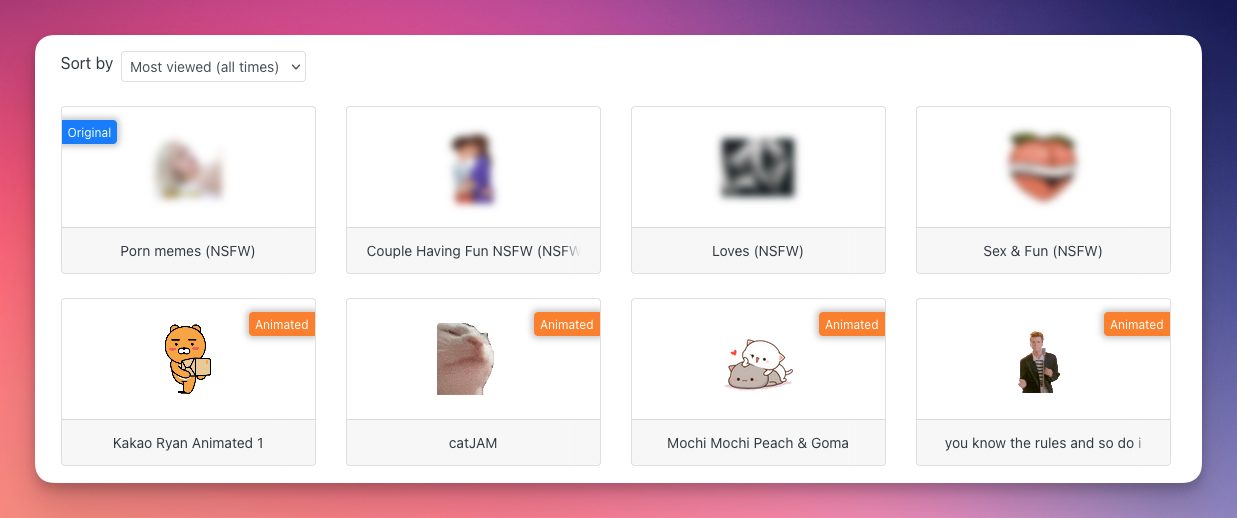
The top four most viewed Signal stickers of all time are blurred out on the Signal stickers website because they are NSFW. The rest are cats and Rick Astley.
This is as accurate a summation of the world in 2023 as any.
Here’s my year-end summary of me and social media, by platform:
Mastodon: Pretty much the only one I use right now. I recently saw it described as the platform for nerds, and I think that’s accurate. After some initial interest when Twitter started falling apart under Musk, it seems to have peaked, but it’s still an important, useful and entertaining place. It takes more work and people don’t like that with their social media. I don’t mind, because:
Facebook: Hot garbage. Also, cold garbage and medium-warm garbage. A hellscape of ads and “Suggested for you” with a few posts from people you’re following dotted in-between. I have no idea why anyone would use Facebook anymore, except for very specific purposes (you’re a member of a group, your family or friends refuse to move to something else because they are terrible people, etc.)
Instagram: The web version is still bare-bones and ugly. It will be this way for as long as it exists. It’s basically Facebook Lite at this point, but with more images and videos. Lots of videos. Do you like videos? Because it has videos. Also, plenty of ads. The ads are also videos. That said, it’s still noticeably better than Facebook, though I rarely visit these days.
Threads: It’s OK. For now, there are no ads, but that will change eventually, and it will join other Meta sites in being an ad-clogged hell. Very bare-bones and minimalist, but not the good kind of minimalist, just ugly and unappealing. If they follow through with federation, it may be possible to follow people and interact through one of the excellent Mastodon clients, so there is that. I check in every month or so, never post.
Bluesky: Their eventual business model (basically premium services over ads) is admirable in a way, but I am skeptical it can work. Also, the fact that it is still invite-only gives me pause. If they still can’t scale up now, after this long, when will they? It feels a bit like a doomed private club. The people there will have a grand time, until it abruptly shutters. I have an account, but have never posted. The web interface is also spartan and unattractive.
There are other social media platforms out there, but I either don’t have accounts or don’t use them in any meaningful way. And then there’s X (formerly Twitter) and all I will say about that is:
Overall, I get most of what I need from Mastodon, as it best fits what I want, which is not to have my posts showered with likes and adoration, because I seldom post and don’t care for or need the affirmation–while not denying likes and affirmation are still nice! I am interested in the trajectory of Threads as it relatives to the Fediverse. Everything else is pretty much meh to bleah.
We’ll see how things shake out in 2024, which will be all sorts of fun on social media with the U.S. presidential election at the end of the year.
On the AirPods Max, which were released three years ago (2020) and have not been updated in any way since:
Apple also looks to breathe new life into the AirPods Max headphones. The cans don’t sell well enough for the company to invest in entirely new hardware or software features, but Apple is planning a model that trades in the Lightning charger for USB-C and potentially adds new colors.
Mark Gurman
This is a rumour, so we can’t treat it as actually happening, but it sounds plausible, so let’s play through the logic as if this is what will come to be:
Unless “breathe new life” doesn’t mean “generate new sales” this plan makes no sense. If Apple doesn’t address the shortcomings of the AirPods Max, no one is going to rush out and start buying them again. Yes, you’ll get a tiny sliver of sales for some different colours, but given Apple’s recent history with colour (fear, paranoia) we might not even know the colours have been updated. I think what bugs me is that the world’s richest, fattest company can’t be bothered to properly update some of their products when some, like Sony and countless others, regularly improve and iterate.
But hey, they are the world’s richest company for a reason, and I’m just a schlub on the internet, so don’t mind me!

Tonight, I said to myself, “What should I do? I already had a shower, what else is there?” And then I noticed that Windows had an update available. It always does. I installed it and it needed to reboot. It always does.
I used the opportunity to jump back over to Linux Mint and girded myself for the billion updates I’d skipped last time. They completed, but it then required…a reboot. I guess Mint always does, too.
I rebooted.
I then spent time tweaking the whole system, installing extensions and applets, slapping on a new dynamic wallpaper so it doesn’t look like a clone of my Windows desktop. It looks fairly snazzy now. I get weirdly hung up on visuals, so this is important to me.
I copied over my music library to the dedicated SSD for Mint, so I could listen to (non-streaming) music. I am doing so as I type this.
The best part, though, is I don’t have any version of Bejewled available on Mint. This increases my productivity by about 1000%. I may have a bit of a Bejeweled problem.
Anyway, things are working, and the system feels a lot more solid now. Will I stick with it and use it more than my previous attempt? Maybe!
YAM = Yet Another Mint
I decided to peek in at Linux Mint again and this meant there were a plethora of updates ready to be installed. After doing so, I had to reboot, then fix the updates that didn’t install properly, and so on.
I mean, it was no better or worse than doing the same in Windows 11. I mean, it was a little worse in that Linux-y way, but not overly so.
But I never gain any traction with Linux because I just don’t spend enough time with it. And I don’t spend enough time with it because there are so many niggles that irk me. Not a lot, but enough.
But still, I try, because I am a dope and a sucker for new things or different things.
And it is different.
Now that I’m (mostly) updated, I’ll stick with it for a bit and see how it goes.
This is the text of a talk Charlie Stross gave today (November 10) at the Next Frontiers Applied Fiction Day in Stuttgart. He talks about how science fiction writers influenced many of today’s most powerful tech giants–in all the wrong ways. Entertaining and also a nice section of SF history, dating back to the late 19th century.
From the November 3, 2023 edition of the MobileSyrup newsletter:
