Some of the thoughts are not fit to be heard by other humans. These have been omitted.
Getting ready
My older PC dates back to 2019, so it’s getting close to around seven years old. This seems to be the typical lifespan of my PCs, so I began looking for components to build a new one before year’s end. I was not in a rush, though that changed toward the end when ram prices suddenly went insane (thanks, AI companies!) I’d originally planned on going with 64GB but will stick with 32GB for now.
For other components, I bought nearly everything on sale and I made a change, going with higher end gear than usual. For example, the CPU I chose, the AMD Ryzen 9 9950X3D, is their top consumer CPU. I usually go mid-tier. The graphics card, my first AMD since the 9800XT I got with a coupon for a free copy of Half-Life 2, to give you an idea how long ago that was, is likewise the fastest they currently offer to consumers–a Radeon 9070 XT.
By buying on sale, I saved a lot of money. I haven’t added it up, but it’s probably between $600 and $800. This kept the overall price closer to my usual mid-tier range.
Building the PC. Twice.
Every time I build my own PC, I generally have a lousy, joyless experience and vow to never do it again1. Then I do it again, because the now seven-year gaps between builds is enough for the memory to fade into “Maybe it wasn’t so bad after all.”
For the record, I once again vow to never do it again. Note to future self: THIS TIME, LISTEN. I may still buy everything, but I’ll pay someone else to assemble it. They’ll do a better job with the cable management, anyway.
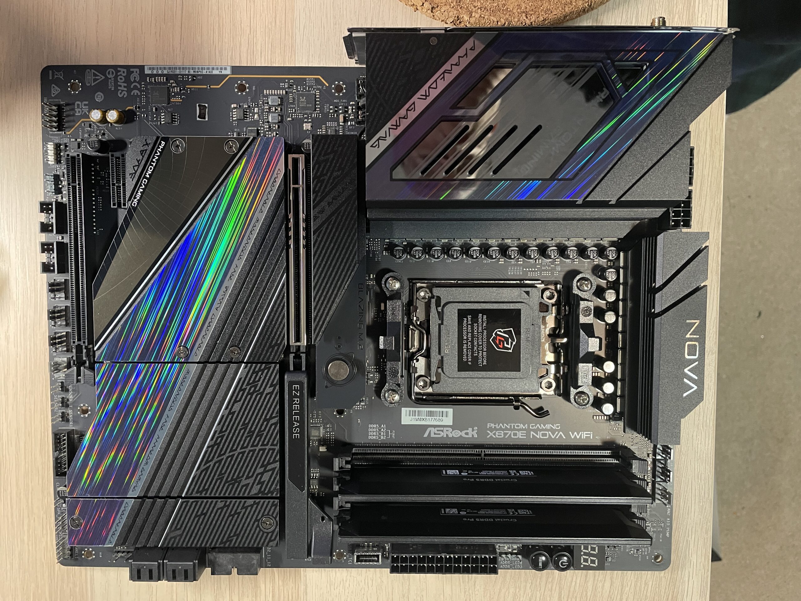
The whole thing was complicated by a defective component. I’ve packed the component up and will be returning it for a refund in the next day or so. This is always annoying, but there’s one component in particular that makes it even worse, and that is the motherboard, because everything connects to the motherboard.
It was the motherboard.
On the recommendation of a friend, I got my first-ever ASRock product, a high-end motherboard that weighed a ton, had RGB bling and came with an inscrutable quick start guide that failed to mention all of its components.
It also, as it turned out, had a bad ram slot. This meant I could only run with a single stick of ram. Not acceptable, of course. So I had to take everything off the motherboard, pack it back in its original box, find another motherboard and hope the whole mess didn’t happen again as I built my PC for a second time.
Because this was my first experience with ASRock, it’s very unlikely I will ever buy one of their products again. I’m sure they’ll manage without my contributions.
I went with an Asus motherboard, as I’ve used them multiple times, including my 2019 build, without issue. The second motherboard worked fine, and I am typing from the new PC now, hooray.
However, there was a complication with the second build and the new new motherboard. One of the two screws on the HSF simply would not line up and screw into the motherboard, as it was supposed to. I have no idea why one screw would not line up, but it would absolutely not line up. I spent about 20 minutes on it, growing frustrated, angry and getting the urge to go Hulk. I ended up walking away for a while. When I came back, I got it screwed in and done in a few minutes, as is often the case with these things.
But the experience reminded me how little the process of assembling a PC has changed in 30–or even 40–years. It should be a lot better than it is now, but this is the world we live in.
The new PC lives
One of the things I like about having a new PC is starting fresh. I spent some time decluttering Windows 11 (this task gets longer all the time, sadly), and now I am sticking to my rule of only adding applications as I need them. It’s a great way to see what I really use.
Here’s the list so far (last updated December 19, 2025):
Applications:
- Asus DisplayWidget Center (adjust settings on my monitor)
- Battle.net client (game client)
- Diarium (journal/diary)
- Discord (chat with my gaming pals of 20+ years)
- Epic Game Store (game client)
- Firefox (default browser)
- Godot (game engine)
- Notepad++ (substitute for Notepad)
- Obsidian (note-taking)
- Scrivener (fiction writing)
- Signal (chat with the one friend I convinced to use it)
- Steam (game client)
- TickTick (to-do lists and reminders)
- Vivaldi (alternate browser)
- Waterfox (alternate browser)
Games:
- Bongo Cat (this is just pure silliness and not even a real game, but it amuses me)
- Diablo 3 (I’ll stop one day)
- Diablo 4 (for when I stop playing Diablo 3, see)
Miscellaneous:
- Aptos font family (Hey, I like Aptos. Maybe I have no taste.)
- PowerToys (some of the utilities, like the command palette, are all but essential to me now with Windows)
Diablo 3 was interesting, because I downloaded and installed the Battle.net client, then copied over the Diablo 3 folder from my old PC to the new one. I directed the Battle.net client to the new location, it grumbled about how it was the wrong version, so I clicked the Install button and a few moments later, after probably writing the new path somewhere, it was ready and fully playable.
I have two SSDs installed: a 2TB main and a 1TB secondary. I want to put a Linux distro on the second (I actually already did, but kind of munged things, so I wiped the drive in Windows), and I’m mulling over what to try. My 2019 PC has Linux Mint, which I’m most familiar with, but I may hold off, as 22.3 is due imminently–unless I go for something else. I’m not hardcore or leet, so it’s not going to be Arch. Sorry, Arch lovers!
Anyway, I’m glad the PC is up and running. I’ll probably post a few more times about setting it up, tweaking things and such. Hopefully none of these posts will be horror stories.
- You may be asking yourself why I have repeatedly done something I claim to strongly dislike. This is a valid question. It comes down to just wanting to do it myself, not because I don’t trust someone else to do it, but because I know I can, and therefore, should. Yeah, it’s kind of dumb. This is also why I repeatedly vow to never do it again, because I recognize the dumbness. ↩︎