And you can read it here: A cartoonist’s review of AI art
Technology
Dark patterns and Windows 11 (and Samsung and OneDrive)
This is a story that is:
- A breathtaking example of dark patterns and how not asking for consent from a user can lead to a tech-related catastrophe filled with bogus warnings and alerts.
- A neat tale of dogged perseverance beyond what most people would do, with connecting-the-dots and searching saving the day.
- A sad testament to what a big ol’ pile of poop Windows has become in its latest incarnation. For every good feature, it feels like there are two user-hostile ones added.
My own experience with Windows 11 has increasingly soured since its debut, which is a neat trick, considering an OS normally starts out kind of janky and unstable when it launches and smooths out over time. Instead, Windows 11 has become both increasingly fragile and obnoxious, with ads, dark patterns and AI shoved into every corner of it, even basic apps like Paint and Notepad.
Anyway, here’s the story of how OneDrive going rogue almost nuked someone’s Windows 11 installation. Enjoy!
80s nostalgia gone horribly wrong
404 Media has a piece on AI slop videos that are all over Instagram and TikTok that not only evoke nostalgia for the 1980s, which has been a thing for a while, but goes further, with generated characters with feathered hair creepily inviting you to come back to 1985 and join them.
Tip: You can’t actually do that. You are stuck with 2025.
I especially like this paragraph from author Matthew Gault:
These videos are awful AI-generated slop, yes, but it’s more than that. Reactionary nostalgia, a desire to return to a fake past or a time when you were young and things were better, is part of why the world is so fucked right now. It is, literally, the basis of MAGA. Worse, these videos about the “past” tell us a lot about our present and future: one where AI encourages our worst impulses and allows users to escape from reality into a slopified world that narrowly targets whatever reality we’d like to burrow into without dealing with the problems of the present.
It’s like the Matrix, except stupid, horrible and about as cool as roadkill.
Full article here, which is horrifying, but also something worth knowing about, even if you (wisely) avoid both of the platforms that have popularized the videos (Note: you will need a free account to view, 404 Media explains why here): 80s Nostalgia AI Slop Is Boomerfying the Masses for a Past That Never Existed
Apps update: 30 updates, more to come soon™
UPDATE, one day later: Now up to 32 pending updates!
What’s funny is when 27 apps on my iPhone 12 needed to be updated, I did update 7 of them and just days later the number of updates is already past that initial 27, to 30. This is just silly.
Phone updates are silly.
I want to see how long I can go before something stops working.

Matt Gemmell on Apple’s Liquid Glass UI redesign
I have avoided discussing this in much detail, but in brief: I don’t like Liquid Glass. Like, at all. I think it’s glitzy, half-baked trash from people who don’t understand or care about good UI. But author Matt Gemmell put it better on Mastodon:
Liquid Glass is the kind of thing that would happen if someone with no UX design experience was put in charge of design, had no opinions on the matter so asked for suggestions, then approved the ideas from the youngest and least design-experienced people who could implement the most flashy demo.
It is thus, comprehensively and multifariously, Not What Apple (Used To) Do. An emblem of the sickness in the company, driven by moribund leadership, dilute focus, and ever more stagnant insight.
Here’s another thing: the degree of vacillation on design in public betas is disgraceful. About 5% of the time, when you change something due to feedback, it’s because you’re responsive and democratic. The other 95%, some highly-paid and ostensibly professional people did not sufficiently consider what they made. Design is intention and anticipation. Aesthetic fuckery is just playtime. When you then make multiple significant changes in successive betas, it’s no less than rudderless farce.
— Matt Gemmell
I have once again mucked around with the colours on the site
Why? Because I can.
I also wanted to have a warmer look that is less business-like/bland. For reference (change is inevitable), it currently looks like this:

I’ve been reading a lot about old-timey blogs of yore lately, and the nostalgia hits hard. I don’t want to fully embrace all the sometimes questionable aesthetics of that era (late 90s, early 2000s) by having busy backgrounds, random MIDI files tooting on the home page and so on, but some actual colour might be nice.
Inevitably, I retreat from these changes and may do so again, but for now, enjoy a little green and yellow instead of the more standard blue and white.
Forgive the McPost, but this is my favourite thing on the internet today
Seen on Mastodon, author unknown:
Seriously, though, when am I getting a new phone?
My phone history, apart from what we now quaintly call “landlines” began in 2009 with a Samsung flip phone and effectively ended in January 2021 when I bought an iPhone 12.
During that 12-year period, I went through 7 phones (get all the juicy details on each in this post):
- Samsung M320 (it cost $40, which seems surreal now)
- iPhone 4
- Samsung Galaxy S3
- iPhone 5c
- iPhone 6
- iPhone 8
- iPhone 12
Other than the dalliance with the S3, you may have noticed an early pattern: I got a new phone pretty much every year. Then after the iPhone 6 I skipped a generation. With the iPhone 8, I skipped two generations (the 10 and 11–the 9 never existed). And now, I have skipped four generations, with the fifth about to launch next month.
The main reason is phone tech improved. They got faster, got much better cameras, and starting around five or so years ago reached a point many would consider “good enough.” Everything since then is iterative, not revolutionary, in the same way computers get better or TVs improve. You only notice the differences if you go a long time between upgrades.
My current phone, which debuted in September 2020 and which I purchased in January 2021, is reporting 83% battery health, yet there are days when I plug it in before bed, and it’s still at 90-95% charge, because most of the time I don’t use the phone at all.
I rarely check social media, which I have largely abandoned save for Mastodon, anyway. I message a few people, take photos here and there, check the weather, make actual phone calls very occasionally and not much else. I never play games on my phone. I don’t read on it, nor write long messages. I may occasionally scan my email. Sometimes I use the calculator. I’ll add food to the grocery list.
I actually stopped using the Photos app after Apple’s misguided1Misguided is apparently now Apple’s north star when it comes to design, especially for software revamp in iOS 18.
Basically, my phone is just a tool I sometimes use for certain things. I’m not one of those people that must breathlessly check the socials every time I get a free nanosecond. I am content to amuse myself with my own thoughts. Since getting my “good enough” iPhone 12, the tech lust to get a newer phone has disappeared.
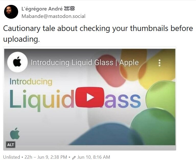
The cause hasn’t been helped by Apple crawling up its own butt and becoming a terrible company in the past five years, either. I would not buy a new iPhone at this point, even if they scrapped the shockingly misguided2See? UI refresh known as “Liquid Glass”.
Or Liquid ass if you go by Apple’s original YouTube thumbnail:
Anyway, this leads to the question I pose in the title of this post: When am I getting a new phone?
I think it will come down to a combination of things, most likely something like this:
- When Apple stops supporting the iPhone 12 with updates, which will probably happen in a few years, though I have no immediate plans to update to “iOS 26” because of the awful aforementioned Liquid Glass revamp. Even here, security updates would probably extend the life of the phone to 2028 or 2029, years that once existed only in bad near-future science fiction.
- When battery life becomes unacceptably poor. I think this may take a good while to happen, especially with my usage.
- If I find a deal on a new/newish phone that is too good to resist. I have no idea how likely this is, but it ain’t happened yet.
- I decide my iPhone 12 cameras are now potato quality (they already are if you zoom in at all) and can no longer tolerate them. This is actually not very likely. I have an actual mirrorless camera for taking good photos of things.
Looking over the list, it seems I’m likely to keep cracking wise about my iPhone 12 for some time yet. But we’ll see.
I guess I’m not concerned about app updates anymore
The evidence:

I didn’t even know I had 21 apps on my phone.
Oops, I did it again
I have chosen to delete my new Facebook account, which was created specifically to access a few groups, which I have decided I no longer need access to.
So goodbye FB again. This time for good. I swear!

Windows 11: Making photo editing weirdly laggy since 2025
The other night I thought to myself that I’ve been taking photos with my new camera, but hardly ever post any of them. So I went through and tagged a bunch I took on Saturday and found I had 51 apparently worth considering. That’s way too many, but it was a starting point. I did the tagging in Linux Mint, but photo editing is still a bit iffy there, so I switched back to Windows 11 and my main photo editing software, Affinity Photo.
I edited one raw image of a barn swallow, then loaded a second image, of a house sparrow. After doing this, Windows 11 turned into this weird, laggy mess. The mouse cursor would slowly drift across the screen on its own, as if it weighed several tons, never fully stopping, never responding to any clicks, though I could get it to slowly move in other directions. The keyboard was also non-responsive, so I could not invoke task manager by using CTRL-ALT-DEL to see what program had gone rogue., or if it was Windows itself.
In the end, I rebooted the PC. It was such an unpleasant experience I even briefly thought of switching over to the Mac, then remembered the security hell of trying to install mouse drivers on it that led me to abandoning it for what has now been multiple weeks, because I am done with modern computers constantly throwing obstacles in the way of a pleasant, or even just nondescript, user experience.
Windows 11 has been behaving so far since the reboot, but I’ve only edited a single photo. I’ll have the full batch of selected photos from last Saturday posted sometime in 2028, probably.
In the meantime, here is that one photo, of a barn swallow.

Linux Mint update: Good news, bad news
First, the good news, which started with Very Bad News.
I got Jeff a Lenovo YOGA 2-in-1 laptop a few months back to replace the aging and decrepit 2017 iPad Pro I gave him when I got a new one in 2020. It has worked OK since, but there have been a few little glitches and weirdness. I was unsure how much was to blame on the hardware, Windows or moon phases.
I got my answer a few days ago when the laptop booted up to an obscure Bitlocker error. I did not realize Bitlocker was even on–it’s activated by default on the Windows 11 install. Researching the error, I was not able to find a reliable solution. Jeff gave the thumbs up to the “nuke from orbit” option. I selected the Windows reset option that blows everything away. It produced an error message with no description other than “an error occurred.” I then offered to install Linux Mint. He said go ahead.
- I prepped a Mint USB stick.
- I inserted the stick and booted from it.
- I chose the Install Linux Mint option on the desktop.
- Linux Mint installed and was ready in significantly less time than it took to get to the Windows 11 desktop after unboxing the laptop–and Windows 11 is pre-installed.
- Mint automatically recognized the Brother printer once it connected to the Wi-Fi. The touchpad was recognized, as was the included pen when using the built-in drawing app, cleverly named Drawing.
Everything is working just fine. The laptop, to me, feels snappier and more responsive. It may actually be a better laptop now with Mint than the bloated mess that is Windows 11. This is good news.
Now, the bad news. On my PC, I dual boot between Windows 11 and Mint. Mint has generally given me no issues, but at some point recently and issue did arise. It may have been an update or something else, I’m not sure. It’s not Bitlocker, at least.
The issue seems to be related to Firefox, the built-in browser (and my browser of choice) and YouTube. At some point, while watching a YouTube video, the whole system will freeze and continue to freeze intermittently. The only way to fix it once it starts showing this behaviour is to shut down Firefox.
The issue might be Firefox. It might be YouTube. It might be something else. I have done no troubleshooting. What I have done is started testing to see if the issue replicates in Vivaldi, my backup browser of choice. So far, it has not happened with Vivaldi. This makes me sad, because I want to keep using Firefox in Mint, but I also really don’t want to spend time troubleshooting this when a) I may spend a lot of time on it when I could be doing something productive or at least entertaining and b) I may find no actual solution. So this is bad news.
But I may do a little troubleshooting, at some point. Maybe.