Back in October I espied a strange sight at my old jogging grounds at China Creek Park. It was this sitting on the northeast baseball diamond:
At long last (and with summer long gone) the city had decided to bring in fresh bark to spread over the badly-deteriorated trail at China Creek. Hooray!
We then move forward to November 19th. With summer even more long gone than before, I noticed that the number of bark piles had shrunk:
Apparently more bark had been delivered and various people had in turn spread it around the trail at the park. This created a visual effect not unlike that of a burrowing Bugs Bunny. It also made the trail entirely unusable:
Not to be deterred, the jogger below simply chose to run inside the trail, with the added bonus of making each lap a tiny bit shorter. Also note her colorful attire. Not many people can successfully pull off combining green, blue, black, pink and turquoise. Actually, I’m pretty sure no one can.
I will be strolling by China Creek in the next few days and will be curious to see what the state of the bark is. For the sake of the joggers, the walkers and even the misinformed dog owners, I hope it’s all nicely spread out. Well, moreso than it is now.
Today I decided to buy some groceries out near Lougheed Town Centre late in the afternoon. This was a bad idea because I knew I would be caught in the rush hour traffic coming back. Sure enough, at the Lougheed SkyTrain station the first train pulled in and it was packed not unlike a sardine can. What amazed me, though, is how the car in front of me began disgorging passengers and after a good 10 or 15 seconds was still disgorging passengers. Ten or fifteen seconds may not sound very long but for a SkyTrain car this is a very long time indeed. And yet for as many people that improbably kept streaming out of the car, a good number remained in. The car had barely started to load passengers from th platform when the ‘clear out, this sucker is moving’ chime sounded and the doors tried to close.
My speculation is a wormhole developed in that particular car and it was letting out passengers from other cars all across the three SkyTrain lines in the Lower Mainland. That’s the only reasonable explanation, really.
Tonight I went bowling for the first time in a million years. Jeff, Jason and I went to Dell Lanes in Surrey (whose slogan sounds like a parody — “The future starts here”). Dell Lanes is part of the Dell Shopping Centre and features Dollar Giant, Al’s Vacuum Superstore and a check-cashing outlet among its retail jewels. Like most bowling alleys, Dell Lanes is below ground where the sound of pins being constantly knocked down will not upset the neighbors.
This was to be five-pin or sissy bowling, as I call it. I knew that such advance mockery would later come back to haunt me.
For some reason the interior of the bowling alley is done up like a disco. I mean, there are actual disco balls, colored lights, black light, everything you’d expect to see from Saturday Night Fever. And music, though not necessarily music. There was instead a digital jukebox, which looks somewhat like an old-style jukebox except it has an LCD screen, no records and probably costs a dollar a pop (I didn’t check). The maker of the jukebox was advertising on the screen to like them on Facebook and follow them on Twitter. Yes, I’m going to do that straight away. It also showed popular choices and it seemed the local folks favored “Jessie’s Girl” and a whole lotta country. We got to listen to Willie Nelson and Clint Black (the latter identified by Jeff). Yee and haw.
I bowled about as expected. Some gutter balls, hooking to the left so often I ended up overcompensating and hooking to the right. I think 5-pin may actually be tougher than 10. The balls are lighter and there are fewer pins but the pins are spread apart further and it seems easier to knock over just one without convincing any of the others to follow along.
Jeff, who said beforehand that he might get one strike per game, opened with a strike. This proved not to be beginner’s luck as he went on to amass an impressive score of 187 in the first game. I managed 110 and Jason was right behind with 108. I should point out that Jason is eight years old. Yes, I was almost beaten by someone who was born the same year Iraq was invaded.
First game scores:
Jeff – 187
Me – 110
Jason – 108
Jeff and Jason cooled off for round 2 while I improved a statistically insignificant amount:
Jeff – 153
Me – 116
Jason – 33
Once the official games were over, Jason improved remarkably, getting several strikes. He nearly threw the ball about a half dozen times while the pins were being reset, though. To his credit, his reflexes were fast enough to stop (except once, but the speed of the ball was just right, so the pins reset just as it arrived).
Jeff, meanwhile, seemed to favor a ‘launch the ball into the air and let it crash onto the alley’ approach. It actually seemed to work, too. None of us managed to go down the alley with ball in hand, so I consider the evening an overall success.
The pizza was entirely decent, too.
I’d like to think I’d do better at ten-pin (more stuff to knock over) but I know I’d probably goof up on that as much as with the 5-pin. No matter, bowling is silly and fun and that’s all that matters.
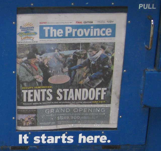
The Province is a newspaper that essentially makes fun of itself or perhaps a better way to describe it is to think of the editors as trolling the people of BC.
I espied this headline while walking past a pair of newspaper boxes. The box on the left was The Vancouver Sun and featured the headline Goodwill gone at Occupy: VPD chief. The Province carried the same story on its front page but with the headline that can be seen below.
Let me explain. Occupy Vancouver is a tent city at the Vancouver Art Gallery, the people gathered there railing against various societal ills, primarily how the rich get richer, the poor get poorer and something about 9/11 being a conspiracy for good measure. The city has been agitating for them to move and after a fatal drug overdose on the grounds started the legal paperwork to get the occupiers out. This has led to what some might term a tense situation. The Province headline has cleverly played on this by using the word ‘tents’ in the headline instead of ‘tense’ because it sounds just the same (that’s a homonym; relax, Province readers, it has nothing to do with homosexuality). See? Tents standoff. Ho ho.
It starts here, indeed.
I actually think this pun is an improvement over their usual front page stories, most of which are about assault victims, the headlines of which are written in the first person and usually along the lines of I thought I was going to die and he laughed like Hitler.
So, good work, The Province. You are slightly less deplorable on this day!
The HMV store at the corner of Burrard and Robson is sporting some new signs lately, as seen in this photo I took the other day. Compare the small sign on the left to the rather large one on the right.
I guess they need someone to help unload those Everybody Loves Raymond DVD sets at 50% off. And if you get fed up with the job, no problem, you won’t have it for very long, anyway!
Maybe it’s just me but in the live video of R.E.M’s “Oh my Heart” (a fine song from a fine album, by the way) Peter Buck looks a bit like a woman. It’s the hair, I think. It reminds me of the old Monty Python gang when they would dress as (rather frightening-looking) women for some of their sketches.
To his credit, Mr. Buck is not frightening looking at all. Except for the hair. It is mildly frightening — much like my own.
Also, Micheal Stipe appears to be the only member of the band still looking lean. Maybe that explains why he started taking nude photos of himself. Brr.
The other day I was looking at this-here blog of mine and thinking about sprucing it up a bit. I have several other images I could use for the header, though I must admit I’m still smitten with the clean, crisp look of Buntzen Lake I have up there now. I could adopt a new theme but I blanch at the thought of all the manual tweaking I’d have to do in order to get it look just the way I wanted.
I also gave thought to tweaking the existing theme, perhaps going with a different body font. Right now I use Verdana, which is entirely readable if a bit bland. I experimented with Arial, Georgia and Garamond but none of them quite looked right. I began searching the vast reaches of the Internet and found a site called I Love Typography. I instantly went gaga over the body font used there and used my Interweb sleuthing skills to determine which font it was, as the site did not appear to share this particular detail. My efforts were without success so I sent an e-mail to the author of the (quite lovely) site and to my delight, he replied the same day with a single word response: Scala.
I now had knowledge but was faced with two new problems as a result:
How the heck did he get a font I clearly do not have to render properly on his site? What sort of JavaScript or CSS trickery was involved? I would have to find out.
Scala is a paid font. If I wanted to buy it I’d be looking at about $239 U.S. for the six fonts featured in the FF Scala Web collection. Now, I’m not saying they are not worth it. I’m saying I wish I had $239 to blow on fonts, because I’d probably have enough to buy some nice fudge, too. Mmm, fudge. Lacking both fudge and funds, my alternative is to look for a reasonable facsimile of Scala as a free font. That means combing through roughly one trillion hideous fonts scattered across an equally large number of font websites.
Whenever you have a stable product that works well someone always starts to tinker with it. Sometimes the tinkering works and small improvements are made. Other times the tinkering is less successful.
Here is an example of the latter.
When Firefox updates to a new version the changes I first notice are the visual ones. Aesthetics are important to me so I will craft everything on the screen to look pleasing to my eye as much as each piece of software allows.
Firefox has a navigation toolbar that shows home and refresh buttons plus left/right arrows. There is a checkbox option to display the icons on the toolbar in regular size or as small icons. I go with small because they are still legible and it gives the browser a somewhat tidier look. In version 7 of Firefox both sets of icons look the same, save for the slight size difference. The just-released version 8 changes this.
On the one hand the spiffy-looking default icons:
And the new horrible-looking small icons:
These are ugly as all get-out and look like someone’s first attempt at making icons in MS Paint.
I’m hoping this is a bug. If not I shall shake my fist in impotent rage.
Tonight Nic and I ventured to Commercial Drive in East Van to check out all the freaks in costume. Lots of people were dressed up for Halloween, too.
Ho ho.
As with last year we had come to experience the Parade of Lost Souls. The 2020 version — my first — was a nifty tour along several blocks through dark and spooky alleys where most ofthe neighborhood had dressed up yards and garages in appropriate Halloween trimmings (or drippings).
Upon arrival at the park near Templeton there were masses of people already gathered. We spotted The Line and took our places in it, ready for the spooky tour.
A pair of bulldogs dressed as a bumblebee and a hot dog were in the line ahead of us (along with a couple of guys) and collectively they provided a
visual distraction as the line slowly crept forward.
The line weaved around and through the park, which featured a band andorher sundry booths and exhibits. Then the line ended, we were back where we started and we wondered what the heck just happened besides a whole lot of nothing.
Answer: nothing. No street tour this year, apparently. We wandered the park a bit (which didn’t require bring in the line to begin with) and the only thing of note was a tent filled eith a bunch of organs — the kind used to creepy effect for the music in musty horto classics. With random members of the public madhing the keys of eight organs simultaneously and none of these people possessing any apparent musical talent you get something equally or posdibly even more horrifying than a movie filled with monsters or vampires. We left.
Nic suggested checking out a fake haunted house perhaps but I figured our luck on the evening had rnded eith the rain holding off so we watched The Twilight Zone and ate popcorn instead.
Had we stayed half an hour later we eould have sern the actual parade as it turned out but them’s the breaks.
At least Nic was seriously stylin’ in his pimp suit. I went dressed in my usual straight guy outfit. Fools almost everyone!
Recently I was participating in a discussion on great science fiction novels and I trotted out one of my favorites that I read way back when I was all of 14 years old, Fade-Out, by Patrick Tilley. A slightly expanded/modified version of the novel was later released that I read as an adult and the story still holds up. That edition featured this cover tiny image ahead, I may scan in my copy just so it’s legible):
Black with a glowing orange-red circle that could signify almost anything. Not very arresting as far as images go (and for some reason this particular scan makes the title impossible to see).
However, the original Dell SF (US) cover on the copy I bought in 1978 was this:
A monstrous mechanical spider in front of the Capitol Building with masses fleeing in panic. A classic flying saucer hovering above. A title done in that cheesy chrome look. How could I resist? I couldn’t!
The great part is that the event depicted on this sensationalist cover does not happen in the book. Nothing even close to it happens — though there is a mechanical spider. And it does take place on Earth, as the inclusion of the Capitol Building would suggest. But otherwise, it’s a mashup that deliberately distorts to create a more exciting image — and it worked! If I had encountered the revised cover in 1978 I’d likely have never picked the book up.
On the one hand, this leads me to think that I should judge a book by its cover (cool cover = cool book) and shouldn’t judge a book by its cover (dull cover = dull book). Since the same book had both a dull and cool cover and especially since the cool cover was a load of hooey, my conclusion is: book covers are hooey. Read the first few pages and see if you like what you see instead.