The James Patterson word factory continues apace

I noticed kobo.com was highlighting something called James Patterson BOOKSHOTS. Before reading further I speculated on what these might be. Photos of James Patterson novels that have been shot at with guns in artful ways? James Patterson book covers re-imagined as placemats for your favorite home-cooked meals (I suppose a better name for those would be BOOKMATS)?

It turns out these are novellas that promise to be under 150 pages and under $5. That’s $5 Canadian, so almost free.

Right now two of these books are available, each for $3.99. “The revolution in reading” promises approximately 50,000 more titles in the next few months, with more to come beyond that. None of them appear to be written by James Patterson. They cover a variety of genres, ranging from thrillers using Patterson’s characters to romance and non-fiction.

Some (many? most?) of these books are banking on the mere presence of the Patterson name to sell them. Do I really want to read a book of quotes from Trump and Clinton? I might if I trust Patterson in a vague, general way and admire his work (“He wrote some kids book, he must be a nice guy”). And the publisher is so confident in this premise (“Patterson’s name alone will sell a book of quotes from Trump and Clinton”) that they are pushing ahead with the aforementioned five million or so books (er, BOOKSHOTS).

The whole thing is predictable–authors attaching their names to books they haven’t actually written is hardly a new thing or exclusive to Patterson–but also weird and a little depressing. I mean, if Stephen King lent his name to a series of cookbooks, I would find it interesting in an abstract sense, wondering if the recipes were all about how best to prepare vampire bat goulash (ghoulash?) or crunchy almond spiders, but if it was just King’s name slapped on each volume I’d be thinking “cash grab” and pass. Actually, I’d pass regardless, because I’m not particularly yearning to find out what sort of recipes Stephen King has to offer. The cash grab is the depressing part.

The weird part is attaching the name to all manner of genres. It’s as if Patterson’s brand is so strong it can be used to promote anything. Why stop at books? Why not James Patterson clothing, lunch boxes or toiletries?

On the positive side, this does give other writers an opportunity to get their work published, and with the Patterson brand behind the books, a greater chance to be noticed. The low price and low page count also pushes these into the impulse buy zone, further increasing the odds that some of them will be picked up.

Now I’m conflicted. I kind of want to hate James Patterson BOOKSHOTS because, come on, it’s a money grab. But if it helps writers, especially new writers…maybe it’s not as horrible as I’d like it to be.

I’m still not picking up Sacking the Quarterback, though.

The first unofficial Africa hot day of 2016: June 5th

It got up to 31º C today, nearly 10 degrees above the average. Even the breeze was hot. Given that this is still the first week of June you might think this would be an omen pointing toward a very hot summer. However, the forecast is calling for rain and below seasonal temperatures just days from now, so who knows.

One day we’ll have smart robots that will know exactly what weather is coming. And they will use it against us because robots don’t care if it rains.

Is it wrong to get excited about new appliances?

The washer broke a month or so ago, though it feels like five years. It would spin then shake then combine both until it felt like it was trying to reach escape velocity. We replaced the rubber ring (after waiting several weeks for the hard-to-find part to ship) that forms the seal when it’s washing (it’s a front loading machine) but after doing this the washer continued to made grindy noises and more disturbingly, smoke. We opted to replace it. Although the dryer still works, we further decided to replace them as a set and began looking for deals.

We found a matching set of Samsung machines at Coast Appliance and they have been delivered. We will install them soon™ and I expect it to be tremendous fun because they are stacking machines and weigh about as much as a pair of mated elephants. Despite that, I can safely say after dealing with a local laundromat for the past month, a place that features washers that leave your clothes with enough water in them to fill a bathtub, as well as staff who apparently hate customers and cleaning clothes, I am actually kind of excited about doing laundry at home again. As a side benefit, the purchase also made me clean the living room to make temporary storage space for the new machines (I don’t recommend replacing large household appliances as a means to encourage you to clean the house, as large household appliances are kind of expensive and you should probably clean anyway, because dust should never become so thick that you can carve into it.)

Bad design: Closing a Modern (Metro) app in Windows 8

Windows 8 is an easy target because so many of its design choices were sub-optimal for desktop computers and were even kind of iffy on tablets, which is what the Windows team was bizarrely designing the OS for back in 2012. It is telling that Windows 10 either undid all of Windows 8’s new features or reworked them, often dramatically.

Here’s one example: Closing a Modern app.

Modern (or as they are often referred to before Microsoft changed the name, Metro) apps are programs specific to the Windows Store, introduced with Windows 8. These apps could run on Windows 8 and Windows RT, the ill-fated version of Windows that ran on ARM processors. They were always full screen and as such felt very tablet-oriented. They lacked the usual minimize/maximize/close buttons in the top right corner so it was perhaps not surprising that some people didn’t know how to close these programs.

Microsoft wanted these to be treated like iOS apps in that you generally would never need to close them. Windows would manage memory and shift apps around as needed. But if an app misbehaved or you suddenly decided you really hated the weather app and wanted to kill it–how would you close it?

By moving the cursor to the top of the screen until it changes from a pointer to a grabby hand, then, while holding the left button down, using the hand to drag the app off the bottom of the screen.

If that sounds a bit awkward, it was even worse when you actually attempted the task, especially on large monitors with a lot of real estate to cover as you worked the app down to the bottom of the screen and the dark oblivion that awaited it. If you flinched and released the mouse button early you had to start over.

This is bad design.

Windows 8.1 modified this by having a title bar appear when you moved the mouse to the top of the screen. This title bar had the expected controls in the top right corner, including the coveted close button.

Windows 10 changes Modern apps more significantly, allowing them to run in regular windows that can be minimized, closed and moved around like any other window. If a Windows 10 device is running in tablet mode (new to Win10) Modern apps automatically  switch to full screen mode and behave as they do in 8.1. This is one of many examples of the Windows 10 team both correcting the flaws of Windows 8, while also coming up with new and better ways for the UI to behave.

A few posts short of a load

When the jogging updates dried up in the second half of the month my general writing inspiration also withered away and so here I am well short of my post-a-day ratio on the final day of May. There’s a little under two hours left in the month as I write this and I could bang out ten lame haikus, one per post, in order to meet the goal of 31 posts for the month but that would be dirty cheating.

Instead, I will admit defeat and resolve to do better in June. On the plus side there is one fewer day in June than May, so that’s already aces, as the kids say.

Here’s a writing haiku I should probably print out poster-size and slap on the wall above my monitor and everywhere else:

Writing is easy
All you do is start writing
Remember, don’t stop

Good design: Windows 10 taskbar icons

I figure it’s only fair to highlight good design as well as bad design, especially where the good design is an improvement over a previous iteration. Here’s my first entry.

When you launch a program in Windows 7 and 8 you get a combo 3D/glow effect on the taskbar icon to let you know the program is running. Multiple instances of the same program stack like cards (as seen by the Chrome and File Explorer icons below):

Windows 7 taskbar icons

The problem here is if you have a mix of running and non-running programs, it becomes difficult at a glance to see what is actually running, especially if you only have one instance going.

Windows 10 dispenses with this and instead uses a slim but easily identified white line under any program that is running, like so:

Windows 10 taskbar icons

The effect actually looks better than the screenshot depicts (the white line is slightly thicker and brighter) but you can still tell at a glance that File Explorer and iTunes are not running, that Firefox and mIRC are active and that OneNote is the program that currently has focus because of the shading behind its icon. The UI is further clarified by stripping away the 3D glow effect, which creates too much visual clutter. The overall effect is cleaner and more practical. Good job, Microsoft!

Bad design: The original iMac mouse (1998)

I’m going to start posting random thoughts on bad design I’ve encountered over the years. Most of these will be tech-oriented but I will occasionally give shout-outs to things like the incredibly heavy and awkward doors on my parents’ 1977 Ford Granada.

In 1998 a recently-returned-to-Apple Steve Jobs ushered in the iMac, a product line that continues successfully to this day. The original iMac was a daring and colorful all-in-one design that did away with a floppy drive (controversial at the time), made an optical drive standard and for the first time included USB ports, allowing Mac owners to use peripherals that worked with the broader PC market.

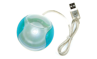
The iMac came with a keyboard and a mouse. This is the mouse (and I am far from the first to highlight its shortcomings):

original iMac mouse
Image courtesy of Macworld.com

It was often referred to as a “hockey puck” for obvious reasons. It is, perhaps, the only round mouse to ever go into mass production.

There is a reason for this.

Look at your hand. Is it round? To be certain, look at your other hand (apologies to any one-handed people reading this). You have probably noticed that your hands are not round. When you grip the original iMac mouse, it is an awkward grip, because its shape does not take into account the shape of the human hand. This is bad design.

Apple did learn its lesson, though it took two full years of people madly trying to keep the circular mouse oriented before it got replaced. Here’s the current (insipidly-named) Magic Mouse that ships with iMacs:

magic mouse

See how it approximates the shape of the human hand? Good work, Apple.

Spoiler: We’ll be revisiting Apple mice at some point in the future.

Best music/worst lyrics combo pick: “One Slip” by Pink Floyd

In 1987 Roger Waters and David Gilmour both released solo albums, though Gilmour’s was done under the name “Pink Floyd.”

Ho ho.

While I do actually enjoy the album A Momentary Lapse of Reason (for the most part), even as I listen to it now, nearly 30 years (!) later, I am struck by how much it sounds not like Pink Floyd but like another band trying very earnestly to sound like Pink Floyd (it should be noted that some of the material was in fact originally intended for what would have been Gilmour’s third solo album). You have the soaring guitar solos, the female backing vocals, the whispered/garbled voices, the moody atmospherics, the weighty topics, and all of these combined do indeed echo moments from PF’s classic catalogue. The effort, however, is undercut by being paradoxically too slick (all of the Floydian flourishes feel very calculated) and yet at times embarrassingly amateurish.

It’s the former that brings me to the subject of this post. “One Slip” is a track penned by Gilmour and Phil Manzanera of Roxy Music. It’s a song about falling in love. Or something. The tune is catchy, although to my ears it’s one of the songs on the album that doesn’t really sound like Pink Floyd. The lyrics consist of clichés and overripe metaphors. It’s cringeworthy stuff. Observe:

I will, I will she sighed to my request
And then she tossed her mane while my resolve was put to the test
Then drowned in desire, our souls on fire
I lead the way to the funeral pyre
And without a thought of the consequence
I gave in to my decadence

I’m not sure if the mixed metaphor of drowning in desire while your soul is on fire (wouldn’t the desire put out the soul’s fire?) is supposed to be clever, but the image of leading down to a funeral pyre is nonsensical. I suppose you might compare having sex to dying if it’s really good and you want to blurt out, “It was like Heaven!” but really. And the woman “tossed her mane,” which immediately makes me think of a horse. And what consequence? Sex is bad? I guess, since it can drown and burn you and kill you.

Was it love, or was it the idea of being in love?
Or was it the hand of fate, that seemed to fit just like a glove?
The moment slipped by and soon the seeds were sown
The year grew late and neither one wanted to remain alone

This verse starts out fine, but then you have hands of fate, gloves, seeds being sown, late years and what is this even about? Is it a couple that reluctantly move to a farm together to save the crops? I like the idea of “neither one wanted to remain alone” but there’s no exploration of this. But perhaps the chorus pulls it all together:

One slip, and down the hole we fall
It seems to take no time at all
A momentary lapse of reason
That binds a life for life
A small regret, you won’t forget,
There’ll be no sleep in here tonight

This sounds like “…and then they had sex (which as we know, is bad.)” I really have no idea what’s going on here. The lustful pursuit of another is visualized as falling down a hole (how romantic), it “binds a life” (sounds important) and yet is also just “a small regret” (sounds trivial)  but don’t worry, in the end there’s some good old-fashioned snogging because “there’ll be no sleep in here tonight.” Unless it means you can’t sleep because of the drowning, fire, slipping and falling. There would be a good chance you’d be unconscious, which is different than sleeping.

I realize this is silly nitpicking on an ancient-in-pop-music-terms song, but it’s always been my go-to pick for a song that I enjoy listening to despite lyrics that make me want to curl up in a ball.

This in comparison to, say, “The Dogs of War” which musically is nothing special and also has lyrics that are a daisy chain of clichés. I leave off with some of the subtle phrasing from the track:

“our currency is flesh and bone”

“hell opened up and put on sale” ($6.66 and up)

“the web we weave” (scary ass spider-dogs of war)

“hollow laughter in marble halls”

“we all have a dark side, to say the least” (to say the least)

“and you must die so that they may live” (see? Totally dark side there, to say the least)

“things can get strained” (strained! Because of that dark side, probably)

I Mac?

No, not really. But I am posting from one. Eventually, I’ll have a whole series of blog posts made from increasingly improbable devices. Macs and PCs are perfectly probable devices to post from, so they don’t count. An iPad also works surprisingly well and has the bonus of letting me post while in bed, something that would prove awkward with a PC, monitor and keyboard/mouse combo spread out over the sheets. This 27″ iMac would just plain crush me. Then I’d have to write a haiku about being crushed in bed by an iMac. And I don’t want to do that.

I figure with this whole Internet of Things (or internet of things, I suppose) the ultimate quest here would be to make a post from a toaster or something. I have confidence that the future promises such a thing.

(The iMac is on loan from work for professional development. I’ve already mastered the critical skill of muting that hellishly annoying start-up sound. And I still kind of hate the Finder and persistent menu bar at the top of the desktop. It feels very 90s. But the display is nice!)

The future is (not) cursive

This post is written entirely using a pen on my Surface Pro 3.

I am not editing it except when it makes obvious mistakes. So far it’s been pretty good but when it goes off the rails it really goes off. On the one hand, it feels strangely retro and on the other it’s like living in some version of the future as predicted in 1964. Which is really the same as strangely retro.

It’s just awkward enough that I wouldn’t want to do it regularly, but it’s a nice feature to have. Well, better than a kick in the pants, anyway.