Mastodon is currently the only social media I really read or post to currently, because I like its model:
I curate what I want to see–no algorithm!
It’s decentralized, so no one “owns” it and if your server goes to poop, you can move to another
No ads! I am fine with ads in some situations, but online ads are almost always awful, invasive, resource-hogging and can even contain malware as a bonus
Mastodon has a web client and an app for smartphones. Both are fine, but because there are no horrendous API fees or dictatorial owners crushing third party apps, you can enjoy one of many different apps. I use the following:
Mac: Mona. This is a one-time purchase (no subscription). It looks nice and runs well.
Windows: I use two web clients because all the Windows apps I’ve tried are ugly, bare-bones, or both. I have no idea why this is, but it is (IMO). For a more Twitter-like experience, there is Elk. And for a more minimalist experience, with cute animations and the like, there is Phanpy.
If you think the twist is that this isn’t actually fun, you’re half right. But also half wrong!
Today, my internet connection went down, as it does on a roughly weekly or bi-weekly basis. This has been going on for some time, and I’ve contacted my ISP’s tech support for help to no avail. I will not name and shame the company for now, but they are bad and should feel bad.
Anyway, usually power-cycling the router fixes the connection in a few minutes and I move on. Today, only the wired connection seemed to revive. I know this because my phone was complaining about no Wi-Fi and I noticed those ominous yellow lines on the pair of Echo Show 5s in the bedroom that mean. “Hey, where did the internet go?” I foolishly decided to test by asking the living room Echo what time it was. Normally, the closest device will answer, and the others stay quiet. Occasionally it gets confused and the next closest answers instead, but it’s pretty reliable.
If you have an internet connection.
If you don’t, the device you speak to and all other devices will all report connection issues, but each one will be just slightly off from each other, so you get this weird echo (lolz) effect with all of them jabbering at you. It’s funny how quickly it goes from sort of cute to driving you mad.
A second reboot of the router fixed the issue.
But if I could, I’d use the HomePod’s saucy Australian male voice on every device, because hearing that echo through every room would be amazing.
If you’d like a nice, non-sarcastic (mostly) take on what Apple unveiled today, have a look at Jason Snell’s post on Six Colors.
If you’d like my take on the actual event, which may contain a wee bit of sarcasm, read on!
Scary Fast
Everyone knew this event would be all about Macs since the preview image included the Mac Finder and so it was. It began at an unusual 5 p.m. Pacific and, being a day before Halloween, had a spooky Halloween theme. The scariest part is checking the prices of everything in Canadian dollars.
I didn’t do timestamps for the event, but the whole thing wrapped up in 30 minutes. There were no interminable sketches about how great Apple is doing on the environment or constant reminders about Apple’s (newly more expensive) services–though there were still reminders.
The event starts with music that is bad, but not overly loud, possibly because really loud music is not spooky.
We then transition into a Mac ad about “hard work” where everyone is cute and riffs on comments everyone else makes, including a guy from Porsche, because everyone can relate to the simple pleasures of a Porsche. At the end, everyone has a good laugh about how they may be doing hard work, but working isn’t hard on a Mac! I can see the marketing team high-fiving each other over this.
We see Apple Park at night, but it’s been enhanced to look all foggy and spooky (I will be using that word a lot). The camera is flying all over, but you know its destination: Tim Cook. Will he be dressed as a pirate? The ghost of Steve Jobs? A giant carbon credit? He is dressed as none of these things. He is dressed as Tim Cook, though he is favouring dark clothes because spooky.
Tim doesn’t say much and we move on to the “lab” with Johny the Chip Guy. The lab is dark and spooky. In the back is a glowing pumpkin that is actually an orange iMac from like 2002 or something.
Johny intros the M3, M3 Pro, M3 Max and M3 Fred. Just kidding, Fred is not ready yet. Neither is the M3 Ultra, but it will presumably come out later, as did the M1 and M2 versions. These chips are totes faster, though if you look, they constantly emphasize performance vs. M1, because vs. M2 they’re merely 10-15% faster, which is nice, but not roll-your-socks-up-and-down exciting.
Dynamic caching is introduced for the GPU. It will help with demanding applications and make for better games. Both of them!
Ray tracing, just like on the iPhone 15 (they don’t say this, but it’s basically the same thing). Ray Tracing would also be a great character name in some future noir thriller.
More vague graphs comparing M1 to M3.
M3 Max now supports up to 128 GB ram, which is impressive until you remember the Intel Mac Pro supported 1.5 TB.
We now transition magically to Kate! Kate is dressed in black because spooky.
Kate talks about the MacBook Pros. They have axed the 13″ MBP ($1299) and replaced it with a 14″ MBP ($1599). You may be thinking, “Don’t they have a 14″ MBP already?” Yes! Now they have two. This new one is basically the same 14″ model, but only gets the M3, no Pro or Max. Also, the touch bar is DEAD. They should have had a ghostly visage of it floating behind Kate.
I kid you not, they highlight performance by showcasing Myst. You know, that game that came out 30 years ago. It’s like they sit down and say, “We need a list of popular Mac games” and no one ever comes up with anything other than Myst.
For some reason, taking 18 months to bump memory from 96 GB to 128 GB of ram is touted as a great feat.
22 hours of battery life. Impressive!
They slam Intel laptops, including older Intel Mac laptops. 11x faster! 11 hours more battery life! WHY ARE YOU STILL USING INTEL MACBOOKS YOU GODLESS HEATHENS? Intel Mac laptops actively seek out kittens and rub their fur the wrong way. It’s true.
Modest card: “World’s best laptop display”
A new colour!
An ad for the new colour!
It’s Space Black, or as everyone else calls it, dark gray.
They promise it hides fingerprints better and is durable, a handy quality for an electronic device.
Suddenly an awkward plug for Monarch, coming next month to Apple TV+. Totally worth the price increase! It’ll look great on these new Macs, see?
Baldur’s Gate 3 is name-dropped. This is actually a current top-tier game, a unicorn among Mac titles.
Suddenly, Kate is standing in someone’s living room. Behind her a guy on a couch is playing a guitar while a girl sits next to a coffee table kind of looking at her MacBook. A keyboard is on the floor. Neither of them seem to notice Kate is suddenly with them and talking to what would be a wall.
Kate suddenly zaps into a lab of some sort. It is an immaculate lab, everything perfectly arranged. It’s not spooky, though.
Kate leaps again (not literally, though that would have been awesome) to her final stop: Some tony home where a person is using a MacBook to control three monitors and what seems to be a large TV above them. The little nook he’s in has foam on the walls to dampen and absorb sound, such as all the gabbing Kate is doing, which the guy sitting there does not seem to notice.
It has taken 24 minutes so far to say “We have new chips in our laptops, which are otherwise unchanged.”
Back to John. He announces prices, which are the same as before but truly scary when converted to Canadian, just in time for Halloween and forevermore.
He also mentions the 24″ iMac getting the M3. No other changes. Price the same. He talks about all its features, which, again, are not new or changed in any way. You can sense the audience starting to squirm at this point. I am starting to squirm.
One more potshot at Intel: 4x faster than their lousy old iMacs.
John then claims the 24″ iMac is the “perfect size” to replace both the 21.5 and 27″ intel iMacs, which is an odd thing to say. I suspect some people with 27″ iMacs would not consider a smaller display to be better, nor would they like the utter lack of ports or other compromises in the 24″ iMac, which, again, is a desktop computer, where thinness and lightness are not really a top priority.
Back to Tim! He reveals himself to be a gay werewolf. Nah, just kidding. He actually says “Only Apple can deliver” the deep integration between all their devices, so BUY ALL THE DEVICES, OK? Especially Macs, because sales are way down.
We are now 30 minutes in and the event ends with a card that notes it was shot on iPhone and edited on Mac. It will later be cut up into memes and posted on TikTok.
And that’s a wrap!
One of the shortest Apple events ever, with no real new products (the low end 14″ MacBook Pro is kind of new), so basically 30 minutes to say, “New chips, yay!” to plug Apple TV+, and mercilessly diss Intel. It could have been a press release.
After re-installing Linux Mint on its own separate drive back in September, I pretty much ignored it. Whoops! As a result, when I do log into it, there’s usually a pile of updates awaiting. Some updates on using Mint itself:
Update Manager: This is currently not responding when launched. It shows updates, but everything is greyed out. I’ll probably have to reboot, or recompile the kernel or whatever it is you do in Linux when these things happen.
TickTick: There was a version of TickTick in the Software Manager, so I don’t need to use the web version. Yay! The window widgets are the same as the Windows version, because this is apparently a wrapper based on the Windows version. I’m okay with that.
Diarium: Still no progress here.
Overall, I have to say, I’m just not feeling it this time. If everything I did was inside a web browser, it might be decent, since Mint comes with Firefox, which is my preferred browser. But there’s just too much other software I use to give up both Windows and Mac right now.
I will check back again sooner, though, mostly to avoid a giant pile of updates again. Assuming the Update Manager works again in the future.
UPDATE: Despite only being in the Live Photos folder, iCloud managed to select and delete more than 100 non-Live Photos, so I had to recover them. Glad to see Apple's tens of billions in profit is going into making iCloud such a seamless experience!
The number of times I have used Live Photos as intended–to make a cute animated video or something–is zero. Well, not zero, because another use is to select a different frame as the key frame, and this is something I’ve used a few times.
I have over 12,000 Live Photos dating back to 2017. This is not a good percentage.
The real reason I leave the feature on is silly–to mute the irritating fake iPhone “shutter” sound when you take a photo. I’ve railed against this particular design choice before.
A more reasonable solution might be to just use the mute switch on my iPhone 12 to silence the shutter sound, and all others. After all, it’s the 21st century, I don’t need my phone squawking at me like I’m some caveman only capable of responding to audio cues.
While I ponder being sensible and changing my ways, I noticed my Apple One™ plan, which grants me and my partner a combined 200 GB of storage, was getting close to full. What to do?
All of my iPhone photos are automagically backed up on OneDrive, with its much more capacious capacity, so I could safely turf them from iCloud. I figured I could keep them on my phone, since it still has plenty of room, but Apple doesn’t give you this option. Delete from anywhere and the photos (live or otherwise) get deleted everywhere.
Dumb.
But like I said, they are already backed up, so I went to icloud.com and deleted all 12,000+ photos. As it turned out, this took awhile, because you can only delete up to 1,000 at a time and there’s no way I could find to just automatically select 1,000, so I had to adjust a few times, but eventually got it down to zero.
It freed up an impressive 50 GB of storage.
I now must decide if I want to turn off Live Photos altogether. I probably should. Probably.
Google may have a monopoly on search engines, but that doesn’t mean writers at major tech websites should be greasing the way for Google by using “Googled” as a synonym for “searched”. This is the kind of thing that used to give Xerox fits when people said they “Xeroxed” something instead of “photocopying” because if Xerox didn’t fight back against the use of its name as a verb (or noun), it could eventually be declared generic and fall into the public domain.
On the other hand, Google probably doesn’t care because they are a mega-company and don’t fear consequences over things like trademarks or copyright. They know they’re in no danger of “Google” becoming a generic term, and actually like it when people say “Googled” because it further cements “search” as being synonymous with Google.
And this is why writers should do better than to help Google along. Other search engines exist (I use DuckDuckGo and Kaigi) and it’s presumptuous to assume everyone uses Google.
(BTW, the editorial is otherwise well-stated and worth checking out!)
I saw a post on Mastodon lamenting the current state of scroll bars in computer software, most often in web browsers, but pretty much everywhere they appear. They have become weirdly thin, they’ve lost the navigation up/down arrows, they often disappear when no scrolling is taking place, or they’re completely off by default.
I miss the old days of chunky scroll bars that:
Let you know where you are in a document/web page/window
Allow you to easily grab the widget to scroll in bigger chunks
Had those navigation arrows that let you scroll a little bit with the mouse or arrow keys
My browser of choice, Firefox, uses the in vogue super-thin scroll bars, but this article shows how to make them chunky again. Woo. I repeat the steps here because I found this both useful and delightful and wanted to share it.
How to Get Chunky Scroll Bars in Firefox
In the address bar, enter about:config, then click the button after the scary warning appears
Search for widget.non-native-theme.scrollbar.size.override
Edit the number to your desired chunkiness. I find 18 or 20 comes pretty close to what I consider “classic” scroll bar size.
Bonus: Change the shape of the widget by searching for widget.non-native-theme.scrollbar.style and changing that number. Choosing 4 changes the widget to a classic-style rectangle.
This may go away on future versions of Firefox, and it doesn’t put back the navigation arrows, but it’s still nice to not just have chunky scroll bars back, but actual customizable scroll bars!
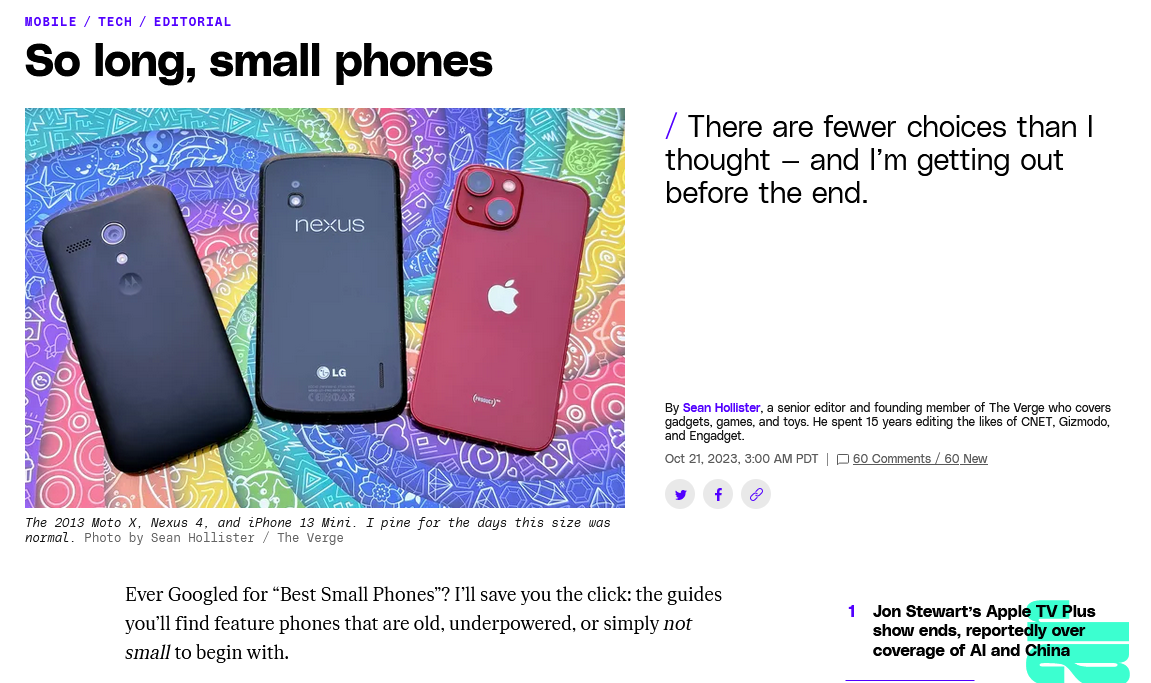
Here’s an original iPhone (3.5″ display) next to my iPhone 12 (6.1″ display). And keep in mind, the Plus/Max phones are 6.7″ displays:
My phone does have a case, which makes it look slightly bigger
If you look, you can see that the display is even tinier, thanks to the chonky bezels on the top and bottom. I still kind of miss the home button though (or more to the point, Touch ID, which was later added to it). And when I hold the original iPhone in my hand, my thumb can easily cover the entire screen without any straining, which is nice. I can more or less do the same on my iPhone 12, but it involves stretching and the phone shifts somewhat precariously as I move my thumb around the display. It’s not really meant to be a one-handed device.
While the original is definitely not as wide as the 12, the change in height is far more dramatic. This makes sense, since we have not evolved wider hands in the last decade.
It was fun to hold an original iPhone (I had an iPhone 4 in 2010 and while it had flat sides, its dimensions were pretty much the same), now I just need to find my one surviving 30-pin cable to see if it will power up (I do not have huge hopes for this).
As I post this on September 27, 2023, the body font for my blog here is the Google font Zilla Slab. It may change soon. It will probably change soon. I can never find one I quite like. I am going through my Serif Phase now, though, so whatever comes next will likely be a serif font.
And yes, I know technically these are typefaces, and it’s only the specific variants that are called fonts, but that battle has long been lost, typography nerds. Sorry!
One day I may even be bold enough to tinker with the site again. Until then, I have billions more fonts to go through.
For when it gets changed, this is what Zilla Slab looks like:
UPDATE, September 30, 2023: New deficiencies/regressions are being added to a list at the bottom of the post as I encounter them.
UPDATE, November 15, 2023: WordPress 6.4 is out and at least one of the regressions has been addressed. The Open in new tab option for links is no longer buried, as seen in the screenshot below. Yay.
I try to avoid spending too much time complaining. Who wants to read some random dude’s complaints, after all? I mean, if they’re clever enough, sure. But this is not particularly clever, so I’ll be brief1In retrospect, this was a massive lie. Apologies for massively lying to you!.
WordPress 6.3 brought a few tweaks to the UI of the editor/block editor, resulting in inconsistency, adding extra steps to do the same tasks as before, and generally made the experience of doing stuff other than just basic text entry more cumbersome, with no discernible benefits that I can see as a trade-off.
There has been a lot of hate for the block editor, and rightly so2Not even a humble opinion, no sir.. It made it easy to drop in or move around blocks of “content”, but made it harder to actually just write, like in the olden days when blogs were all the rage.
I flirted with the classic editor plugin (5+ million installs) and have the classic editor block I can always use in a pinch, but my preference is to use software as intended, not install a bunch of hacks or workarounds to bend it to my will. The assumption is that the software will work the way I expect it to (mostly), and stay out of the way.
WordPress 6.3 does not stay out of the way. It blocks (ho ho) your way. It is anti-way.
None of what I’m about to detail is going to cause meteors to fall out of the sky or give someone a bad rash. These things don’t make WordPress unusable. But they make it clunkier, they add friction where there was no friction before, and they speak to a trend in design that suggests things may get worse still.
The three issues covered here:
Preview is now hidden behind a terrible, tiny, and meaningless icon.
If you want a caption on an image, you now have to specifically toggle captions on.
Setting a link to open in a new tab is now a multi-step, cumbersome process.
NOTE: I have added a pretty blue border around a lot of the shots below to make them stand out better. They are not this pretty in real life.
In order:
Preview’s new icon
Preview used to be a button that looked like this:
It is now this icon instead:
I believe it’s supposed to be an icon representing a laptop. Or maybe it’s an old-fashioned hand iron. Who knows? And if it’s a laptop, what does that have to do with Preview, anyway? And why is Preview now an icon, but Save draft and Publish aren’t? It’s not like there isn’t enough space. It’s inconsistent, vague and looks amateurish. And ugly.
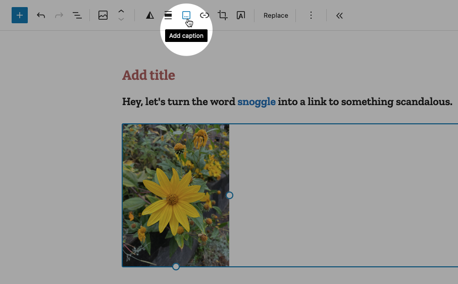
Caption an image
Back in the olden times of WordPress pre version 6.3, you would add a caption to a photo by simply typing it into the caption space below the image. If you left the caption space blank, the space would not render. Simple!
Now when you want to caption an image, you must specifically choose the option from the toolbar while the image is highlighted, like so:
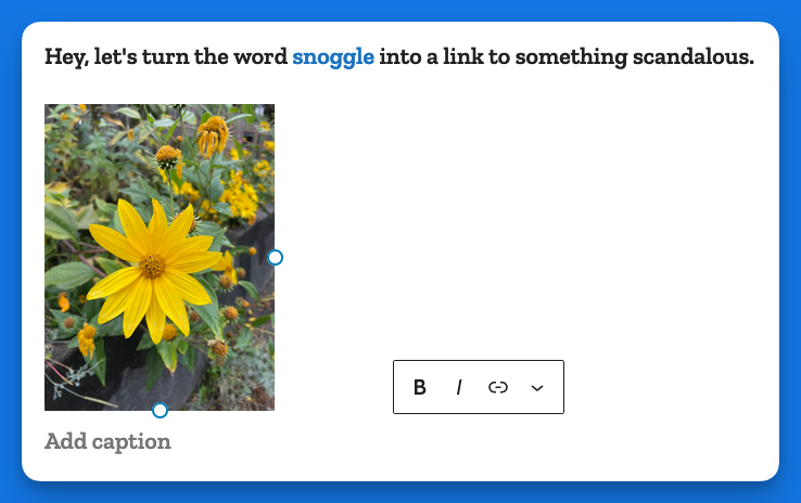
This puts the caption area below the image:
In some crazy parallel universe where everything is opposite, this makes sense. Here, it just adds busywork to a task that literally had no steps to it, you just started typing!
Making a link open in a new tab
In the previous version of WordPress, if you wanted to make a link open in a new tab, it was a checkbox item right there below the URL, like so:
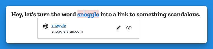
Now, when you go to add a link, you get this (in the example below I have highlighted the word snoggle for the link):
You get a blank text box, and nothing else. So let’s type something in there:
Now we have a link, Hooray!
But how do we have the link open in a new tab?
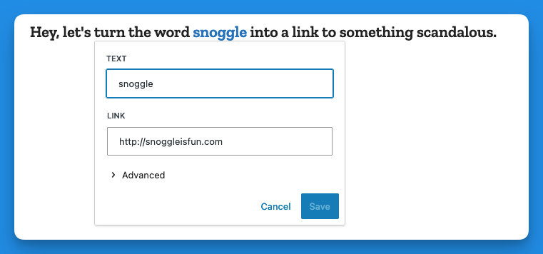
Well, you click on the link (you naughty person) and get this:
The two icons above are, respectively, Edit and Unlink. So you click Edit and you get this:
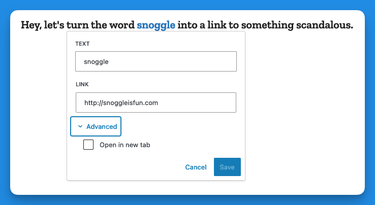
Then you click on > Advanced and get this:
That’s right, the Advanced menu gives you one option: Open in new tab.
I don’t have the proper vocabulary to express how cosmically dumb this is. If there was a universe-wide contest for really, really bad UI, this would finish in the top three.
Now, go back and add up the number of images I’ve used to illustrate the new way of opening a link in a new tab vs. the old way. Explain this madness. You can’t. There is no explanation. Perhaps it’s meant as a joke, a cruel joke on us pathetic humans.
Theses are only three obnoxious things I’ve found in WordPress 6.3 so far. There may be more. And I haven’t even listed the remaining issues with the block editor (or other parts of the UI). But I have written enough on this, and now it is time for chocolate.
Post-chocolate:
Additional 6.3 regressions
Previously when using the Preformatted block, if you copied the text from a Preformatted block, then pasted it elsewhere, it would remember the formatting (bold, etc.). It now strips this formatting. Even better, it does this inconsistently, so sometimes it will strip, and other times it won’t.
Previously, a selected image would show you its dimensions under Width and Height. This information is no longer present, though the Width and Height properties are still shown.