I care about aesthetics and finally made Thunderbird pretty enough to use

Proton (who is not an entirely unbiased source–they provide email and other services) provides a take on how the new Outlook is another vector in Microsoft’s ever-growing data harvesting/advertising empire. I don’t live in Europe or the UK, so I get none of the opt-out options the people there do to help control how much of their info gets hoovered up by Microsoft and its 722 (!) partners.

I have email accounts from multiple sources:

  • My main outlook.com account
  • My vestigial gmail.com account
  • My account for creolened.com
  • My account for protonmail.com
  • Probably a few others I’ve forgotten about or haven’t used since 1887

This means any solution that can’t incorporate multiple accounts is a non-starter because I don’t want to log in to a bunch of different webmail interfaces. I’m trying to work smarter, not work…more.

Since Outlook works with everything but Proton (I am on Proton’s free plan since I don’t use it much, and you need a paid plan to get access to third party clients) I’ve been using it, and it works well enough. The UI is a bit different between Mac and Windows (I prefer the Mac version), and there is no Linux version at all, but it mostly works.

But reading stuff like the Proton article made me think I should try Thunderbird again, since it will work with everything (save Proton) and has clients for Windows, Mac and Linux. Great!

There’s only one problem: It has been hit with an ugly stick, repeatedly and at length.

I am willing to overlook aesthetics to a certain degree. My journaling app, Diarium (that name) is great, but it really is nothing to look at. But it’s plain, not ugly. Functional.

Thunderbird is functional, but ugly. So, so ugly. Everything about the way it looks rubs me the wrong way. The size of elements, the various layout options, the colours, the fonts, the use of (or lack of) white space. It looks like something designed in the 1990s and has never been touched since.

But this time I was determined to make an effort into fixing it up. I opened it alongside the “new” Outlook app (really, just a standalone version of the outlook.com web interface) as reference and went to work making Thunderbird less ugly.

The good news is, I succeeded enough that I have now switched to it as my email client. Go me! (And go away to Microsoft and its 722 partners.)

Here’s what it looks like now, with certain info redacted. I am still tweaking, and it’s still not 100% where I want it, but it is no longer ugly1This is subjective, of course, and my taste may not match yours. For example, I don’t think plaid socks are a bold fashion statement..

I have pixelated most of the info, but you get the idea.

I’m sure there are Mac users who would still sniff in disdain at this, but it’s good enough for now.

Here’s what I did:

  • Switched to the built-in light theme (dark is OK, but light looks better to me). Note: If you don’t enable any theme, it will use the theme/colours of your OS.
  • Under Layout, I enabled Vertical View, Folder Pane and Message List Header
  • Under Folders I enabled All Folders and Favorite Folders, then collapsed All Folders and selected the Inbox for each (plus Junk for my primary account) as a Favorite. This allows me to compact what would otherwise be a crazy-long list of subfolders.
  • Density is set to Relaxed
  • Under Message list display options I chose Table View
  • Under Message List I chose Name only
  • Font size in the main view is 15 point, and the font is set to Aptos (this is the new default font Microsoft uses in Office and I like it!)
  • I have replaced the default set of gray icons with Phoenity icons, which is installed as a Thunderbird extension. This not only adds a splash of colour, I feel the icons are easier to scan.

I’ll continue to tweak, but I already find Thunderbird much more readable for when new mail comes in, both in the taskbar (there is a badge for new mail) and in the folder view, so I’m already benefitting from the move. As a bonus, this also seems to have fixed an issue where images were very slow to load into Outlook (maybe the hundreds of trackers get priority now), as images are working normally again.

Next up: Seeing how easy it is to replicate this on macOS and Linux Mint.

Star Trek: The Motion Picture re-review

You’ll be seeing a lot of this ship.

I rewatched Star Trek: The Motion Picture for the first time in a while, catching it on Paramount+ (as an aside, my experience with Paramount+ has been pretty bad–videos crashing out, resetting your progress, no “Continue watching” which is either baffling or just open contempt for the viewer [or both], and movies or shows not showing up on the site but appearing if you do a search, which in this case specifically applies to this movie).

There are a few things most people remember about the first Star Trek movie:

  • It is deliberately paced (ie. slow)
  • The scene where the retrofitted Enterprise is revealed goes on for about five hours
  • Space pajama uniforms
  • Illia coming back as the galaxy’s sexiest alien probe

Now that it’s 44 (!) years later, how does it hold up? It’s…OK.

The problem isn’t that the pacing is slow (and it is slow), it’s that there’s a lot of padding where nothing much happens. You get the feeling that director Robert Wise was trying to really set the mood of travelling into an unknown and alien realm (boldly going), but you could probably lop off 10 minutes of the footage of the Enterprise moving deeper inside V’ger without it hurting the continuity at all.

And that initial pass of the Enterprise is silly. My reaction, even knowing full-well what to expect was still:

  • The new Enterprise. It looks nice!
  • Going around the ship, still looks nice!
  • Still going around the ship. Shouldn’t they have docked by now?
  • Why is this scene still happening?
  • I am going to the bathroom. Will the scene still be going when I return?
  • The scene still runs after returning from the bathroom for another minute before Kirk and Scotty’s shuttle finally docks with the Enterprise.

You could cut another five minutes from this sequence, and it would still be long, but it would end just as you started to get squirmy.

The effects are fine for a movie of this age–they should be, as they cost a fortune and made Paramount go cheap on every Trek film to make sure it didn’t happen again. The space pajama costumes are very 70s, and while I appreciate what they were trying, subsequent TV series (and movies) did a much better job of looking like uniforms, while retaining the colour and style of the originals.

The main issue with the movie, though, isn’t the looks or the pacing, or the effects–it’s the story, or more specifically, the execution of it. You basically have:

  • Unknown entity of unimaginable power is heading for Earth
  • It vaporizes every bit of technology it encounters
  • Only the Enterprise is in range to intercept before something probably really bad happens to Earth

This is a fine premise.

The problem is the way it’s presented, where the Enterprise crew gets pulled into the mystery box of V’ger, then just hangs around on the bridge while V’ger does stuff and they react to it, trying to figure out what to do next. Mostly they can’t do anything.

What this means is there’s a lot of nothing much happens. The cast sit and stand and talk about V’ger and that’s most of the movie. It’s just not very interesting, let alone exciting. There’s one scene where MCcoy comes onto the bridge–this is specifically shown. Everyone watches V’ger on the viewscreen. McCoy hangs around for a bit, never says, a word, then leaves the bridge. Why? Who knows!

Still, I admire the film for not having a typical villain or space shootouts and other stuff people usually expect to see in a sci-fi movie1These are not bad things, but they became super common after the success of Star Wars, which came out only two years earlier.. They tried going for “big idea” and while it doesn’t make for riveting viewing, it’s not bad, either. Some of the interior design of V’ger is downright funky. It was neat watching Kirk and others step off the saucer of the Enterprise to meet V’ger, giving a great sense of scale of the ship. There are a few funny lines here and there. The cast does what it can with a script that demands they mostly react to things they can’t see.

In the end, this was not really the way the Star Trek crew should have returned, but it did make Star Trek II: The Wrath of Khan look even better in comparison.

Birding, January 13, 2024: Frozen

Where: Reifel Bird Sanctuary (Delta), Piper Spit (Burnaby)
Weather: Sunny, -7°C to -5°C

The Outing

The second birding trek of 2024 took place as we were breaking records for cold weather. It started out at -9C and got up to -5C by the time we left Reifel. Normal highs would be around 7C. So it was chilly. Fortunately, there was little wind, as earlier wind gusts had temperatures feeling like as low as -26C.

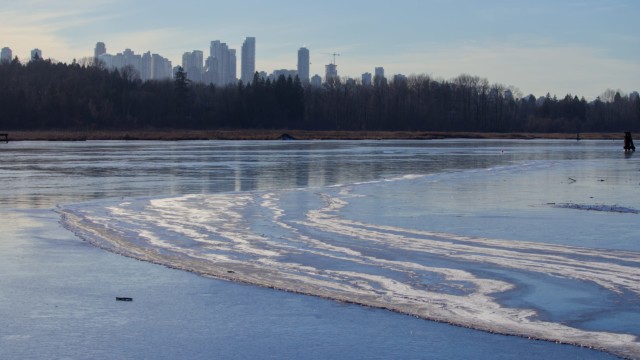
In fact, save for a bit of open water tucked under the deck that houses the warming hut (my second favourite place), every pond and waterway at Reifel was frozen solid. It was pretty, but this meant that diving ducks were nowhere to be seen, as they do not have tiny, duck-sized ice picks to break through the frozen surface.

Shorebirds were also absent for similar reasons. We were sad.

Canada geese and wood ducks, which might have otherwise been present, were both absent, though we saw them at Piper Spit.

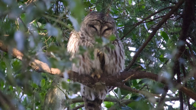
But we were compensated by seeing a red-bellied sapsucker and a barred owl. I actually got a shot of the owl’s face, proving they exist (owls, not just owl faces).

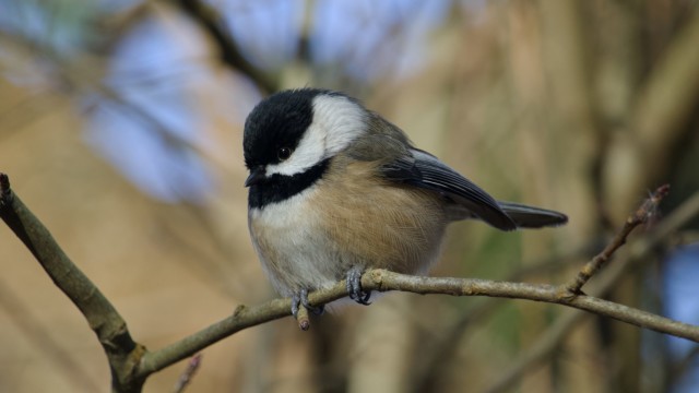
Back on the negative side, it seems the extreme cold was playing havoc with our equipment at times. I had a sequence where all of my photos were super blurry, as if image stabilization was working in reverse or maybe the ghost of George C. Reifel was grabbing my camera and shaking it every time I lined up a chickadee.

There were a lot of chickadees.

My camera seemed to benefit from spending some time in the warming hut, as did I!

The cold not only affected which birds we saw, it also affected the behaviour of the ones that remained. I asked Nic1If you are reading this and you are not Nic or haven’t read a birding post before, Nic is the friend I go birding with. He still only has a single SD card, but his camera could totally beat up my camera around the back of the school. to offer his thoughts on the birdly behaviour, and they are below.

Nic's notes on winter birds as written by Nic:

Aggressive chickadees

Chickadees were landing and flying very close. They even landed on us a handful of times, which they’d never done before! 

Missing ducks

With every single pond frozen--and not just a little bit frozen, the ice looked really solid--there were far fewer ducks to be seen. Some species, such as hooded mergansers and buffleheads (diving predators) and shovelers (filter feeders), were complete no-shows. Remaining were some mallards, wigeons and pintails--all ducks that live on grass--clustering around the main pond behind the office and warming huts. That’s where people were feeding them, and the ice under the huts seemed mostly melted. 

Likewise, no shorebirds anywhere. Are the avocets finally moving on?

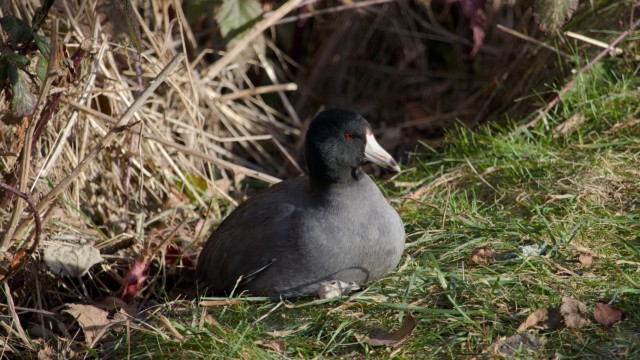
Coots (yes I know, they’re not ducks) were present, but in very limited numbers. They seemed to be scattered throughout the sanctuary: one by the small slough in front of the entrance, a handful by the observation platform in the centre.

More robins

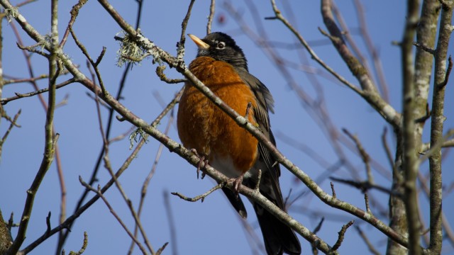
Robins come and go regardless of temperature, but there seemed to be an unusually high numbers of robins around, and in unprecedented spots, like around the west dyke trail. Then again, maybe that’s where the best winter berries are found!

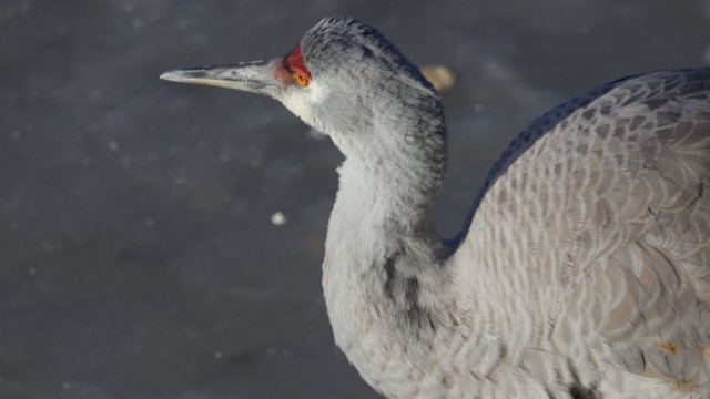
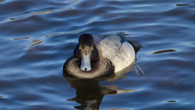
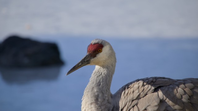
More Sandhill cranes

Staff said there were fifteen cranes hanging around the sanctuary, and they all seemed to stay around the main pond. Small wonder, since they were being fed mountains of grain 24/7! This is not without problems, because those birds are fairly finicky and territorial, and I could see a few small confrontations as they bumped up against each other's personal spaces; the local family (2 parents + 1 young) are the most put out, I'm told. And wouldn’t you be, if you suddenly found a dozen strangers camping in your front yard during lean times?

Birbs and ducks crouching down

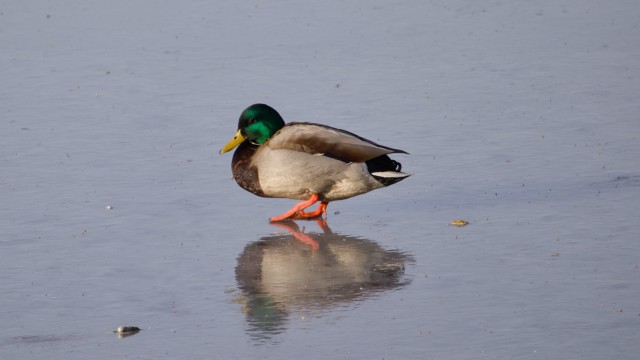
Ducks tended to lie down on their stomachs when resting on the ice, and in at least one instance it looked like it was pulling its feet up and into the feathers. Likewise, birbs crouched down very low when eating, covering the legs with their belly fluff. Just some rarely-used tactics to keep their extremities warm.

In all, it was weird dealing with such unusual cold, one of those “interesting to experience” things that I can’t say I’m eager to go through again.

We wrapped up at Piper Spit, and while there was ice on the lake, it was not fully frozen and the area immediately around the pier had no ice at all, so most of the usual waterfowl were present, along with a bunch of gulls and crows. By this time the temperatures were starting to fall and, as is often the case, there was some wind coming across the water, so my hands were starting to defeat the image stabilization all on their own. I also took copious shots of gulls taking off and landing repeatedly, but most were with the sun shining into my viewfinder, so I was hoping the shots would turn out.

Most did not turn out.

But I did get some decent shots, even with the cold and complications. In all, I’ll be happy to go out next time with temperatures above freezing. It’ll feel downright spring-like in comparison.

The Shots

The Birds (and other critters)

Sparrows and sparrow-adjacent:

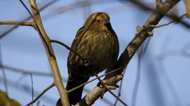
  • American blackbird
  • American robin
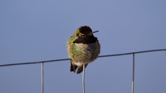
  • Anna’s hummingbird
  • Black-capped chickadee
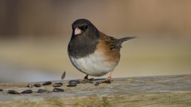
  • Dark-eyed junco
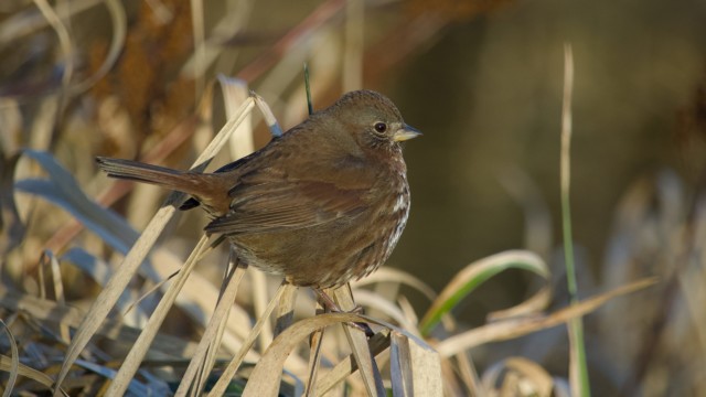
  • Fox sparrow
  • Golden-crowned sparrow
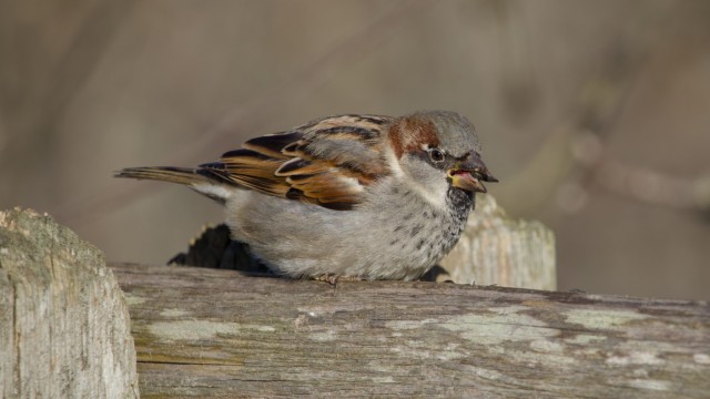
  • House sparrow
  • Northern flicker
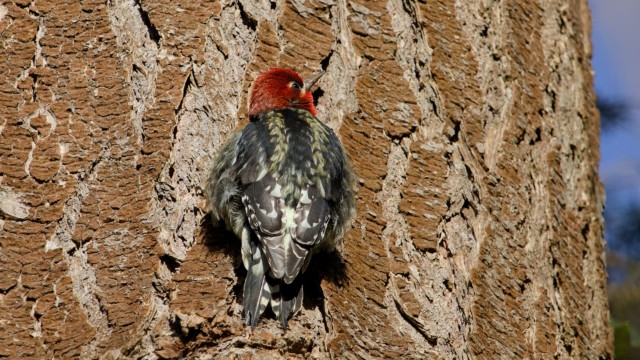
  • Red-bellied sapsucker
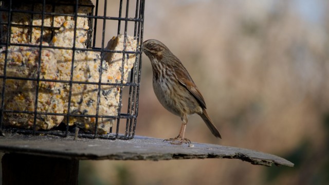
  • Song sparrow
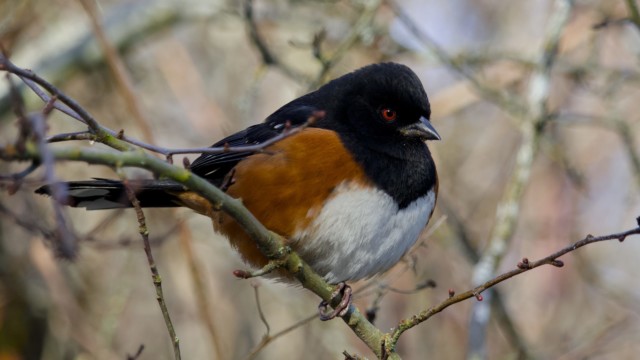
  • Spotted towhee

Waterfowl:

  • American coot
  • American wigeon
  • Canada goose
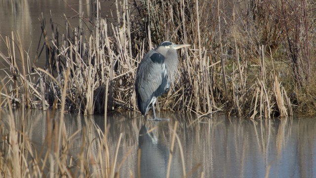
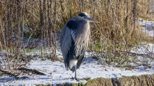
  • Great blue heron
  • Green-winged teal
  • Mallard
  • Northern pintail
  • Ring-necked duck
  • Sandhill crane
  • Wood duck

Common:

  • American crow
  • Rock pigeon
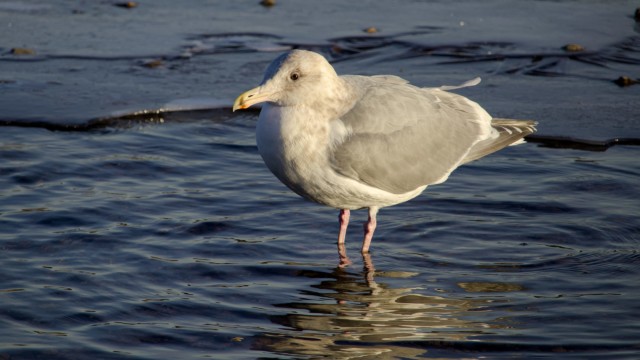
  • Seagull

Raptors:

  • Bald eagle
  • Barred owl
  • Northern harrier

Non-birds:

  • Gray and black squirrels

Change is in the hair

a vintage typewriter
I like this because you can’t actually blog with a typewriter (kids, ask your parents about typewriters). Photo by Suzy Hazelwood on Pexels.com

I never had a lush head of fulsome hair, though when I was younger I grew it out to present the illusion that I did, most obviously during my Robert Plant hair phase, my own Stairway to Hairven1I won’t apologize for this, but I will promise never to use it again.. I first got my hair cut short for a play in 1983. It was set during WWI (“Oh What a Lovely War!”) and I had multiple small roles, most of which were soldiers or other military men. Most military men in 1918 did not have Robert Plant hair, so off it came.

I liked the look and my hair was kept shorn thereafter, until that fateful day in 2011 when I decided to remove it entirely before male pattern baldness could.

But this post isn’t actually about my hair, it’s about this blog (yes, I’m going meta yet again, maybe this will be my theme for 2024). Specifically, I think I’m going to start moving some of the stuff I post here to another site/service (to be determined).

What will move off of creolened.com:

  • Running and other fitness or health-related stuff (trips to the ER will be excepted, because that sort of thing is perfect for sharing here, as it’s always a comedy of mild horror). The running posts in particular have always been better-suited for a journal, as it’s not interesting to others. I mean, it might be interesting in some tiny way if you also run, but even then, not so much. (I think I started posting my regular runs here in part as a way to keep myself accountable, by making it public, but after 15 years of running, I should probably be OK to take this stuff offline now.)
  • Writing projects.
  • Art or other creative projects.

What would stay on creolened.com:

  • Ramblings and whatever pops into my mind.
  • Reviews.
  • Subjects that interest me, like tech, writing and so on. Opinion pieces, essentially.

What I’m, unsure about:

  • Photography. One-off photos and especially stuff I snap with my phone will still get posted here, but I am undecided where I want my birding or camera photos to live.
  • Anything else I haven’t mentioned already.

I’ll start with the running stuff first, then go from there. I’ll probably keep the running posts here, but maybe make the category non-public, so the posts aren’t visible, then find some clever (?) way to move those posts elsewhere.

Onward to a year when things are different, but hopefully better!

2024: Year of the Fakenet

elderly man thinking while looking at a chessboard
This came up when I searched for “AI”. As Homer once said, close enough. Photo by Pavel Danilyuk on Pexels.com

I Have No Mouth, and I Must Go Against OpenAI Use Policy

– philmv (Mastodon link)

In November 2022 OpenAI revealed ChatGPT, a Large Language Model (LLM) chat interface that would answer questions, write poetry, whistle and dance, all based on data it had scraped and trained on from the internet (copyright be darned). It can be useful (it helped me write some code for this blog) and it can be silly/weird/dangerous (giving famously bad answers, of which there are too many examples to name).

But it also, more insidiously, provided a new tool to spammers, scammers and their ilk.

Futurism has one of many stories on just one tiny slice of this: Amazon Is Selling Products With AI-Generated Names Like “I Cannot Fulfill This Request It Goes Against OpenAI Use Policy”

People were already complaining about Google search results getting worse, and now it’s filling up with AI-generated junk. That same junk is also serving to help train future LLMs and you see where this is going: an internet-wide ouroboros of spammy, misleading nonsense choking out anything written by actual humans.

My observation on this, coming as we near mid-January of 2024, is already old news. I just wanted to record it here for posterity. Let’s check back and see how things have evolved by year’s end.

I have proven I can stick to at least one thing for 4,000 days

I mean, apart from stuff like existing, breathing and such.

And that thing is logging into MyFitnessPal on a daily basis. Behold today’s login:

Not accounting for leap years, this works out to logging in every day for 10.95 years. And in that time, my weight has gone up (to a high of 187 pounds in 2008) and down (to a low of 143 pounds in 2012) to various levels in-between (I am currently struggling with getting my weight down again, though I’m well clear of hitting 187, at least. For now, anyway. Check back with me in a few cookies months).

Oh snow

Guest parking at 1:53 p.m. Note: Ventilation shack was not pulverized by the snow, it’s been like that since August 2023.

Today we had our first real snow of the winter. Considering we’re well into January, that’s not too bad. It is still unwelcome, albeit pretty. We are expected to get a few days of below-freezing temperatures before going back to our usual mild winter. Take a look-see at tomorrow’s low temperature:

  • Normal low: 2°C
  • Record low: -9°C
  • Expected low: -13°C (!)

And just a few weeks away we set a record for the high temperature hitting +13°C. Climate change is fun!

AllerJAZZ!

person holding allergy medicine bottle
I tried using AI to generate the image, the results were…not good. Photo by cottonbro studio on Pexels.com

I think my allergies have been bonking me over the head the past few days, and this lead me to having a dream (I think it was a dream, I was in bed and all) about a new anti-allergy medicine called AllerJAZZ! The packaging had the compelling slogan: “Takes care of your allergies…and all that jazz!” Apparently, my subconscious mind is big on exclamation points. Also, jazz hands were a prominent part of the logo.

I can kind of see the packaging for this. Maybe I’ll mock up something later. That seems like a good use of my time.

Treadmill workout: Two whole days in a row!

I mean, it’s not a run day, and I have vowed to either go for a walk every non-run day, or do a treadmill workout. Today I decided to do the treadmill because it’s sitting there right behind me. It’s hard to beat that kind of convenience.

The only change from yesterday is running the speed at 6.7 the entire time. As you can see below, my pace was much faster and my BPM was lower, both nice to see. I managed to burn fewer calories, but that’s just body weirdness and rounding errors.

I can verify that I do not suffer from DMS1Dry Mouth Syndrome when using the treadmill in January. I also gave the water bottle a better rinsing today so the water didn’t taste funny in that “not haha funny” way.

All in all, it was fine.

Speed: 6.7 (6.7)
Incline: 1 (1)

Pace: 8:30/km (8:48/km)
Time: 30:00 (30.00)
Distance: 3.53 km (3.41 km)
Calories burned: 292 (317)
BPM: 129 (133)